For this project, I created a one-pager and a Reddit ad for a SaaS platform called TeamFlow. The aim was to present a clear, engaging overview of product features while staying adaptable for use across digital marketing channels.
The one-pager features a clean layout, modular feature blocks, and a limited palette of brand-aligned colours (blue, teal, and soft grey), designed to echo typical SaaS aesthetics. I chose Urbanist as the typeface for its versatility and clarity across screen sizes. The layout is structured to be print-friendly but flexible enough for web or PDF formats.
To show the design in context, I developed a Reddit ad using the same visual language. This demonstrates how TeamFlow’s value proposition can be distilled into a native-feeling, scroll-stopping format that suits high-engagement environments like Reddit.
The result is a compact, consistent visual identity system that communicates product value clearly and quickly - ideal for fast-moving B2B SaaS marketing.
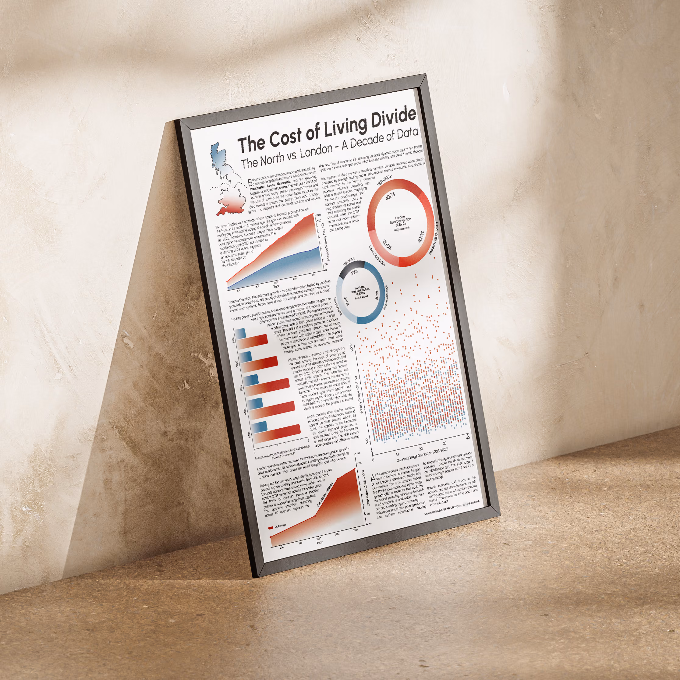
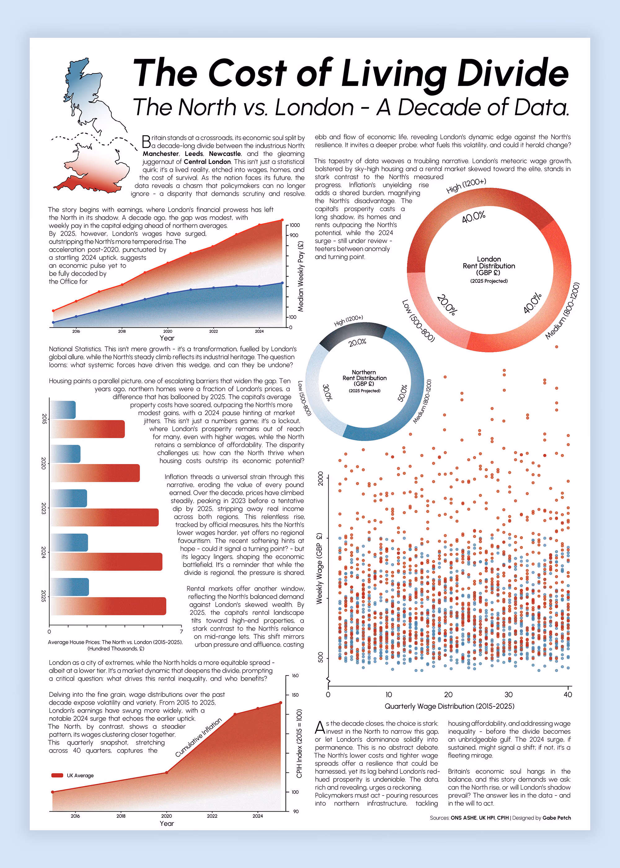
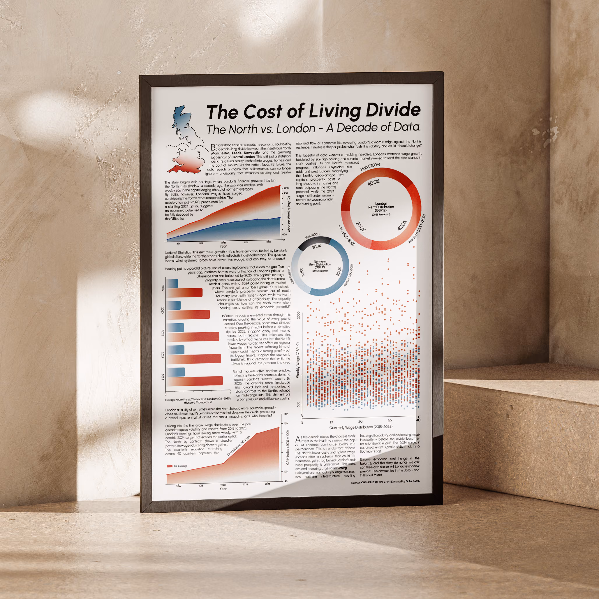
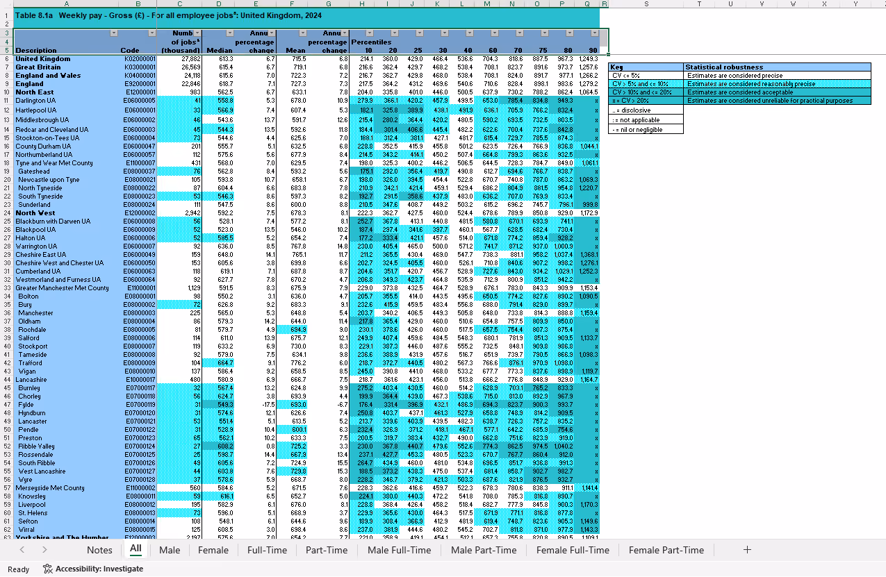
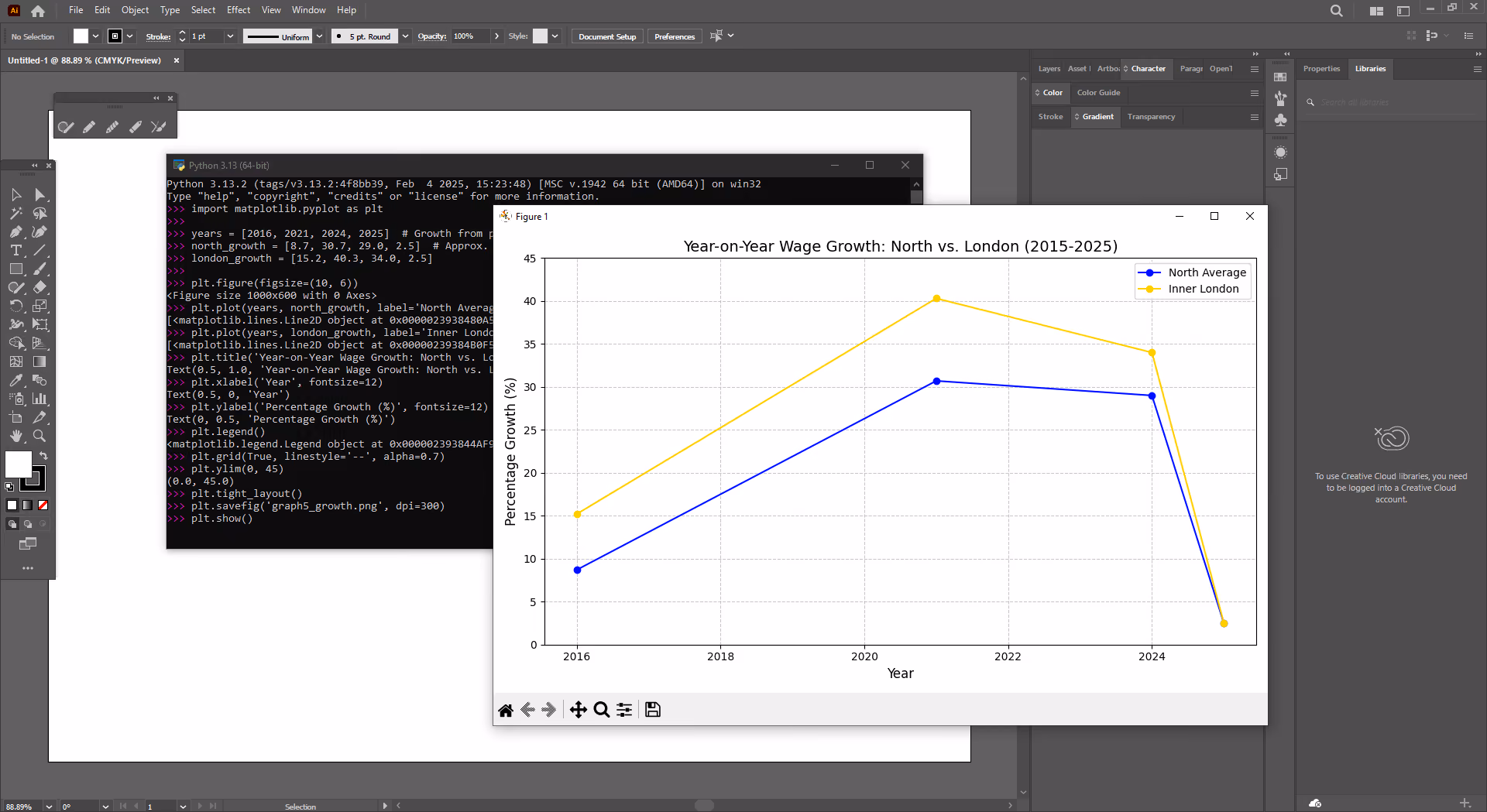
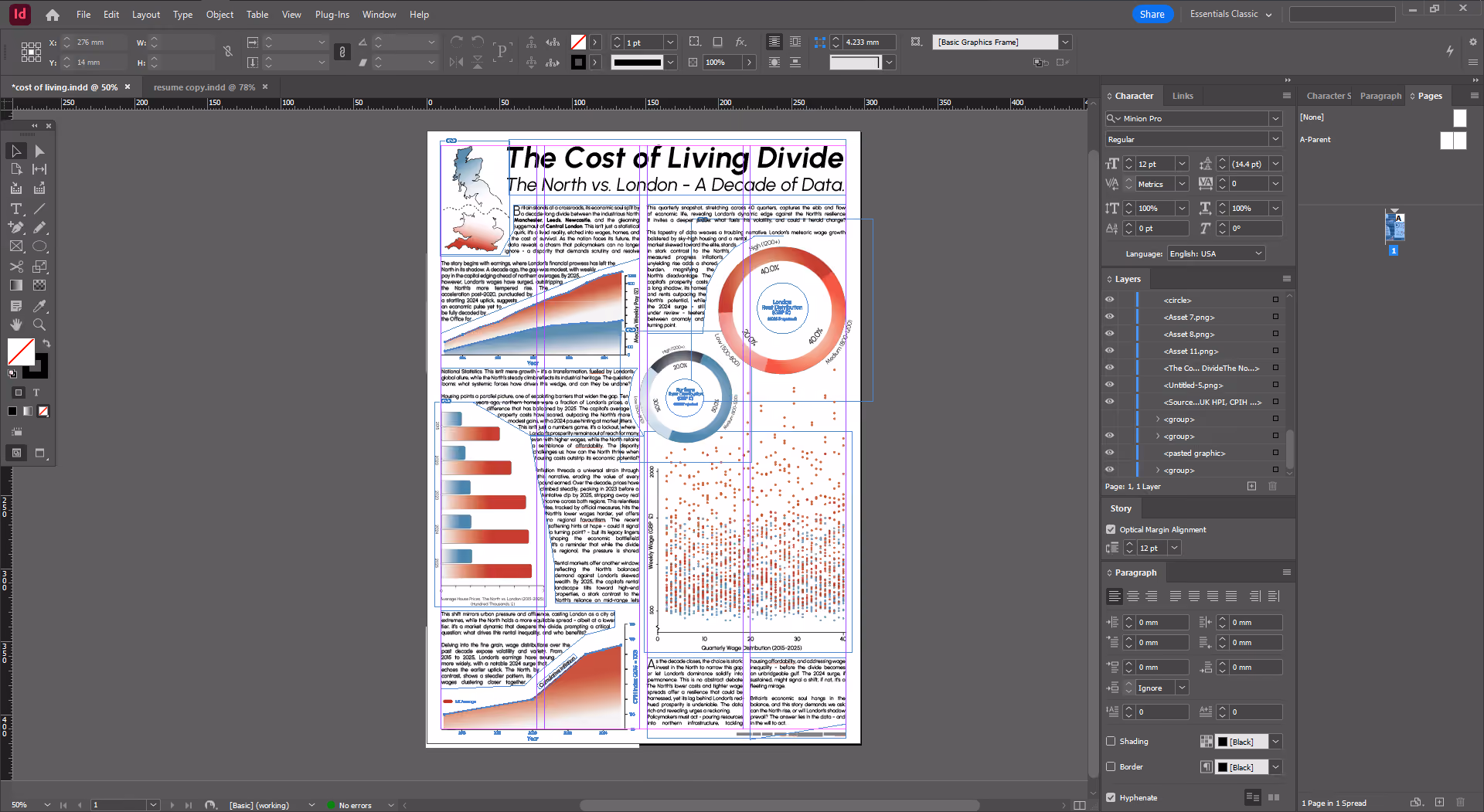
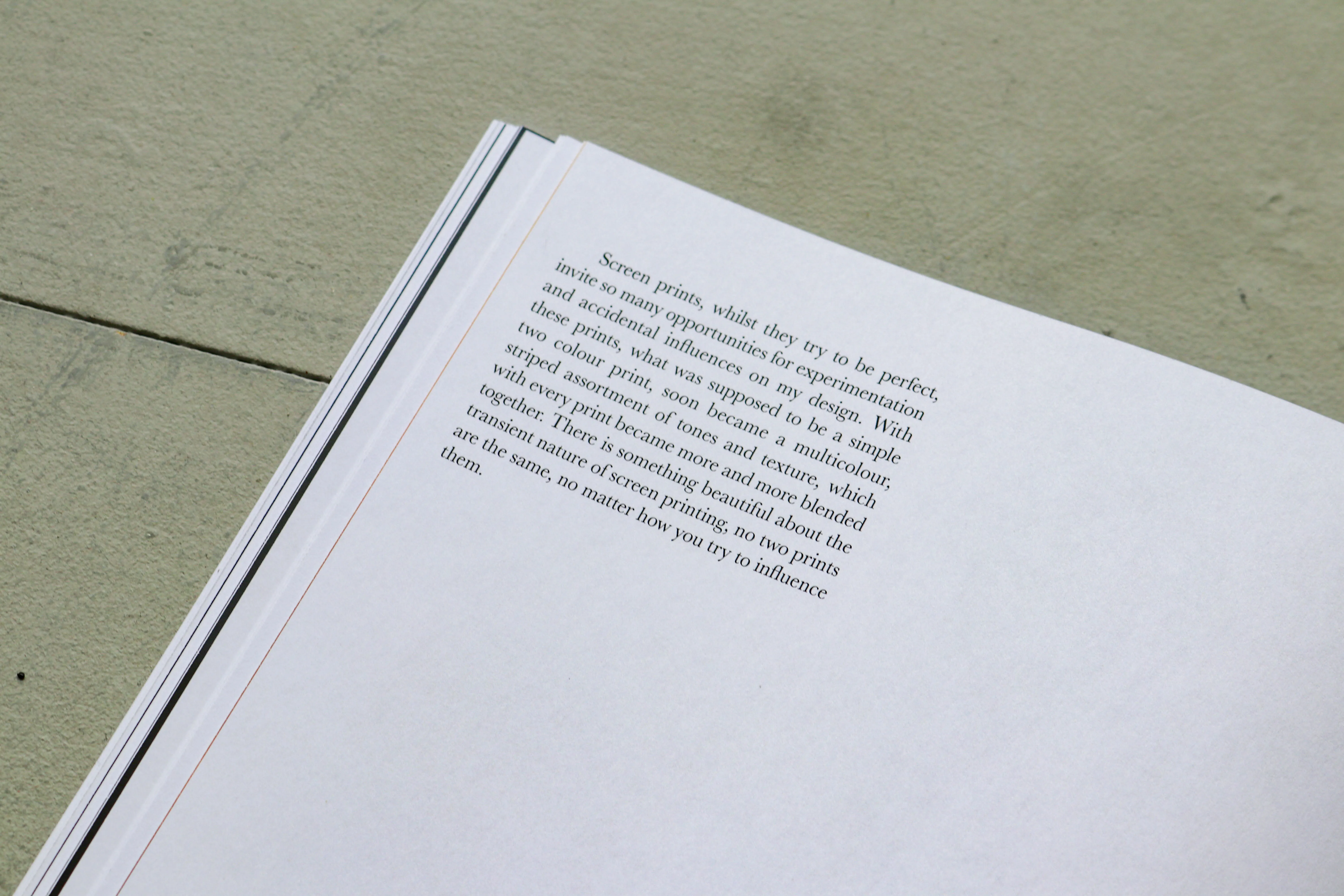
For The Cost of Living Divide: North vs. London, I designed an A3 poster breaking down a decade of economic disparities between northern England and London. Using Python and Matplotlib, I created five SVG graphs—line, bar, area, pie, and stacked bar—plus a scatter plot. These visualisations, based on data from ONS ASHE, UK HPI, and CPIH, highlight trends in wages, housing costs, inflation, rent distribution, and a composite cost of living index. The scatter plot adds another layer, showing how these factors intersect over time.
To tie it all together, I developed the visual identity, a logo with a split horizon - blue for the North’s perhaps cooler economic climate, red for London’s explosive growth. A consistent color palette and typography reinforce this, while a structured two-column grid integrates visuals with written analysis, making the data clearer and more engaging.
It was also a chance for me to do some editorial-style writing, building on my background in journalism. The project brings together data analysis, Python visualisation, and design - showing how I turn raw numbers into compelling, accessible visuals.
.avif)
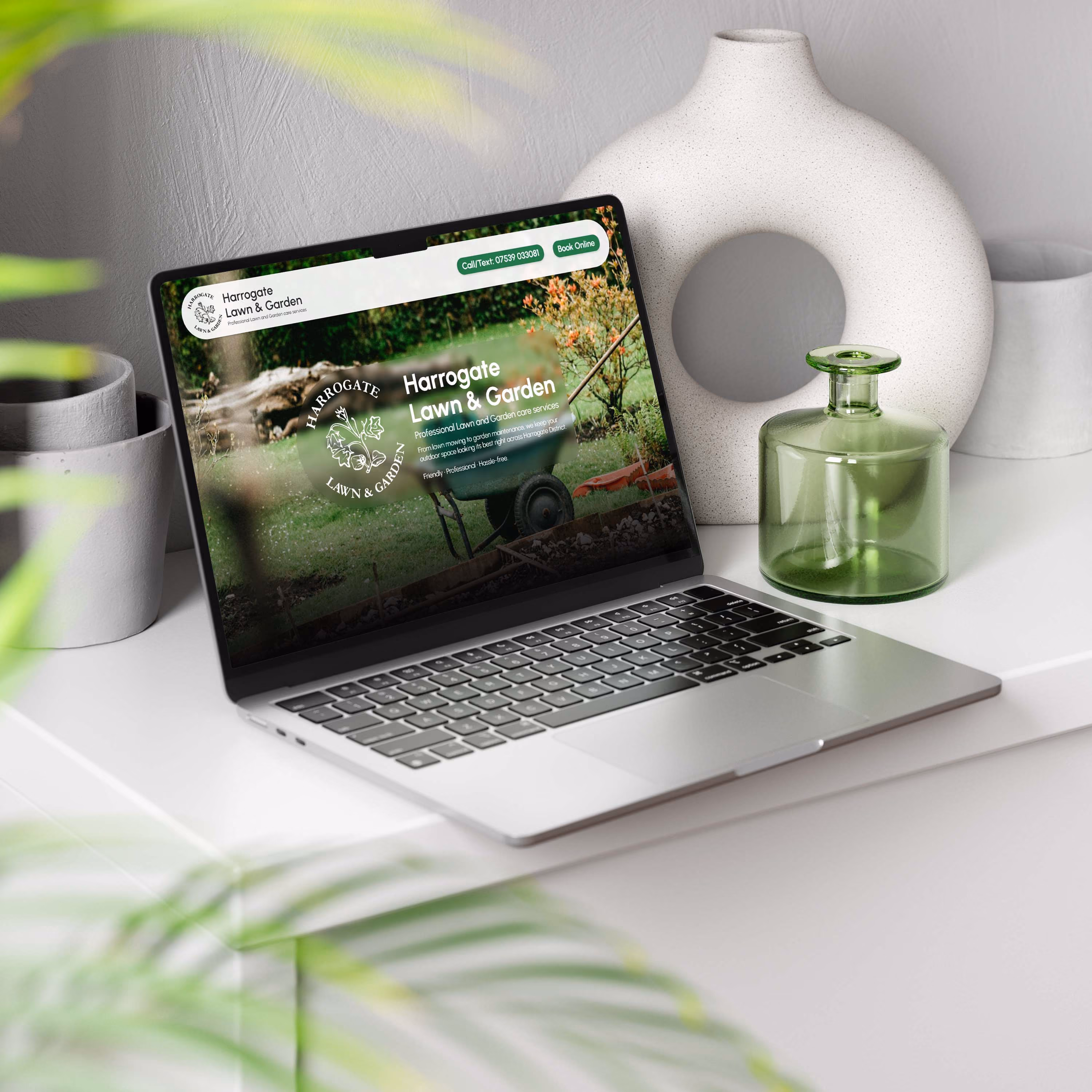
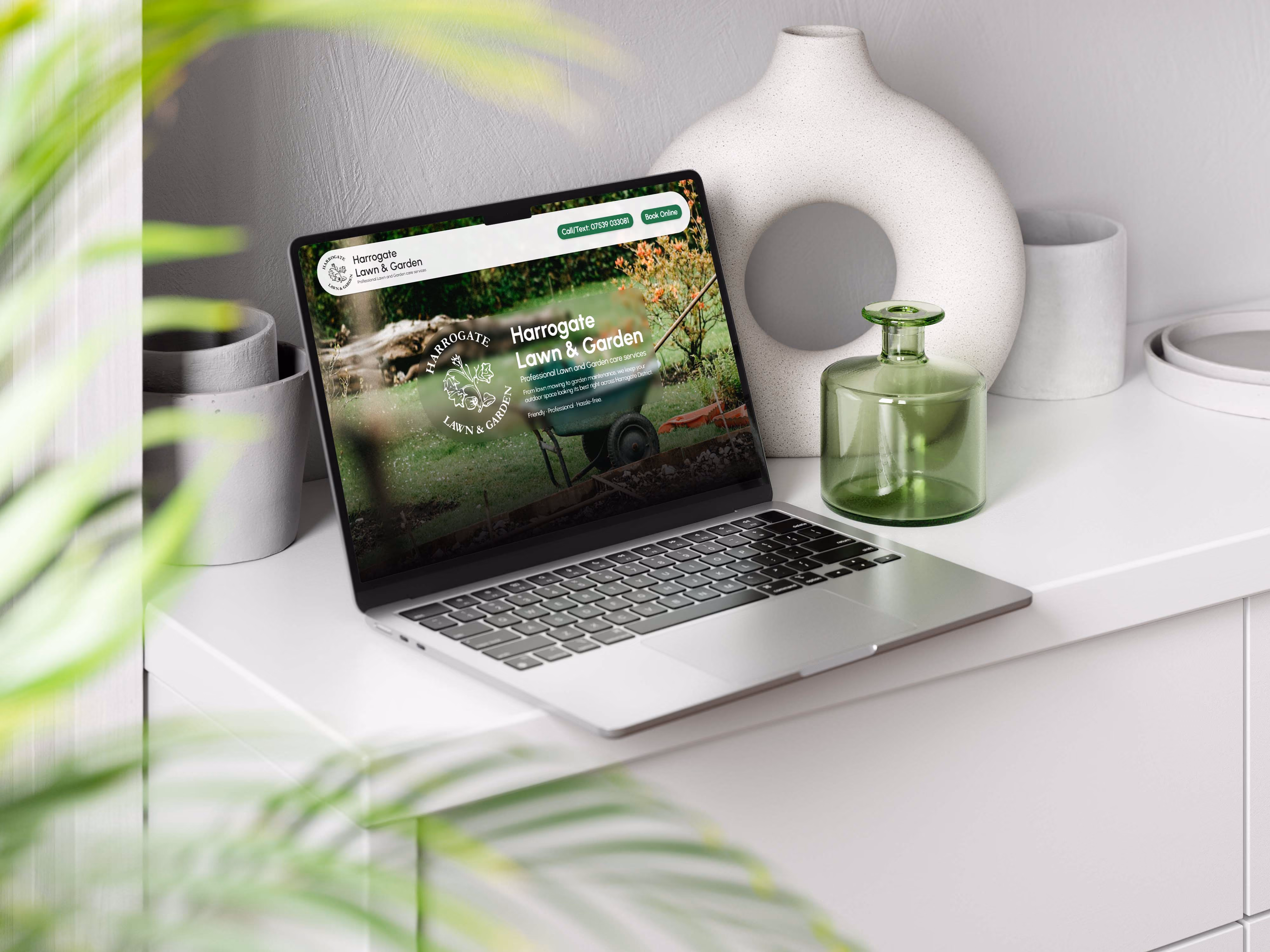
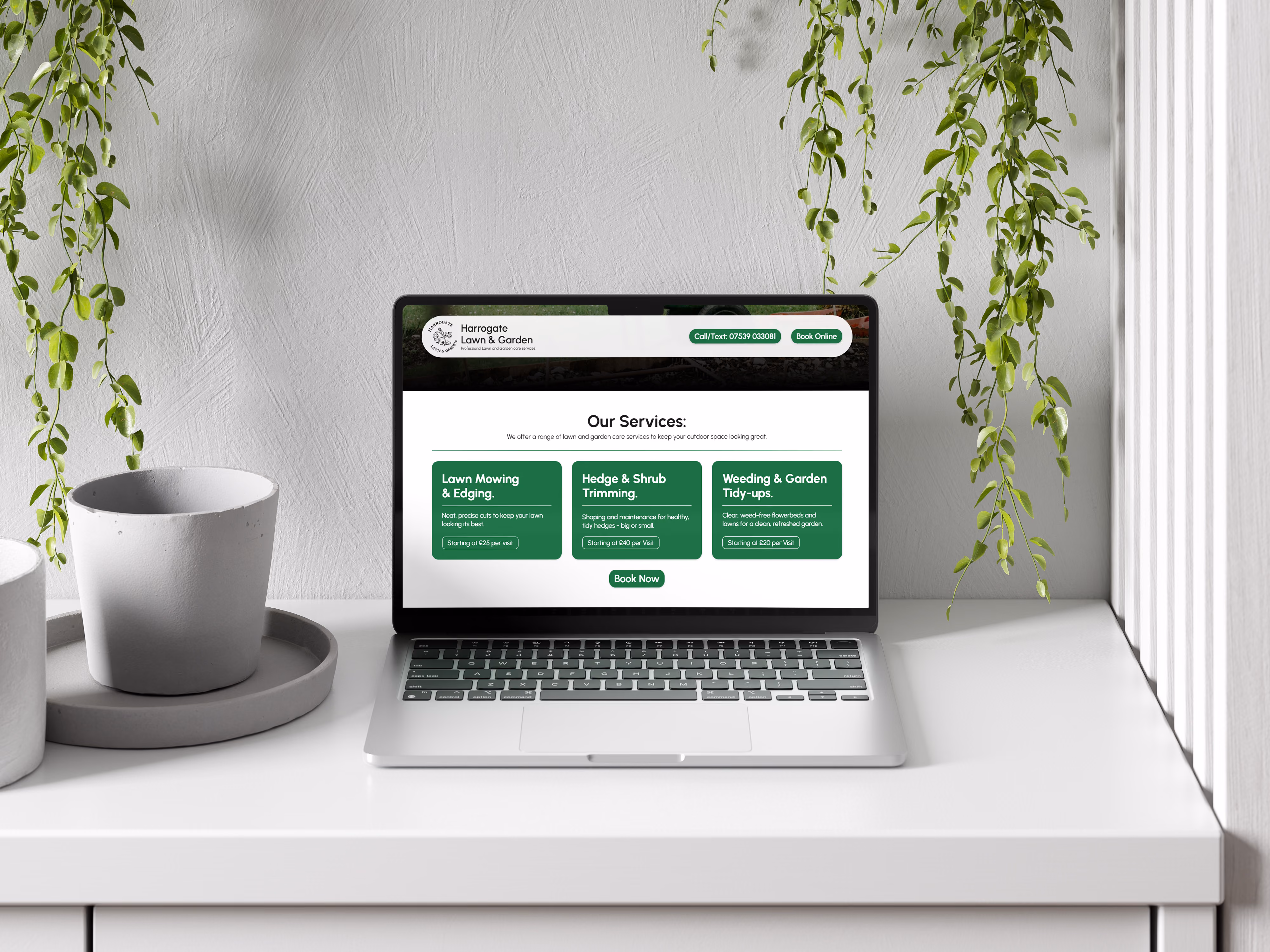
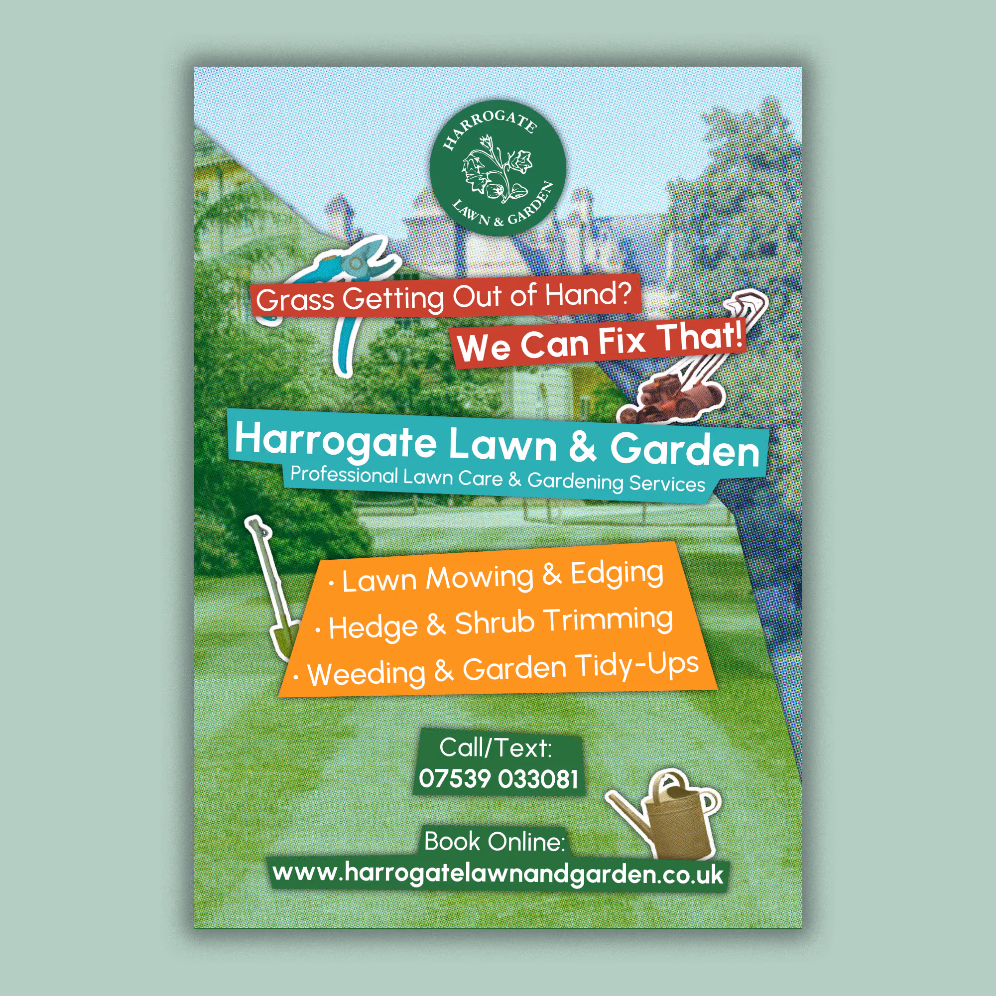
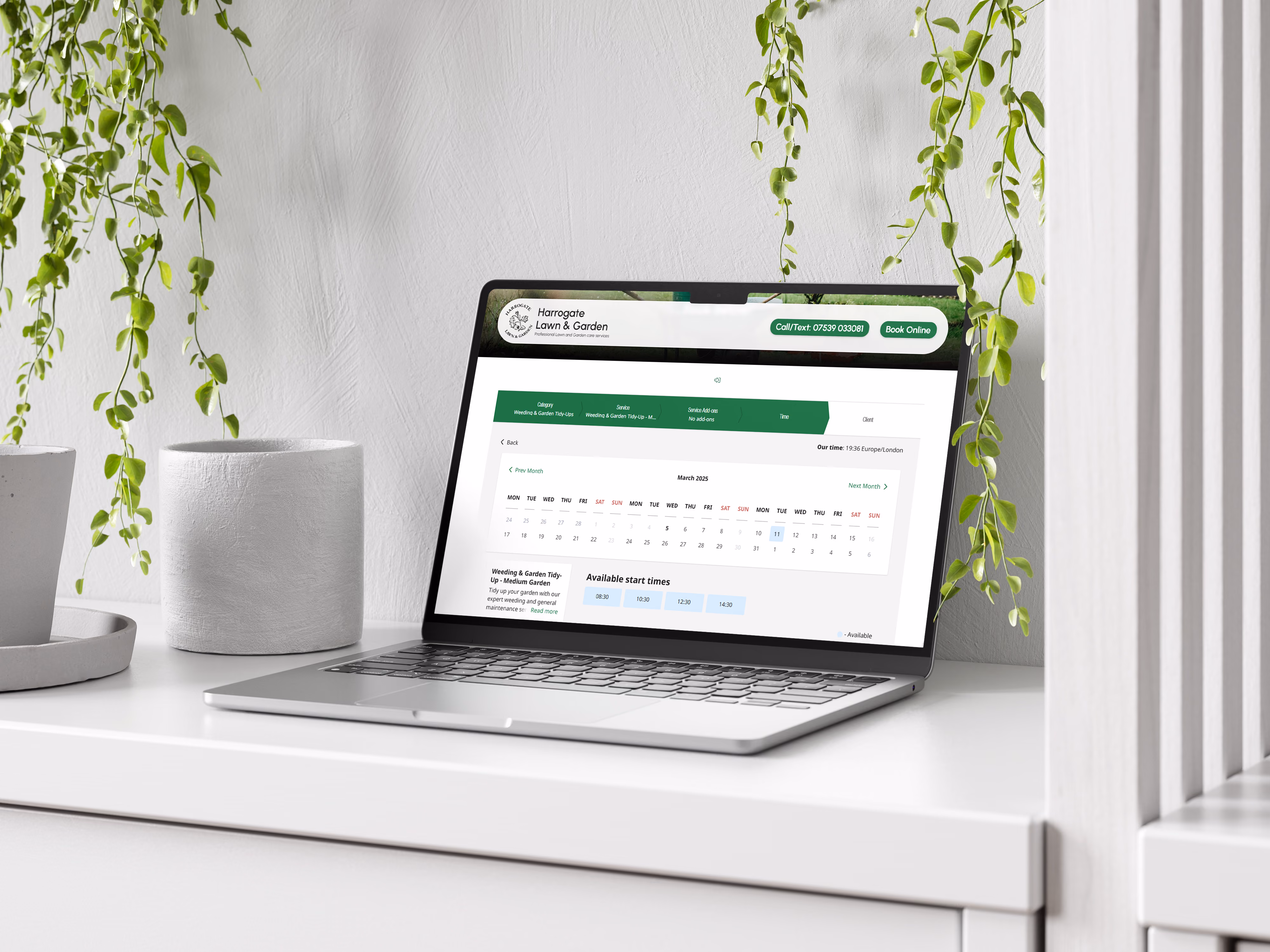
For Harrogate Lawn and Garden, I designed and built a fully responsive website in Webflow, integrating SimplyBook to handle client appointments. The site lets customers book services, manage accounts, get SMS reminders, and make secure payments through Stripe. I also set up Google Analytics to track performance and improve the user experience.
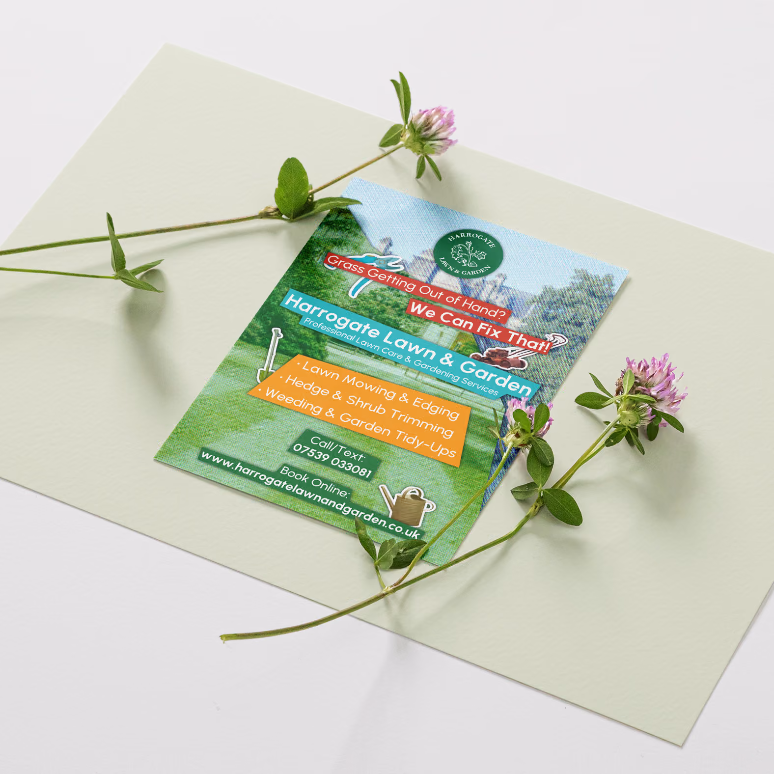
Beyond the website, I created a full visual identity, including a logo that reflects reliability and expertise. I carried this branding through to a promotional flyer with a clear, engaging call to action to drive inquiries.
This project wasn’t just about design—I handled everything from concept to execution, making sure all systems worked smoothly together. It’s a great example of how I deliver end-to-end solutions that look good, work well, and help businesses run more efficiently.
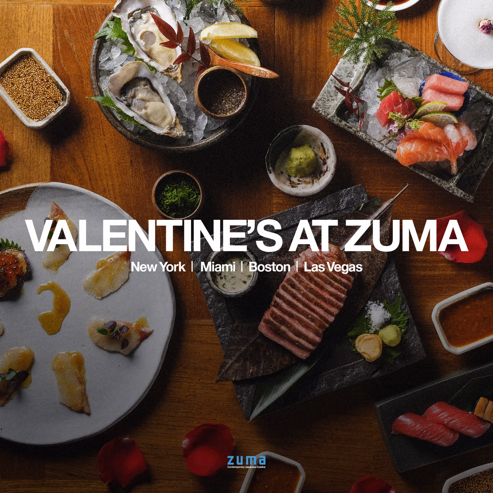
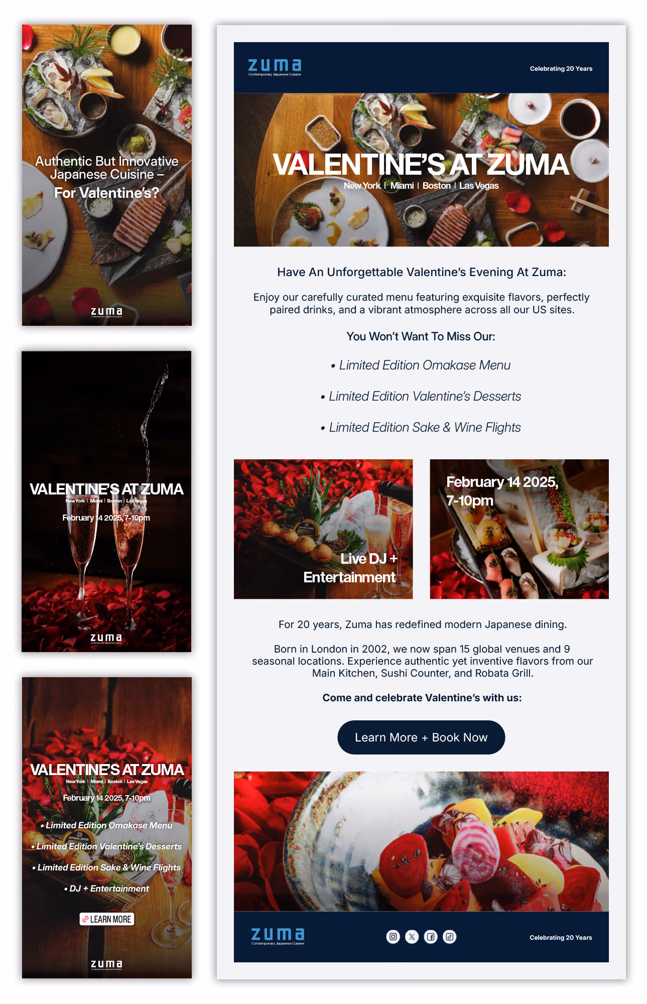
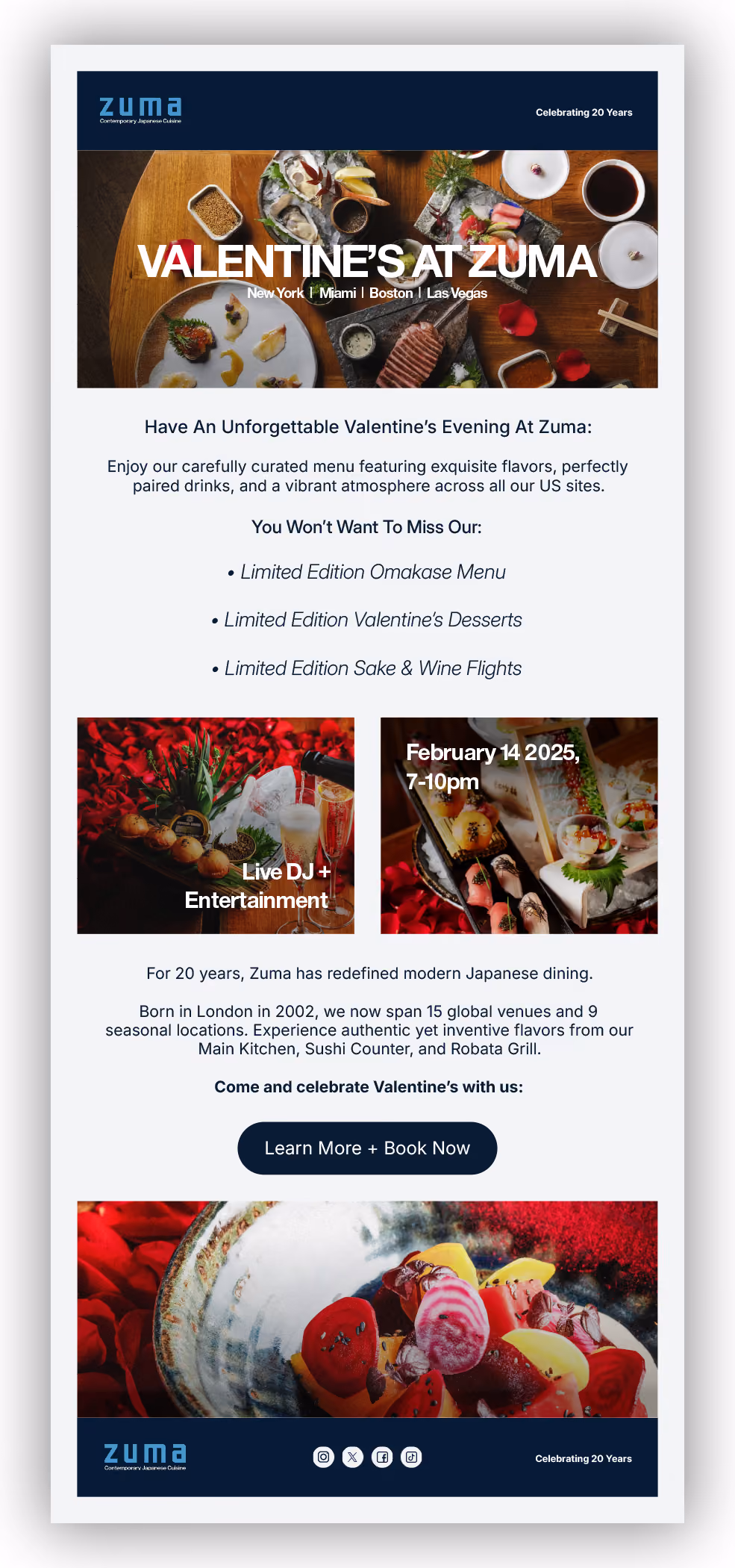
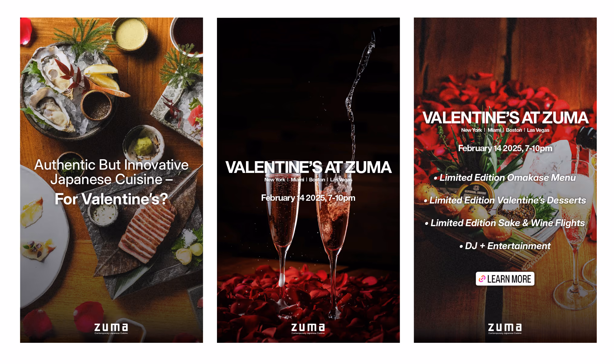
For this campaign, I designed email and social media story assets for Zuma’s US locations—Miami, New York, Boston, and Las Vegas—to promote a special Valentine's Day event. The brief called for a creative approach to highlight the exclusive offerings, including a limited-edition omakase menu, a special Valentine’s dessert, sake and wine flights, and live entertainment.
I created a cohesive design that reflected Zuma's sophisticated yet modern aesthetic, with bold imagery and elegant typography to draw attention to the event details. The assets were designed to work across different platforms, ensuring that each location’s audience would feel engaged. The design was adaptable for both email and Instagram story formats, making the campaign accessible on all devices.
The assets were optimised for clear communication and strong calls-to-action, encouraging users to reserve their spots for the event. This project is a good example of how I blend design with functionality, creating visually striking materials that also drive action.
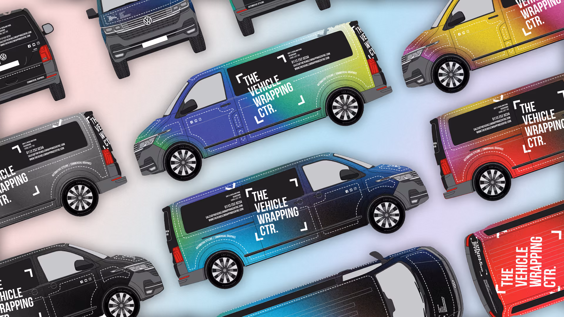


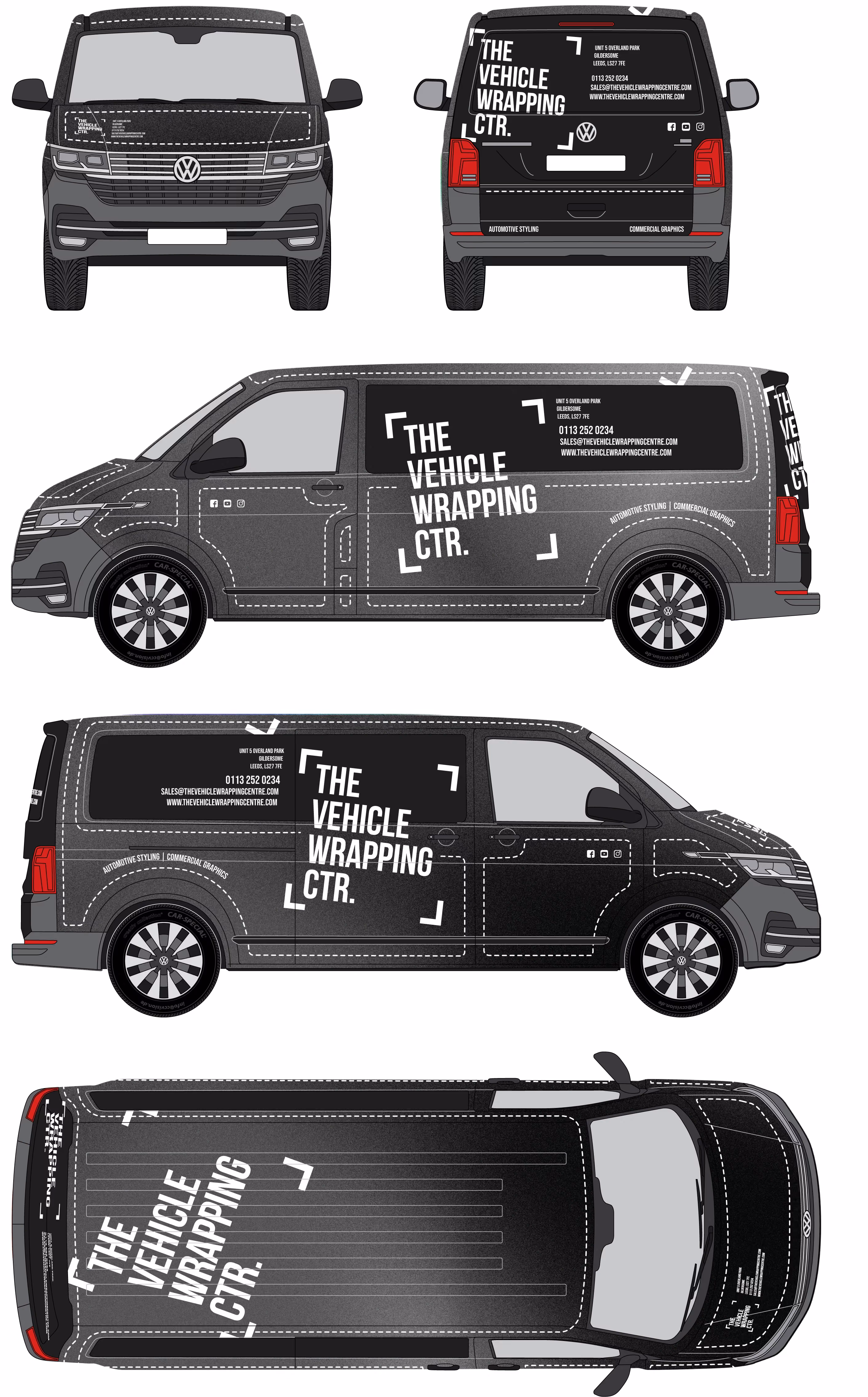
I was tasked with creating vehicle wrap concepts for The Vehicle Wrapping Ctr, focusing on designs that showcase their creativity and versatility.
The designs feature a large, abstract gradient texture I created in Photoshop, cut into smaller sections and placed across the van’s surfaces using Illustrator. This adds movement and visual interest from every angle while reflecting the endless design possibilities the company offers.
To highlight the wrapping process, I incorporated a dashed line motif inspired by vinyl cut lines. These lines follow the van’s curves, segmenting panels and adding subtle visual intrigue.
The logo is central on each face of the van, creating a bold focal point. Supporting details like the address and phone number are dynamically positioned to enhance the design without detracting from the logo.
Alongside vibrant color options, I included a monochrome version to ensure flexibility.
This project combines technical precision with creative flair, resulting in designs that align with the brief while emphasizing innovation.
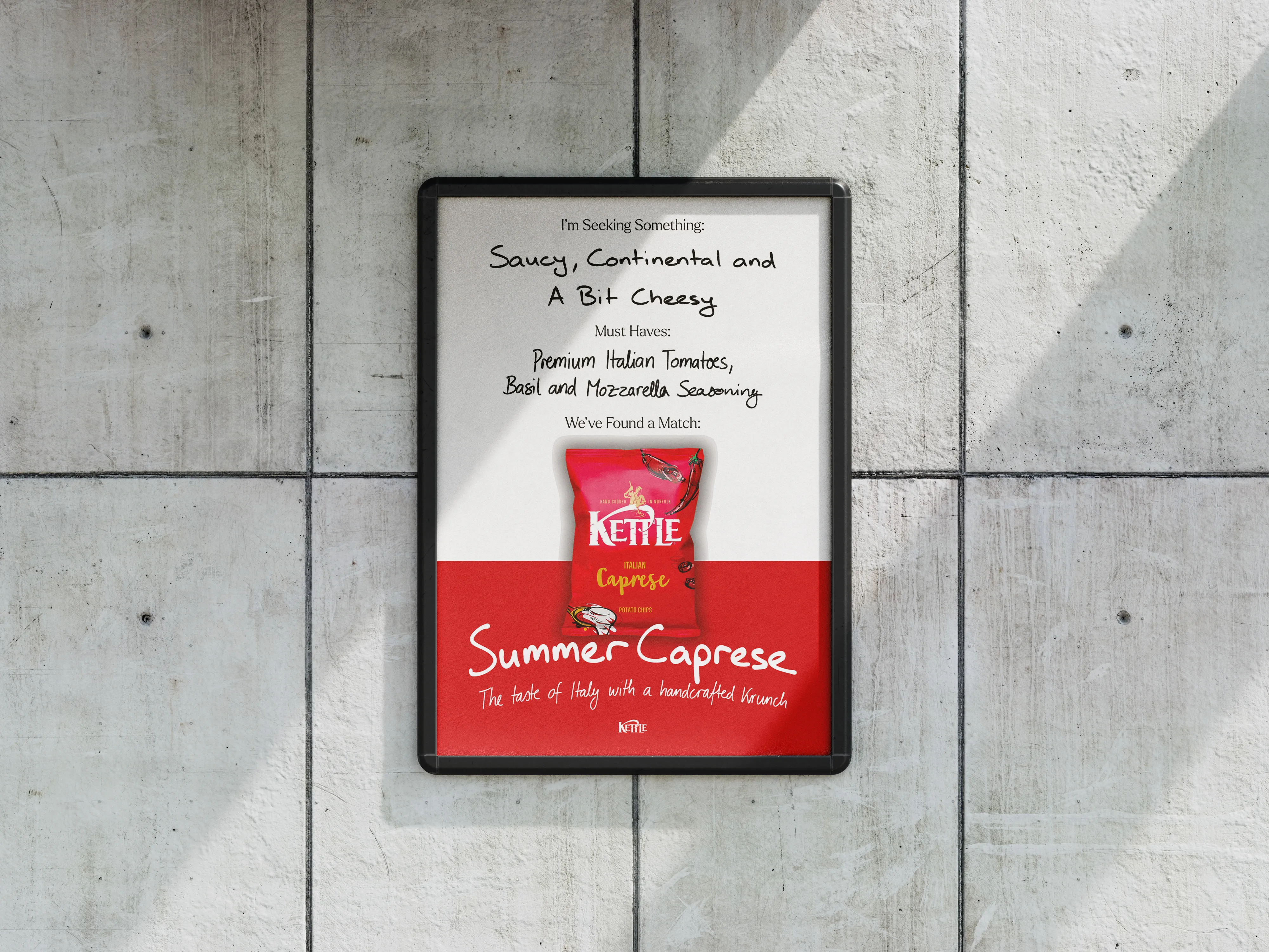


I created an animated text poster for Kettle Chips’ fictional “Summer Caprese” flavor, designed to feel dynamic and authentic. The animation mimics handwritten text appearing on the poster, adding an engaging and playful element.
The brief emphasized bold, eye-catching visuals that highlight the flavor’s premium Italian ingredients - tomatoes, basil, and mozzarella. Using vibrant colors and textures inspired by the Italian summer, I brought the flavor to life while staying true to Kettle Chips’ handcrafted, premium identity.
This project allowed me to experiment with animation, typography, and texture, resulting in a design that feels fresh, distinctive, and on-brand.


.gif)

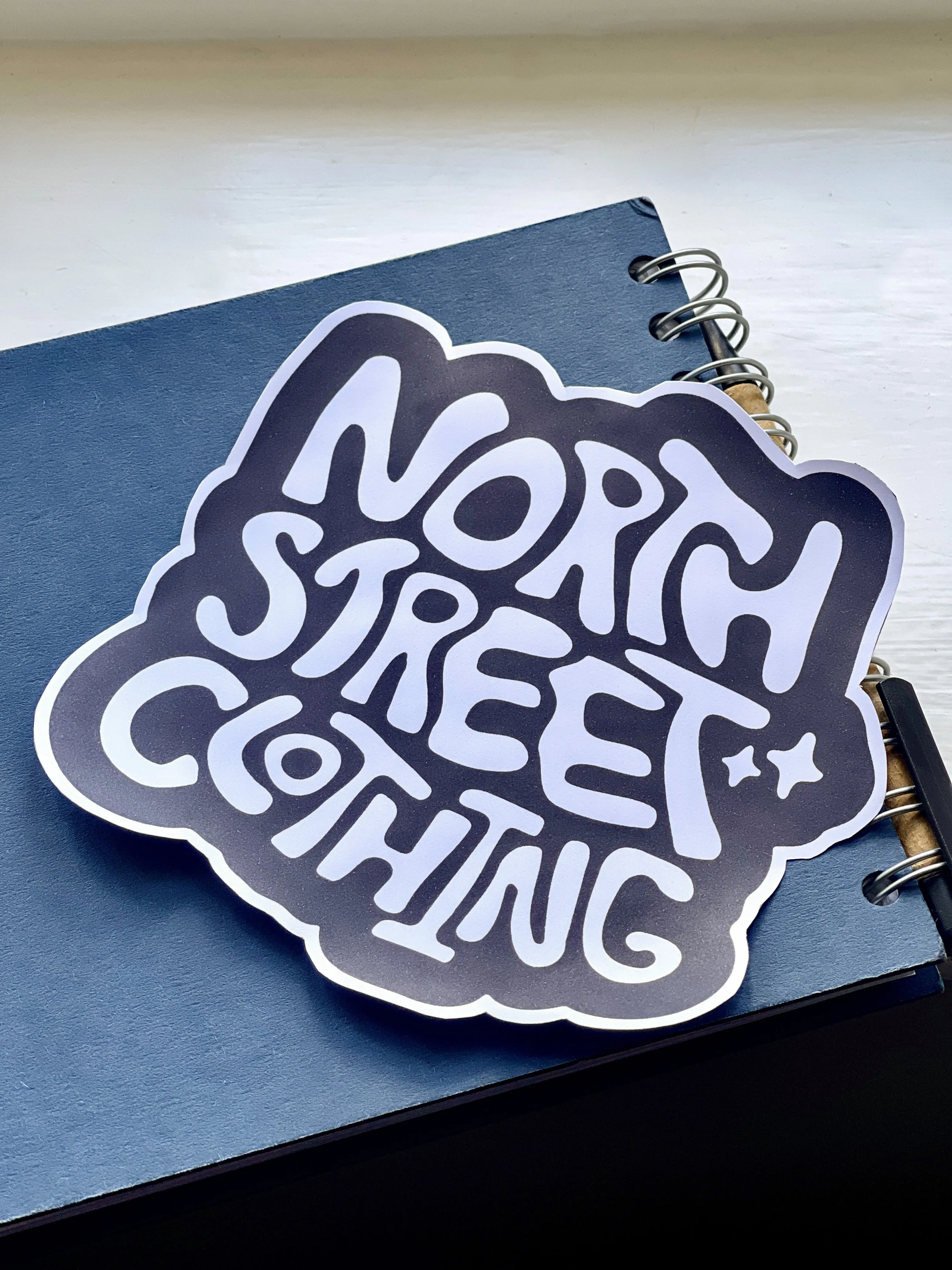
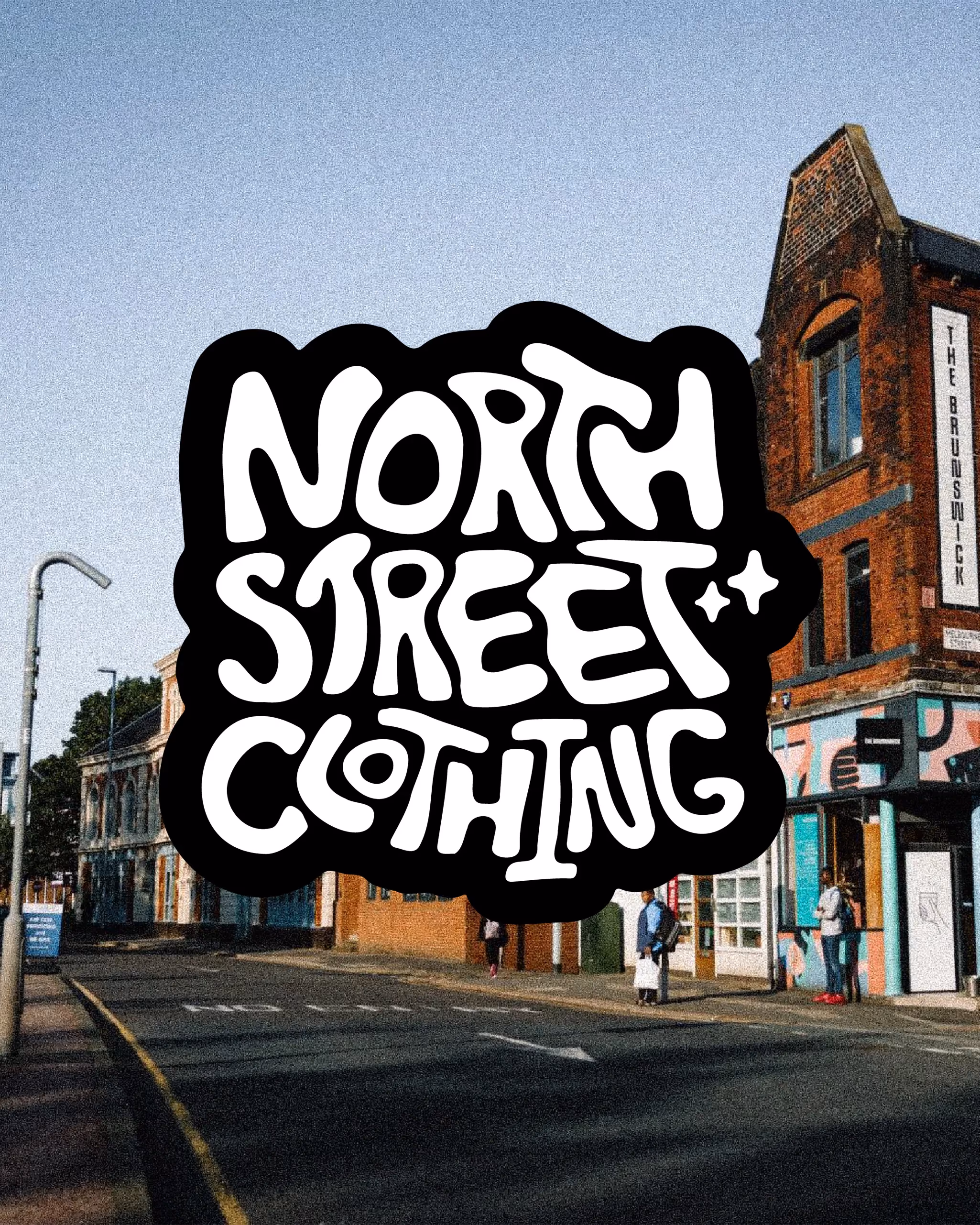
A sustainable fashion brand from Leeds, UK wanted a new identity to reflect not only their link to the city but also elements of sustainability and Y2K aesthetics.
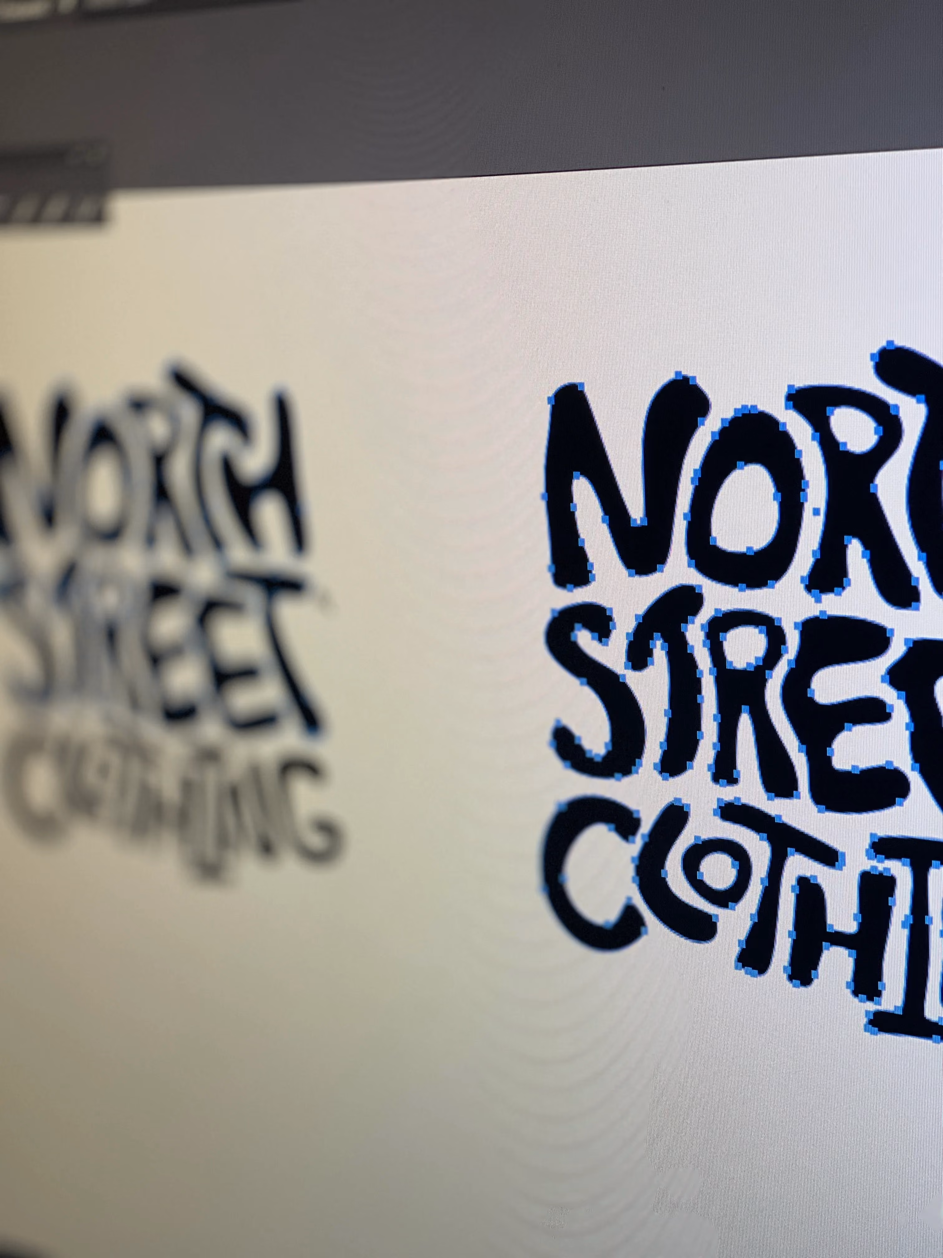
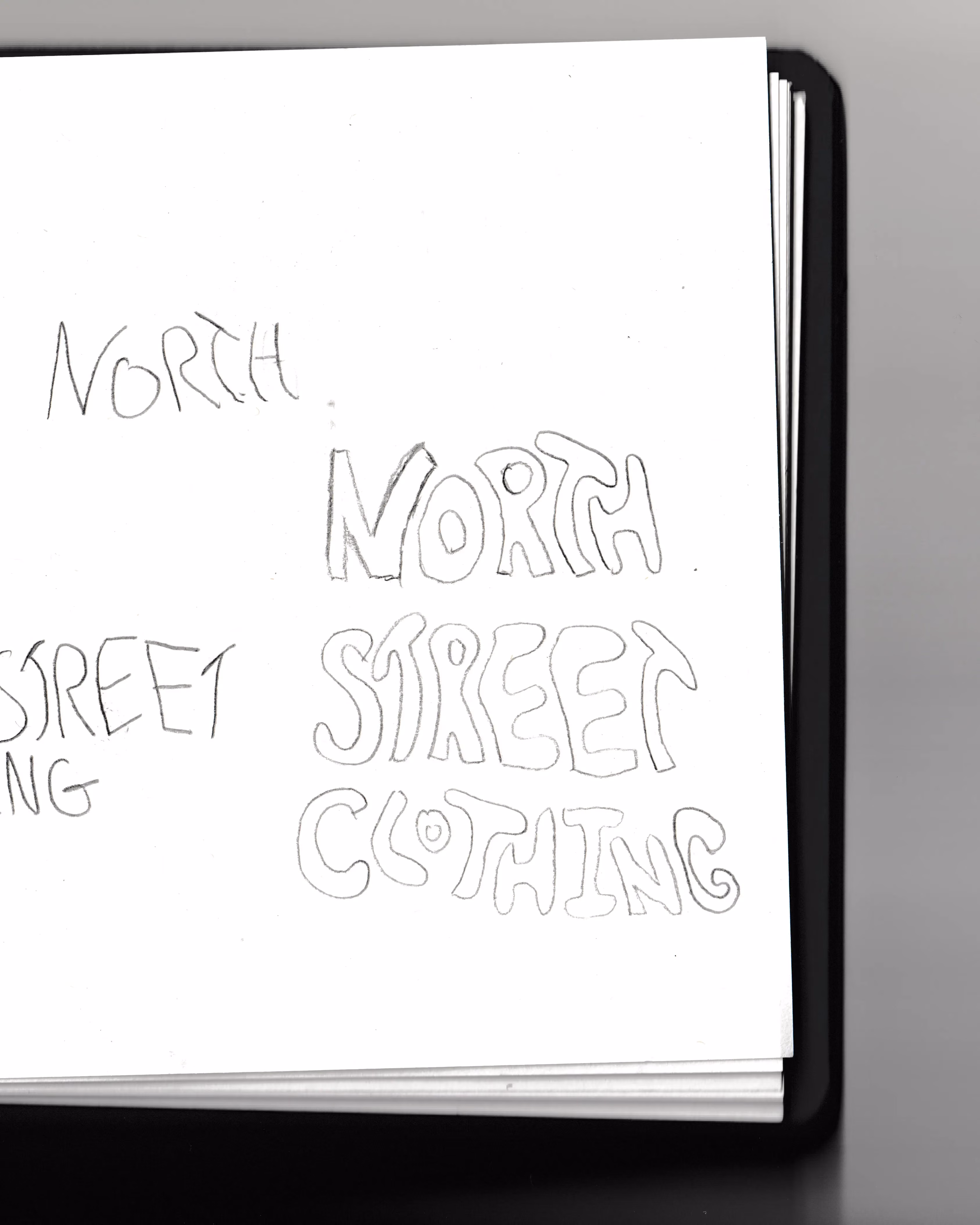
Starting life as a hand drawn sketch to provide unique and organic forms to the type, I digitised and refined the logo mark, fine tuning letter spacing and stroke widths to increase legibility across a range of platforms and sizes.
Small decorative Y2K elements provide motion and flair to the mark whilst helping to balance the identity's multiple influences.
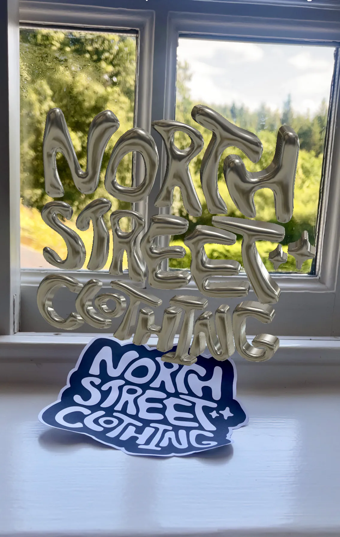
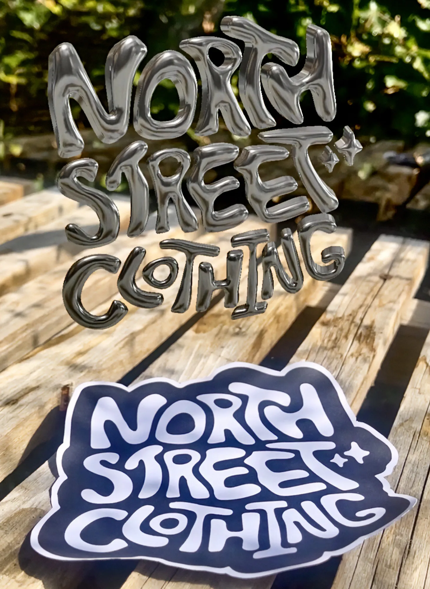
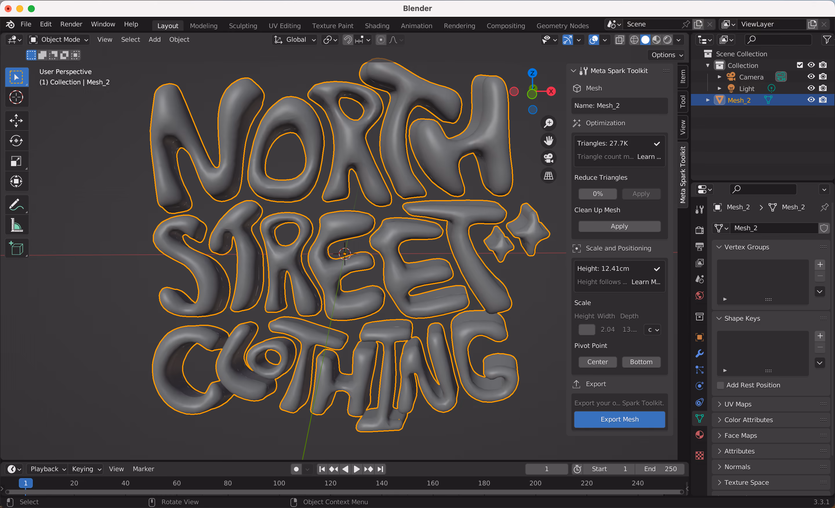
With the fashion industry in mind, Gabe wanted to give the mark an extra dimension. Converted to 3D, the logo forms an augmented reality experience when Instagram is pointed at it, animating a metallic version of the logo - with the idea that customers could post about their new North Street Clothing products, perfect for driving social media traffic in an interesting and contemporary way.

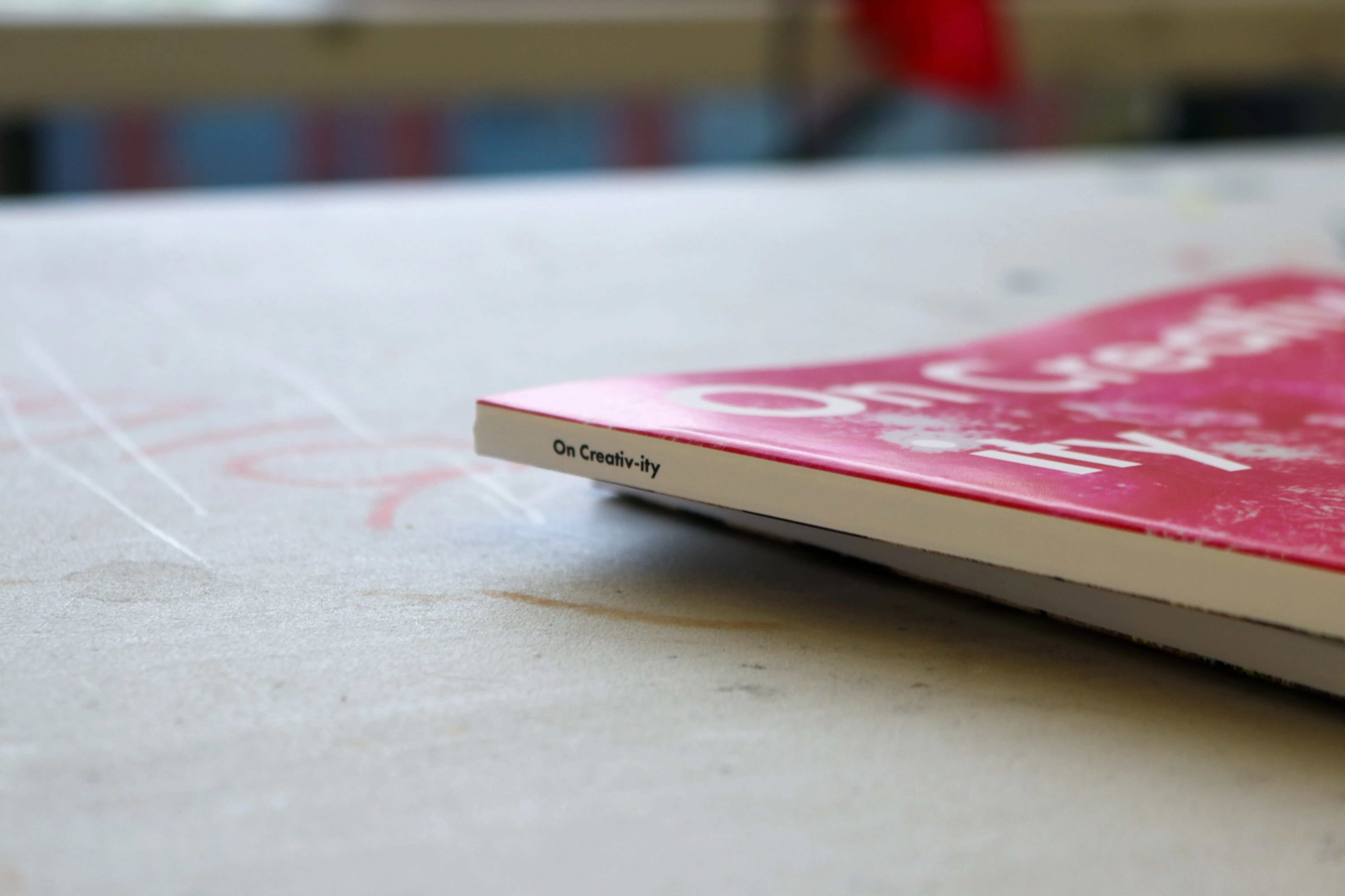
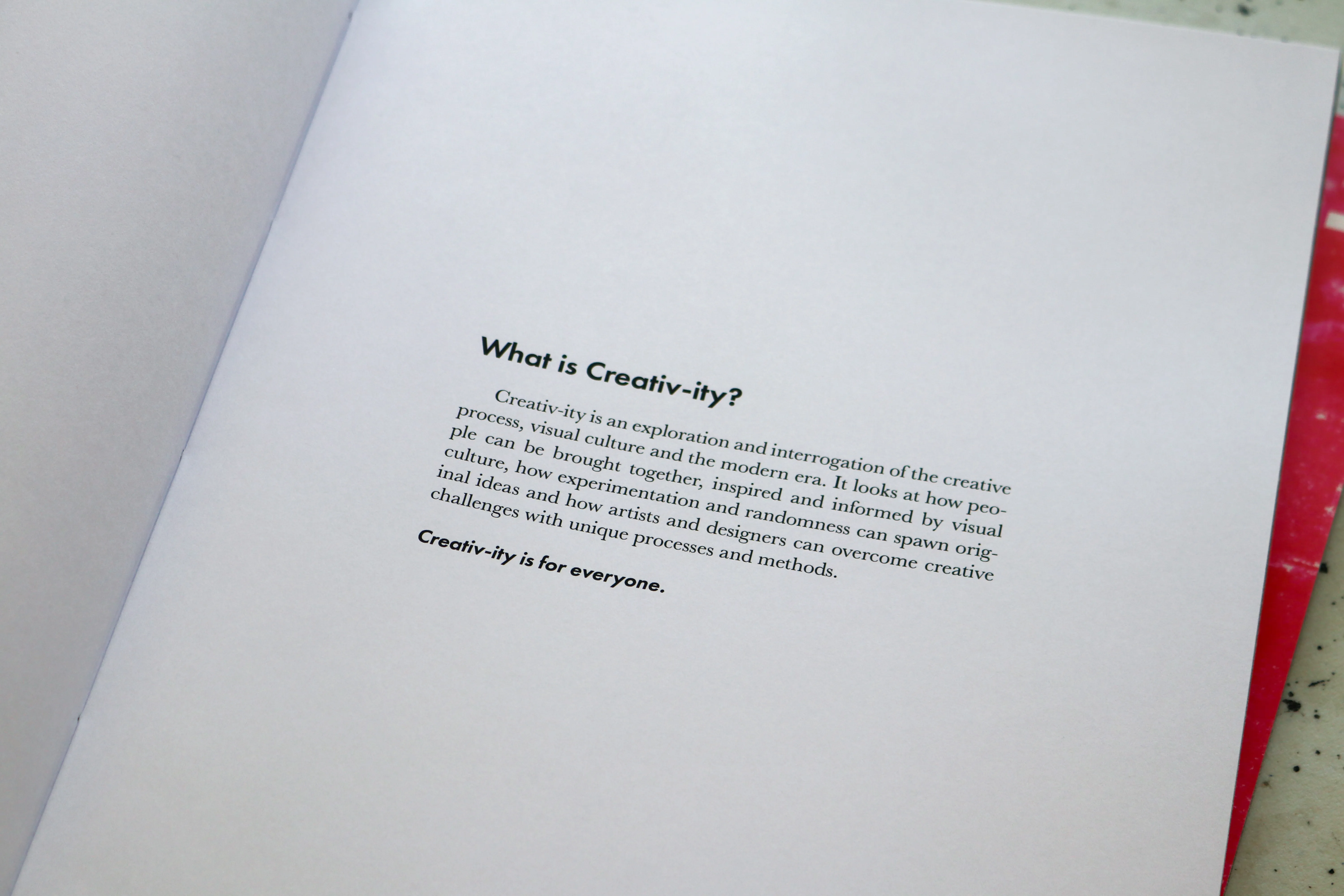
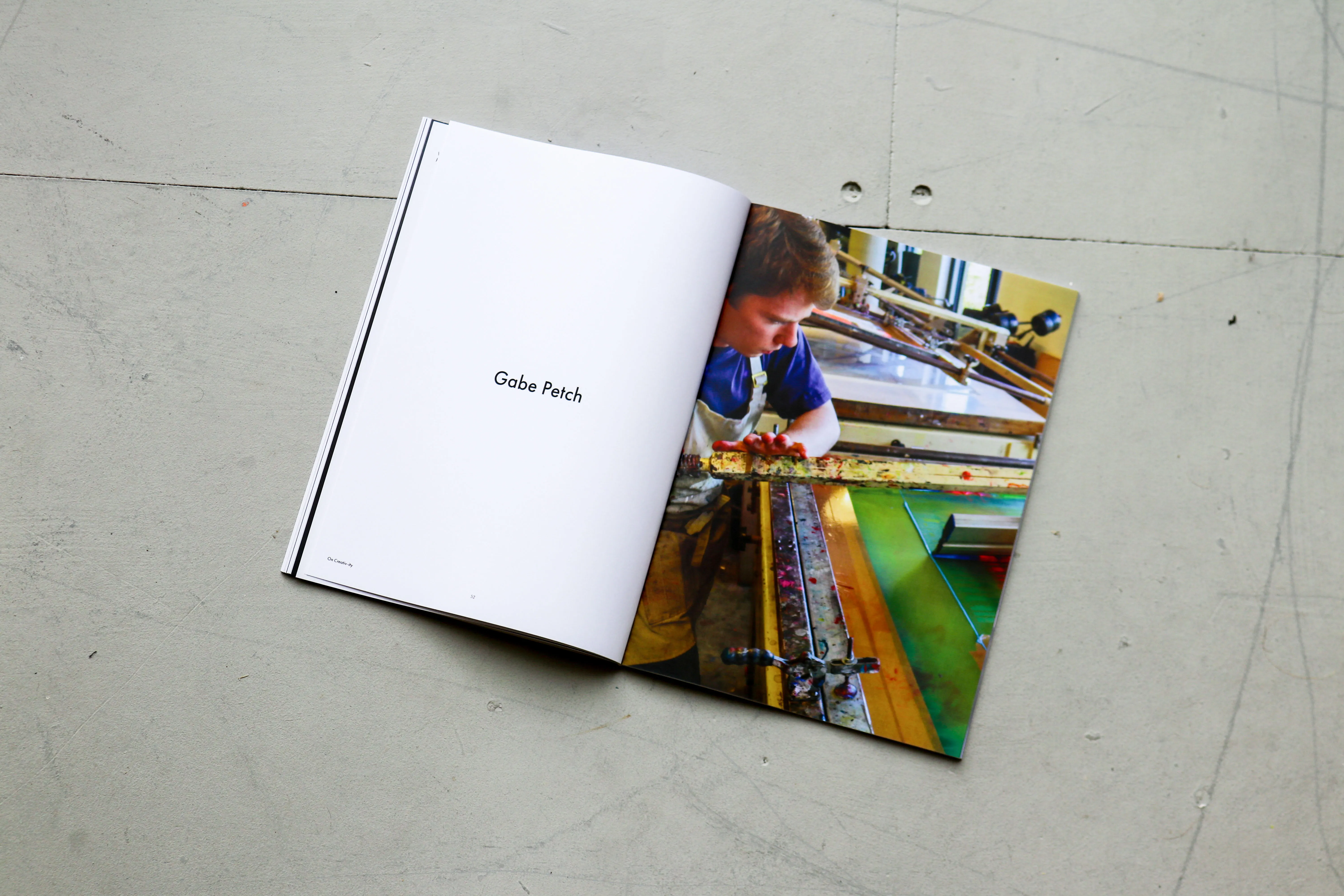
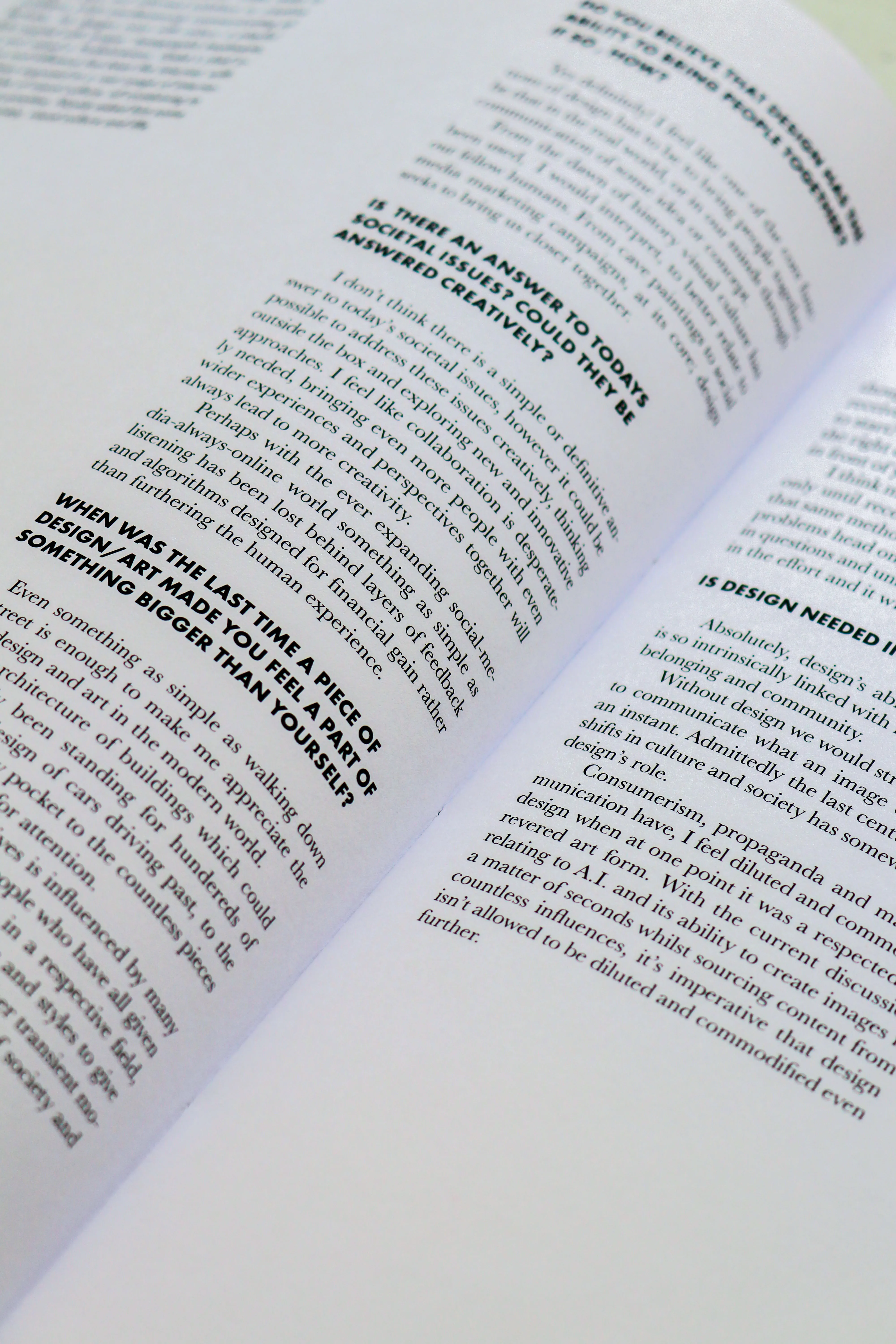
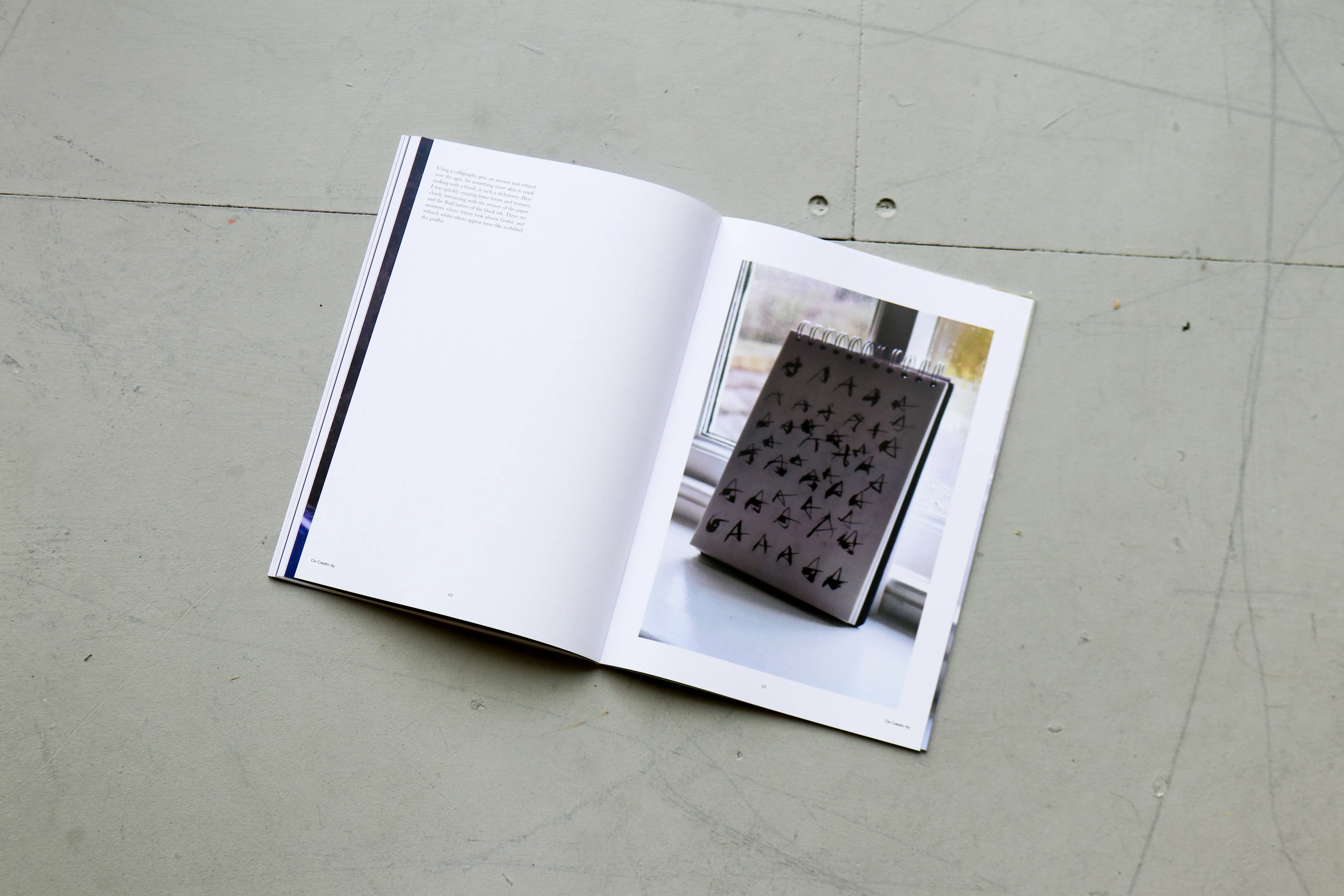
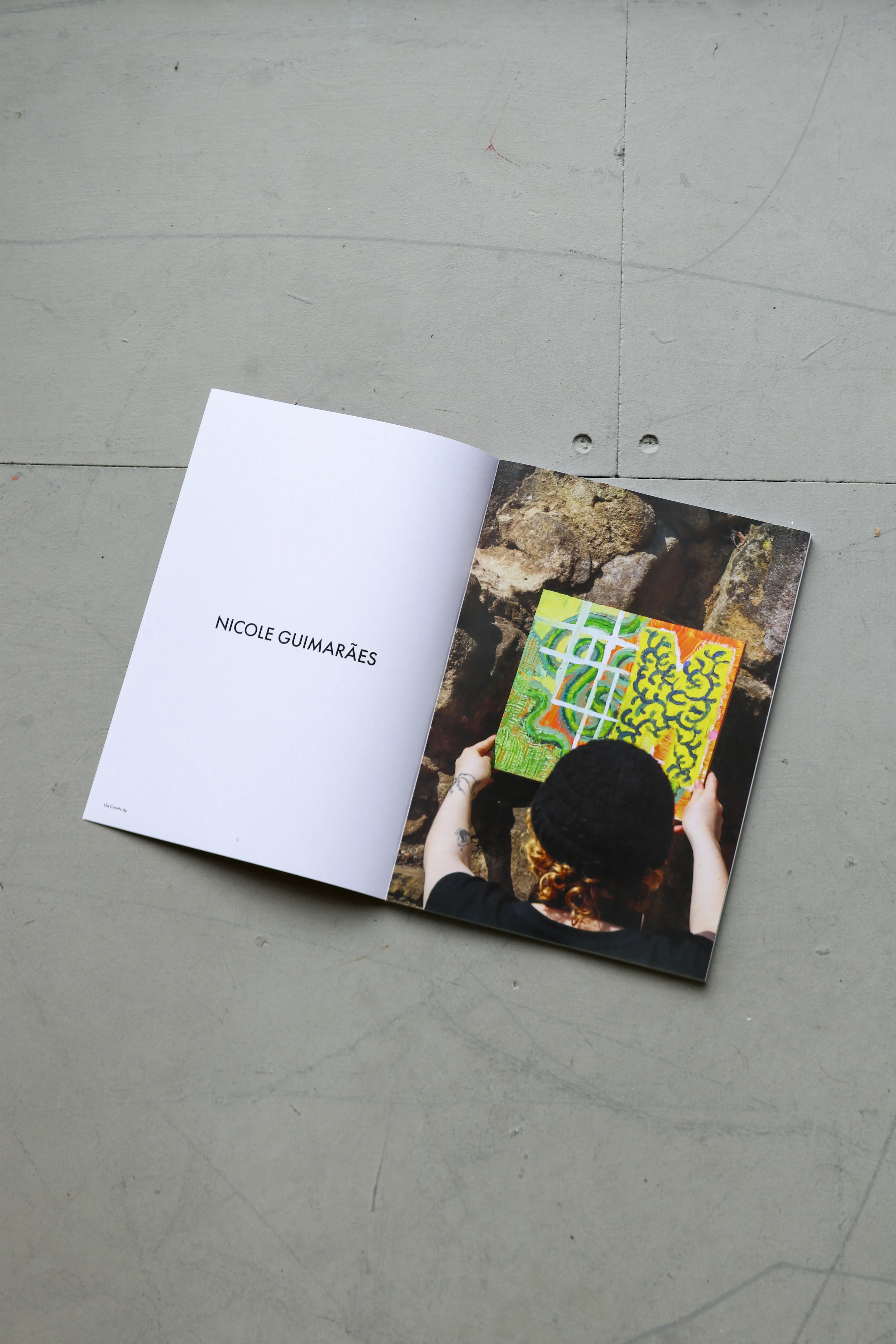
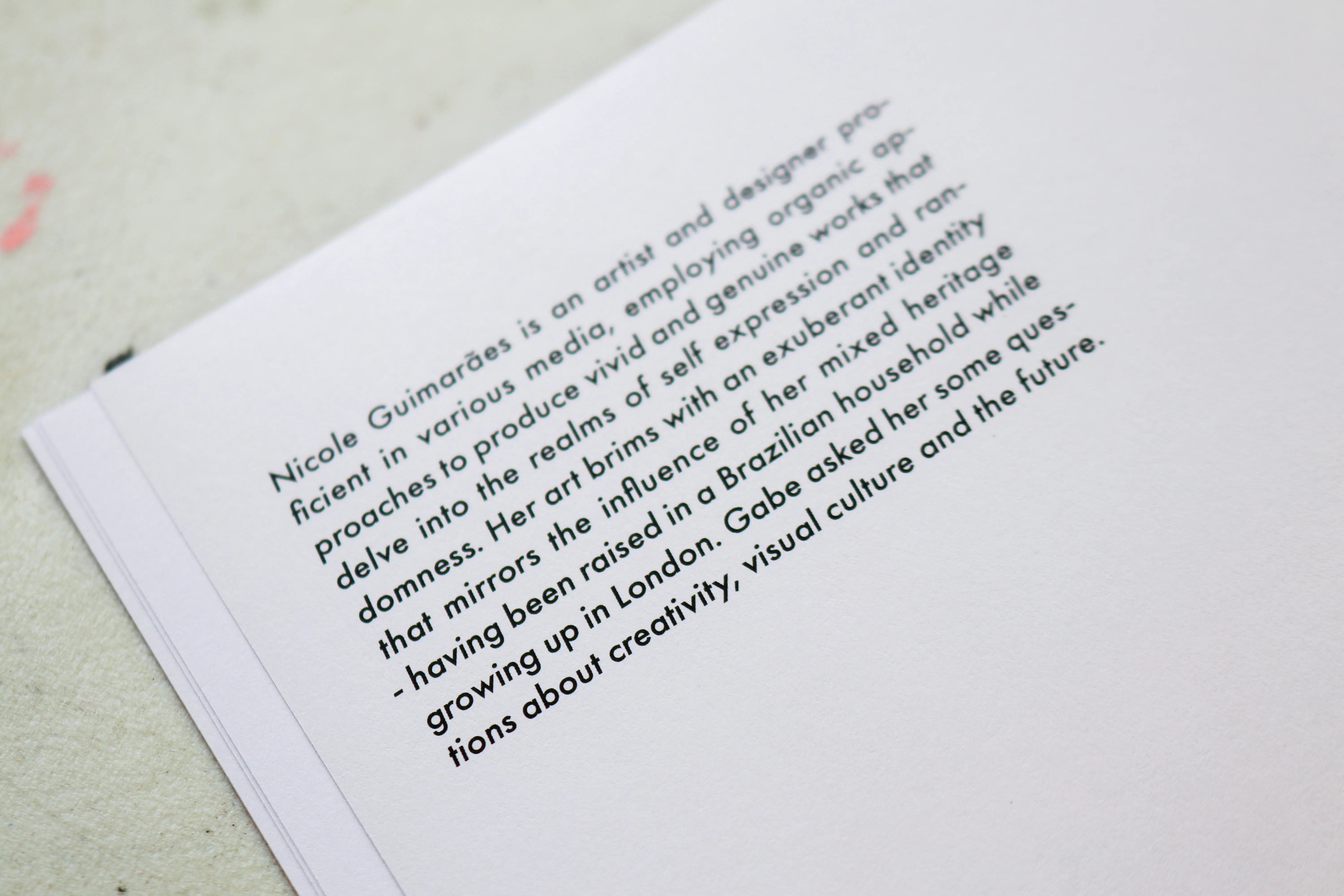
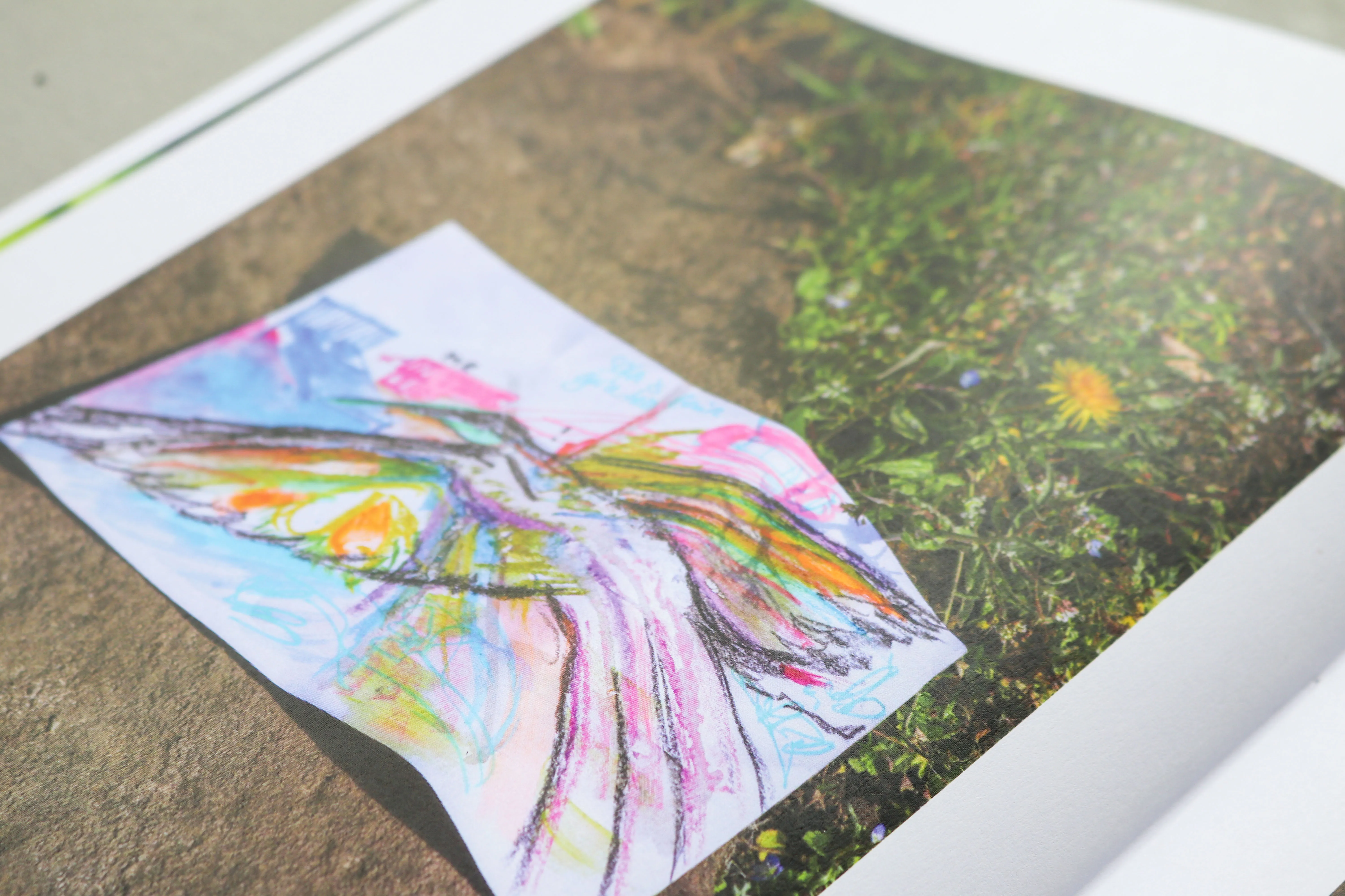
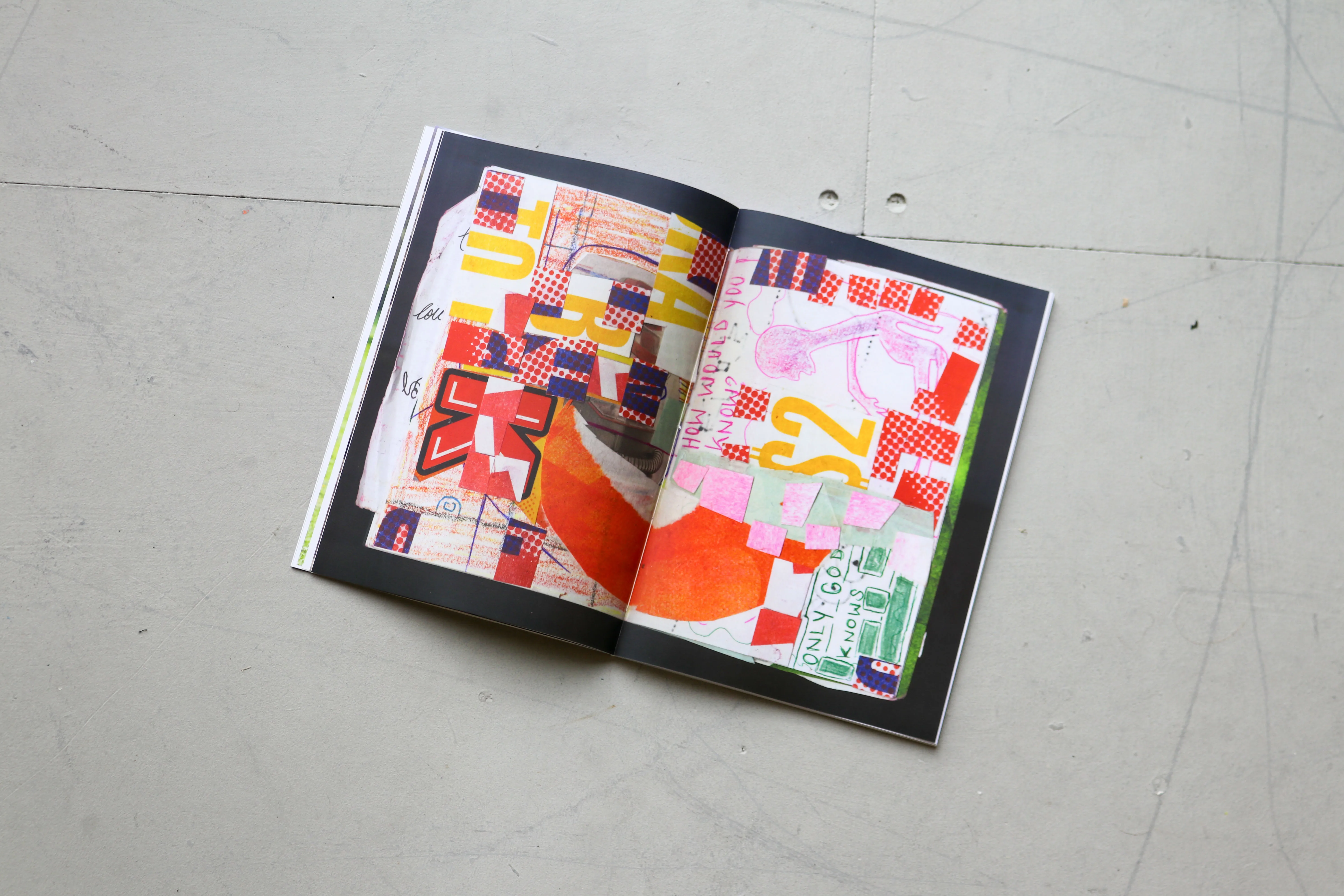
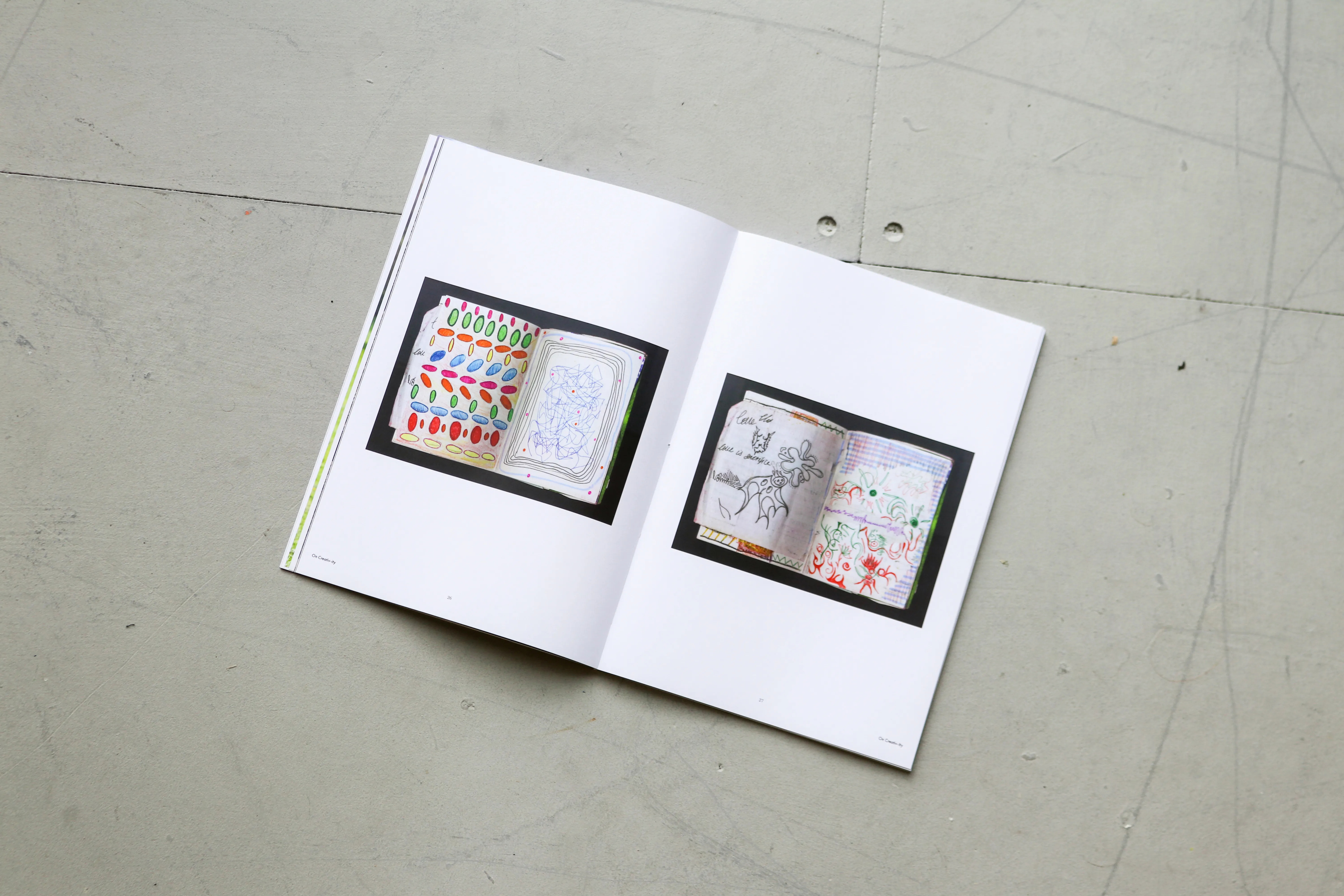
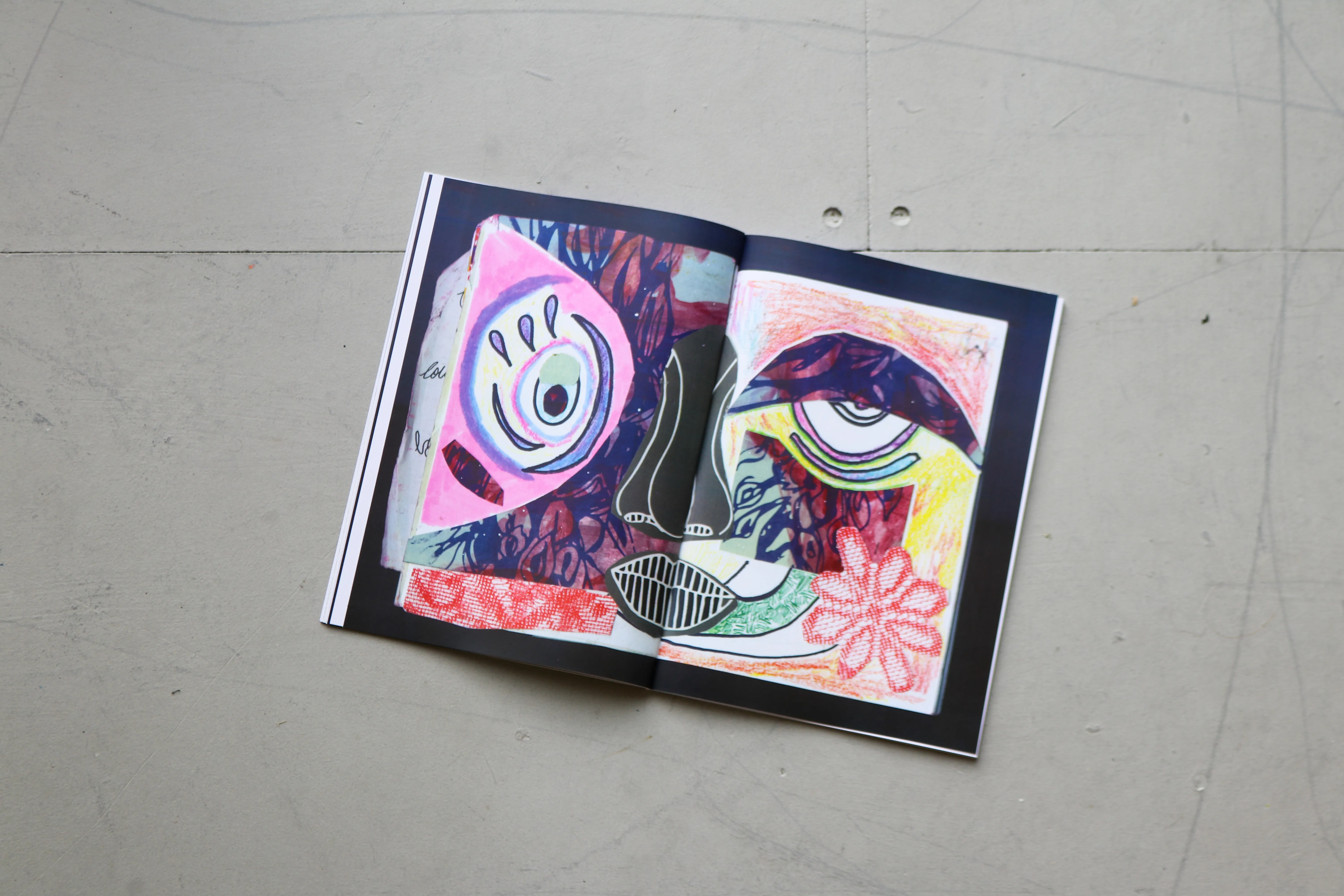

Featuring work by fellow final year Graphic Design students Gabe Petch and Nicole Guimãres, On Creativ-ity was an opportunity to not only explore more experimental, diverging aesthetics and processes, but also to critically explore and evaluate each of their own interpretations of creativity, originality and inspiration, in a world where technological and societal shifts force us to ever rethink design's position and role in culture.
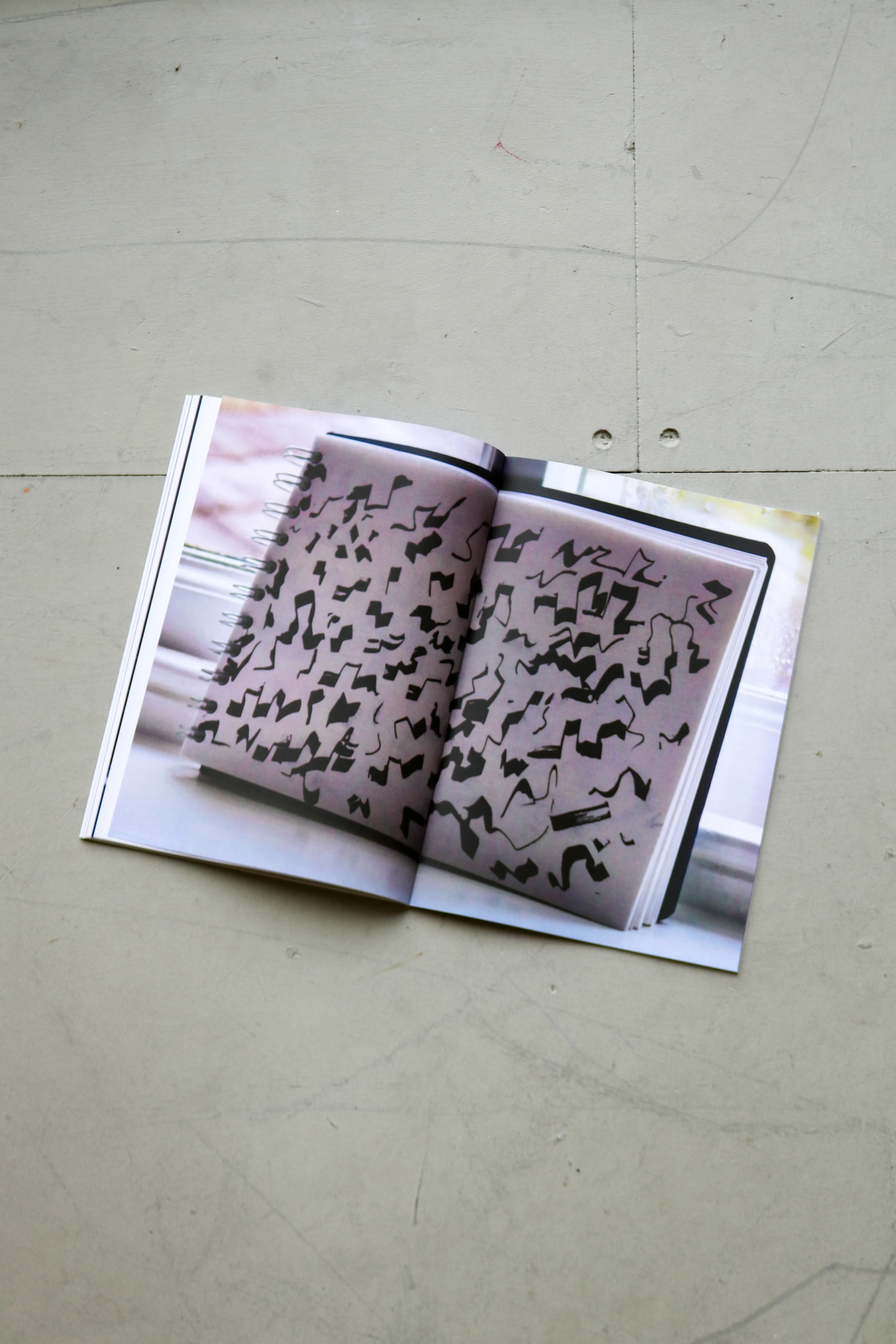
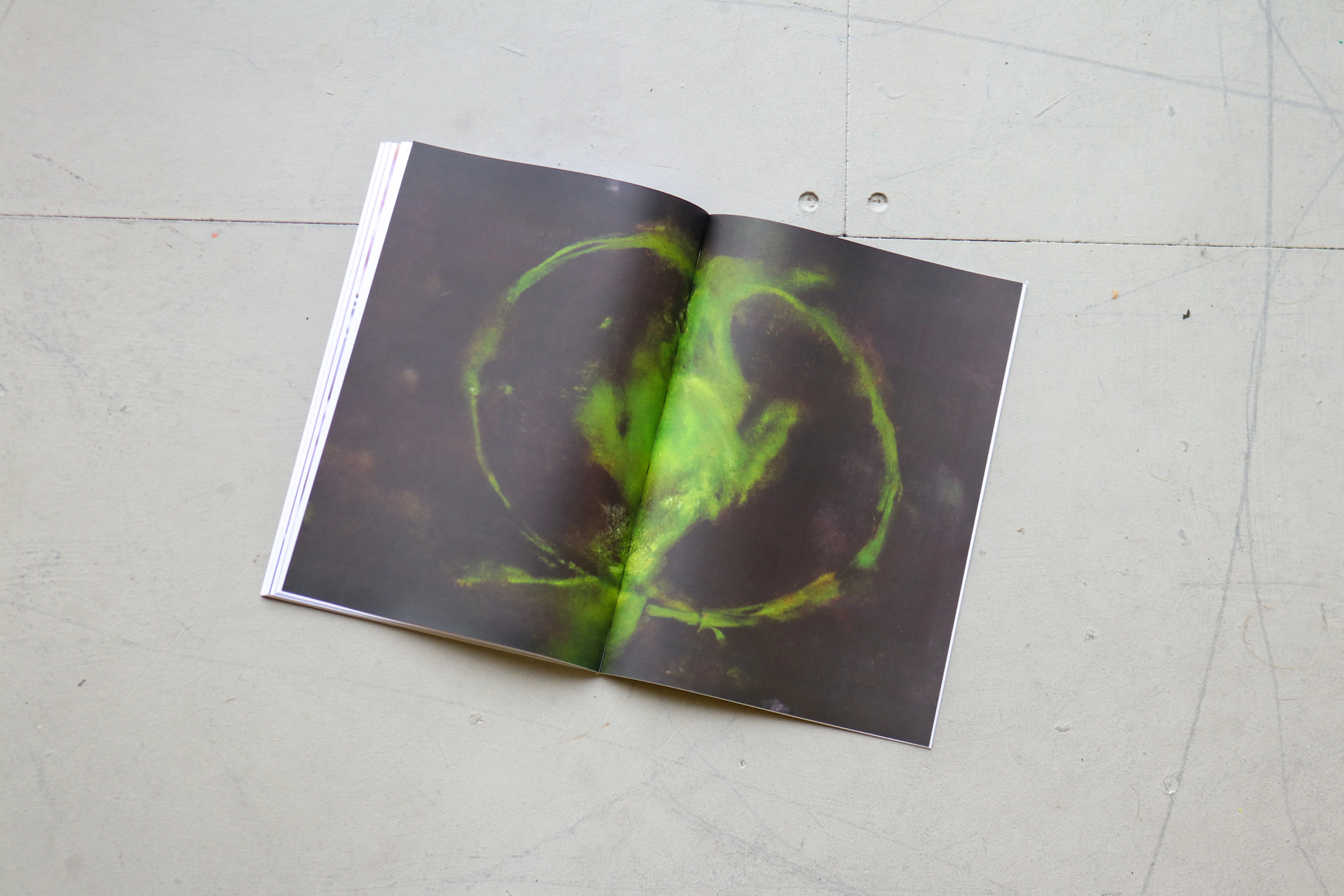
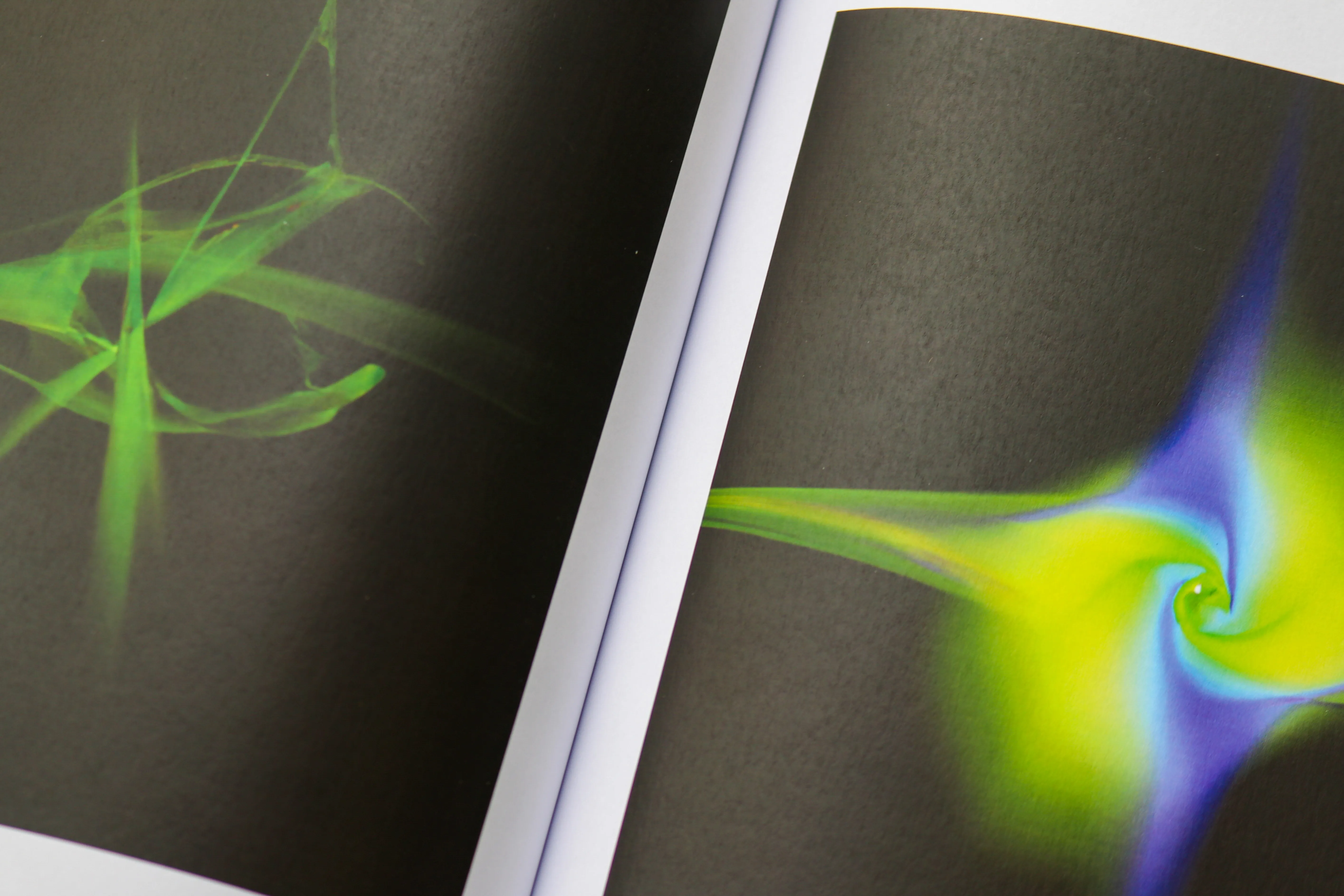
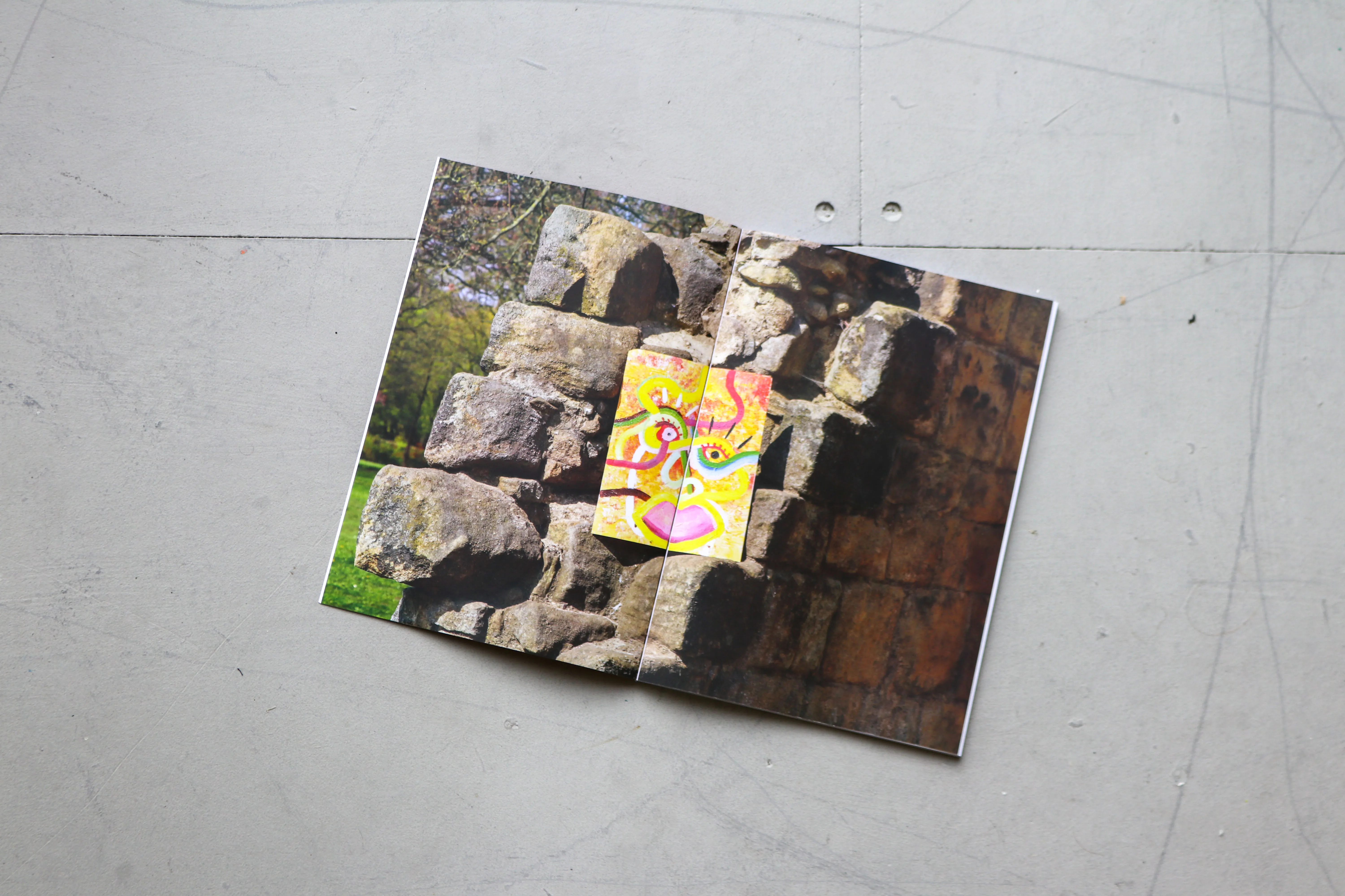
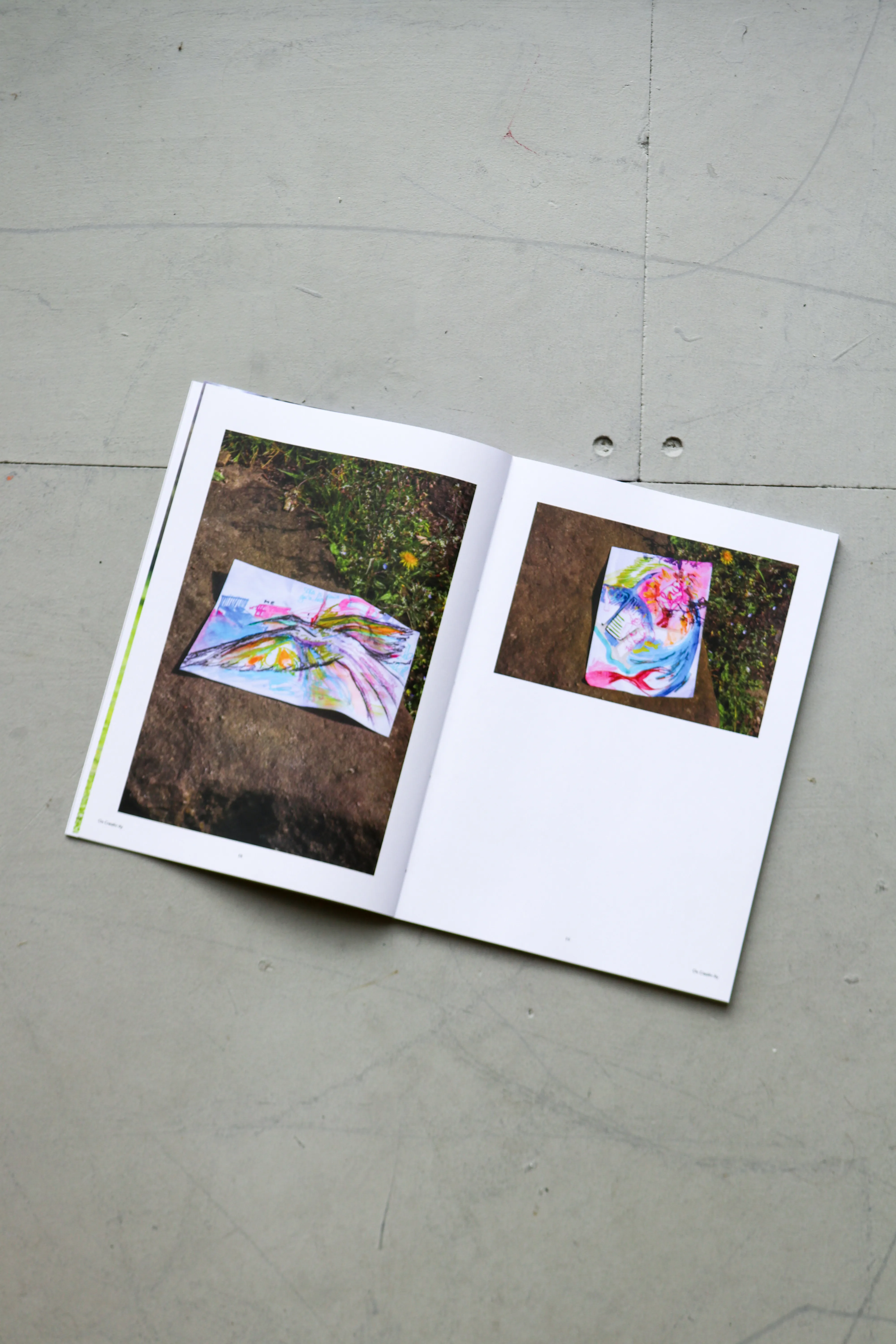
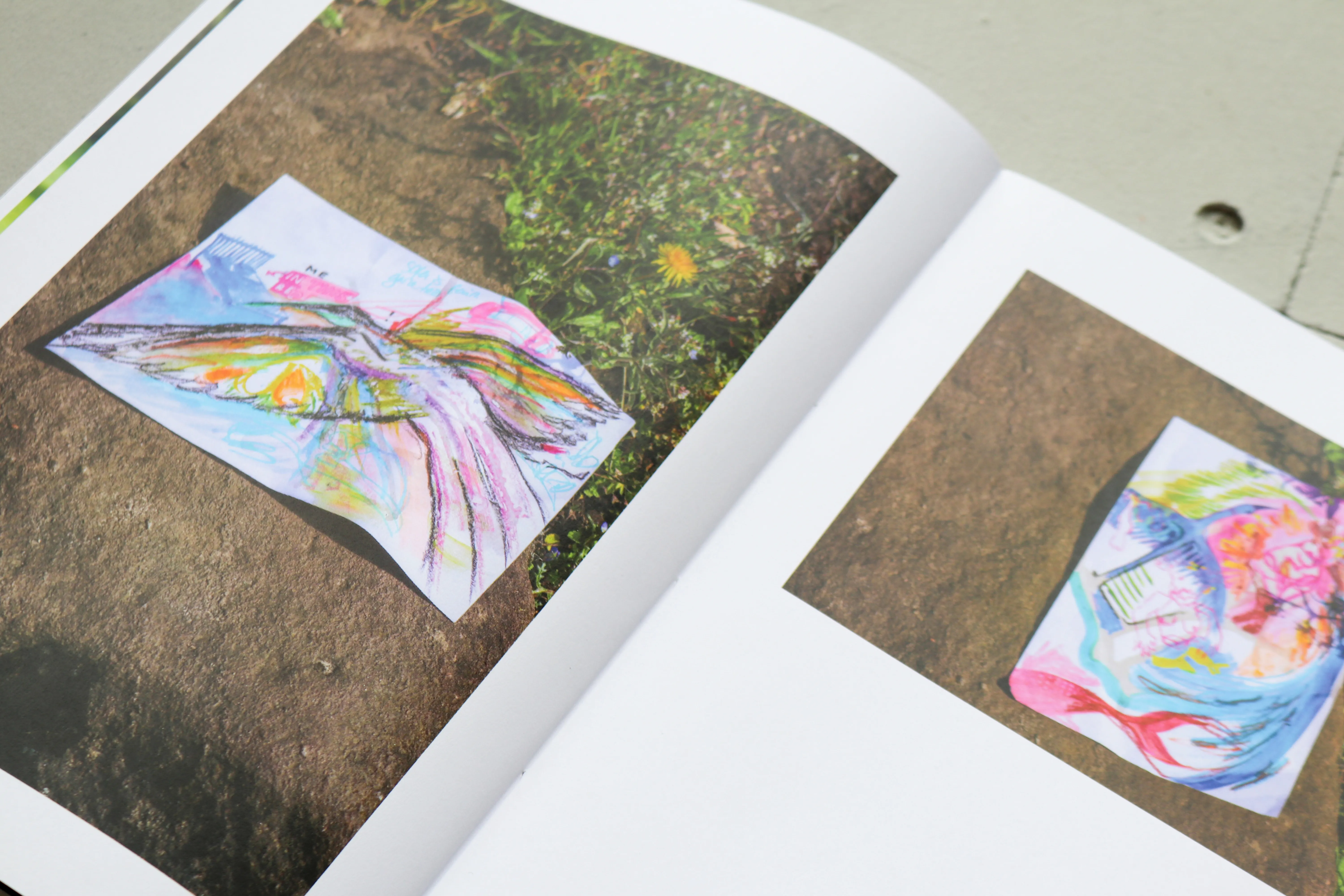
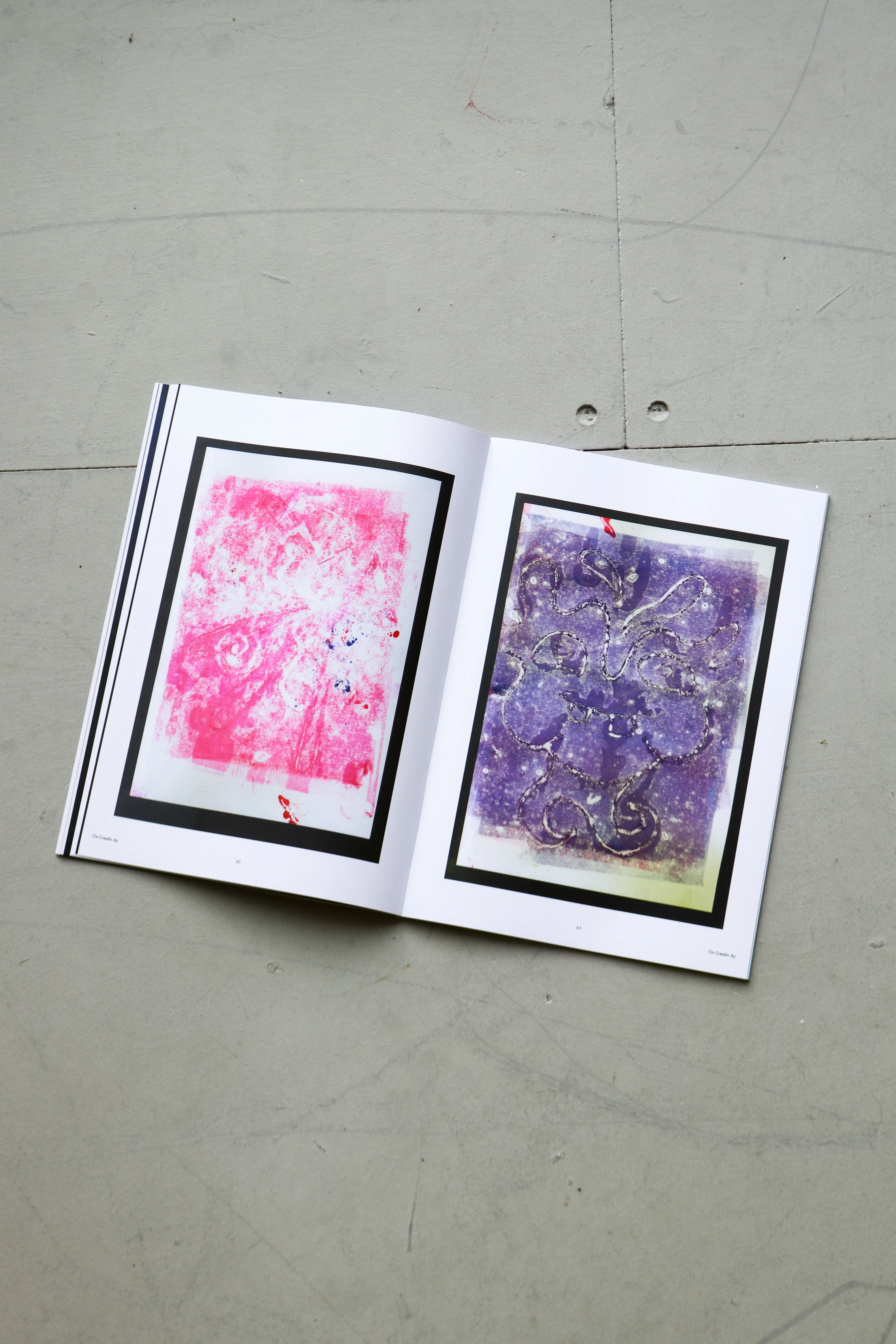
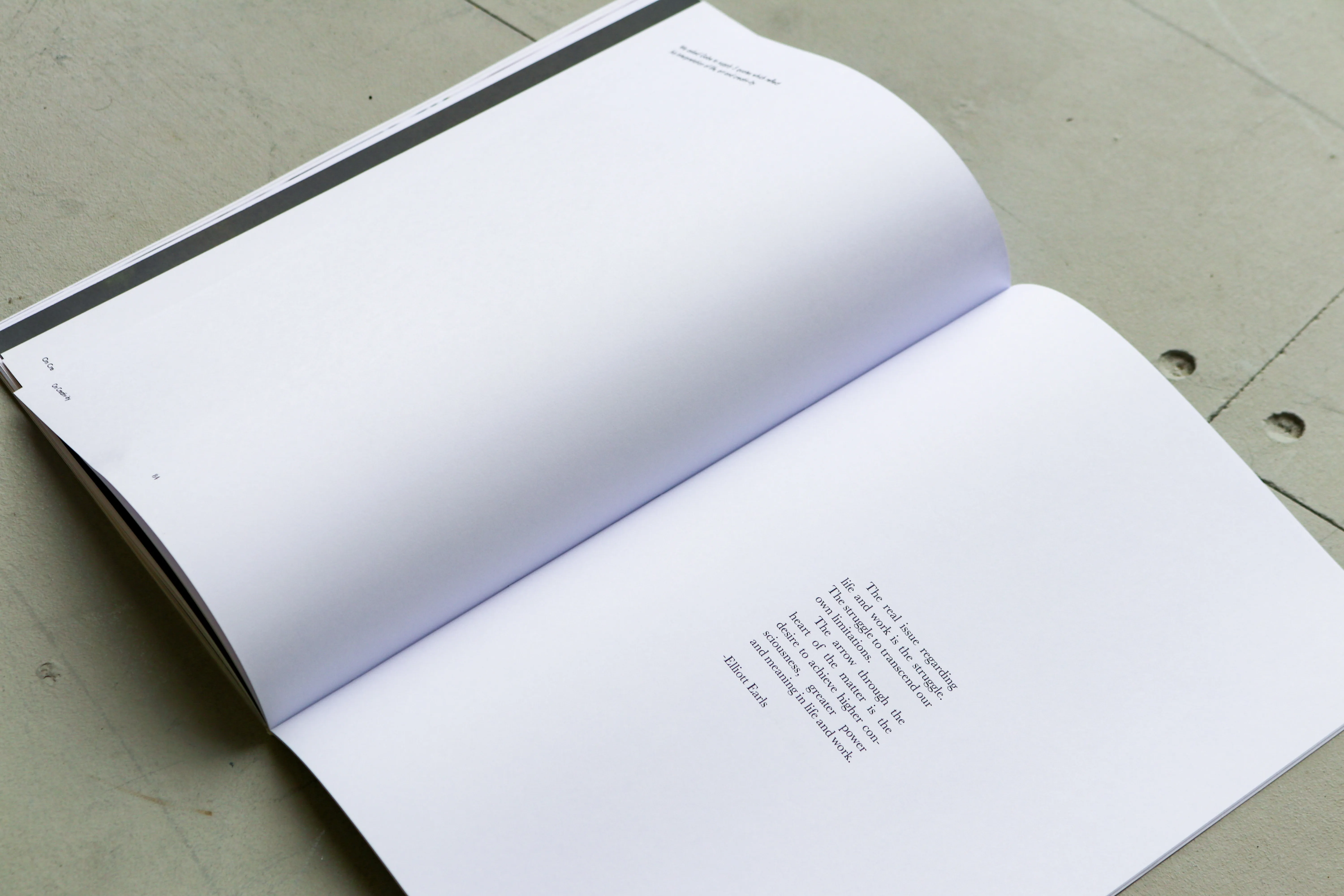
At over 100 pages, On Creativ-ity takes the form of a magazine, featuring interviews conducted on and by each student, alongside three personal projects, ranging from mark-making to collage, all photographed or scanned for use in an editorial context. Finally, On Creativ-ity features a set of quotes chosen by each student, highlighting other creatives and thinkers who have also interrogated the idea of ‘creativity.'
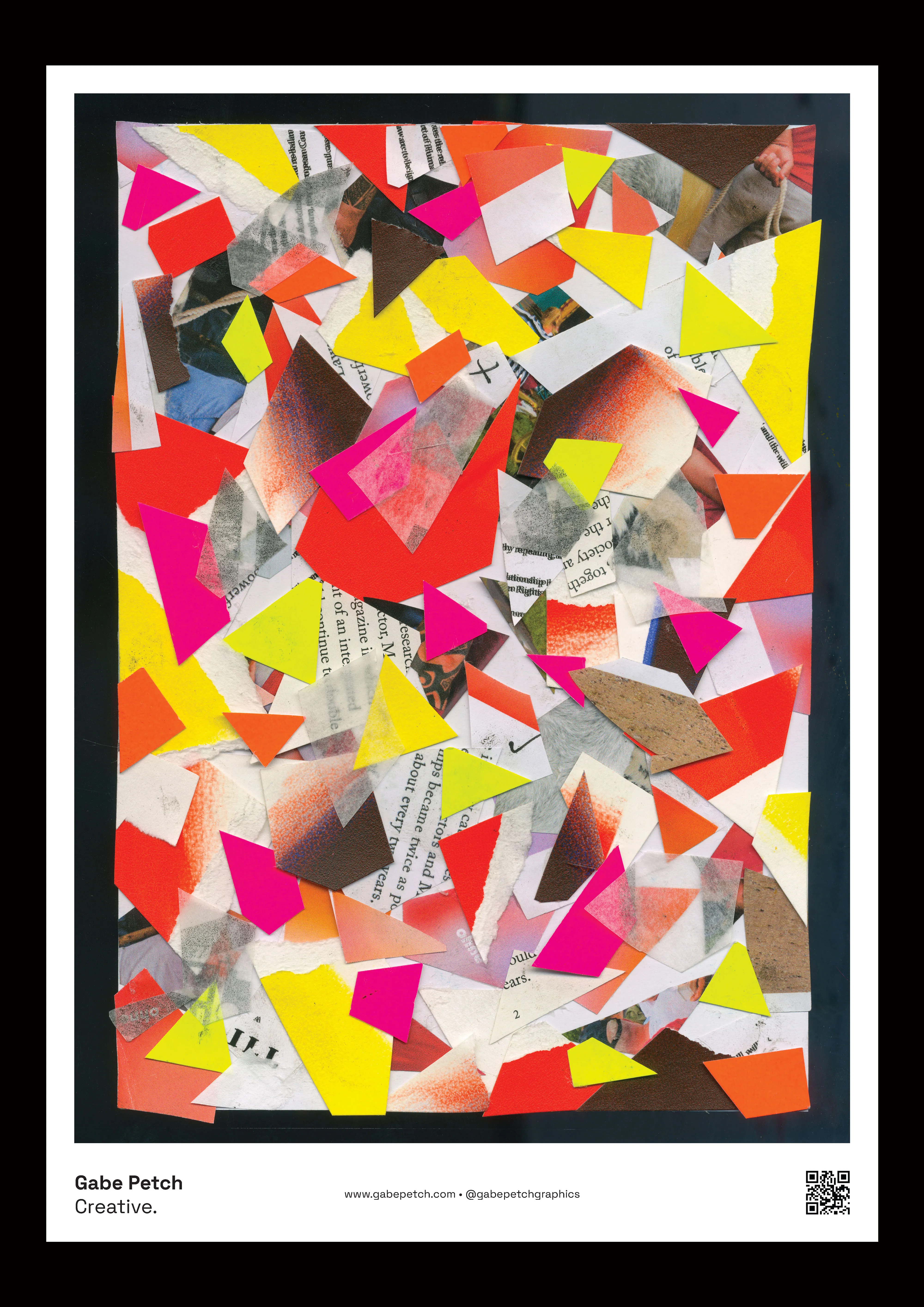
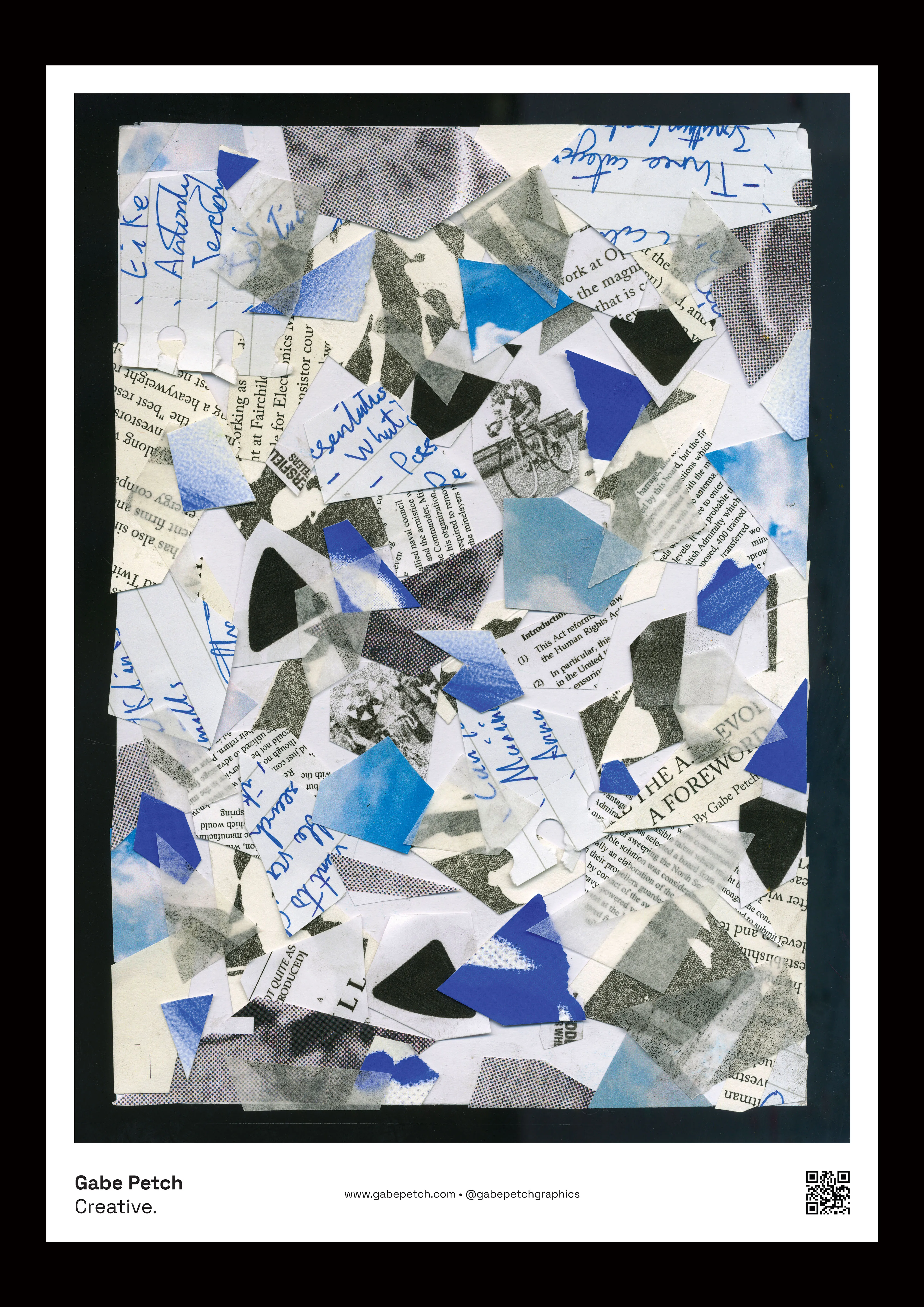

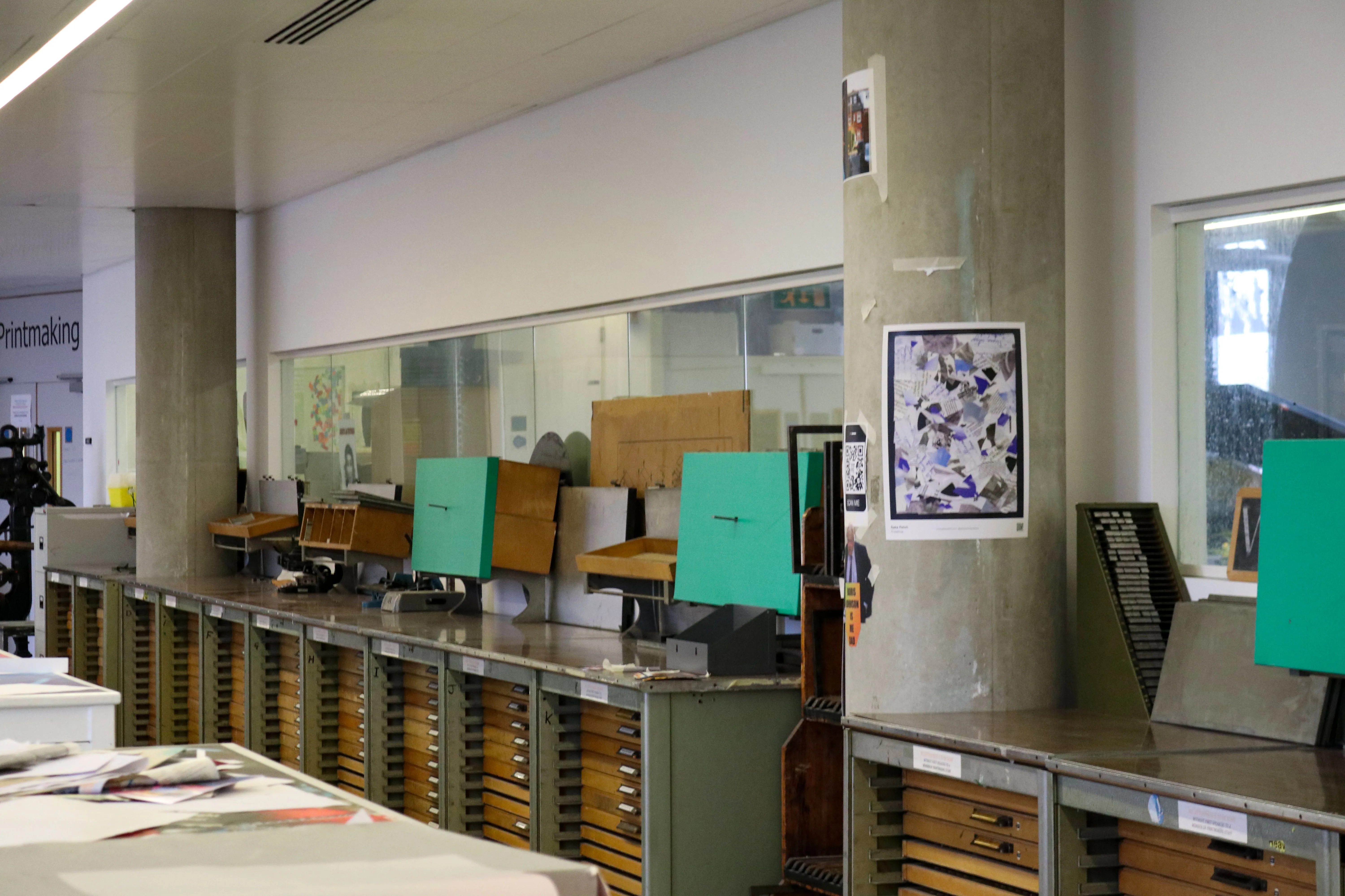
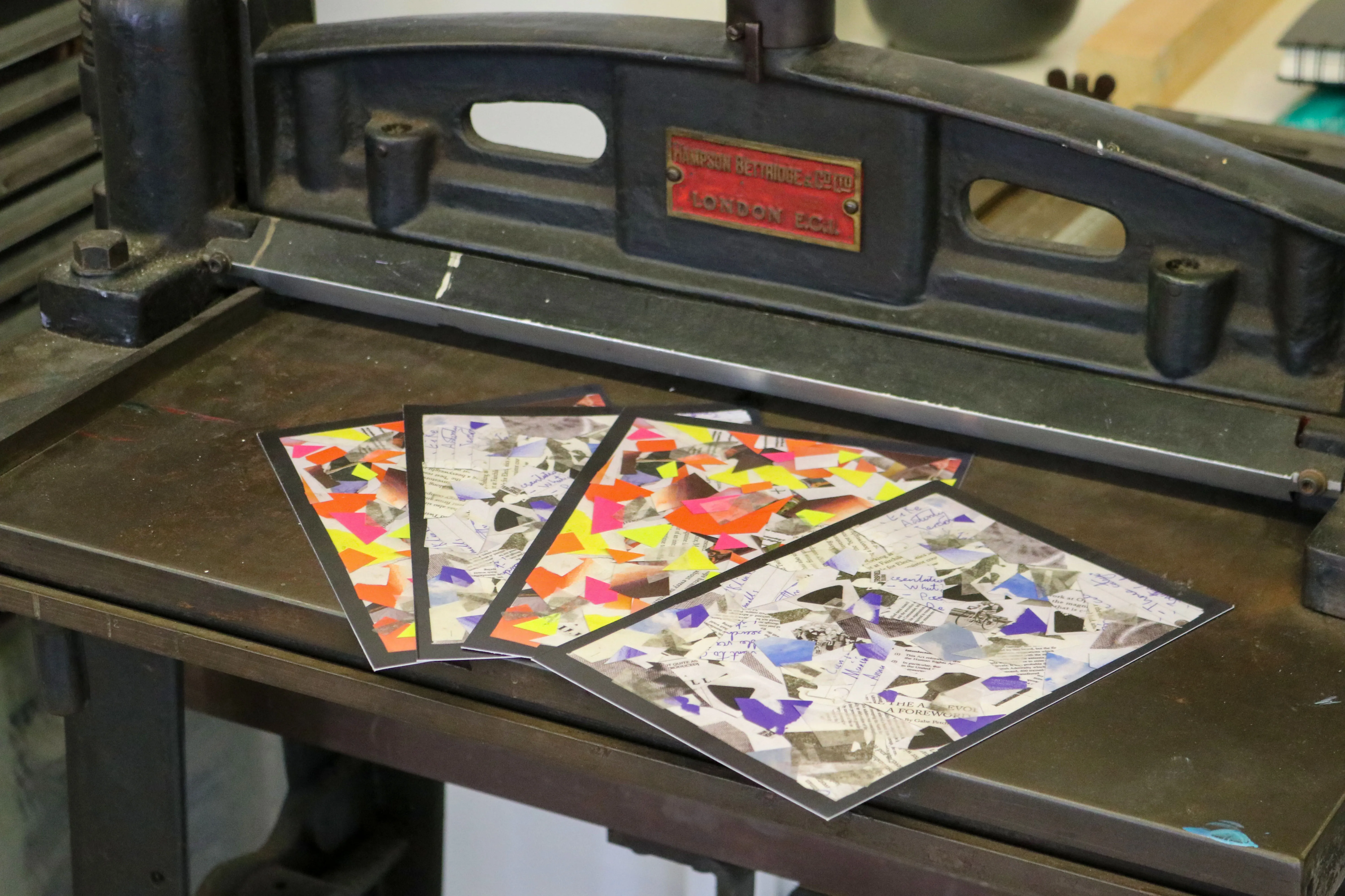
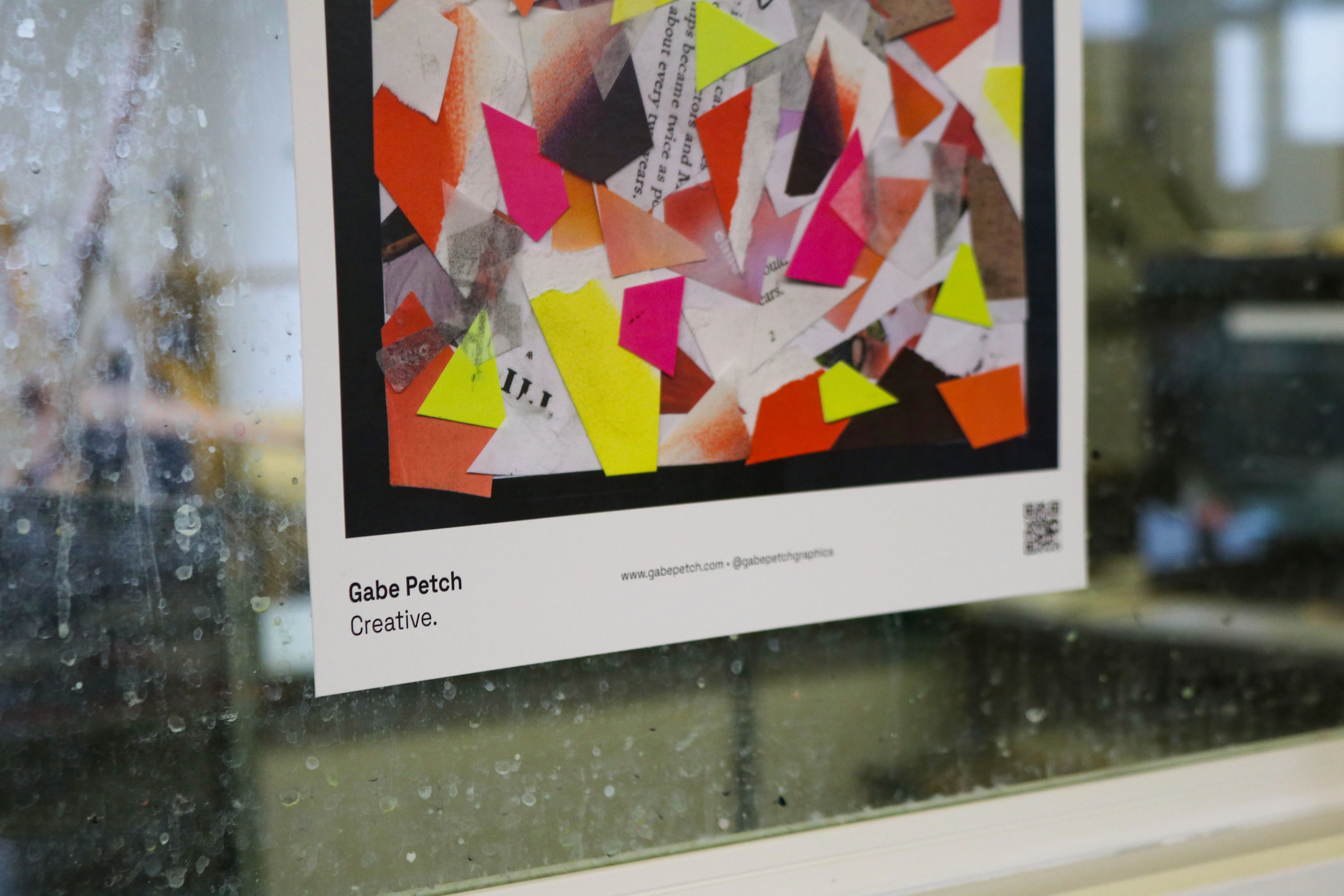
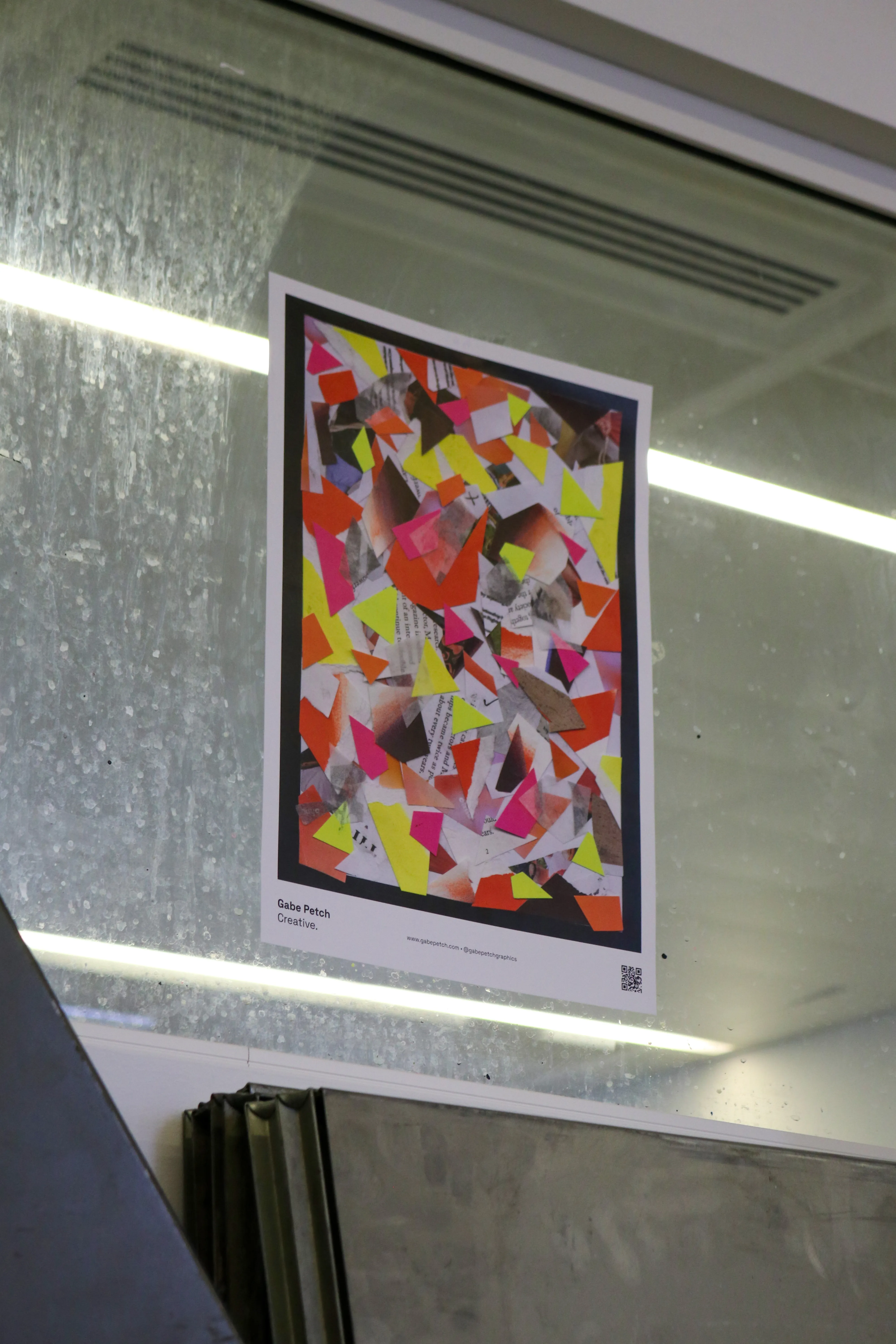
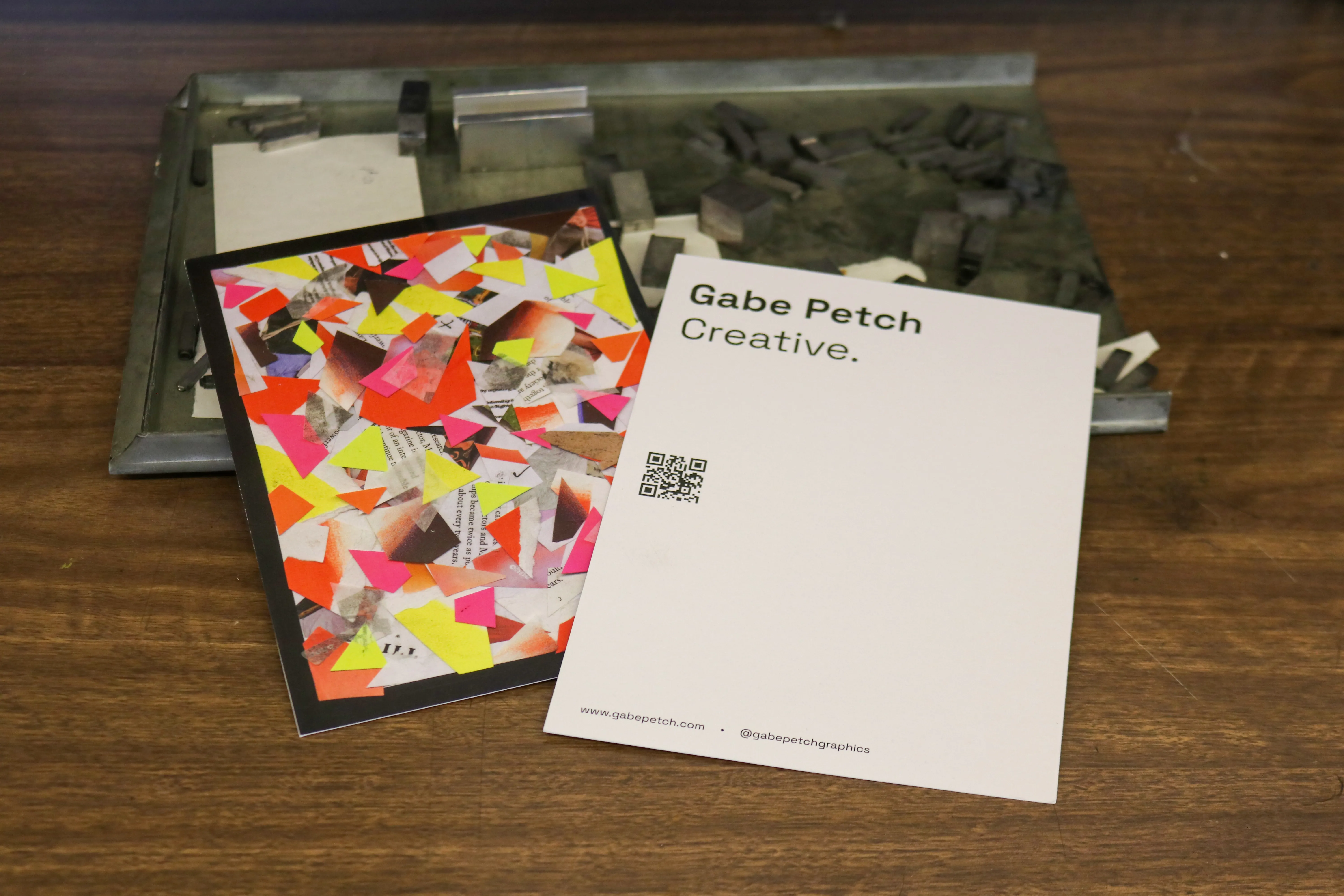
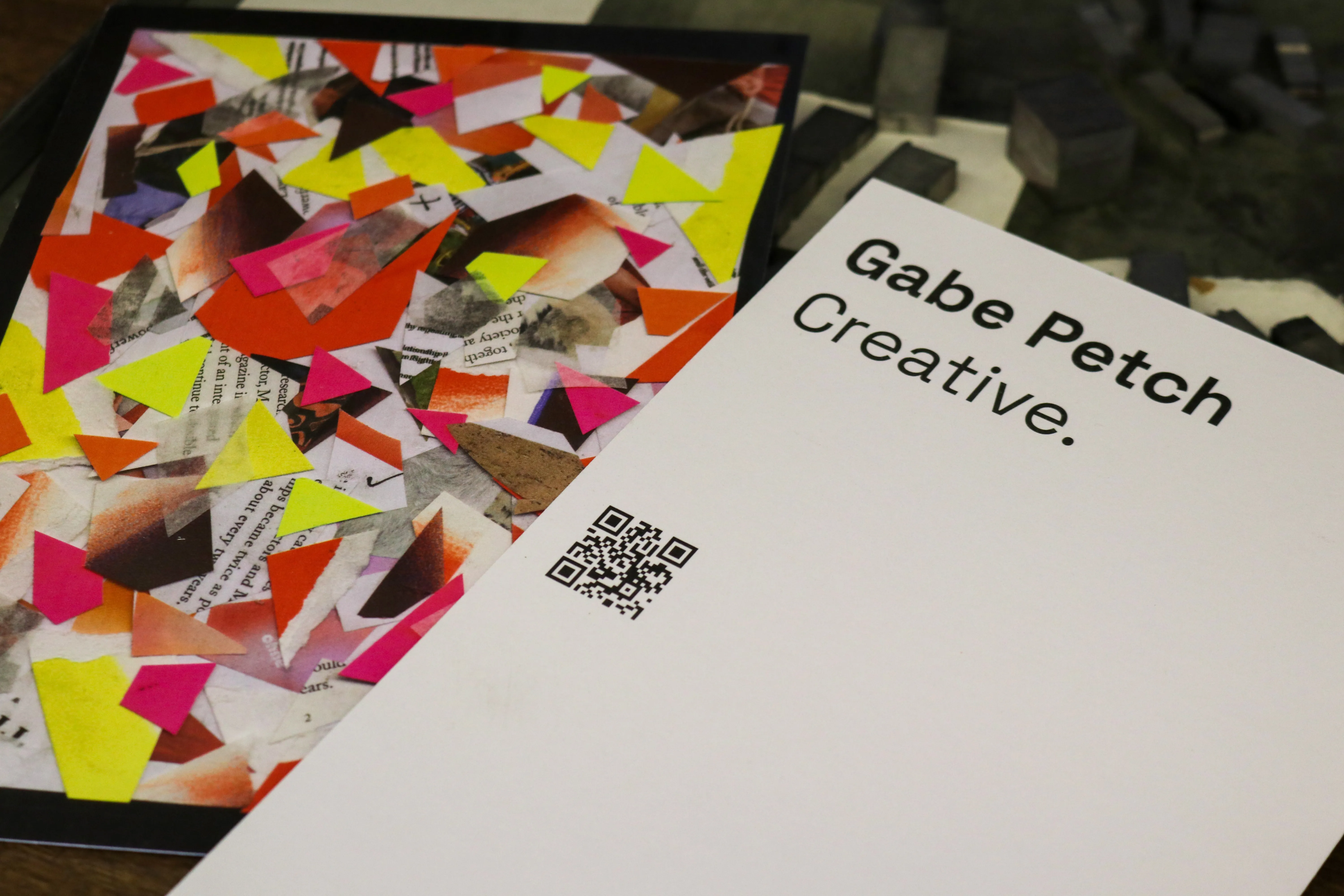
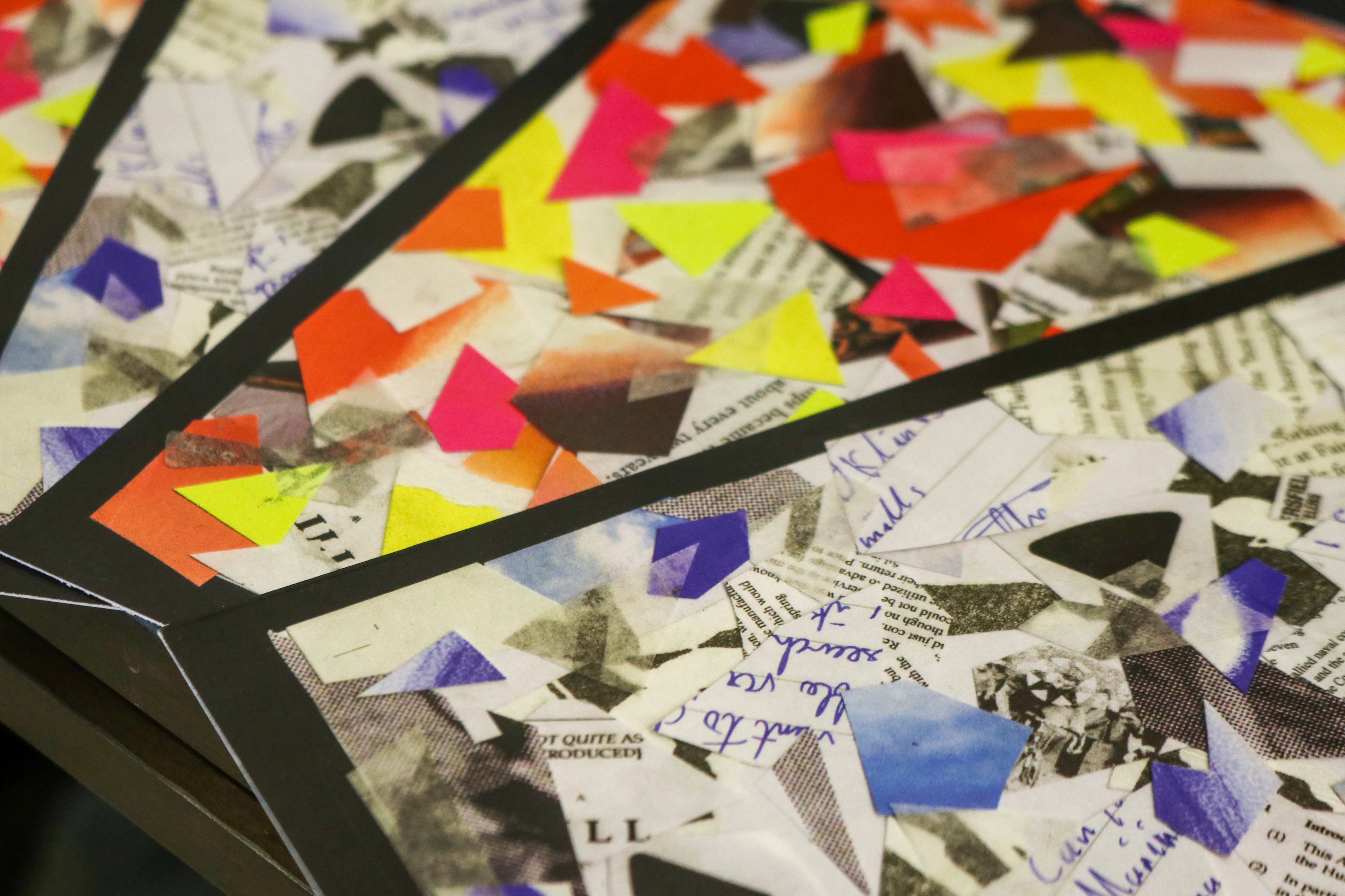
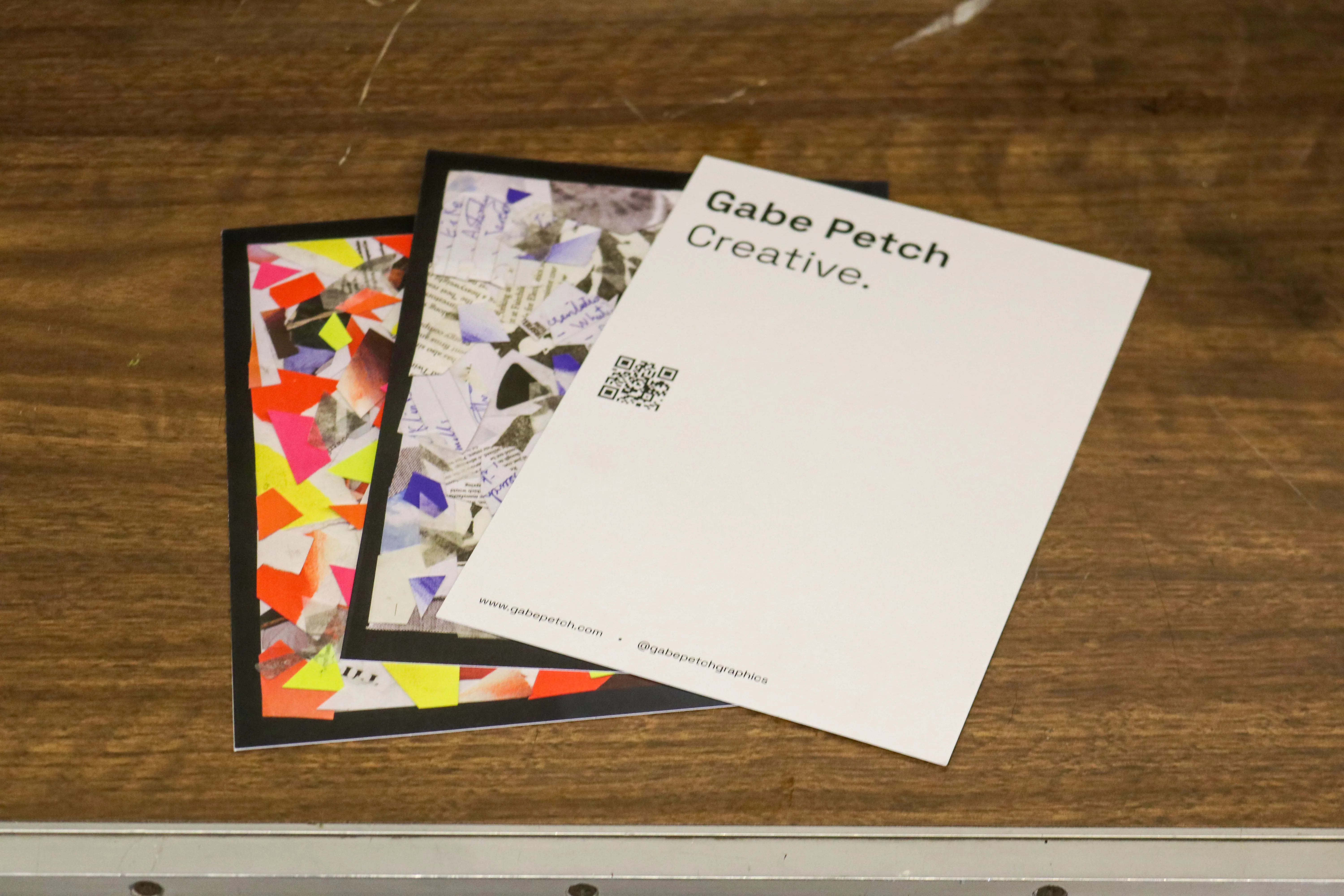
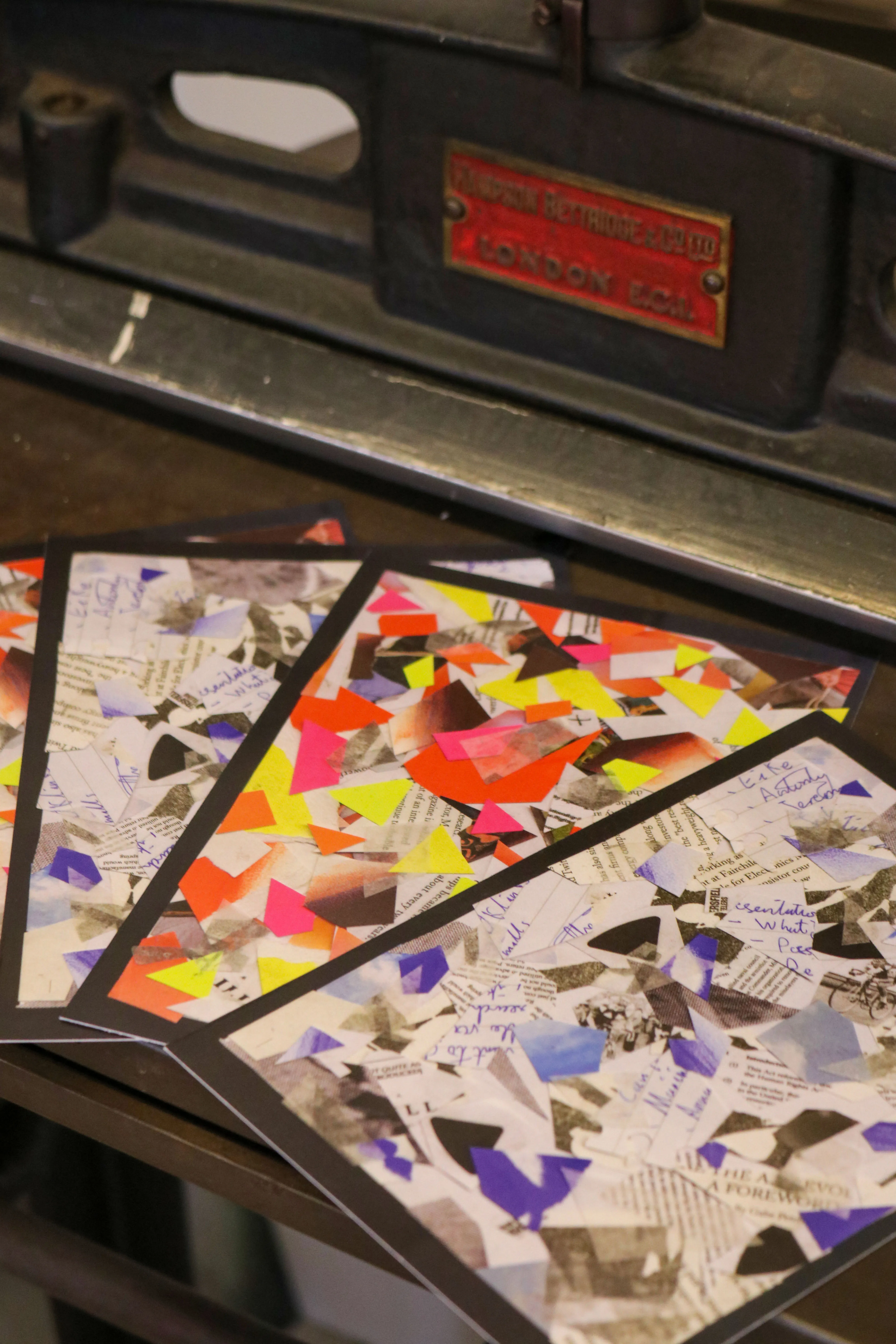
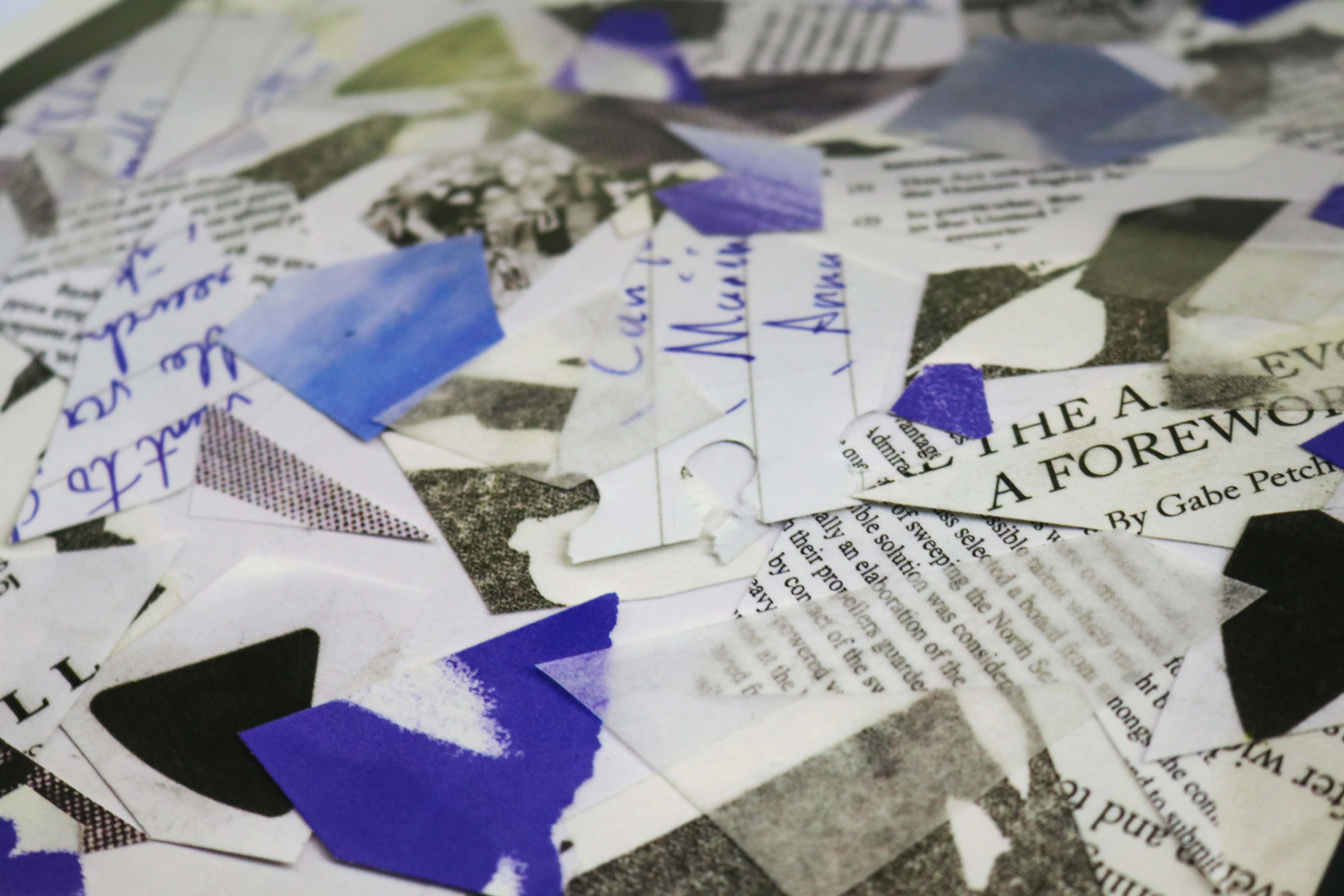
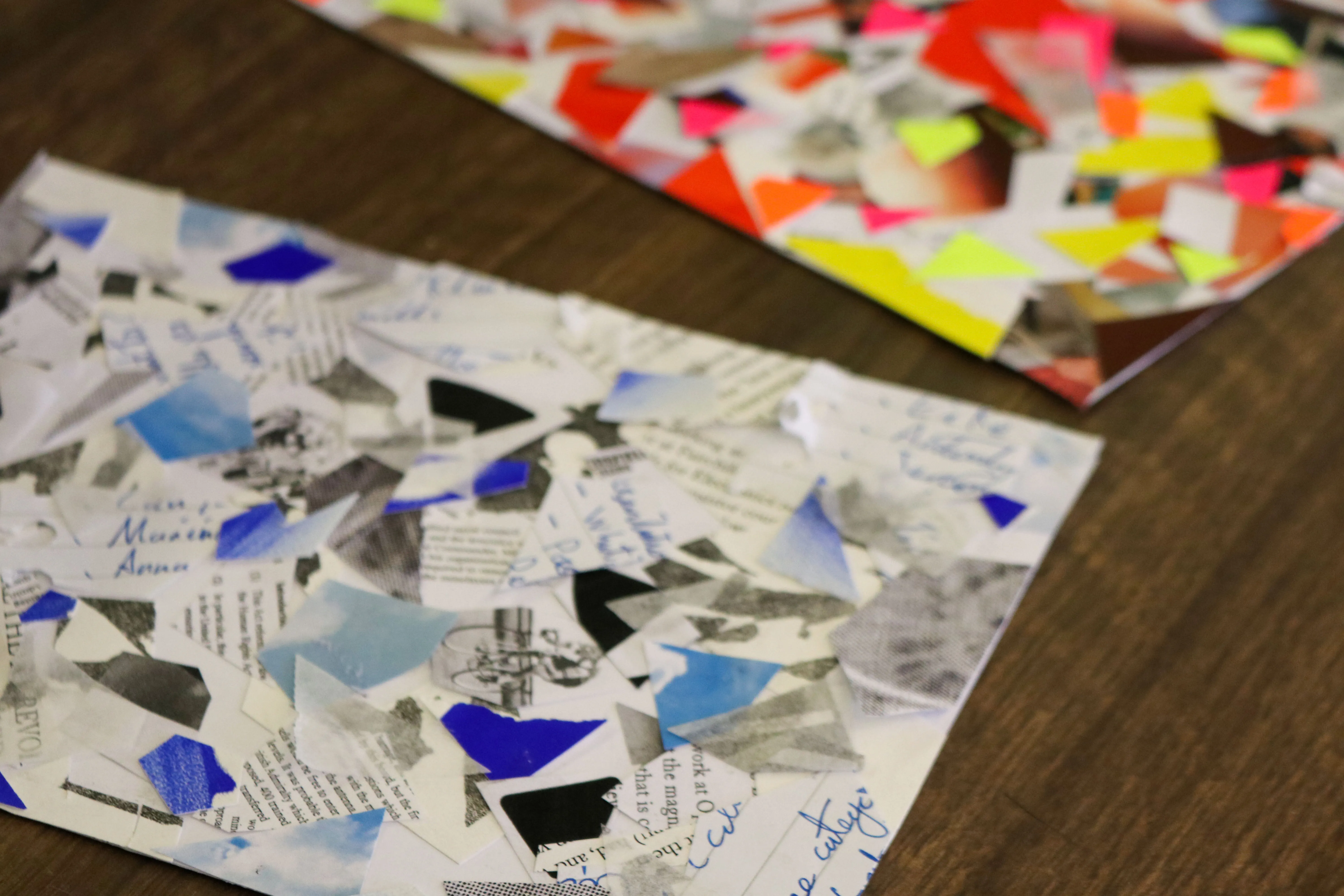
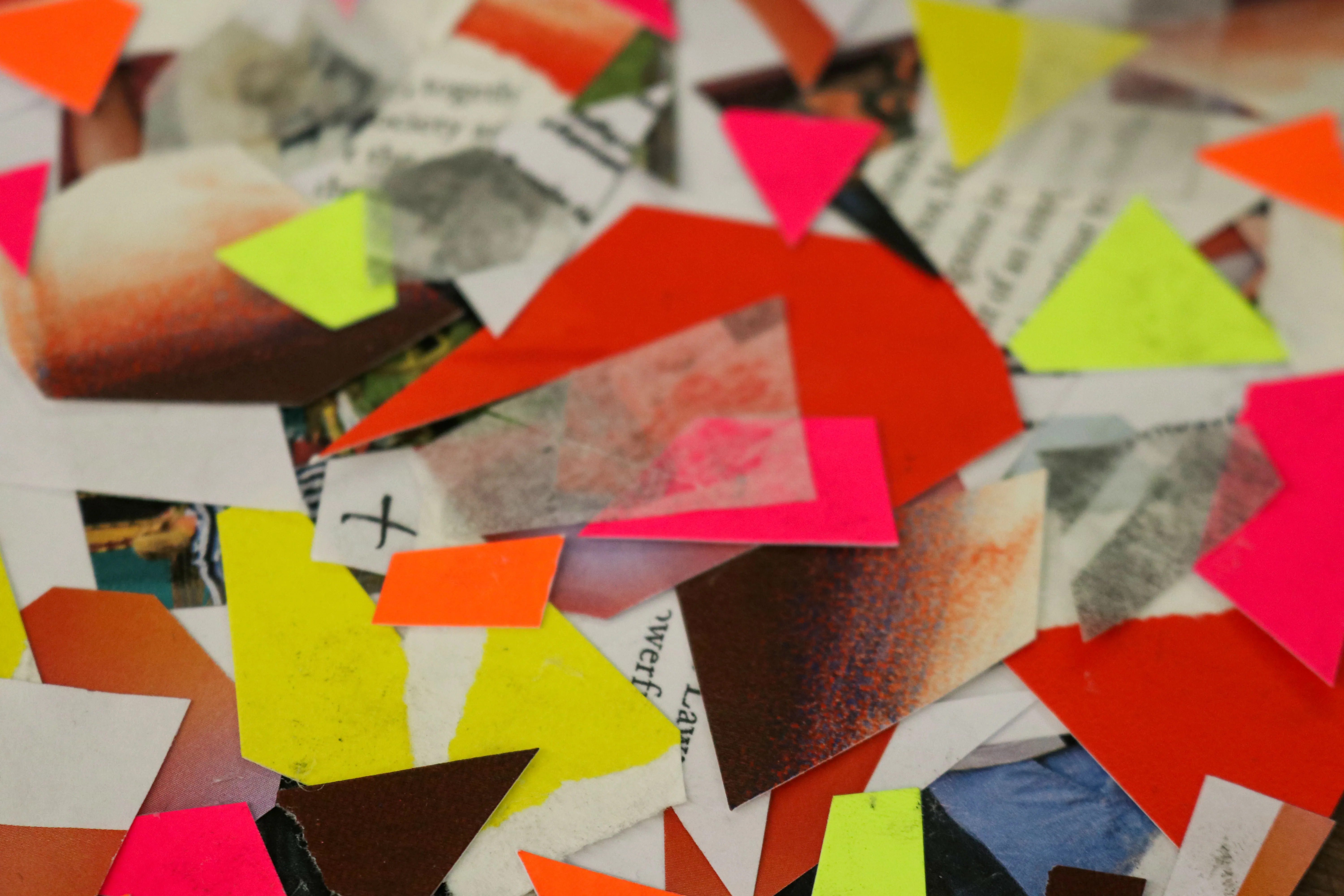
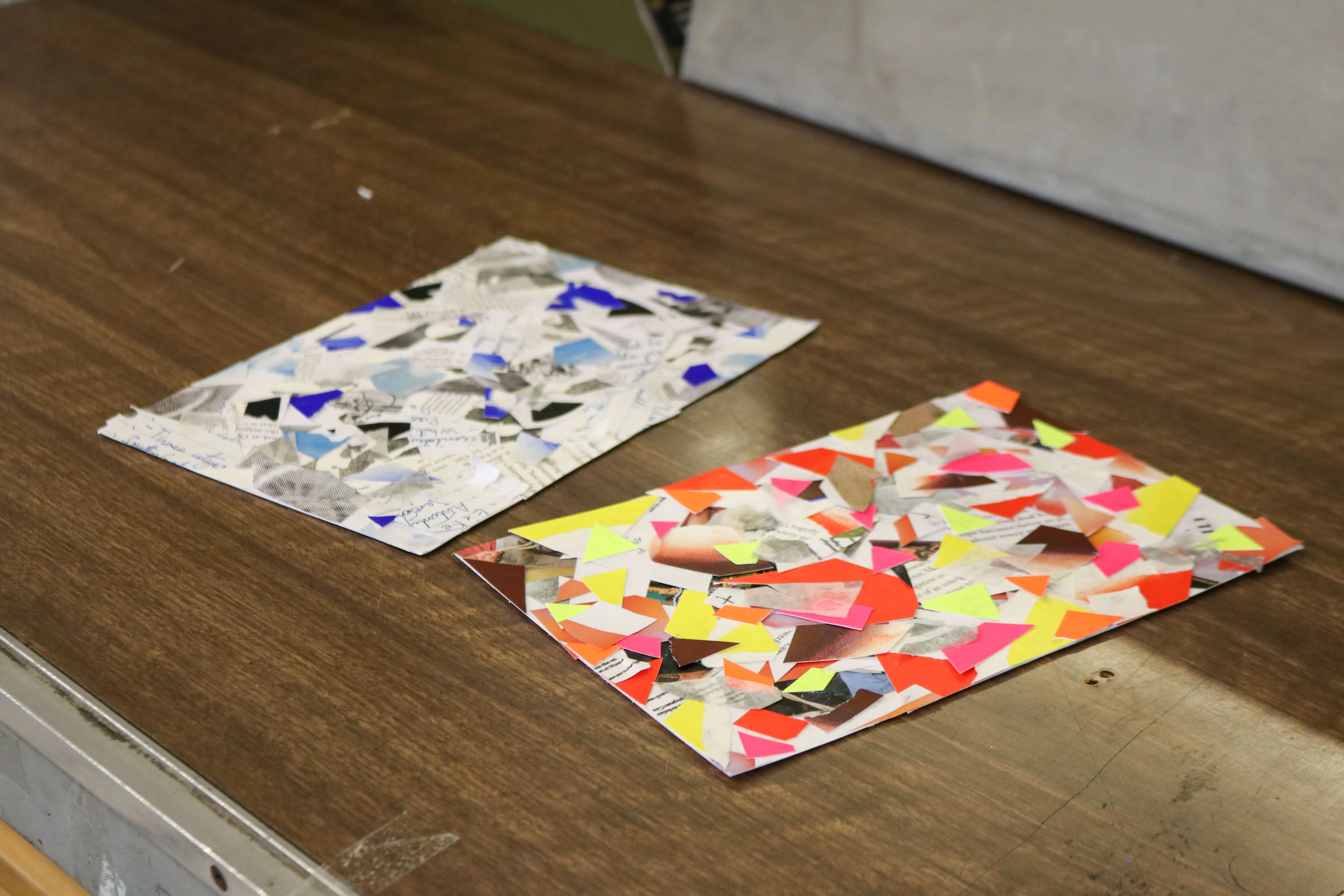
Rather than create a more obvious promotional work, I wanted to work on a project which could exist in its own right, living more as an art piece than as a typical advertising poster.
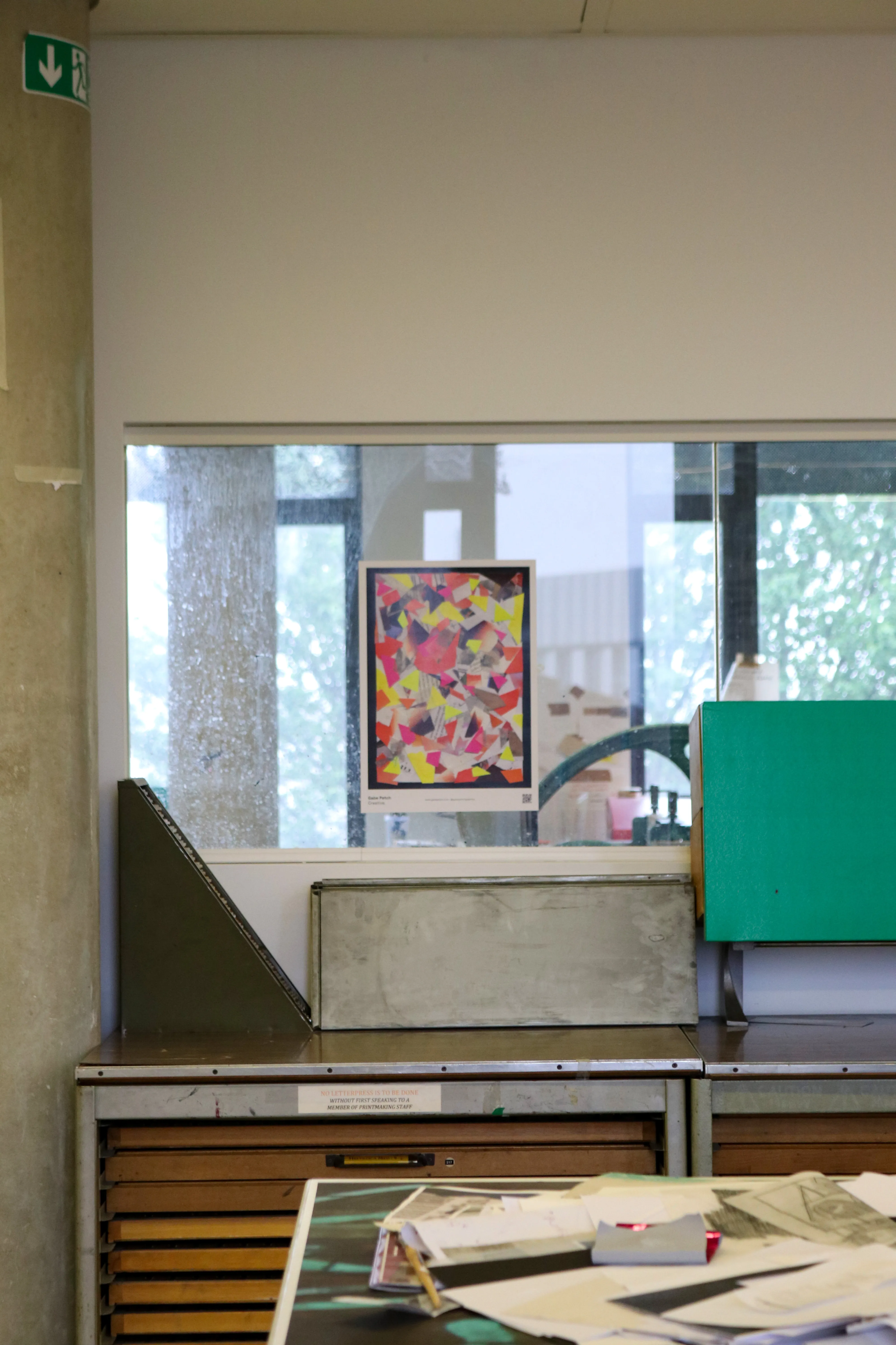
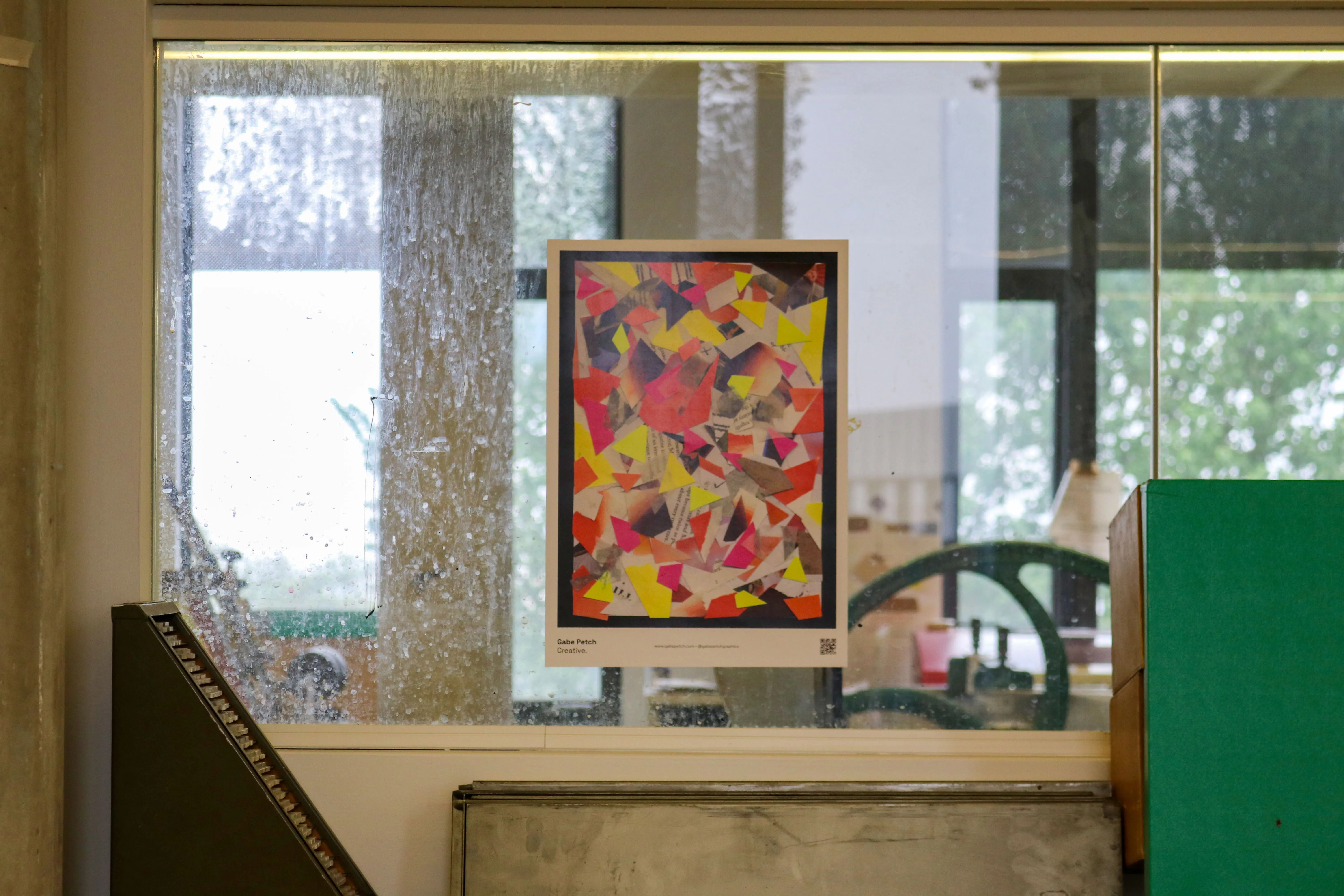
Featuring two collages made up entirley from offcuts and test prints from my final year of study, each collage was scanned and reproduced across different formats, such as A3 posters, and A5/A6 cards. Which beyond featuring my contact details, also allow a recipient to hold onto a high quality art print, giving enduring meaning to the work - and by extension: Gabe Petch Creative.
I also experiemented with augmented reality, an example of which can be seen here
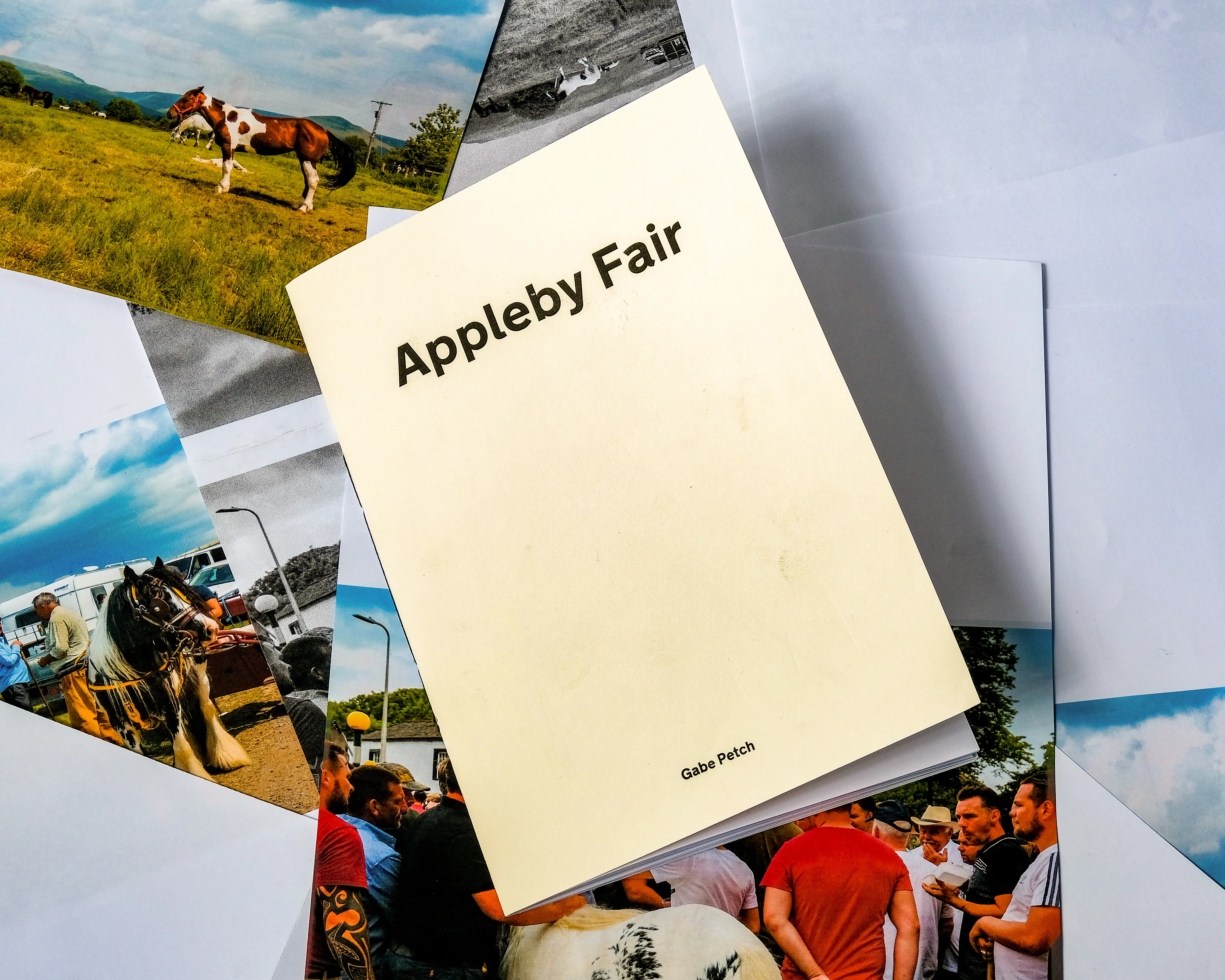
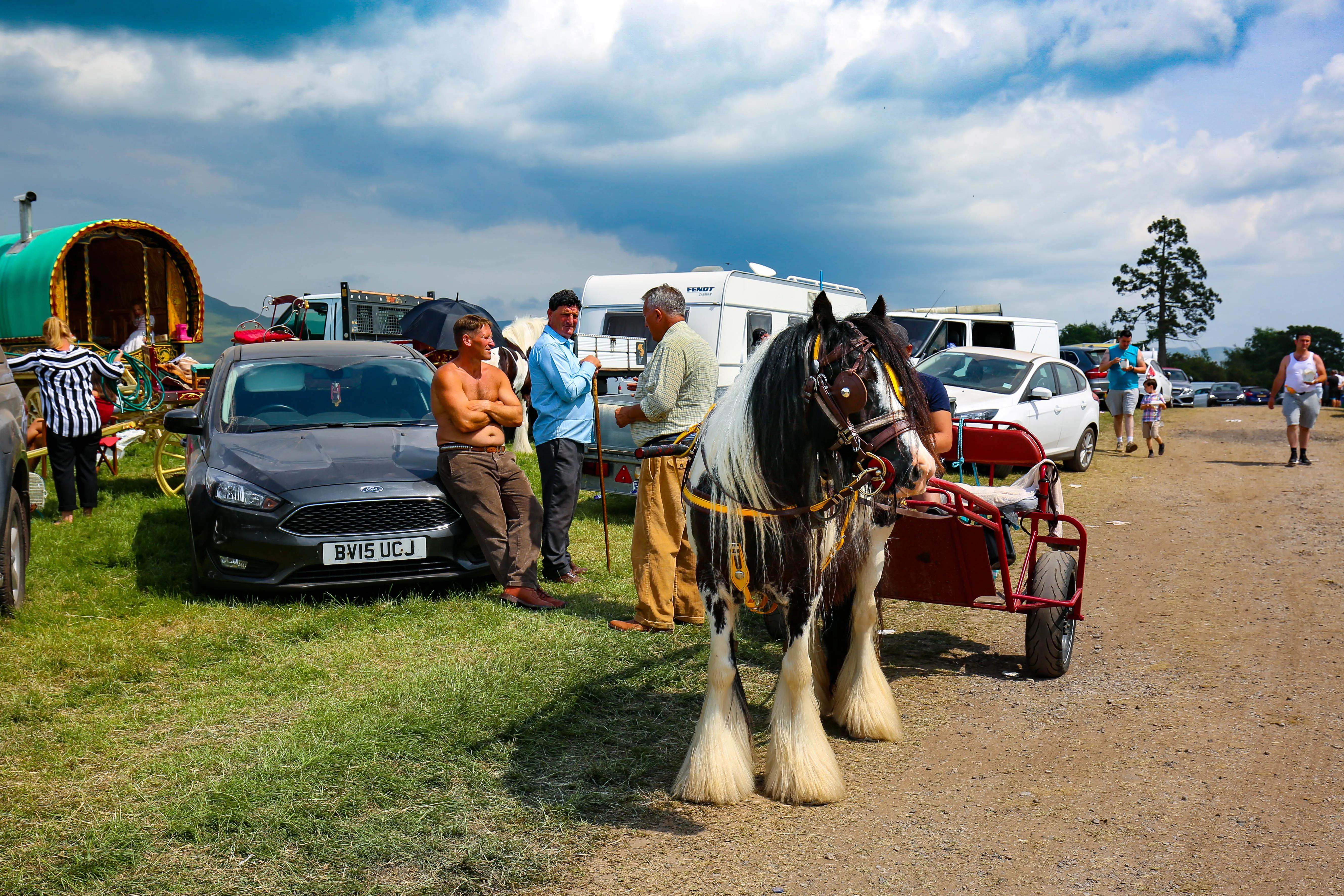
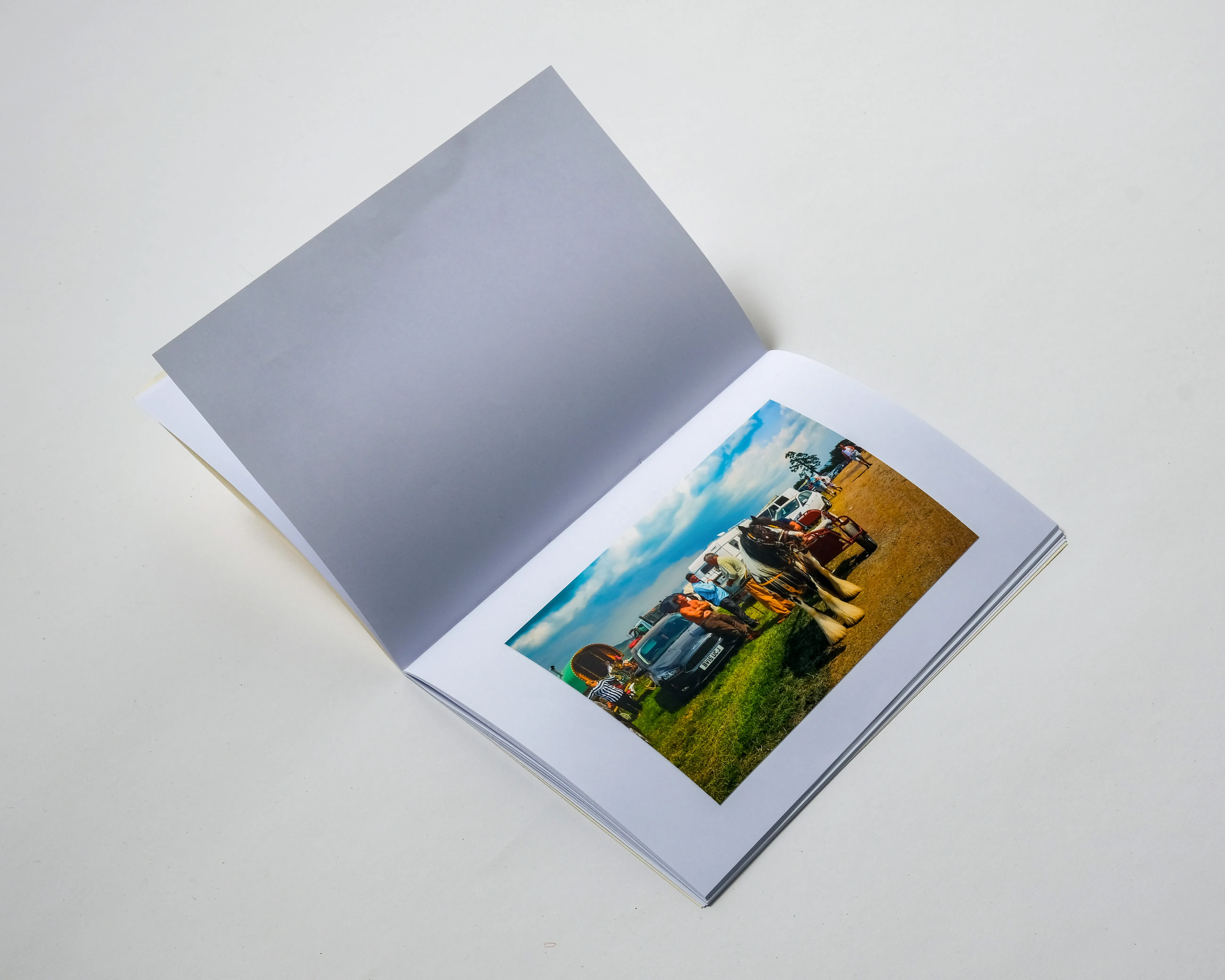
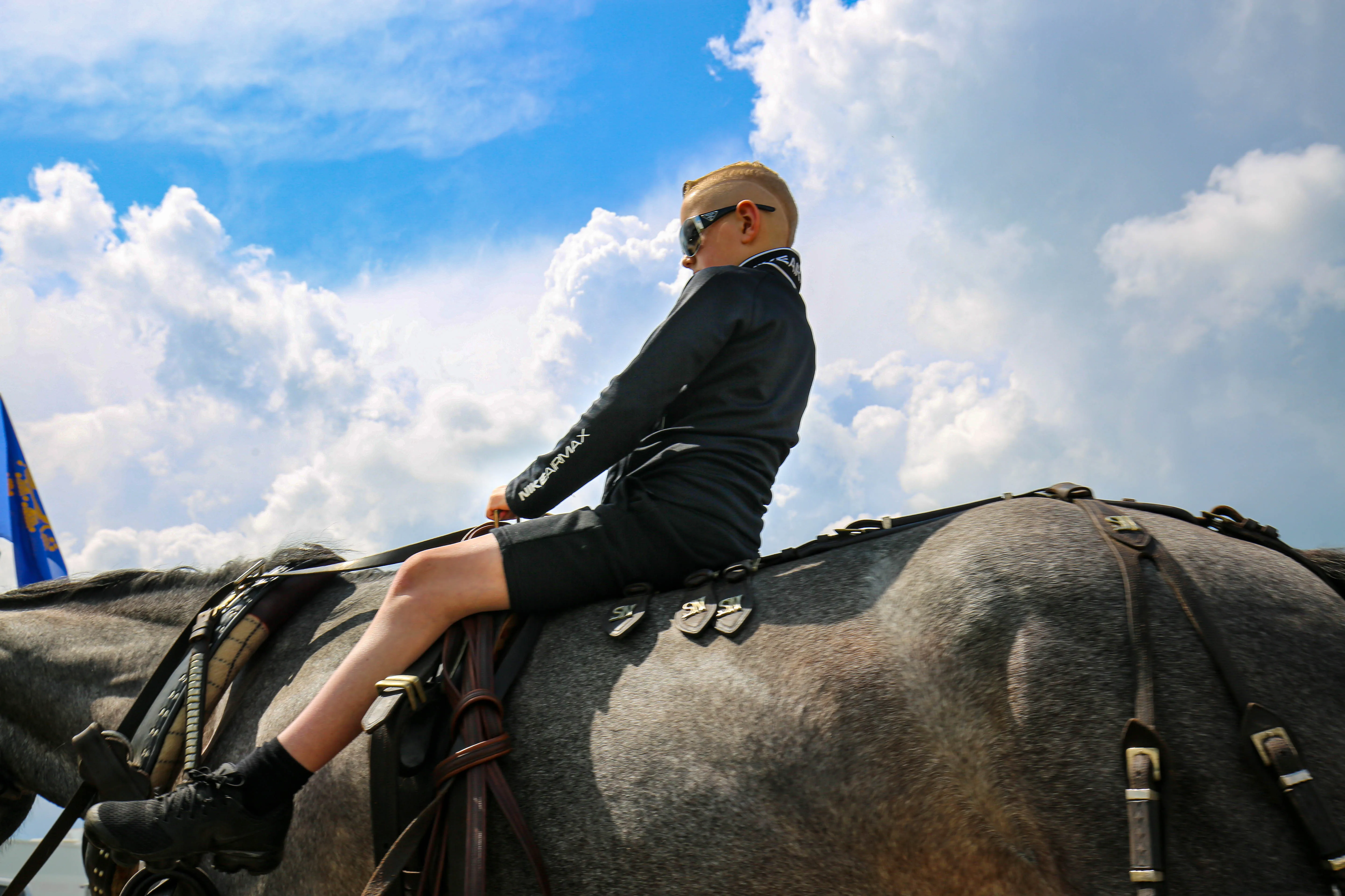
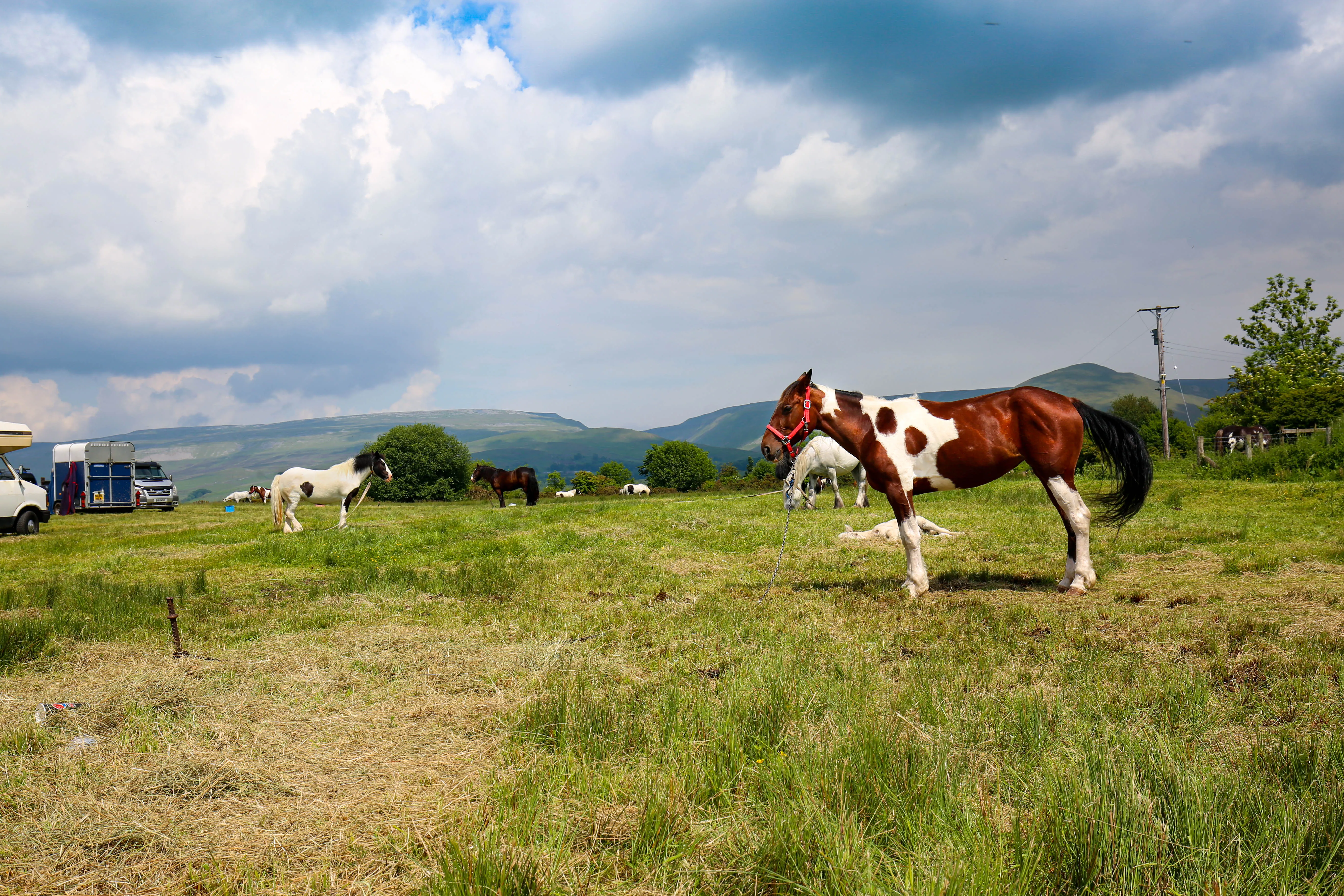
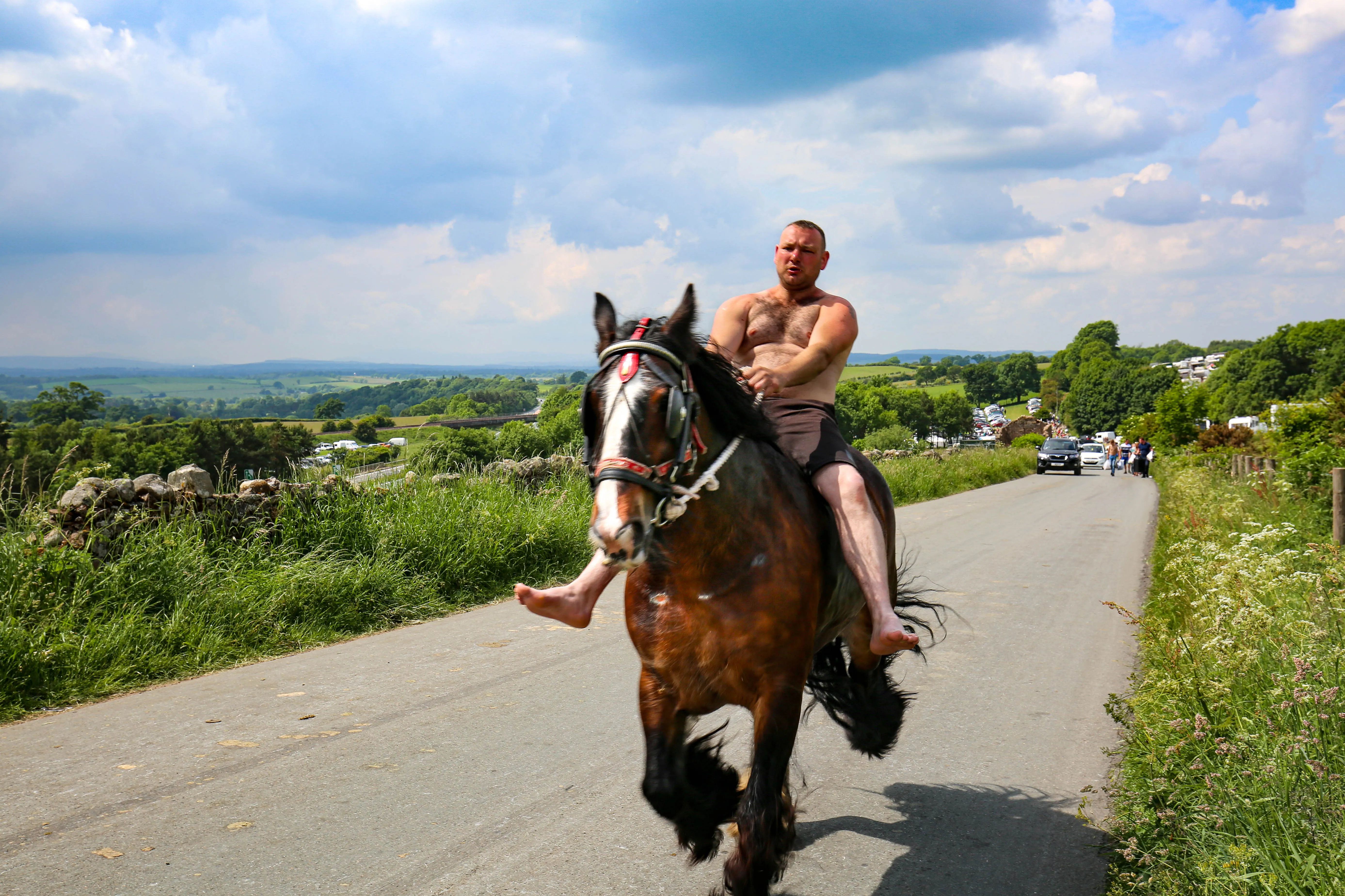
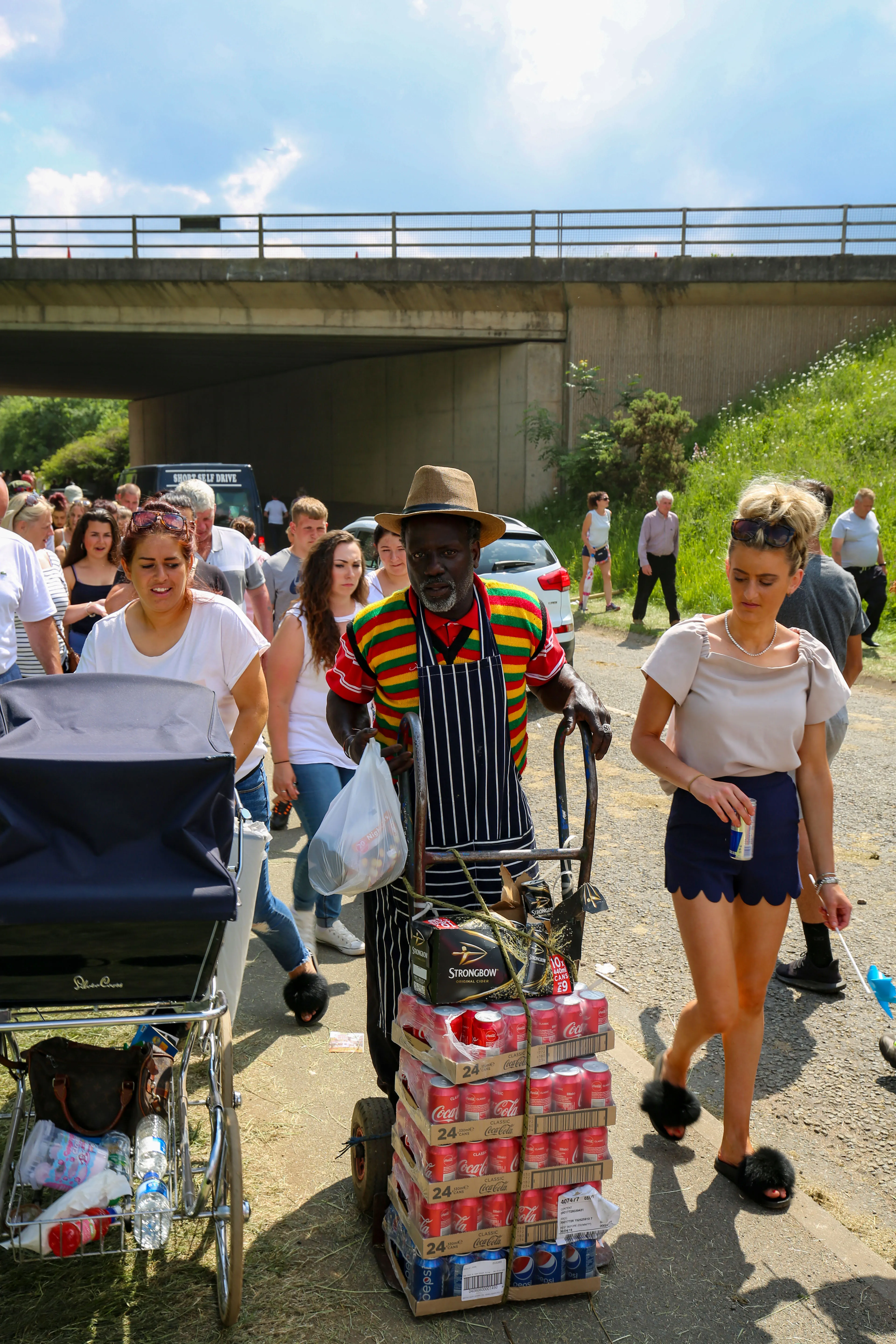
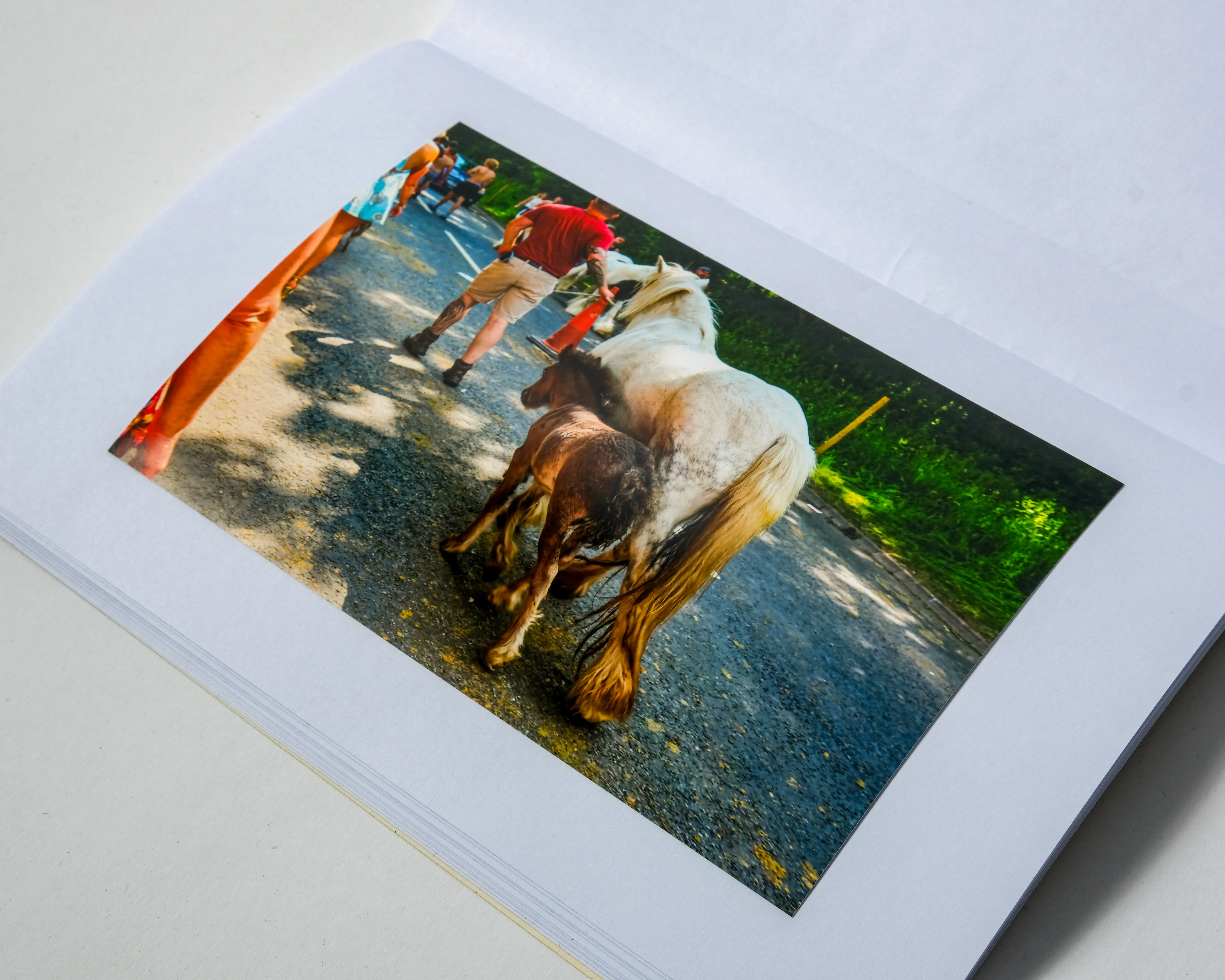
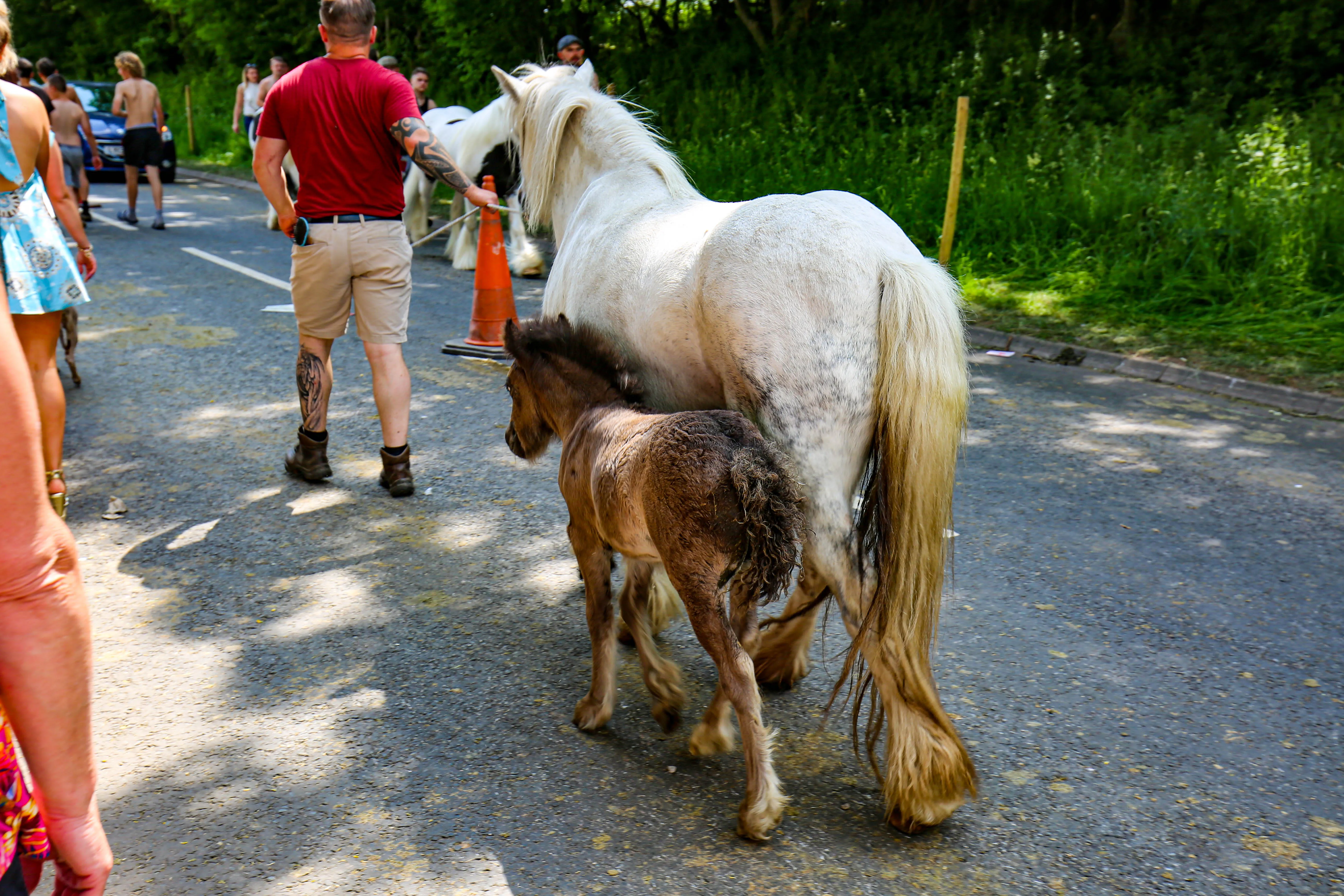
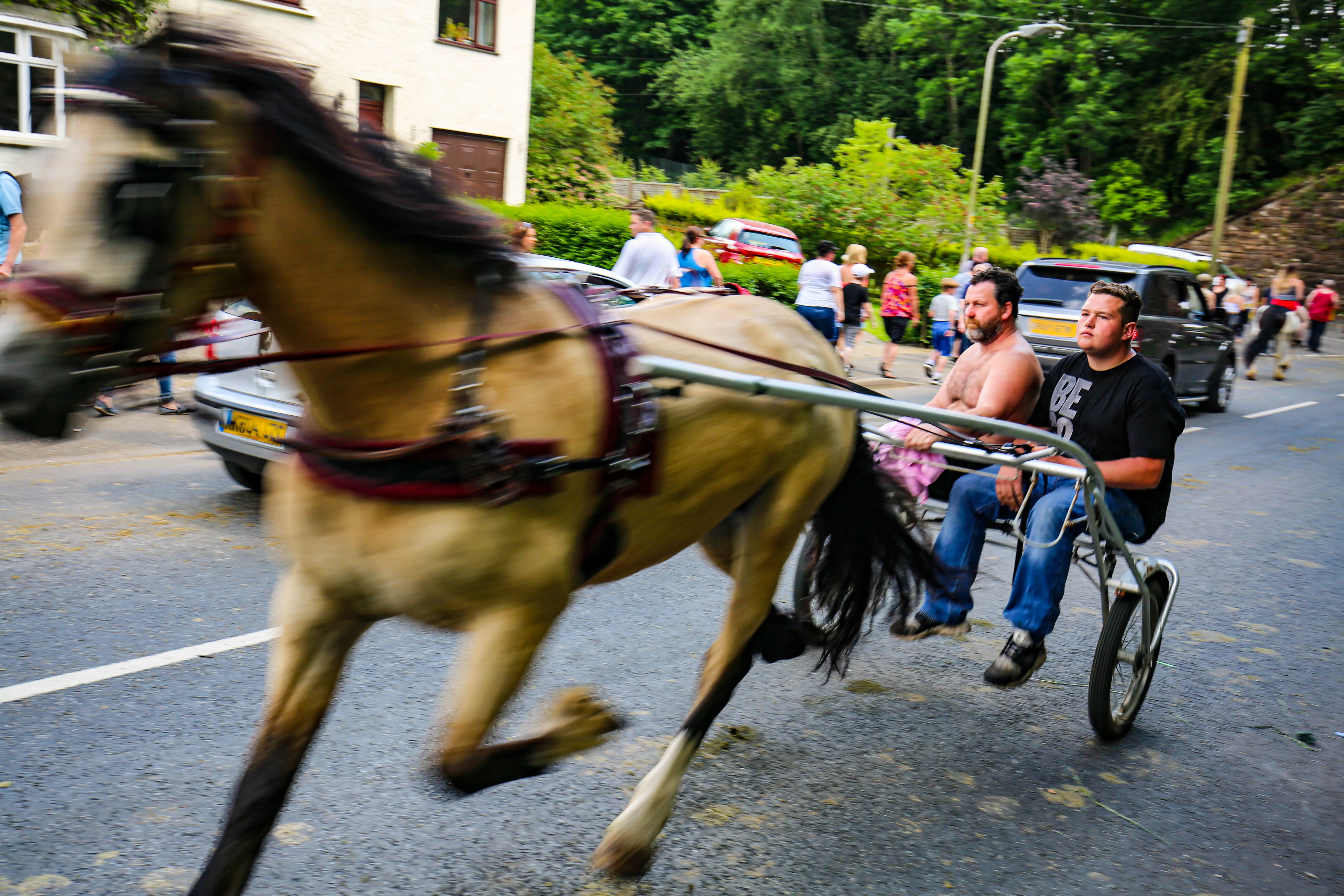
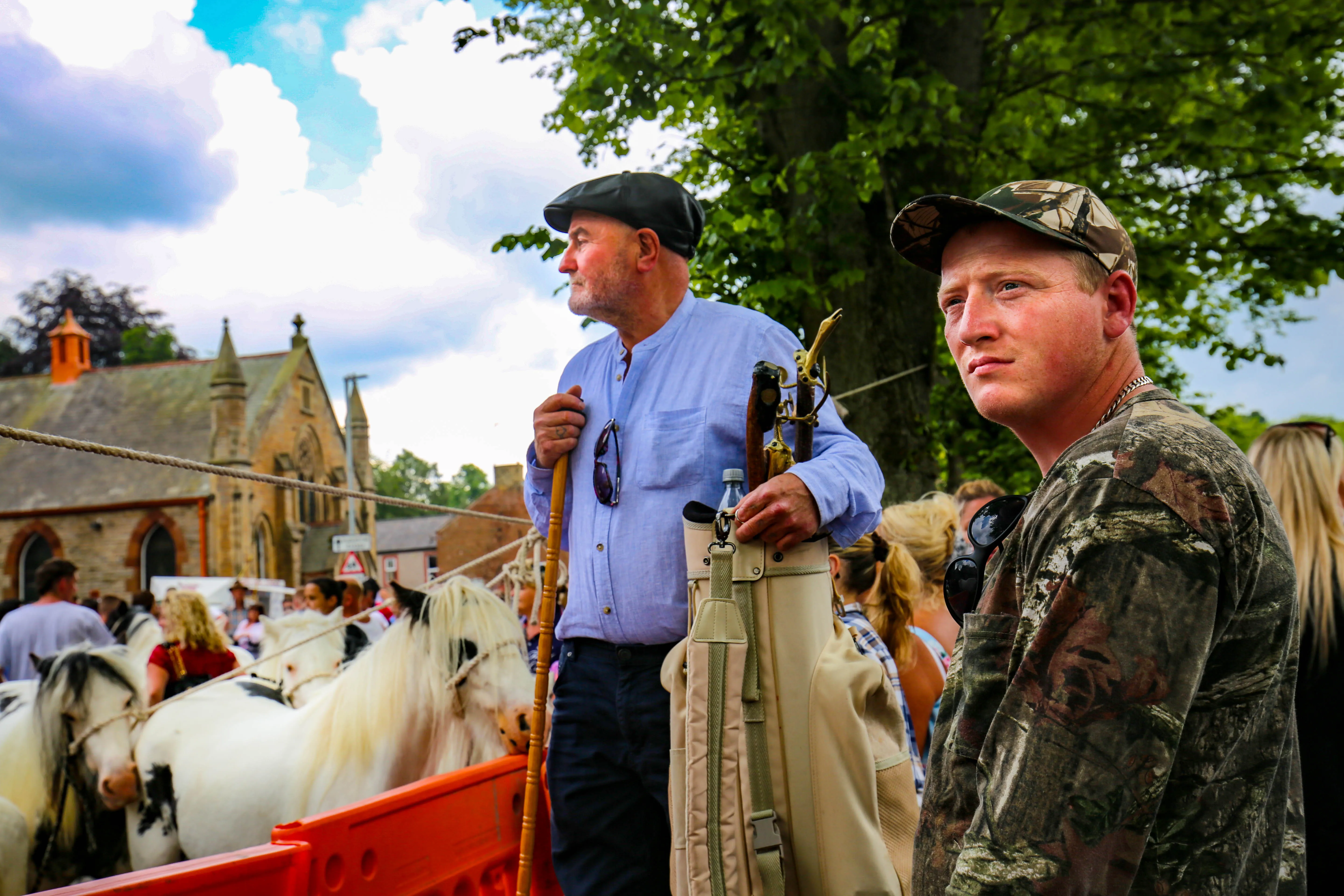
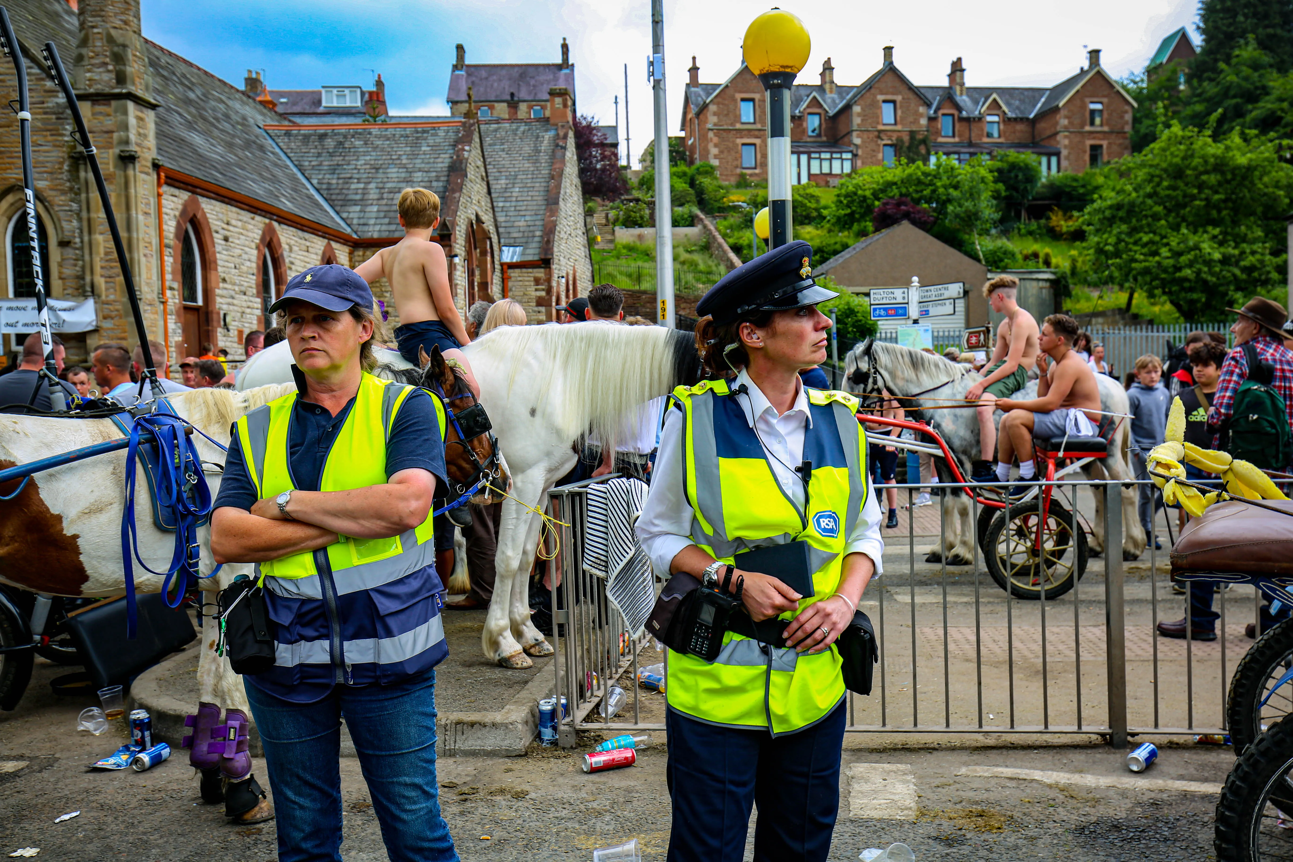
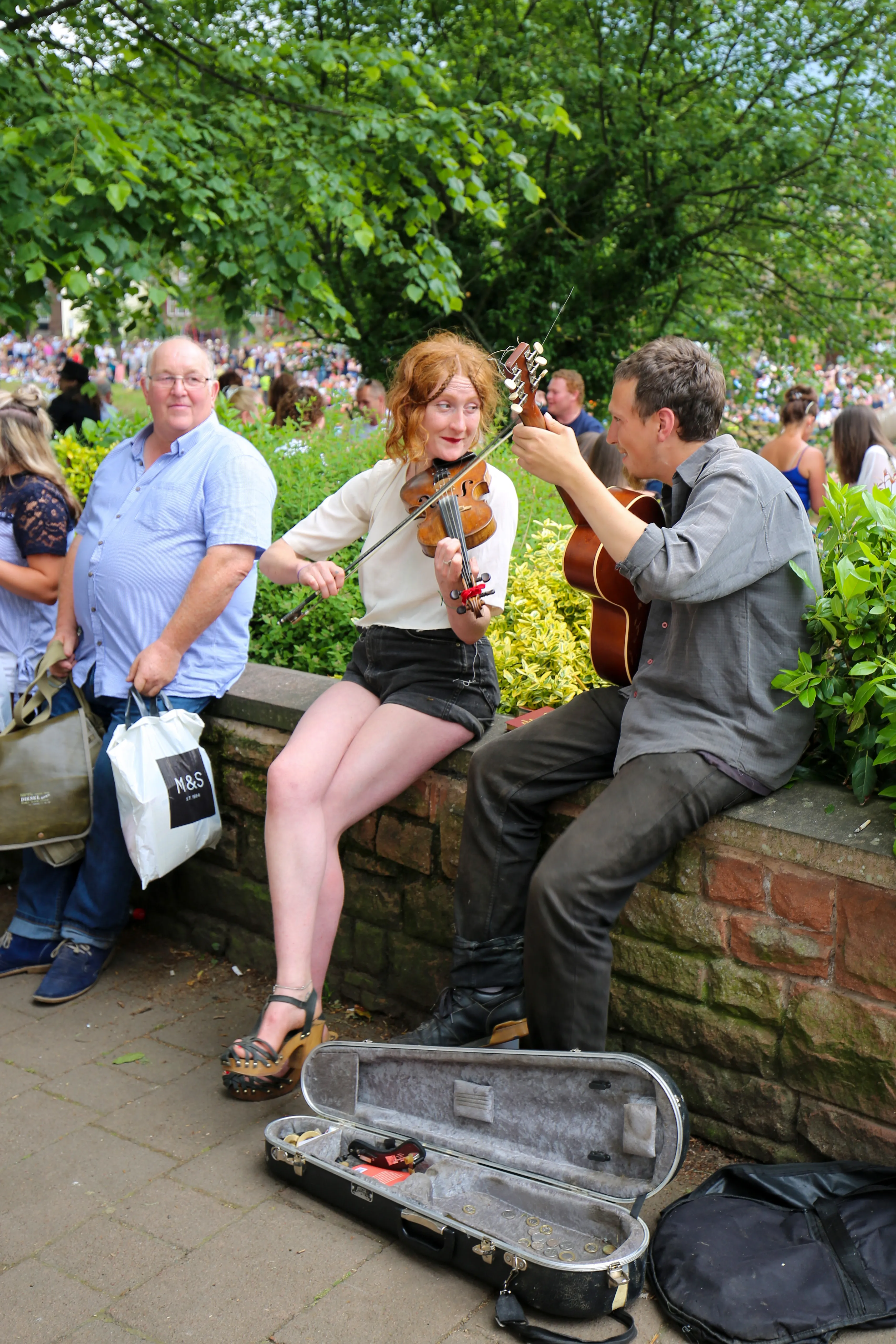
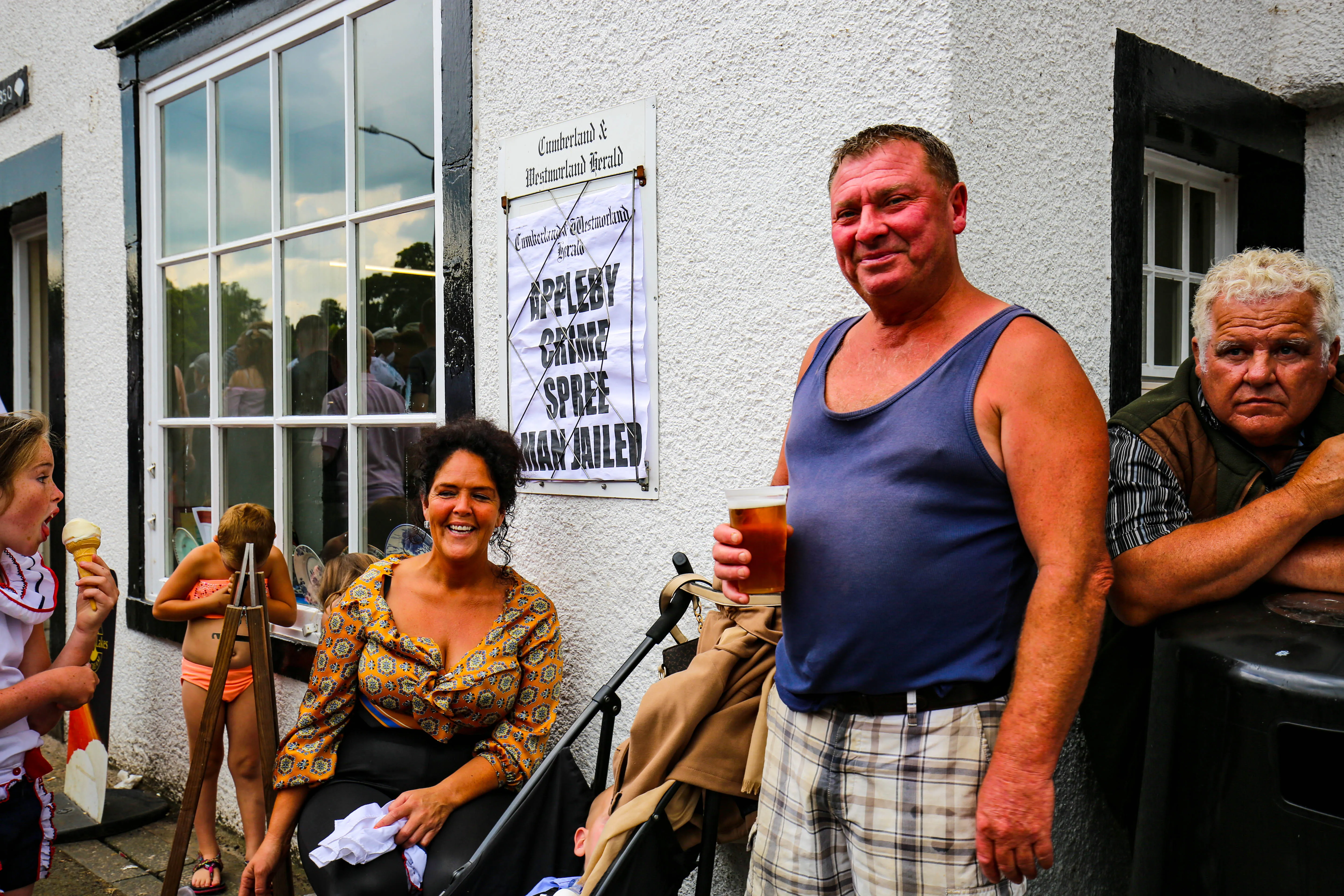
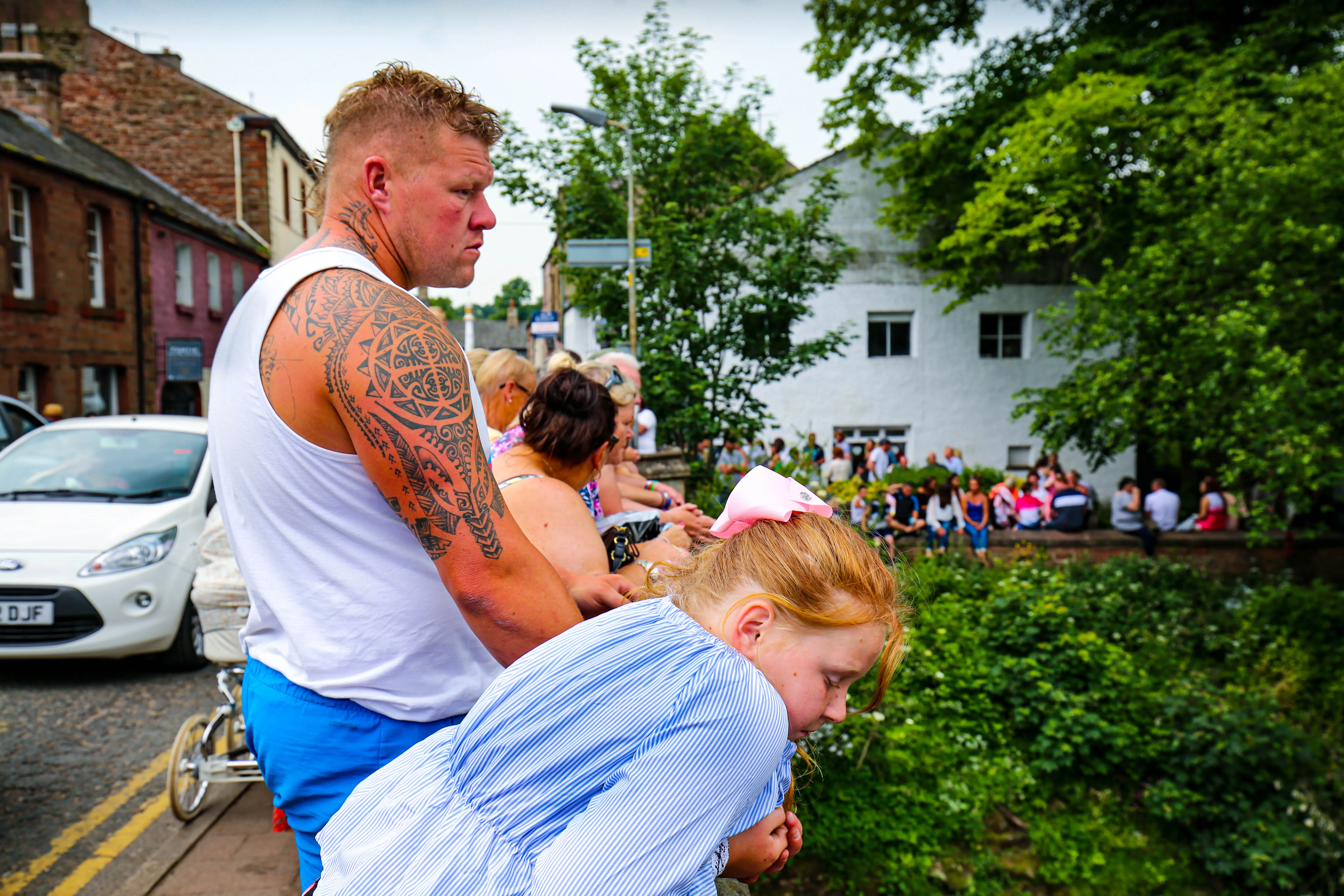
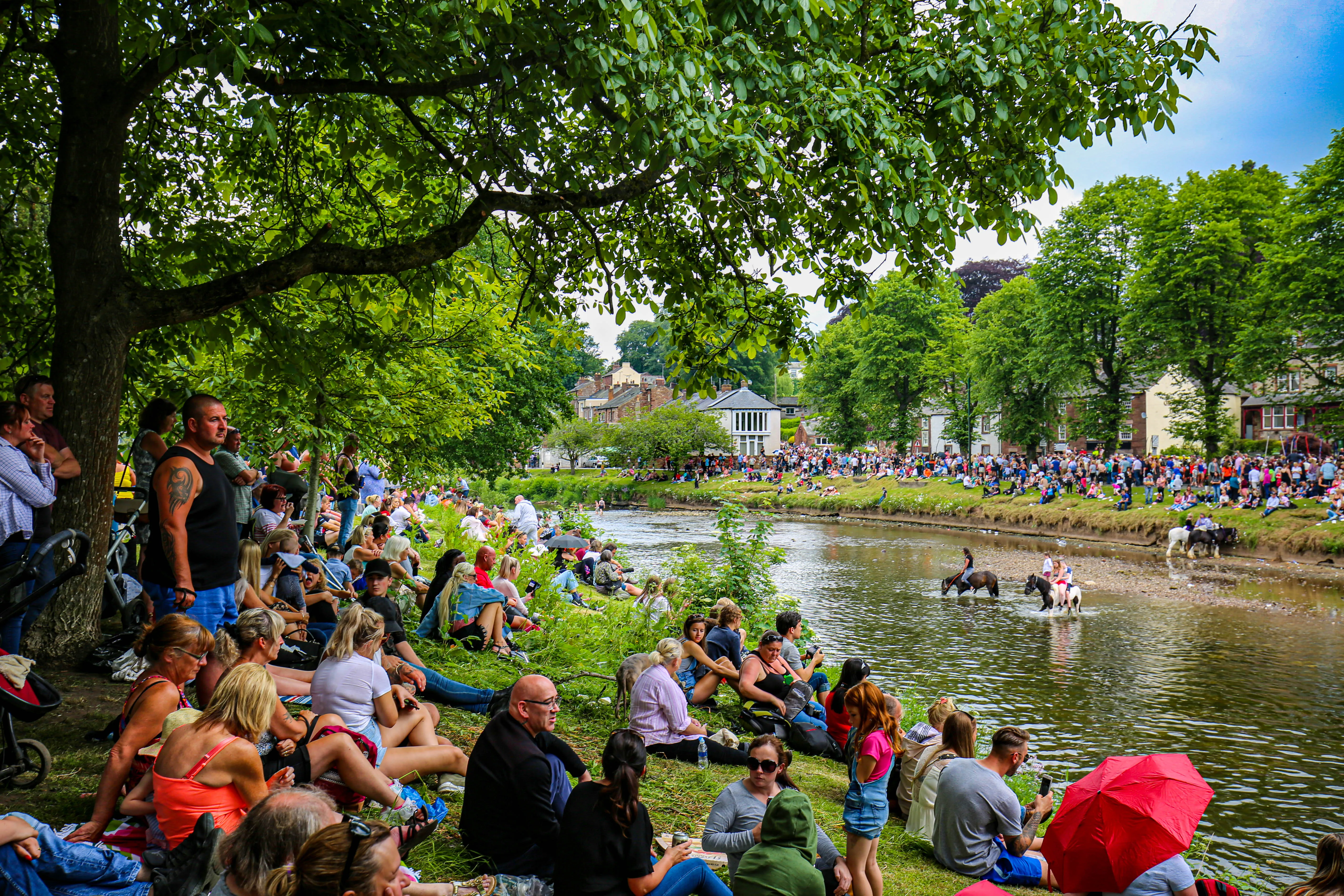
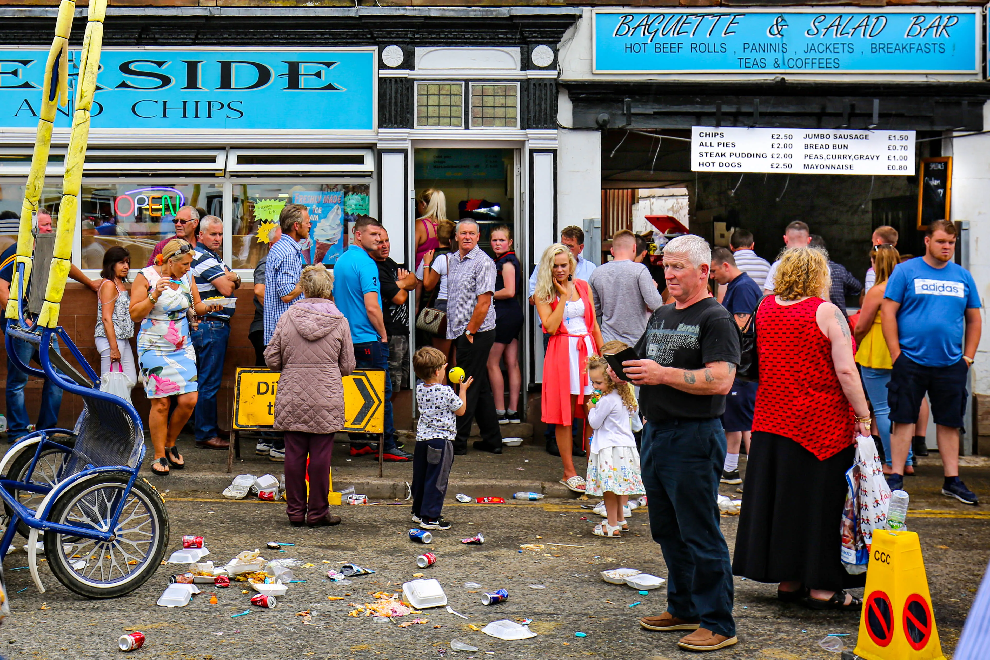
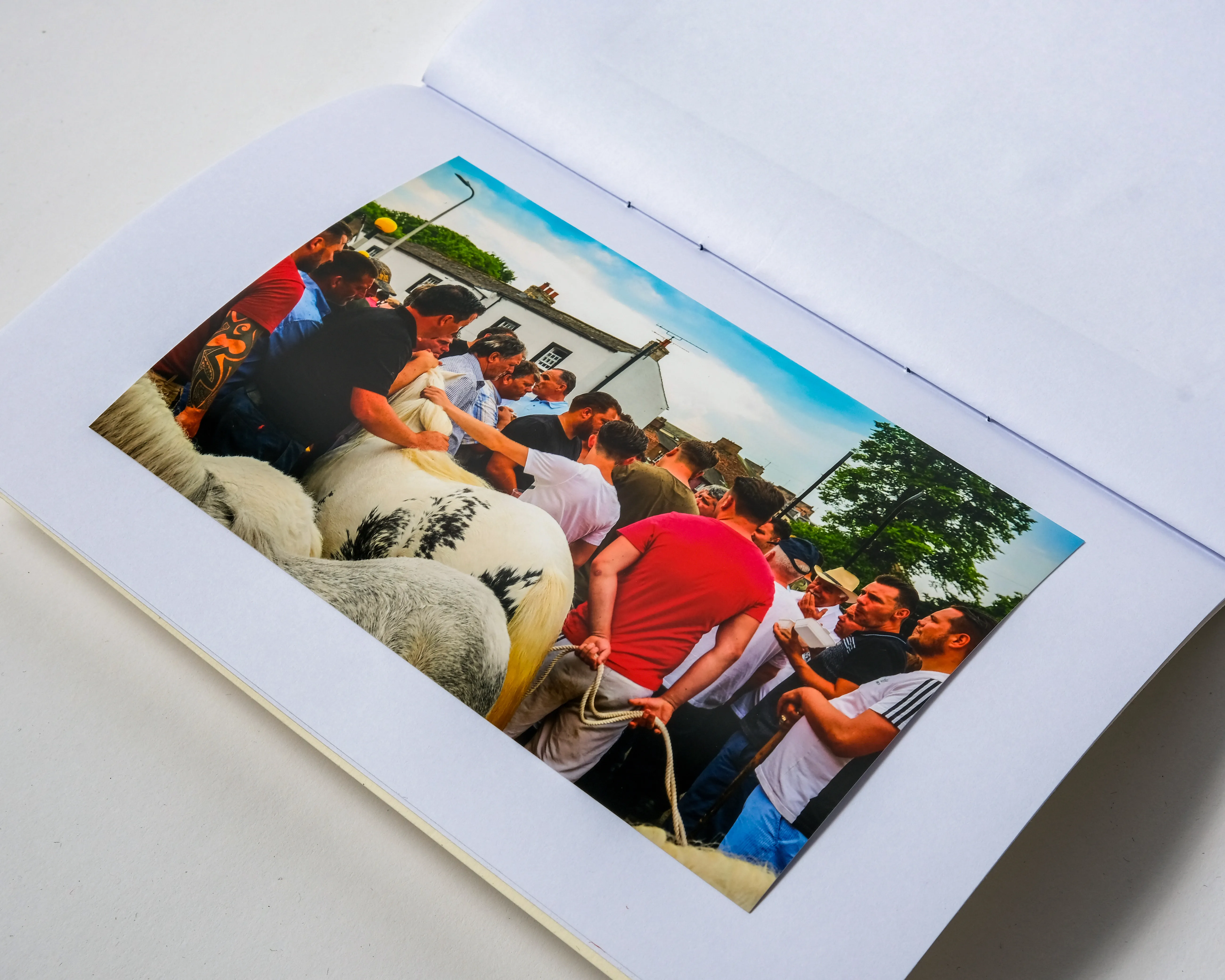
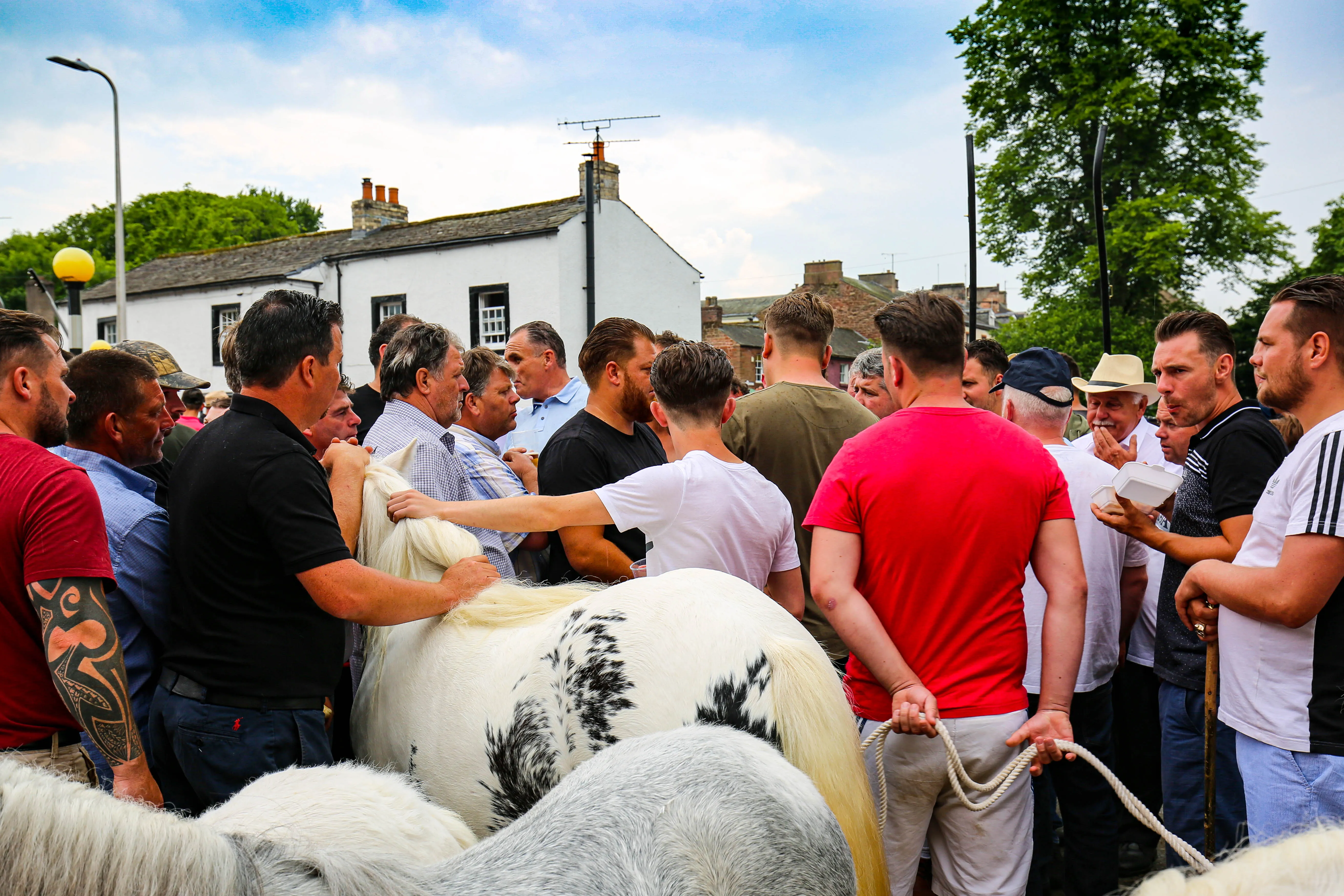
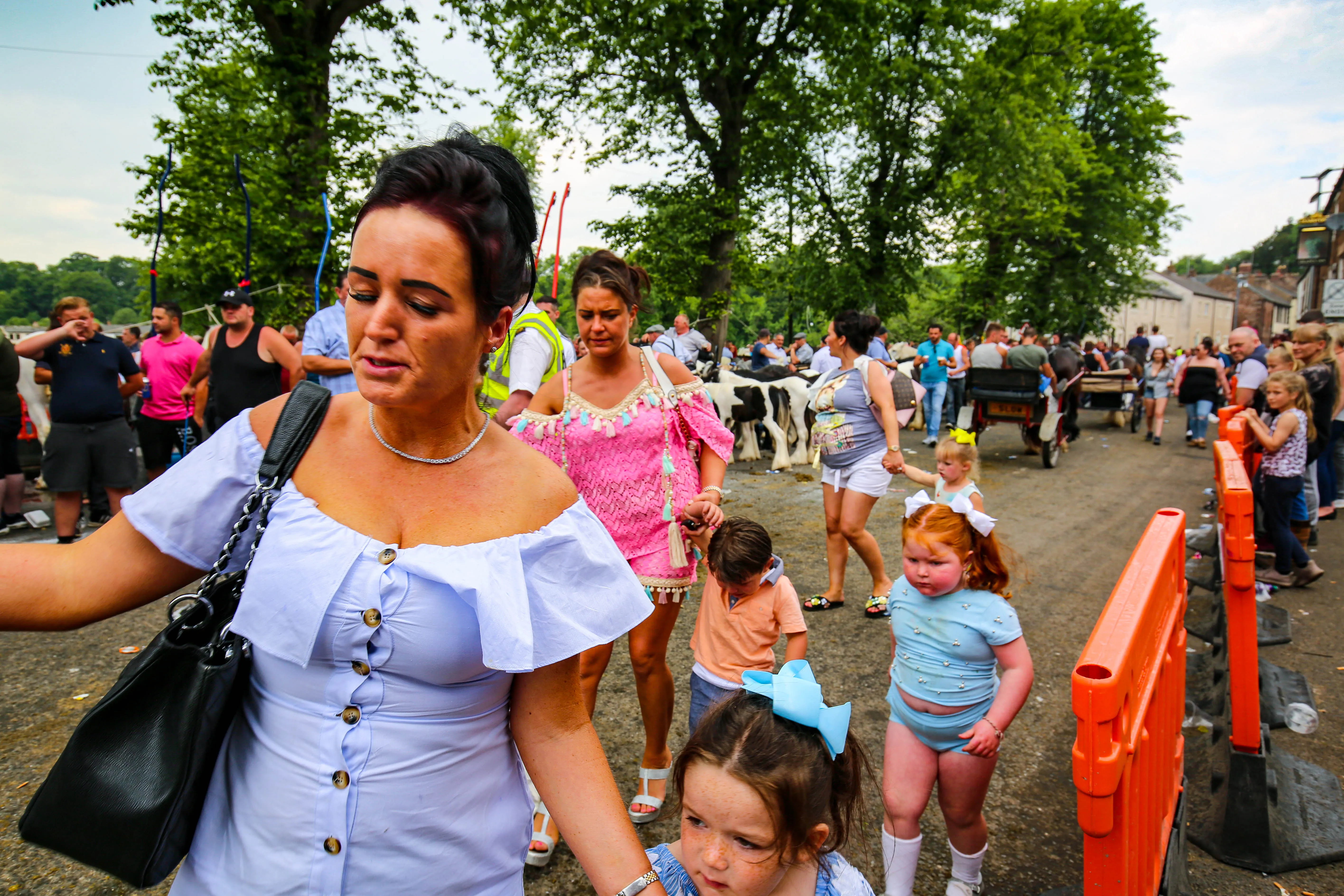
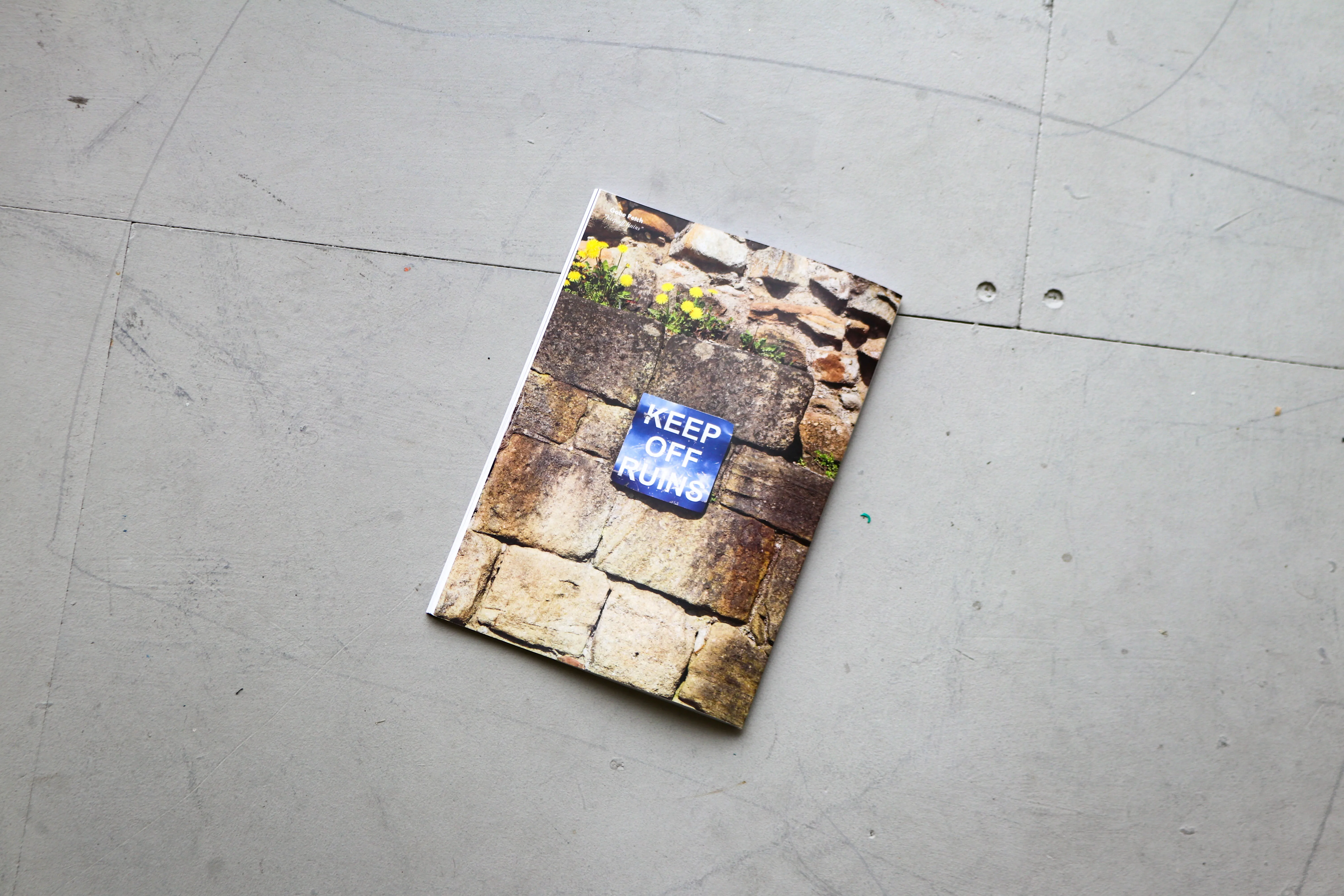
The Horse Fair is one of the largest of its kind in Europe, drawing in thousands of members of the Gypsy and Traveller community.
Able to trace its history for centuries, the event has drawn controversy in recent years amidst growing sentiment against Travellers, the Coronavirus Lockdown and most recently the ‘Police, Crime, Sentencing and Courts Bill’, which was enacted in April of 2022, giving the police more powers to evict Travellers from sites they deem ‘unauthorised’ as well as making it easier to confiscate their property.
Capturing this event and community as they are now is vital, because an already maligned minority now face even greater limits to their freedoms.

.gif)
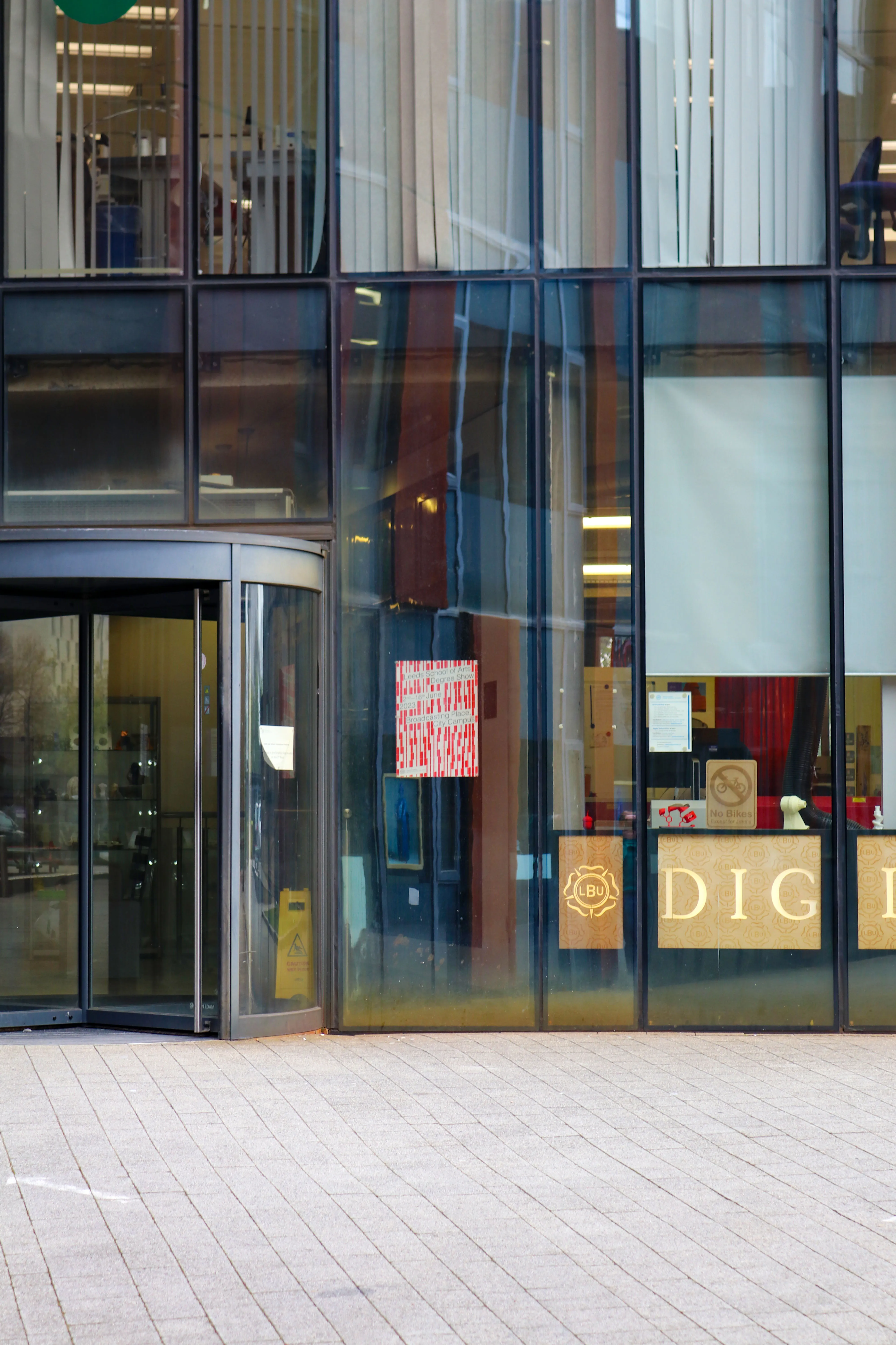
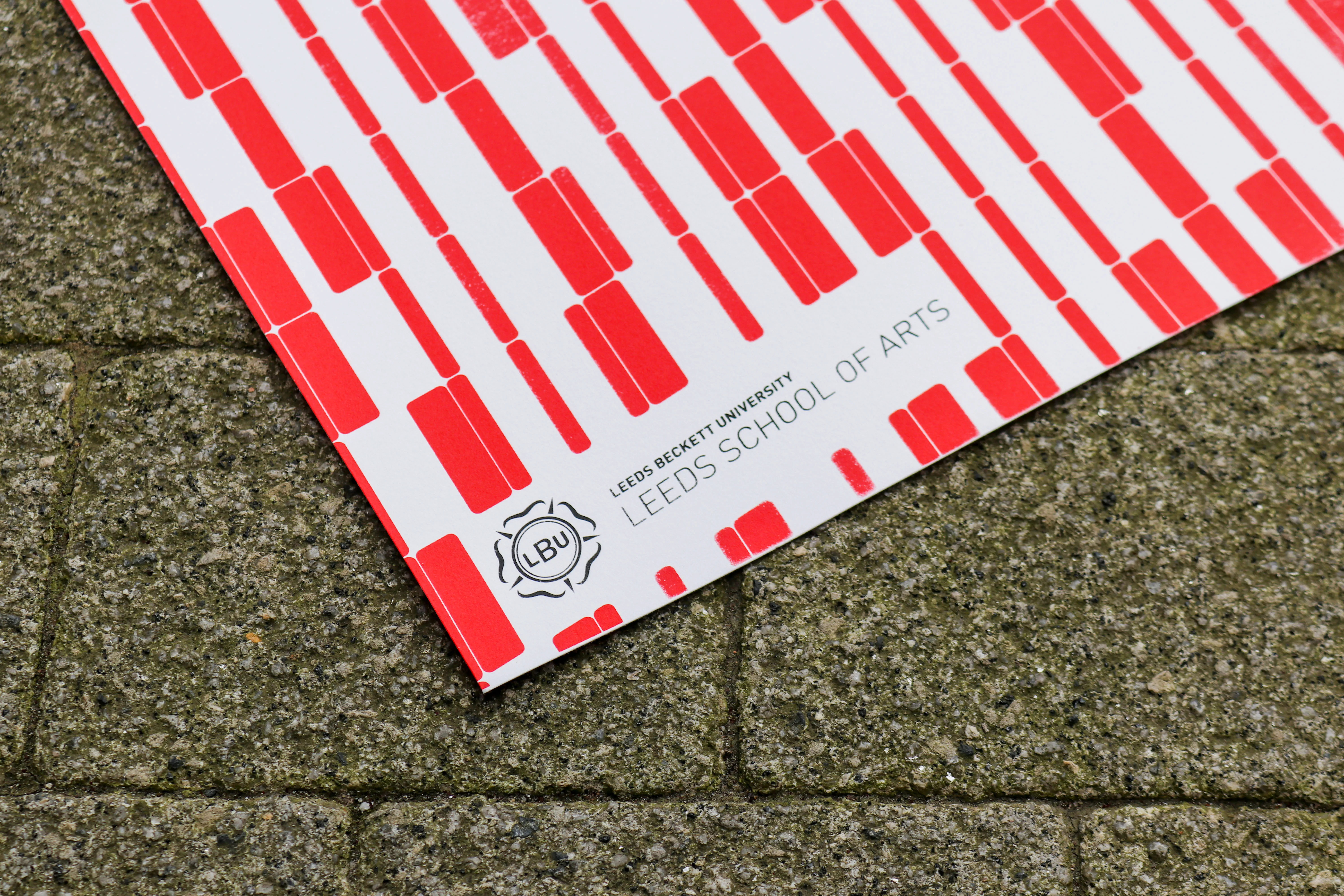

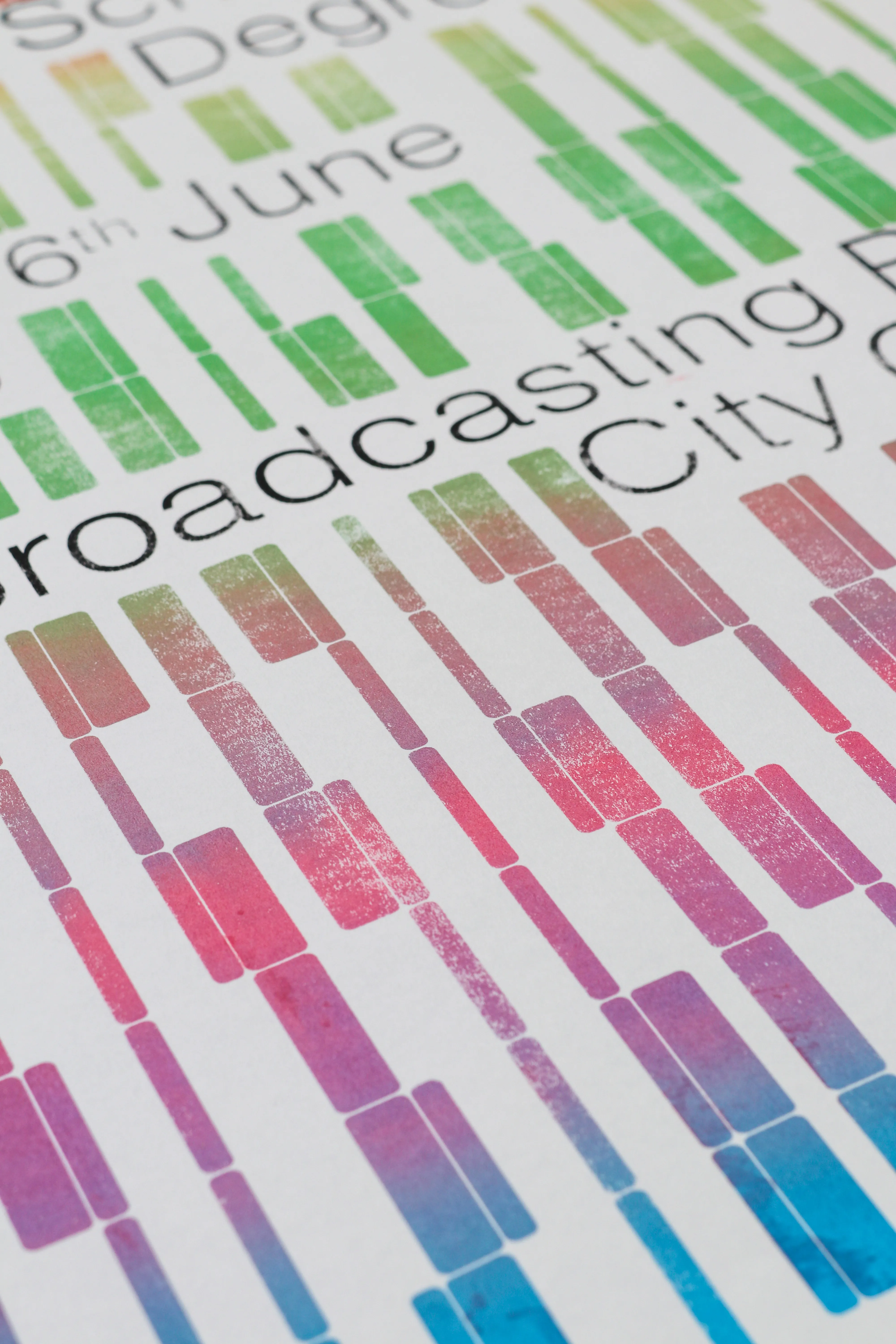
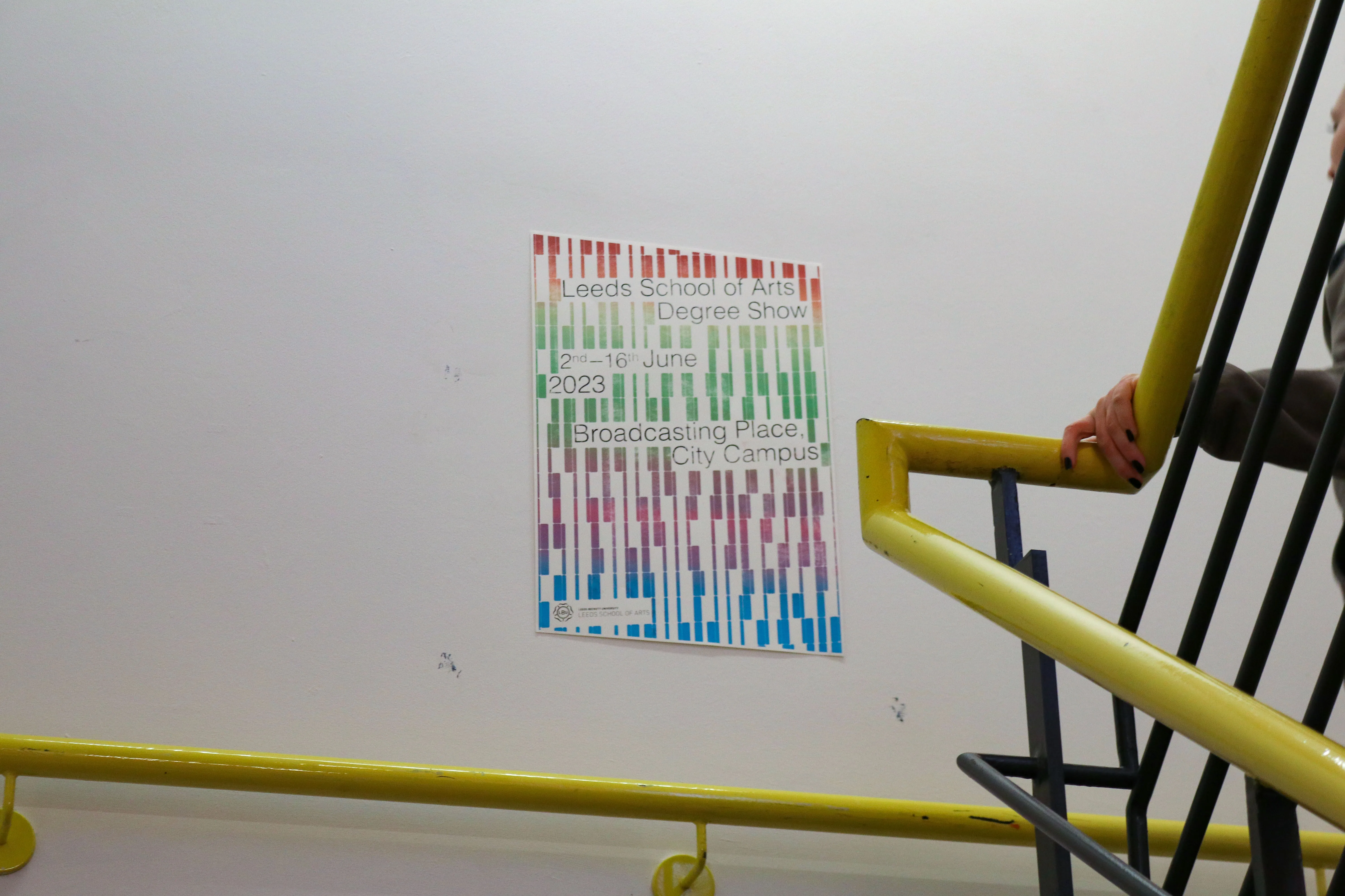
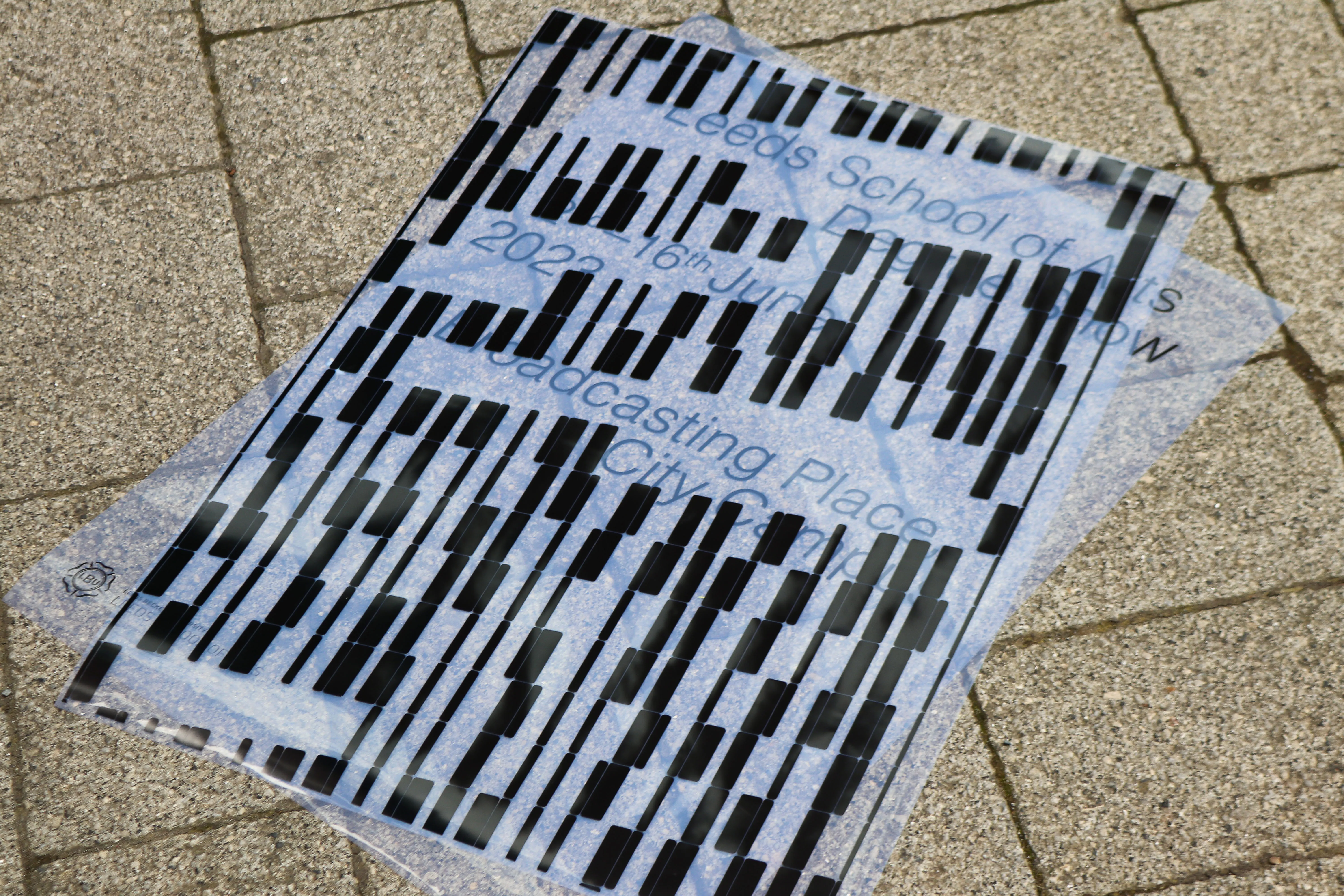
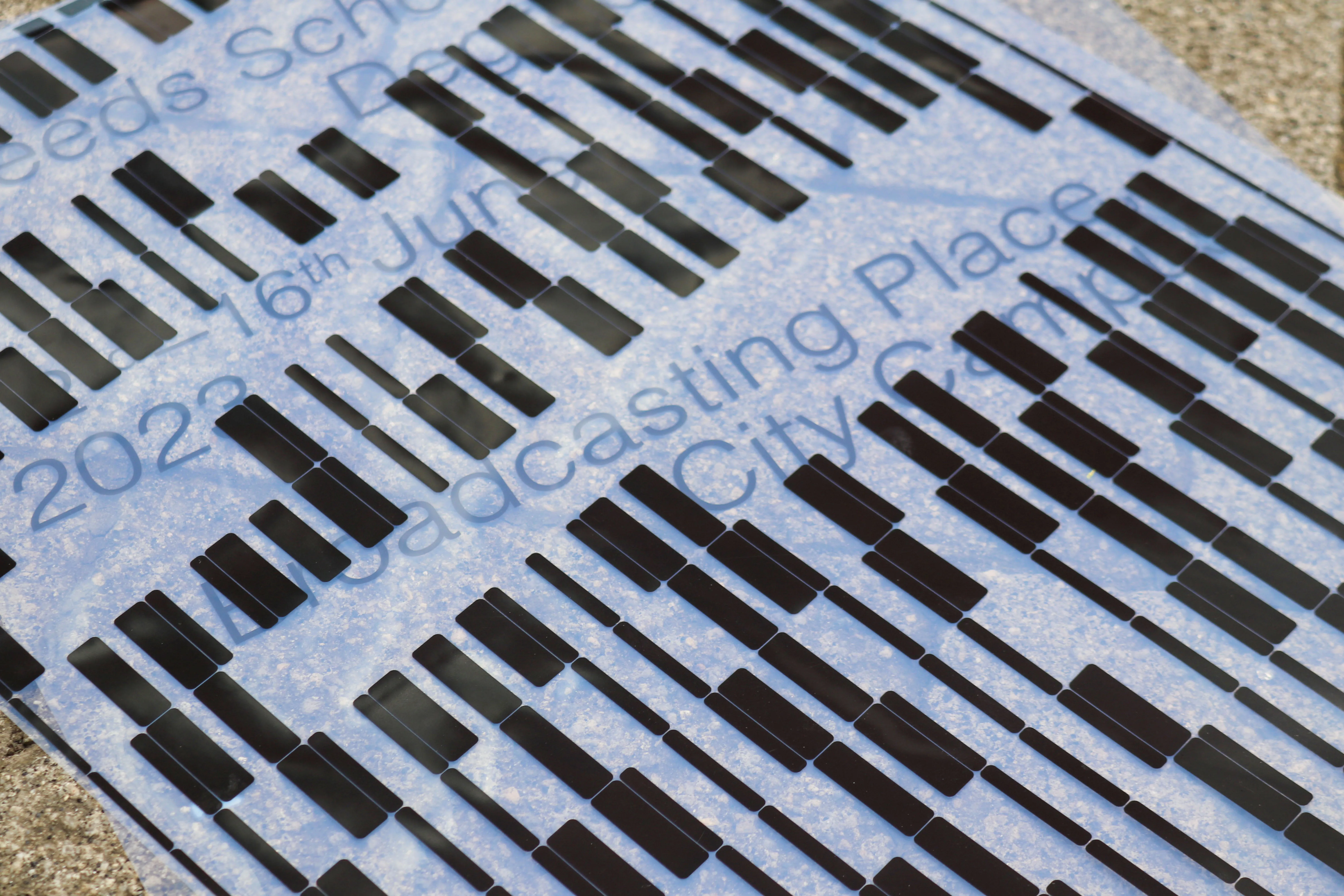
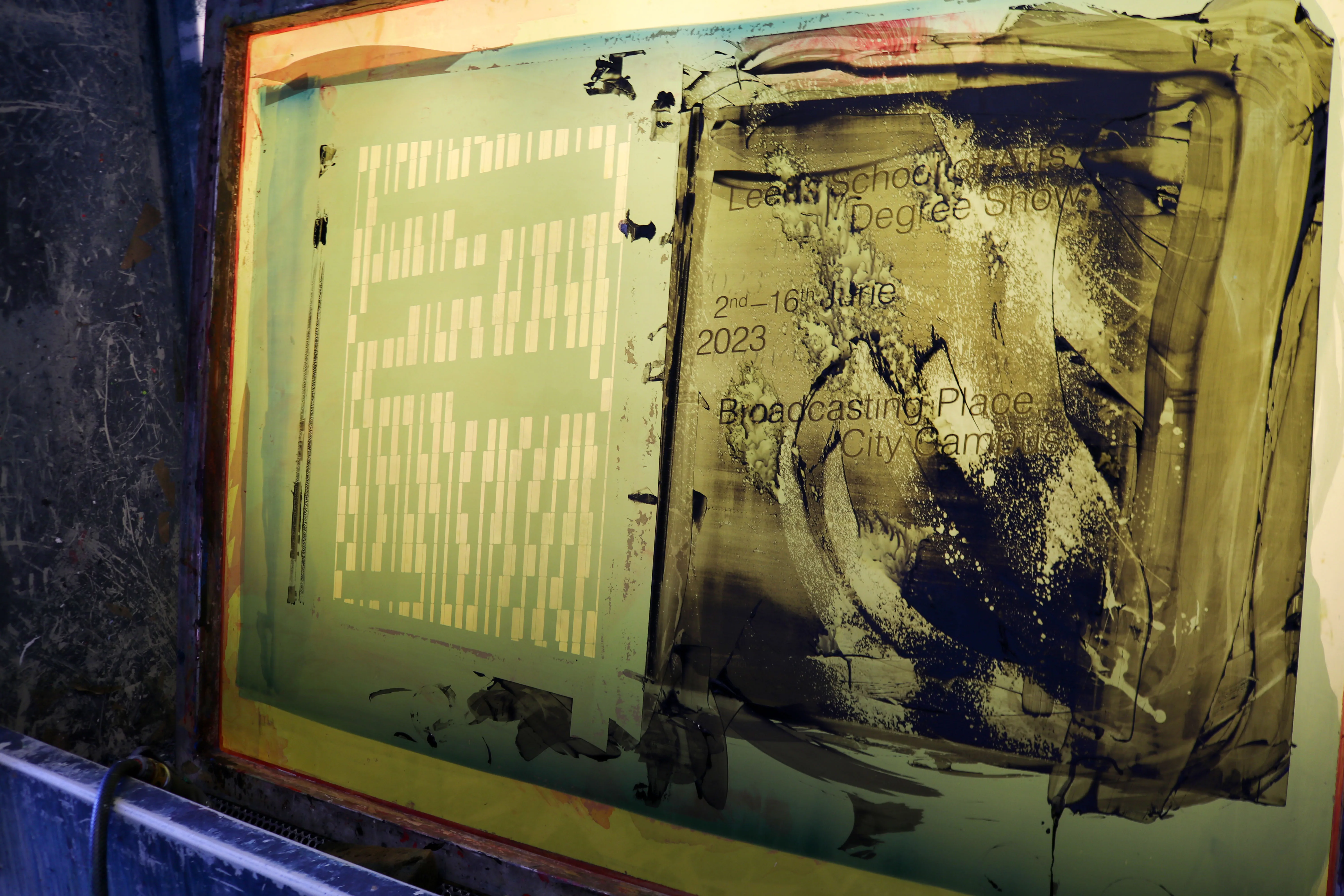
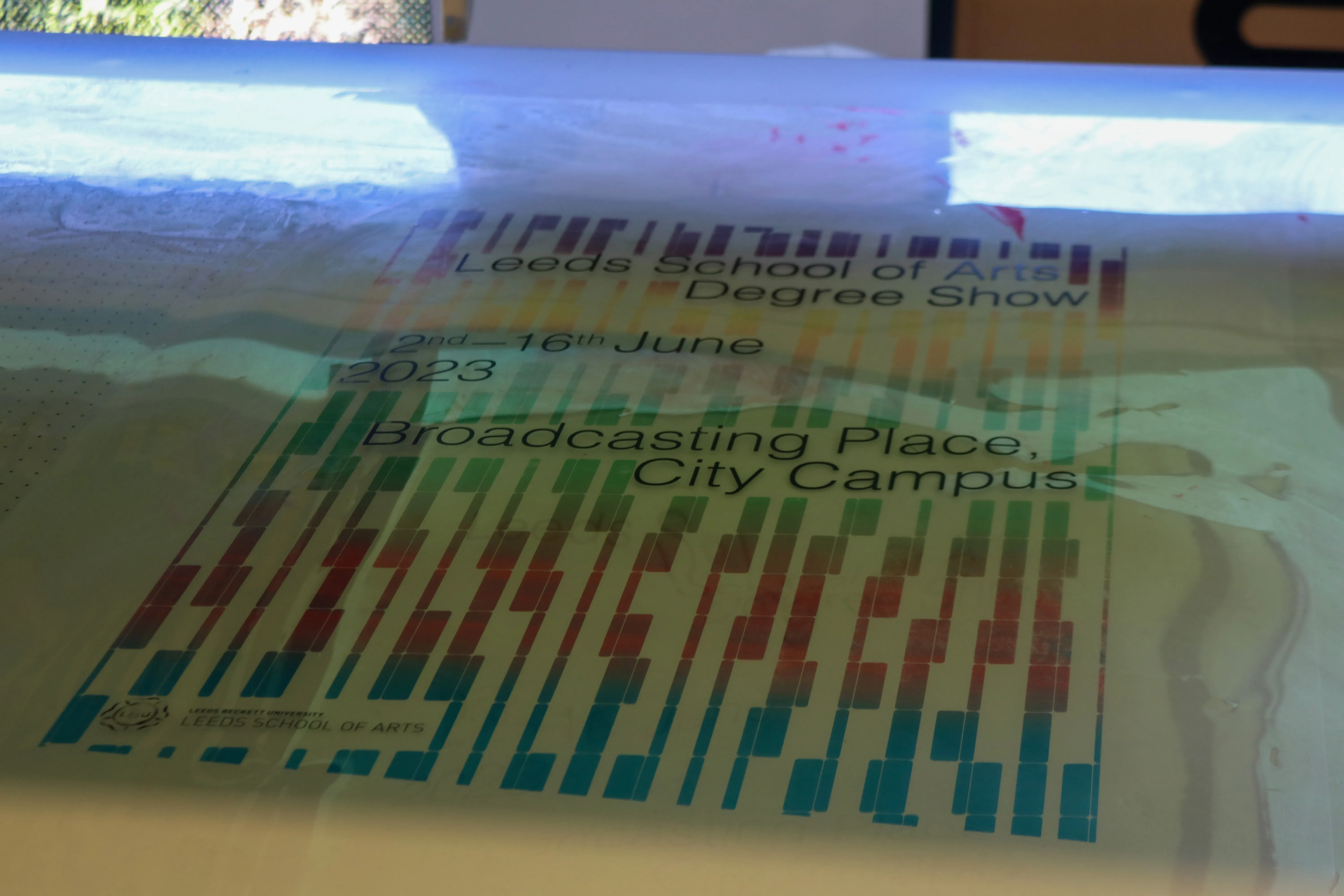
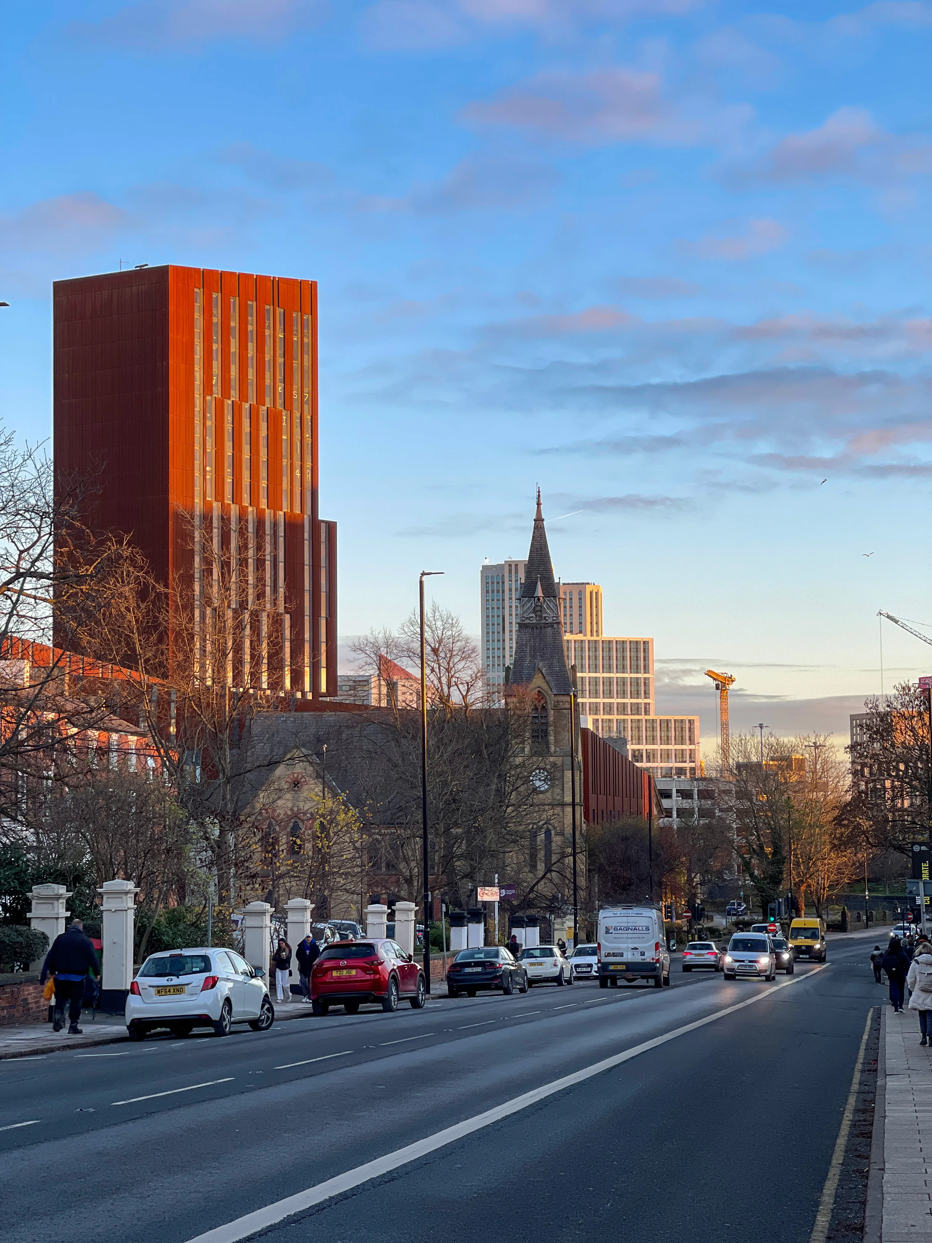
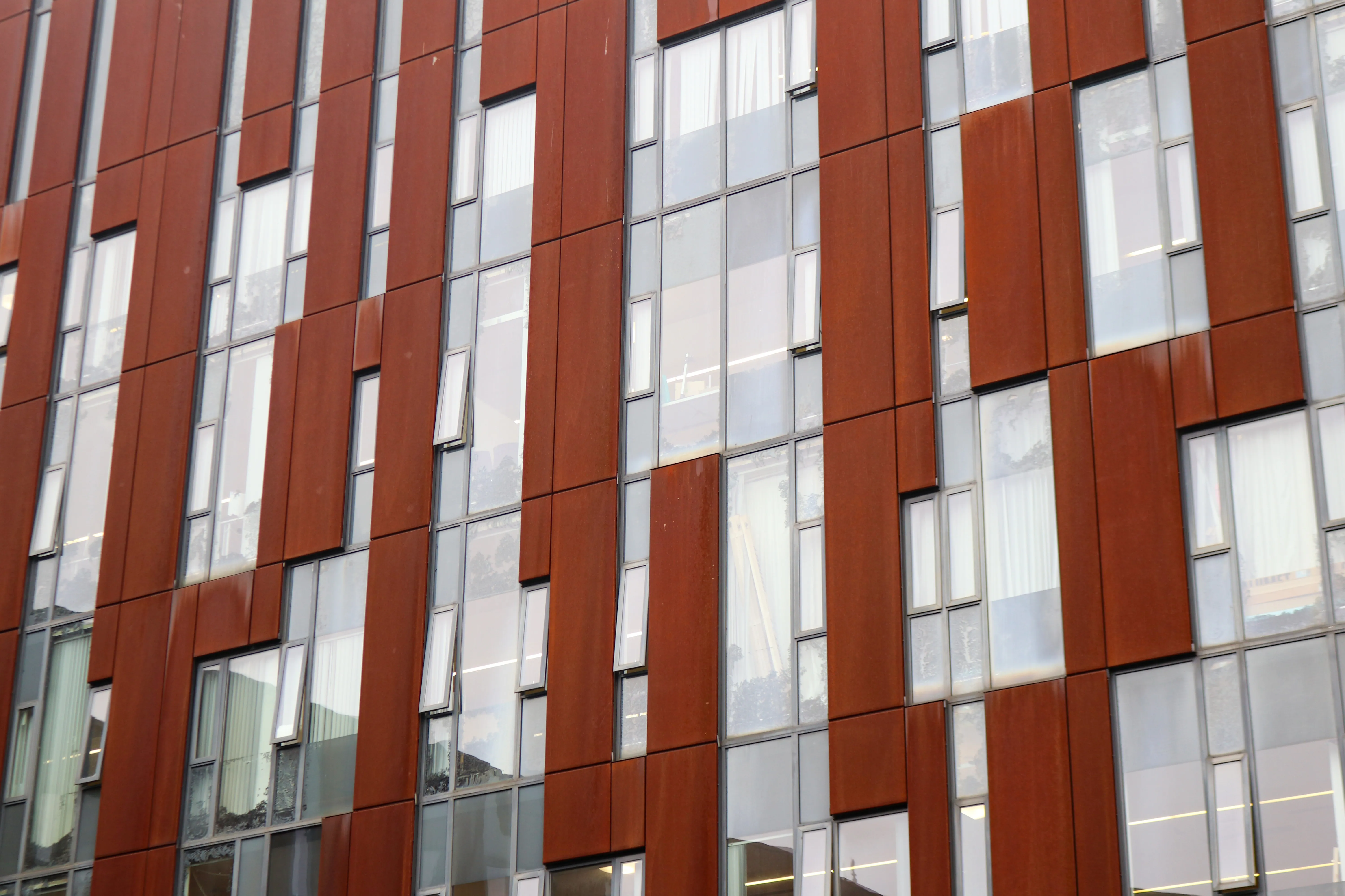
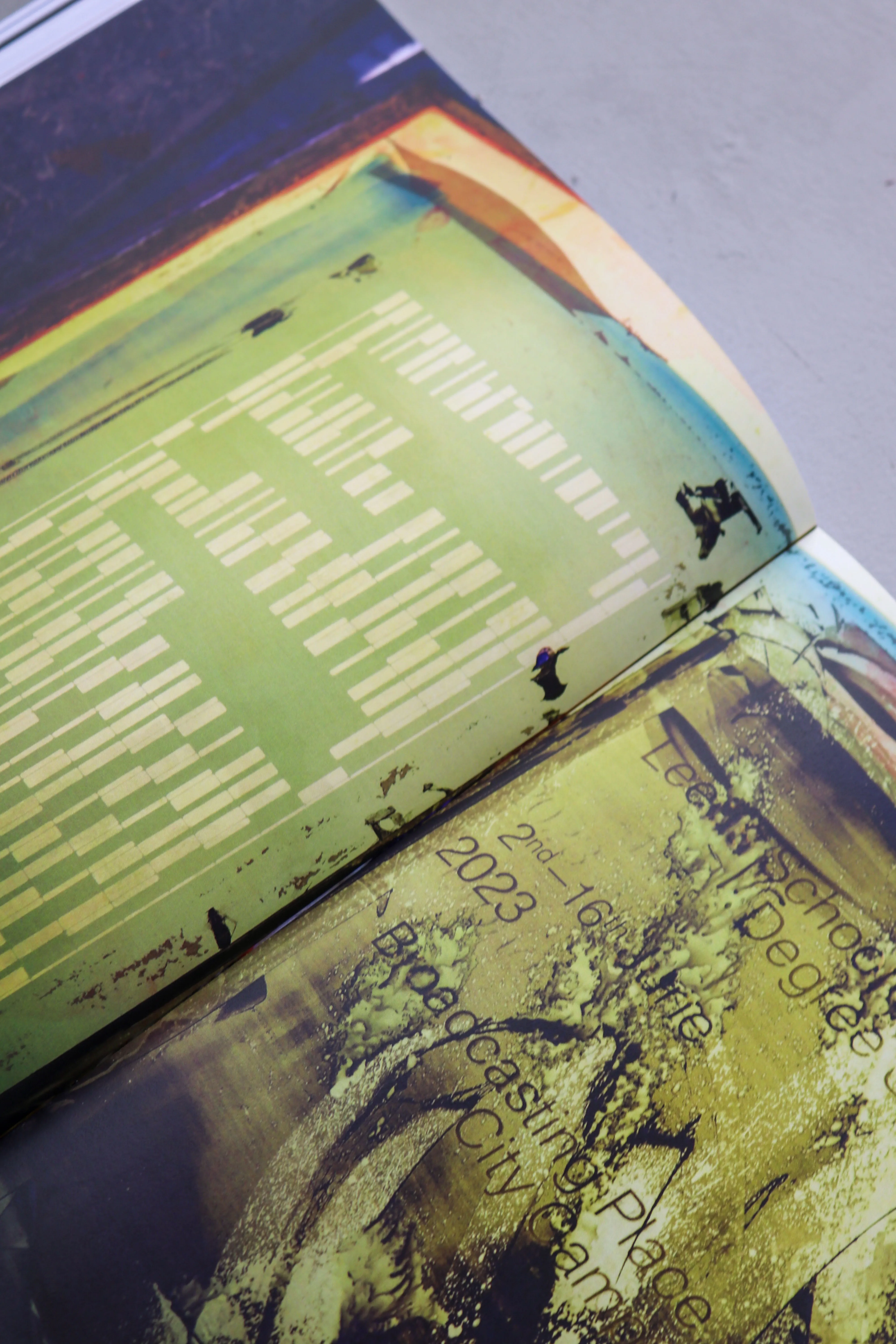
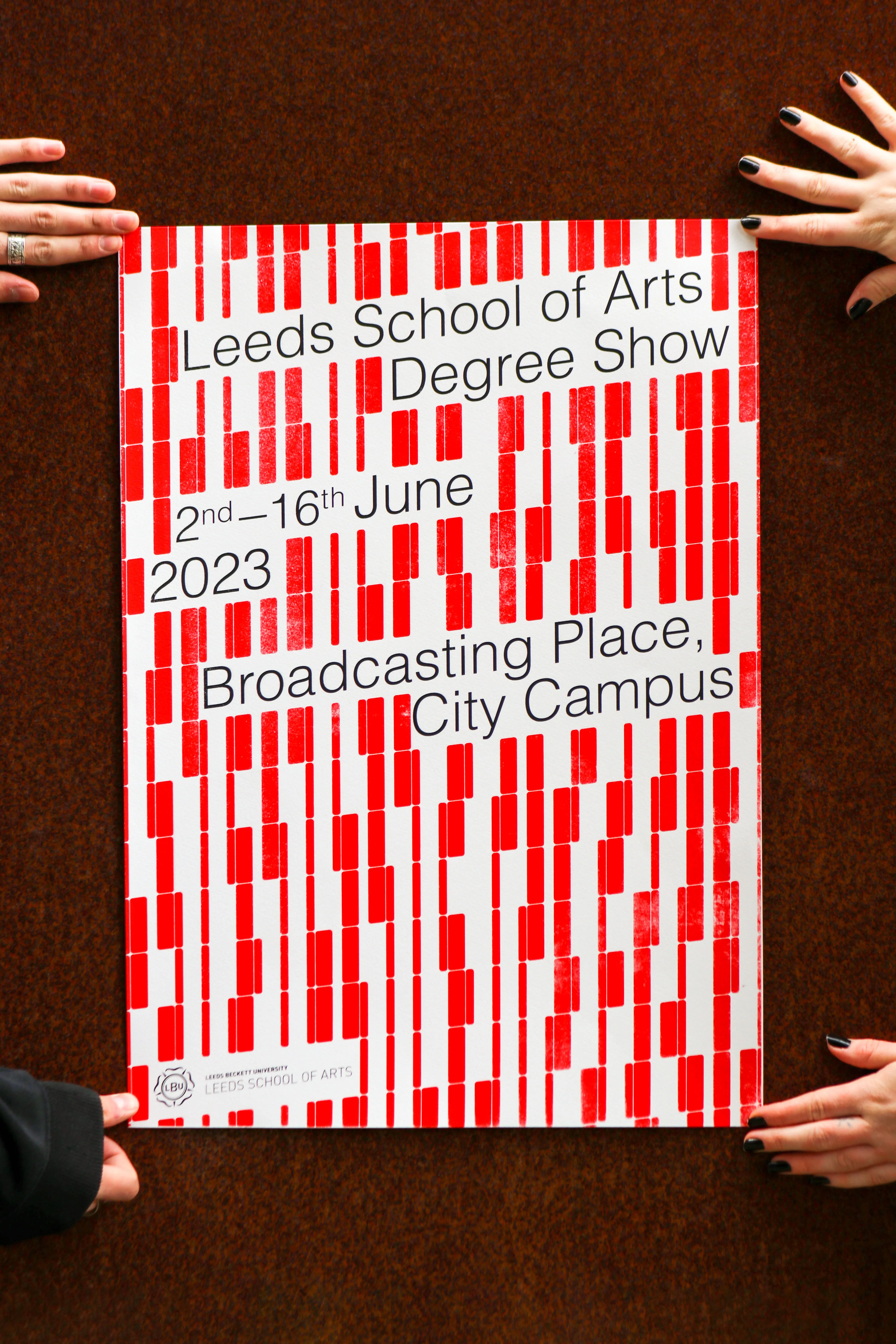
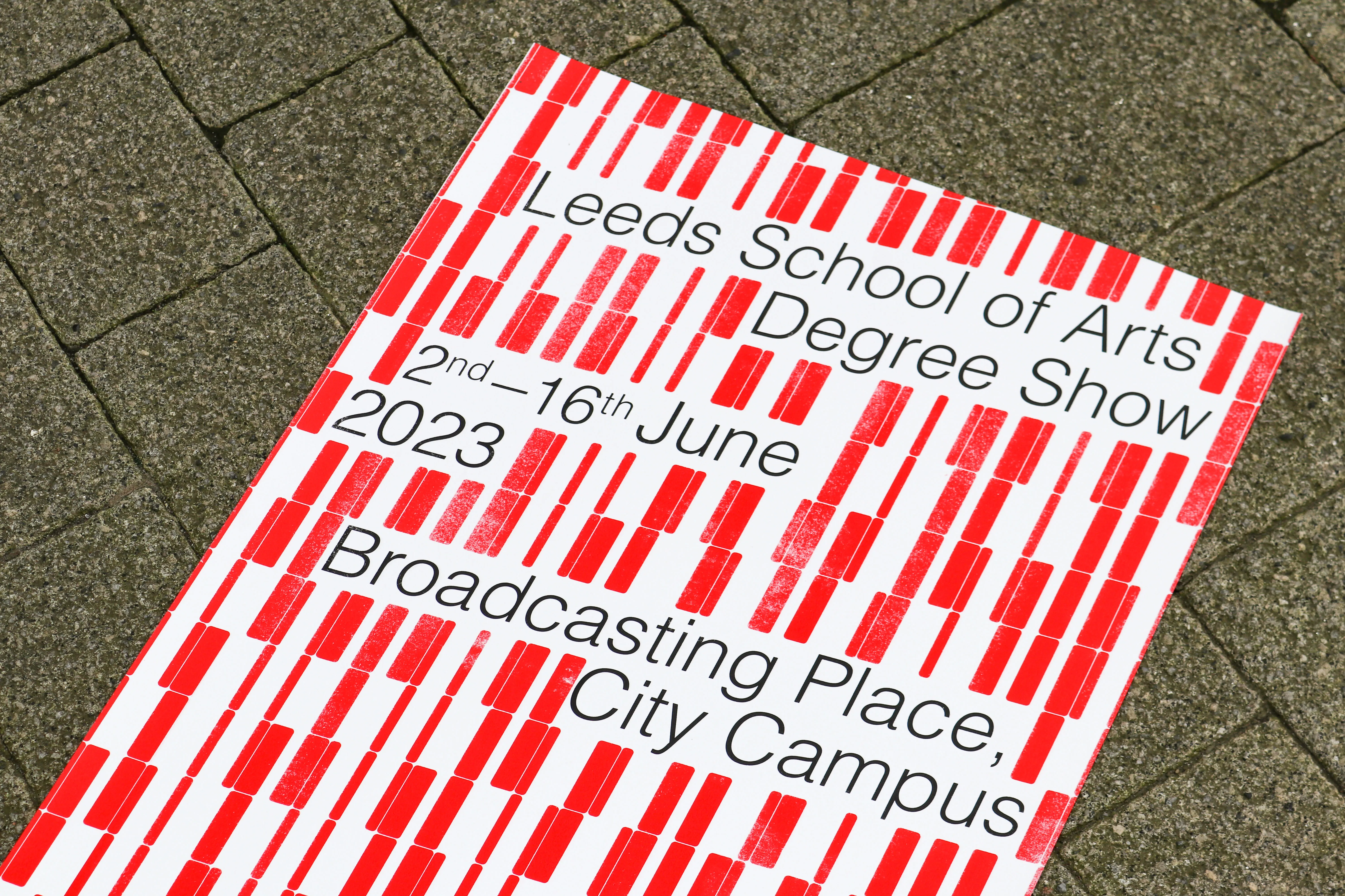
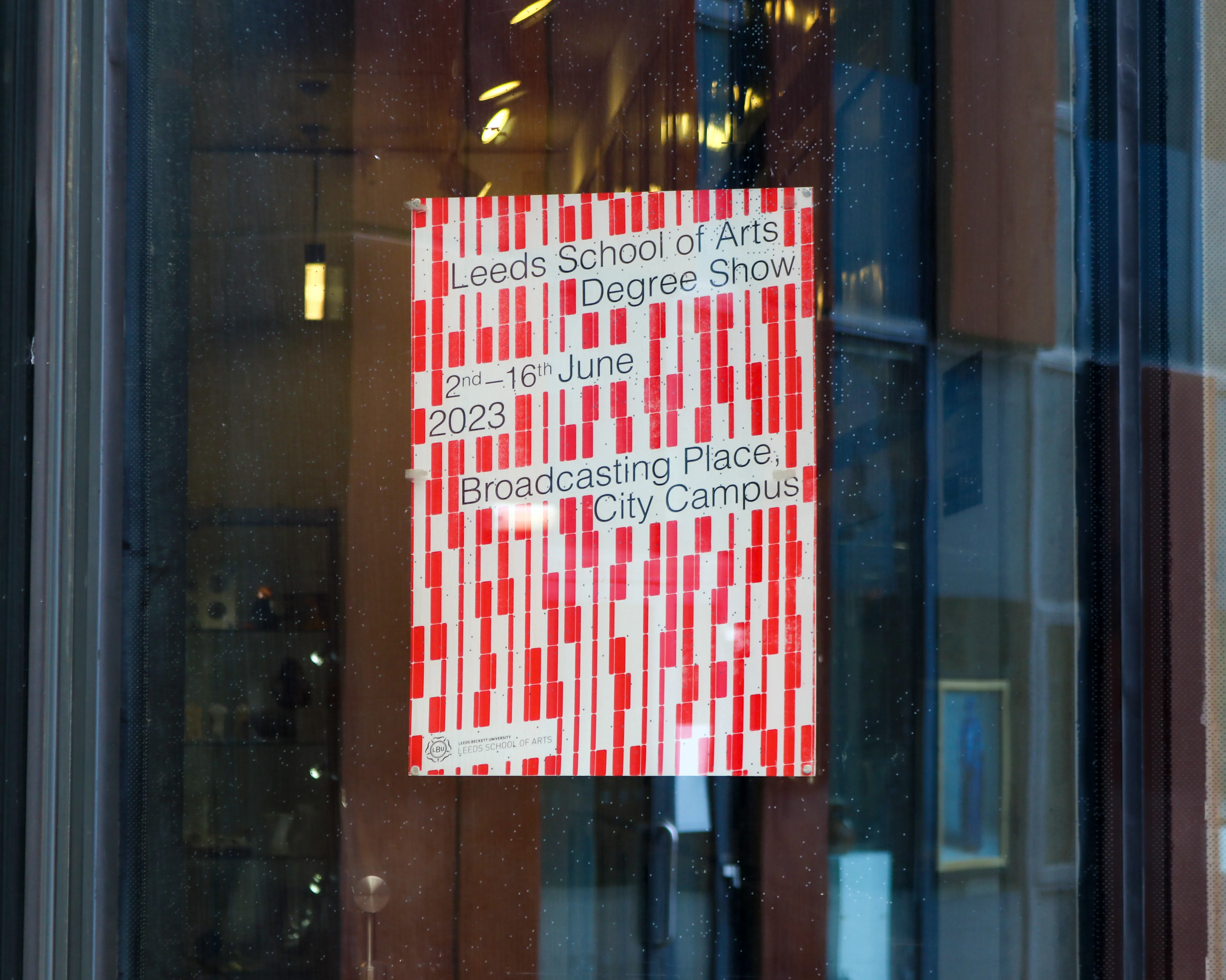
Designed by the architects at Feilden Clegg Bradley, Broadcasting place is home to the Leeds School of Arts.
During research, I discovered that much of the facing of Broadcasting Place was designed using a computer algorithm which FCB designed specifically for this project. This algorithm chose where or where not to place windows on each of the sides of the building based on light data collected by the architects.
I noticed the seemingly 'random' pattern of windows and knew there had to be a story behind them, more specifically, as a designer he knew there was an avenue to explore.
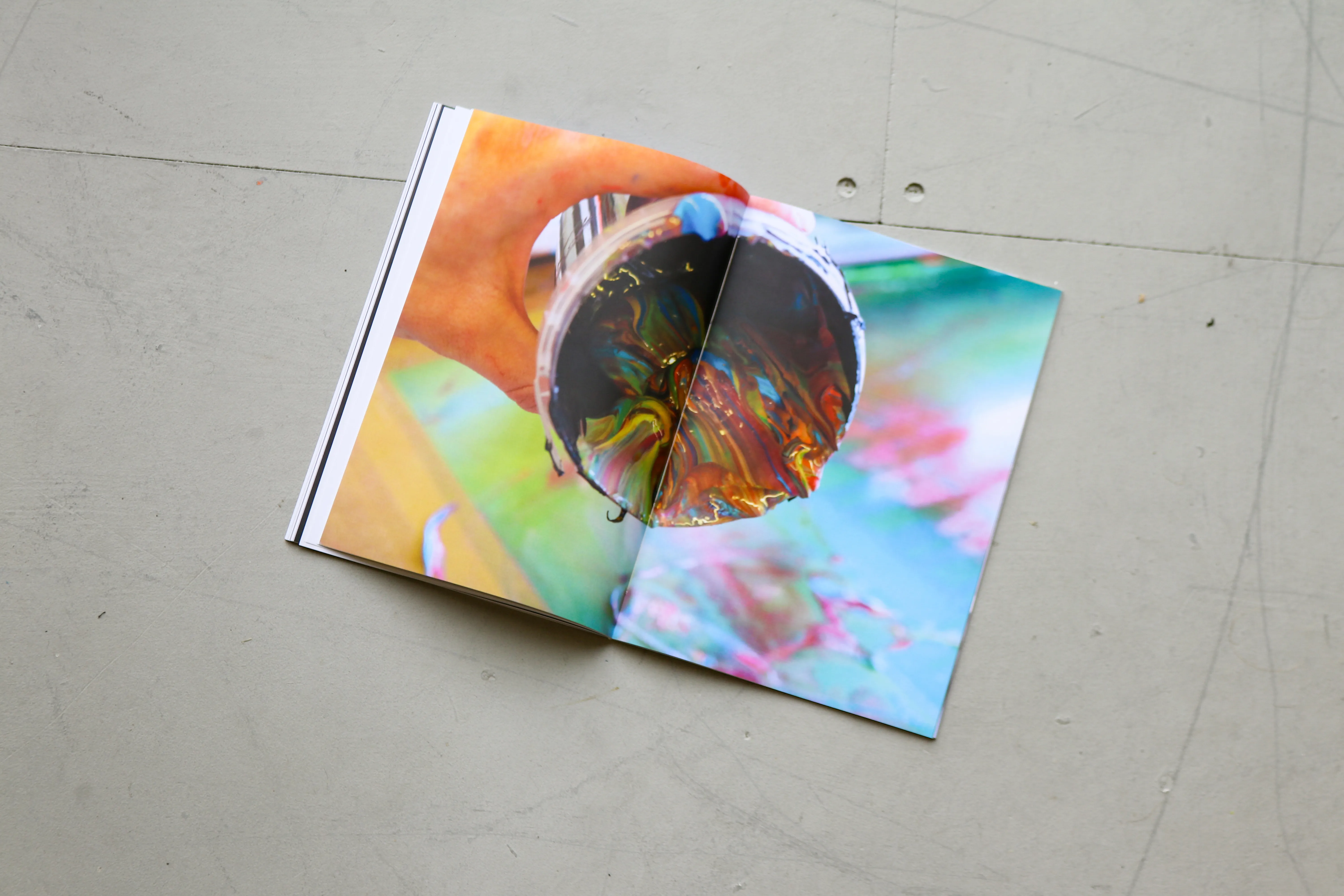
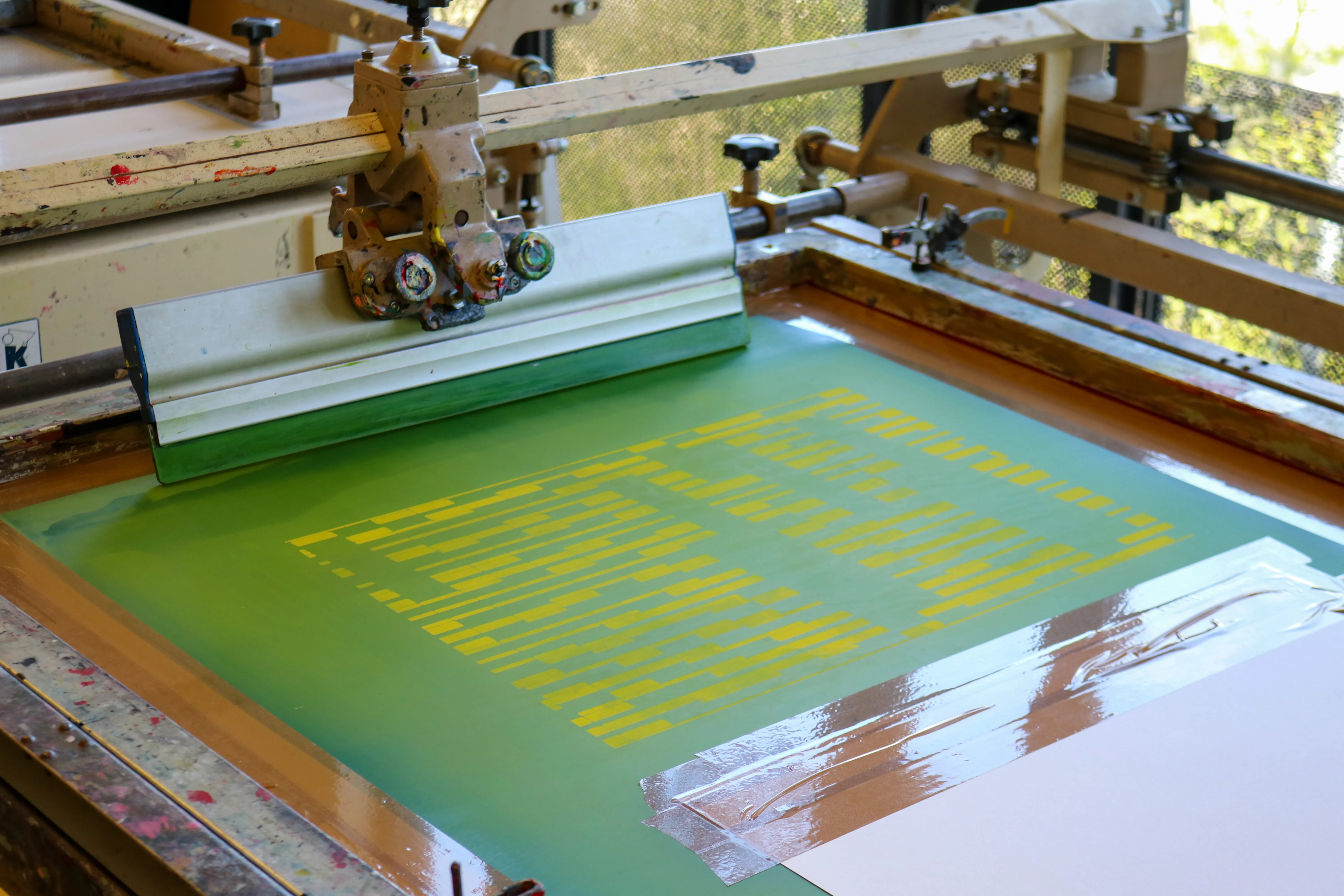
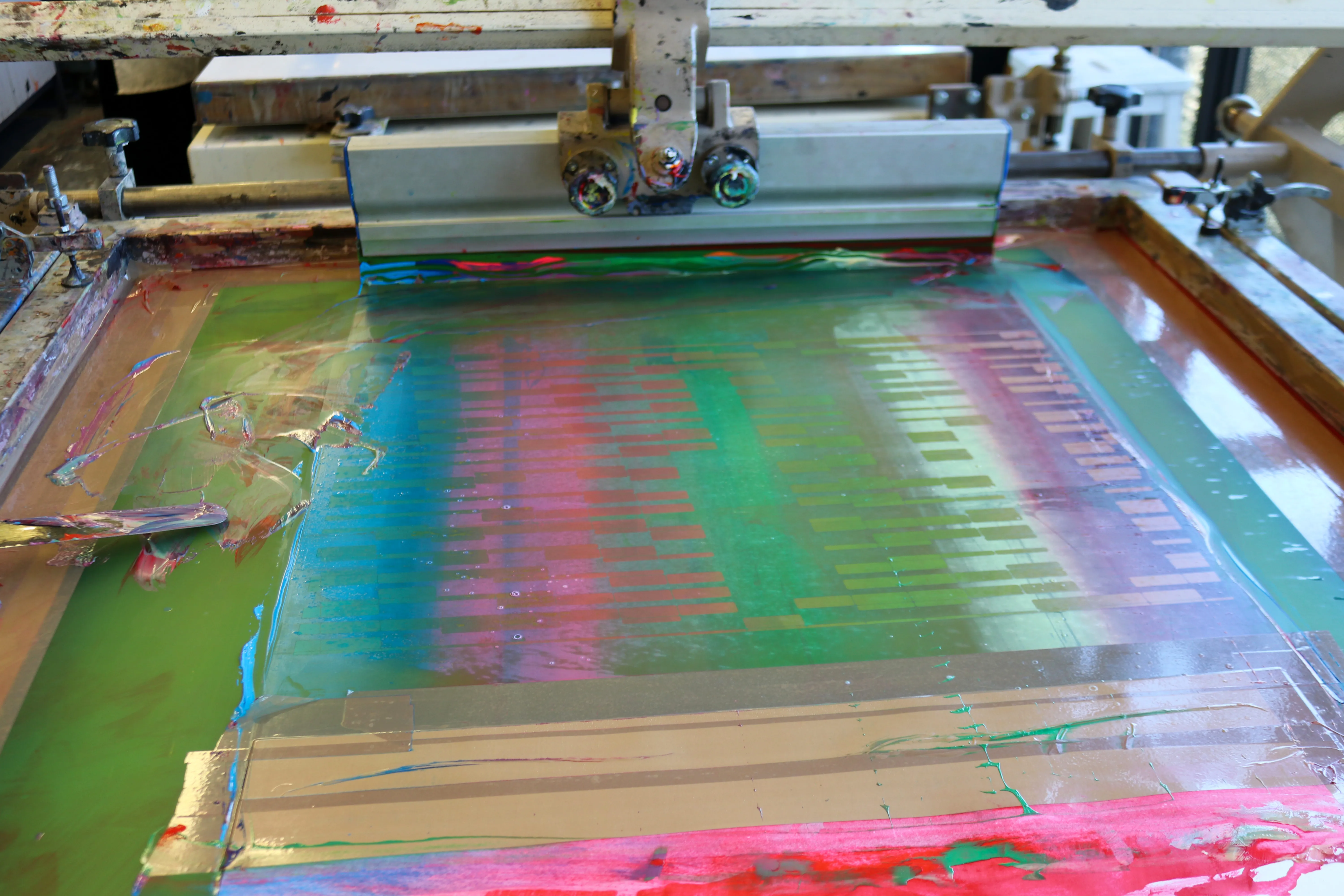
Abstracting the pattern, I went on to create promotional material, in print and digital, even animating the design. Later creating silkscreens to use for printing, allowing for more experimentation with colour and texture.
Inspired by my love for the building and the people within.
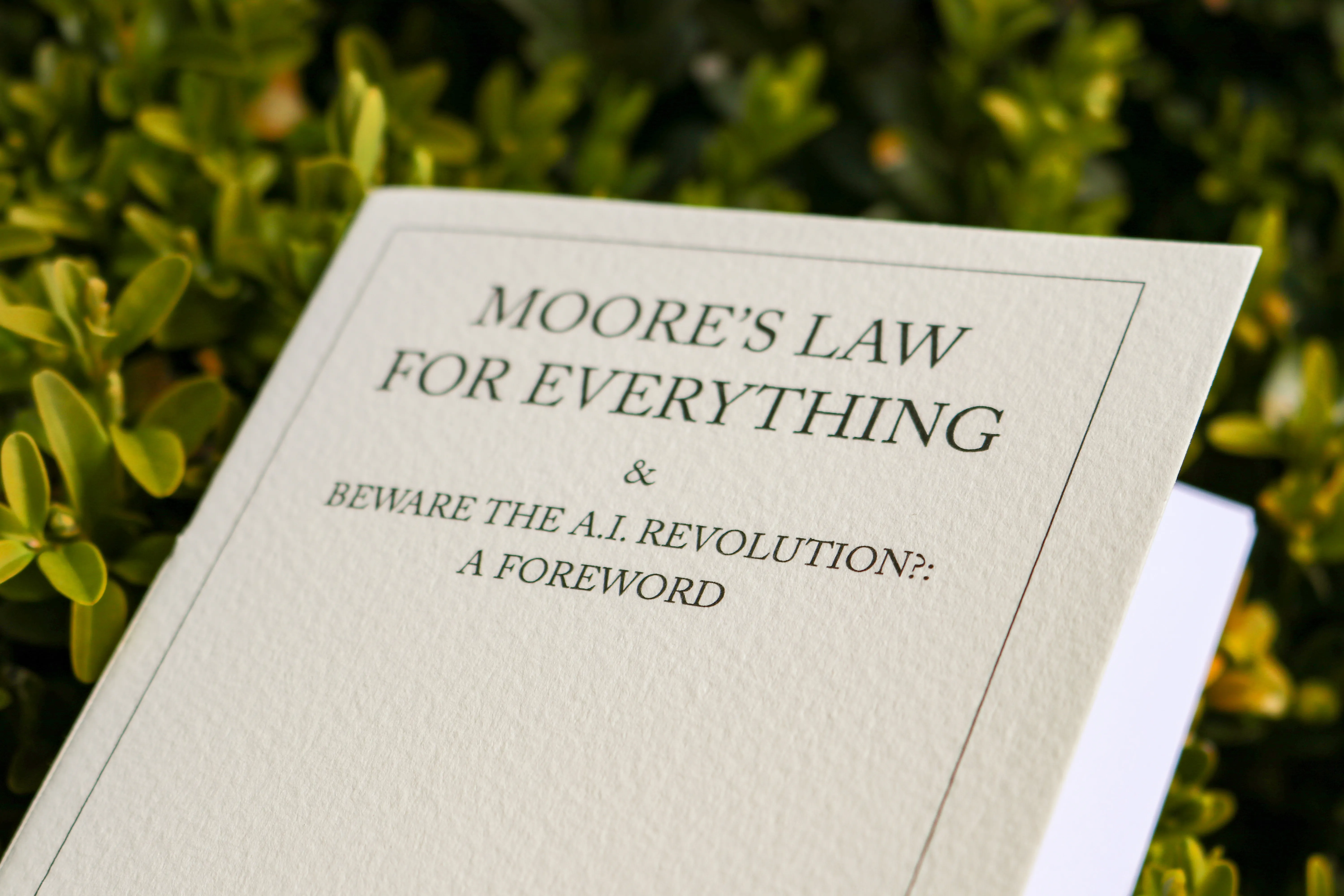
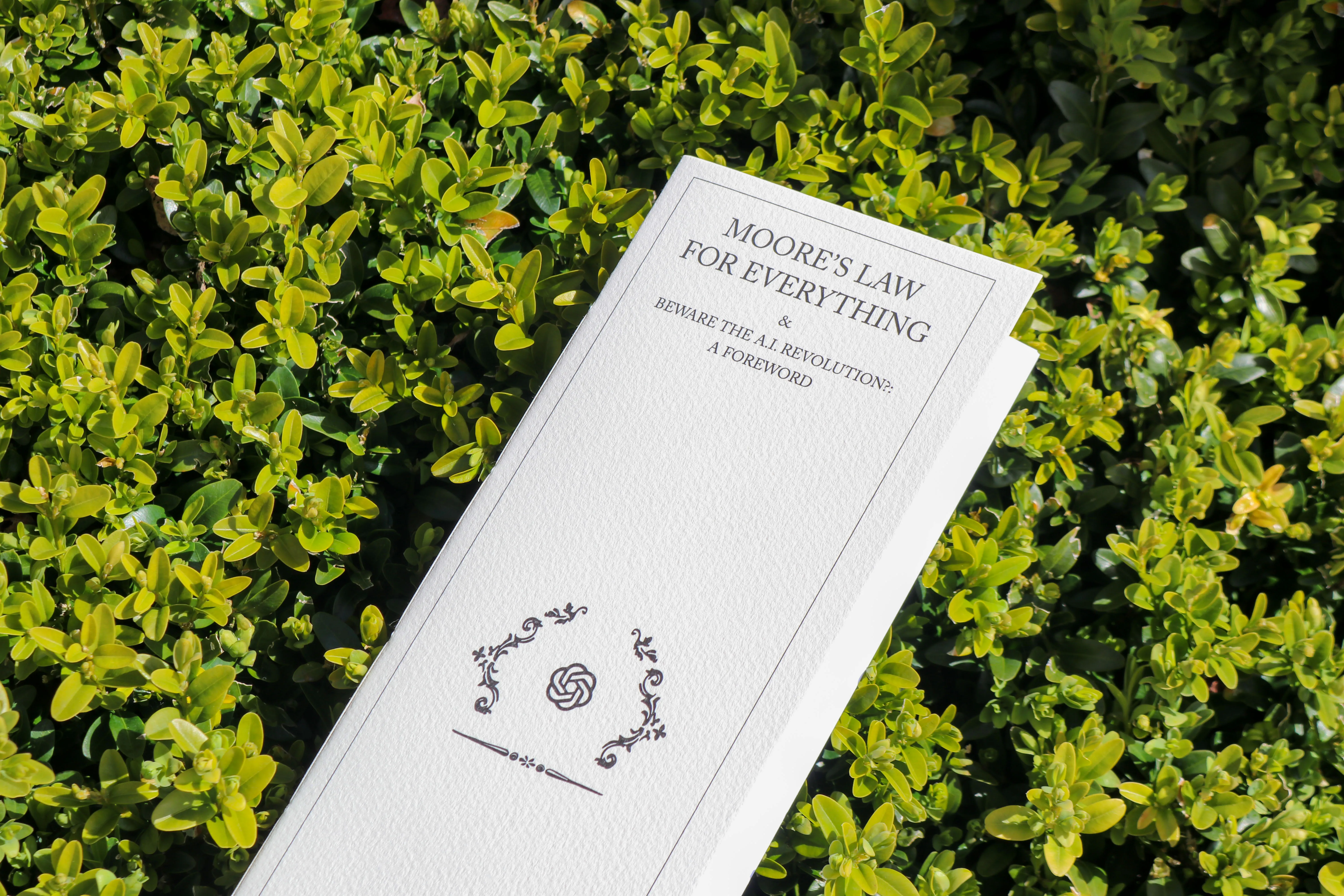
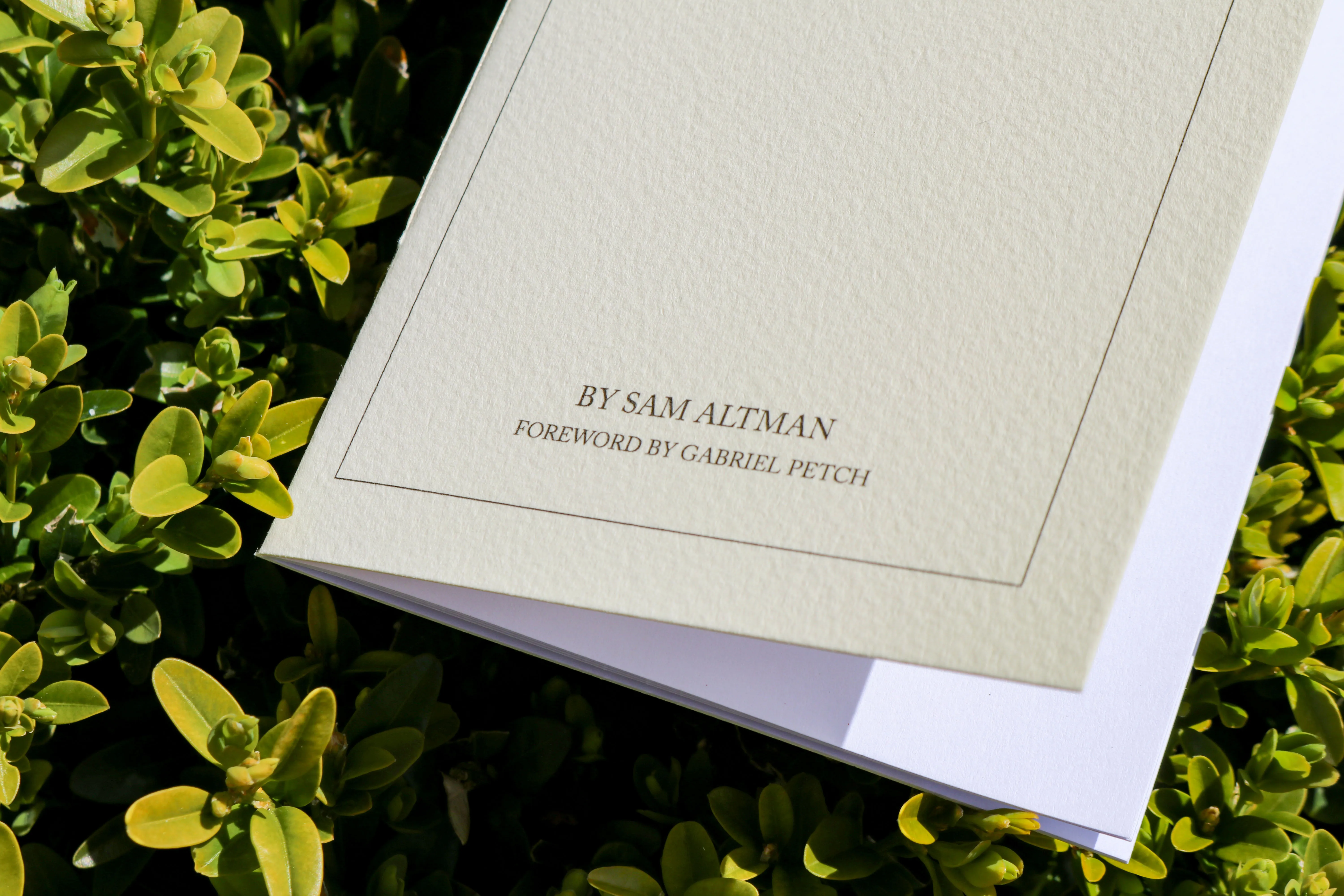
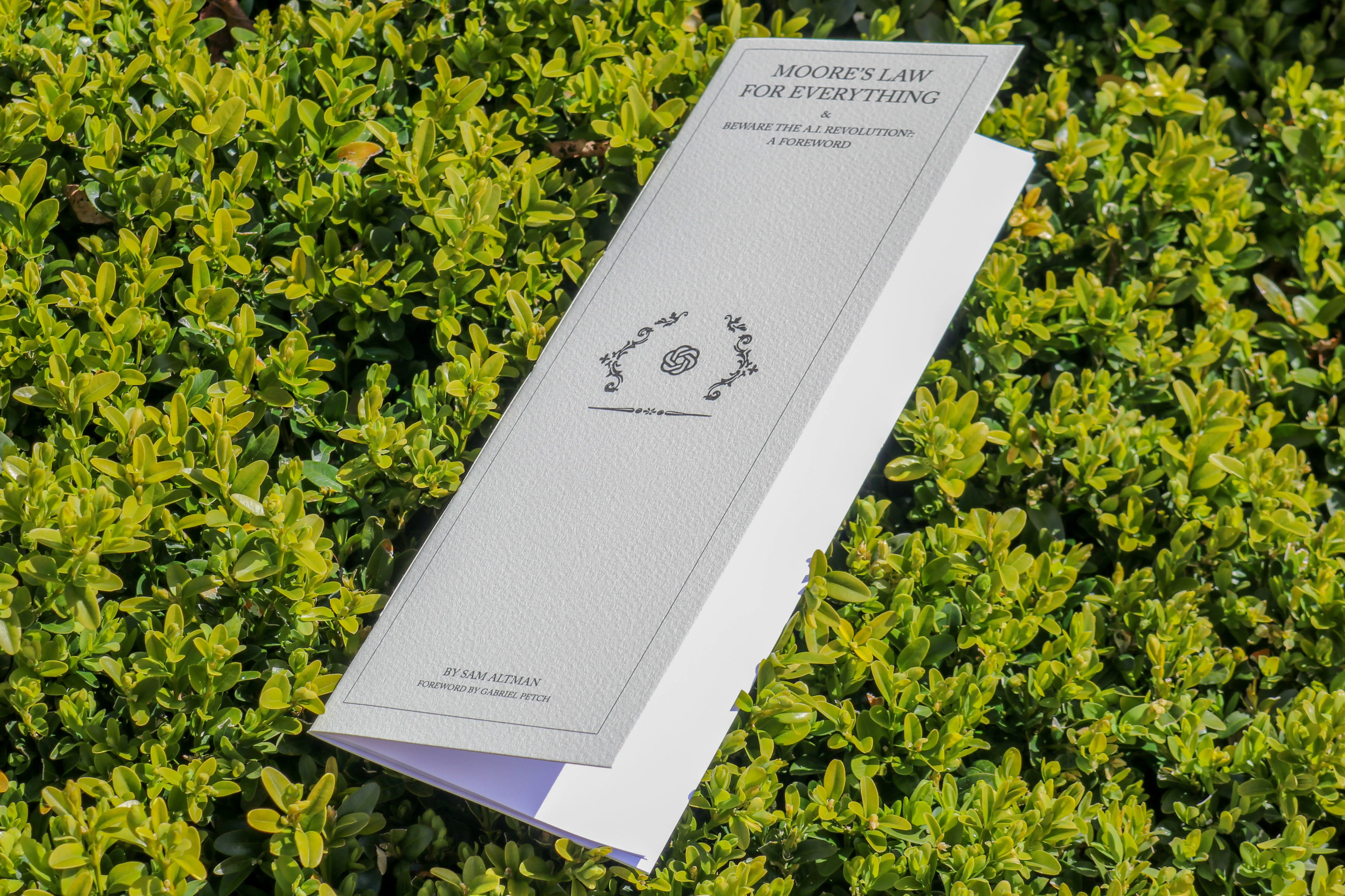
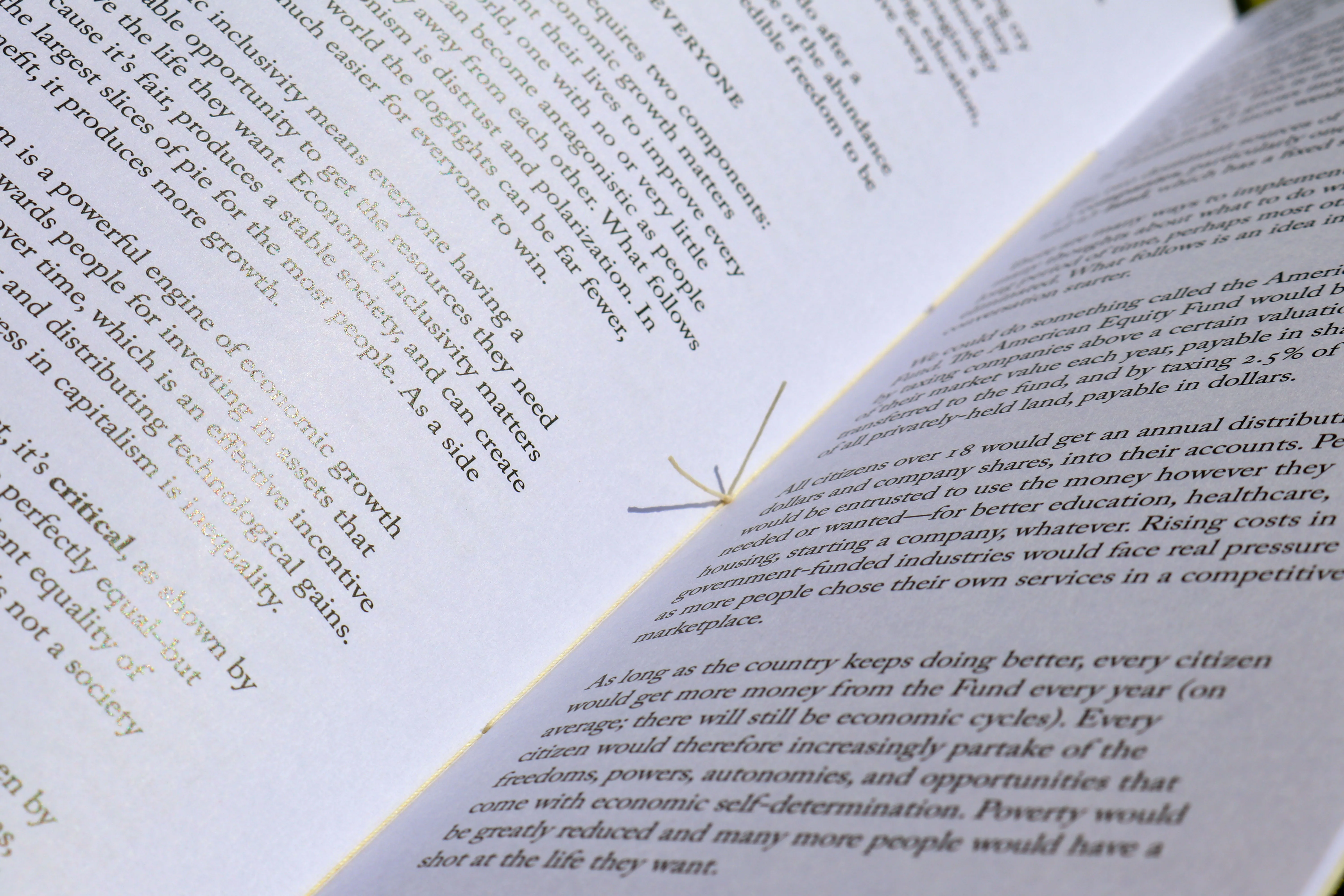
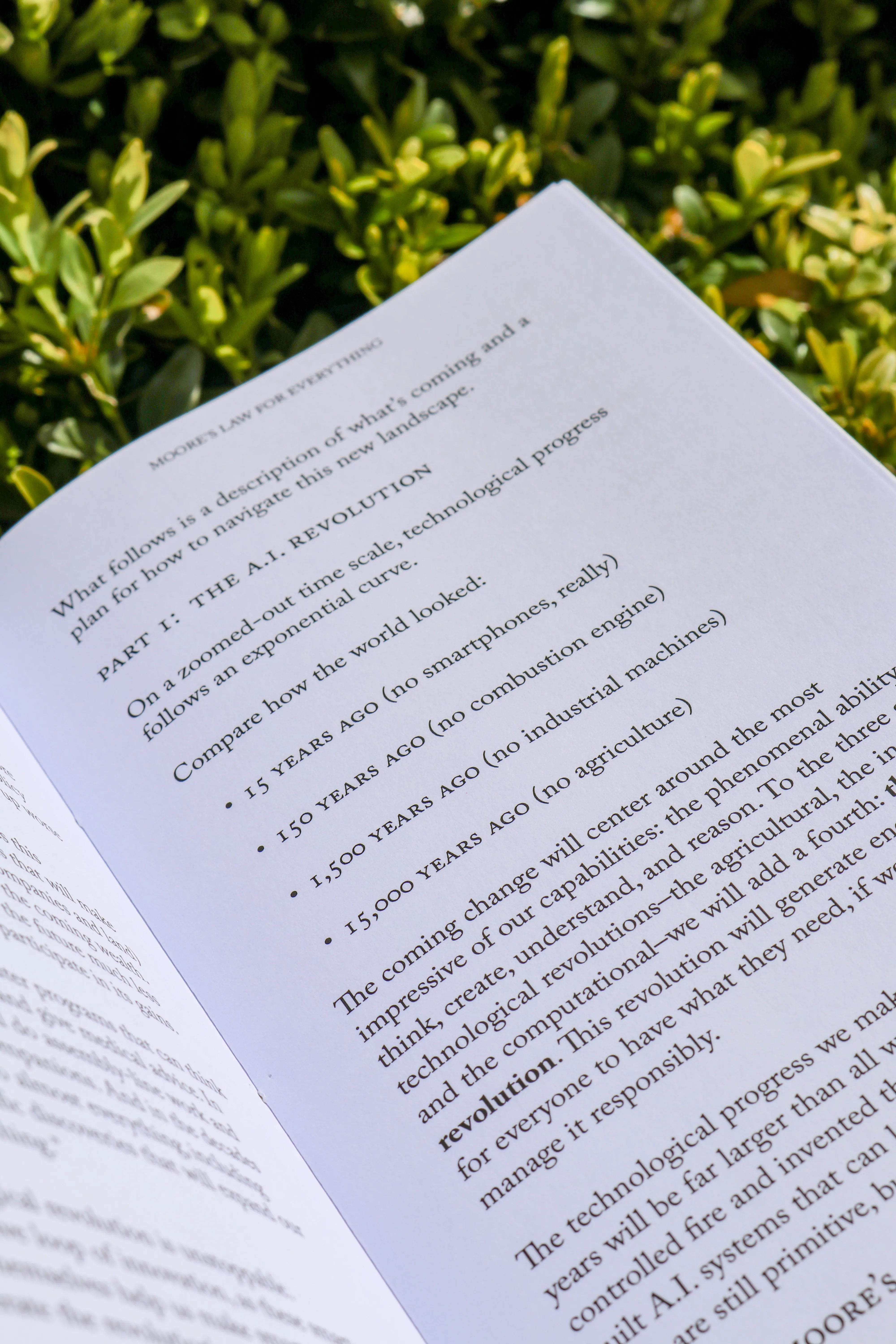
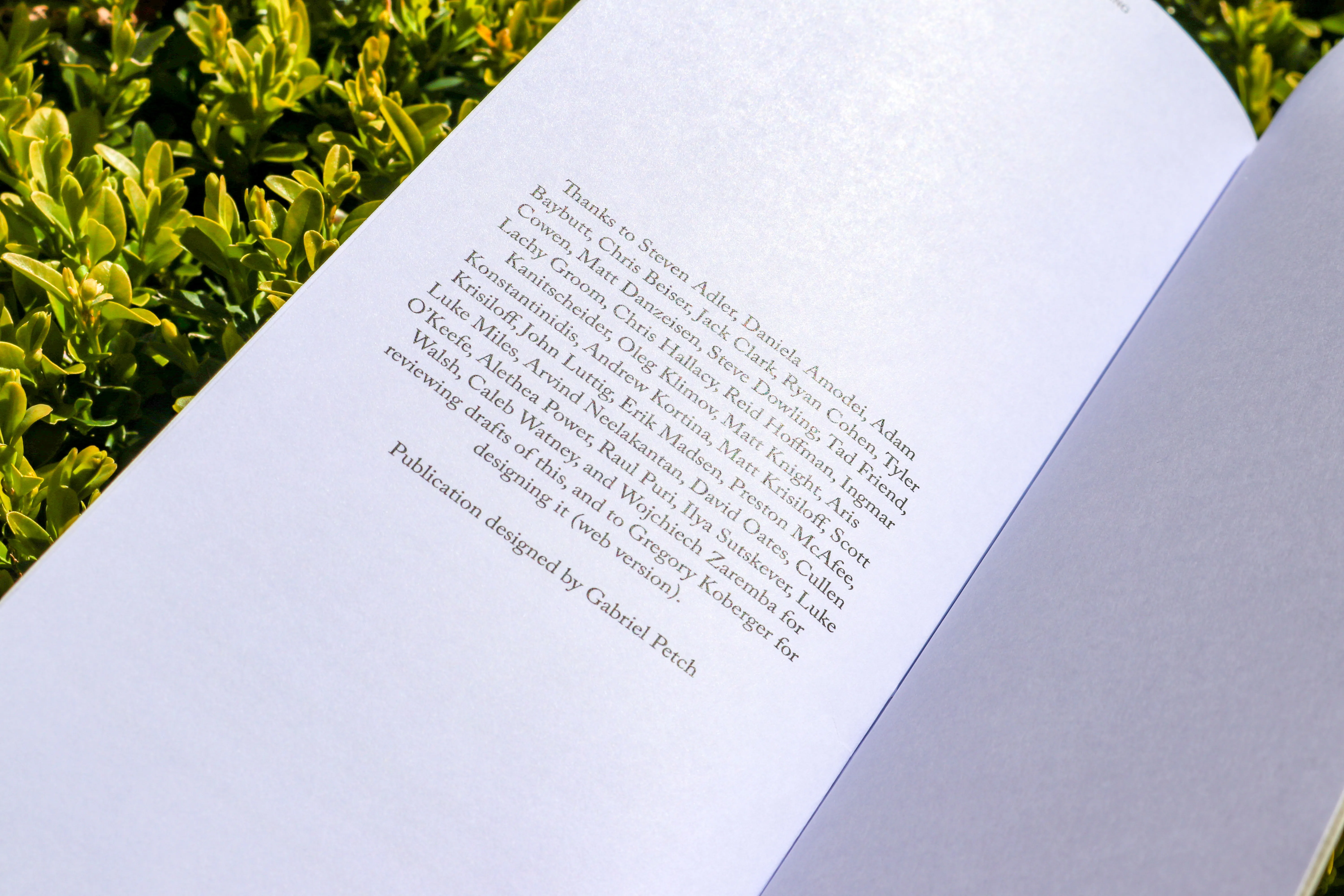
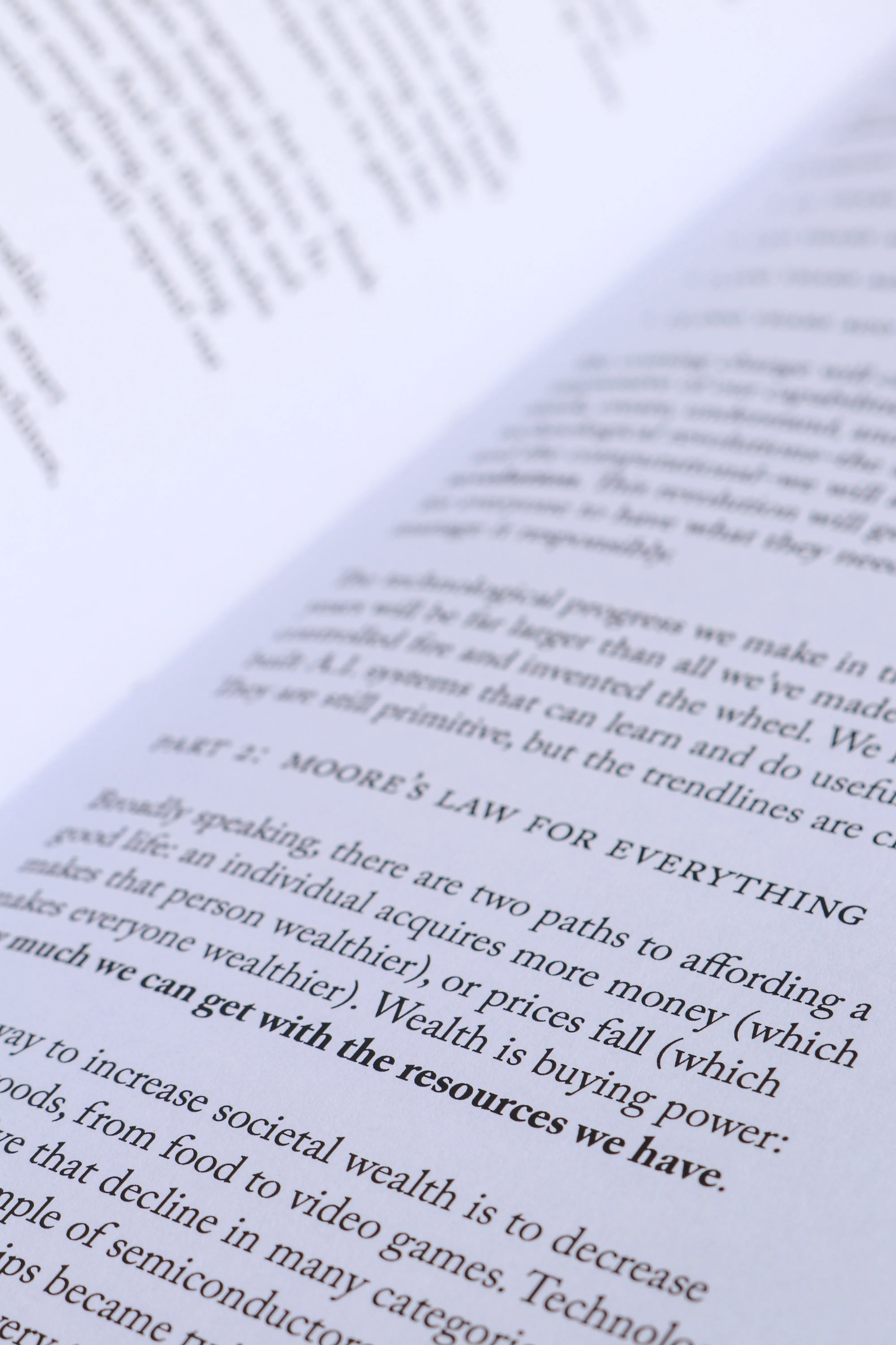
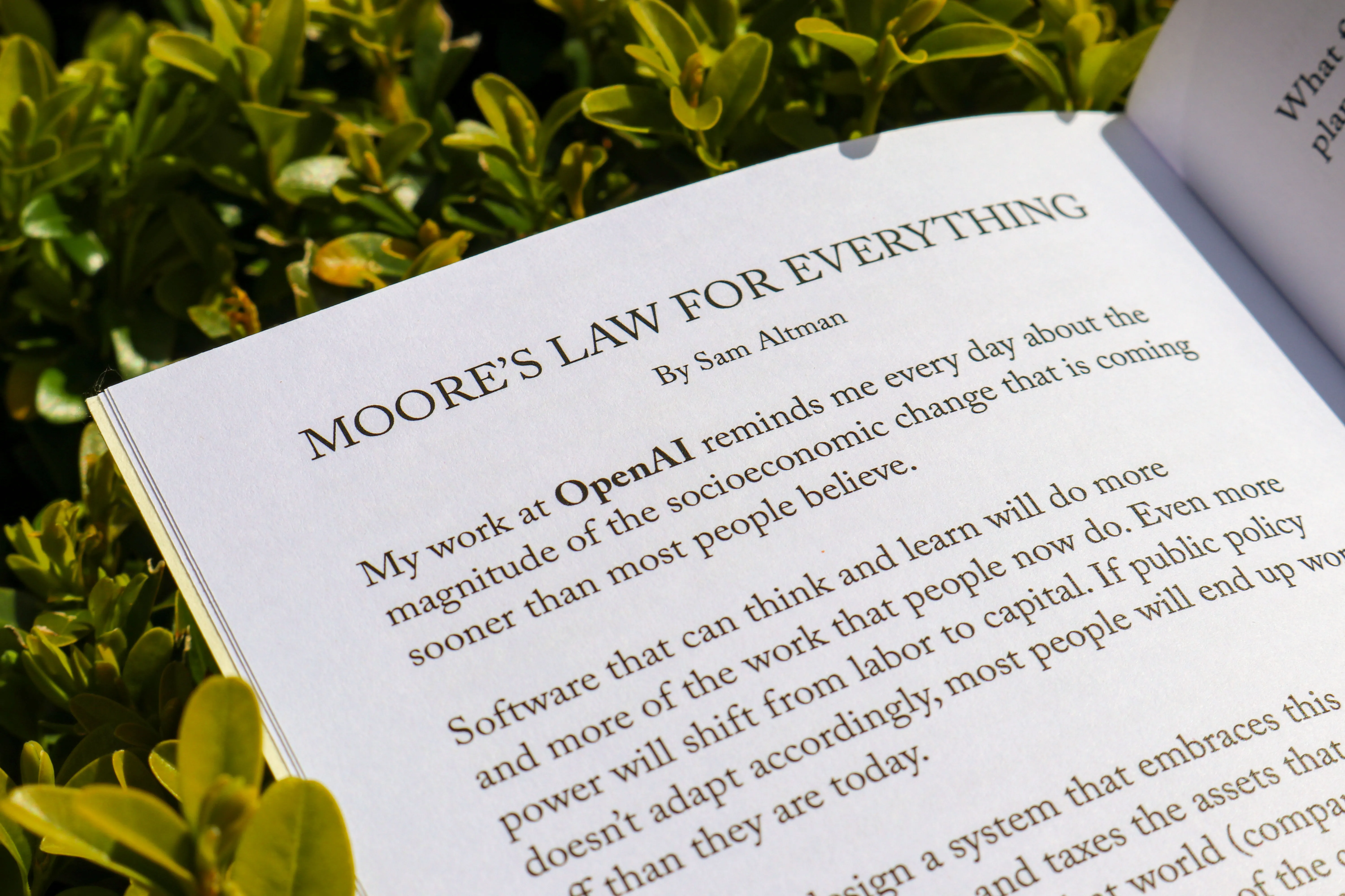
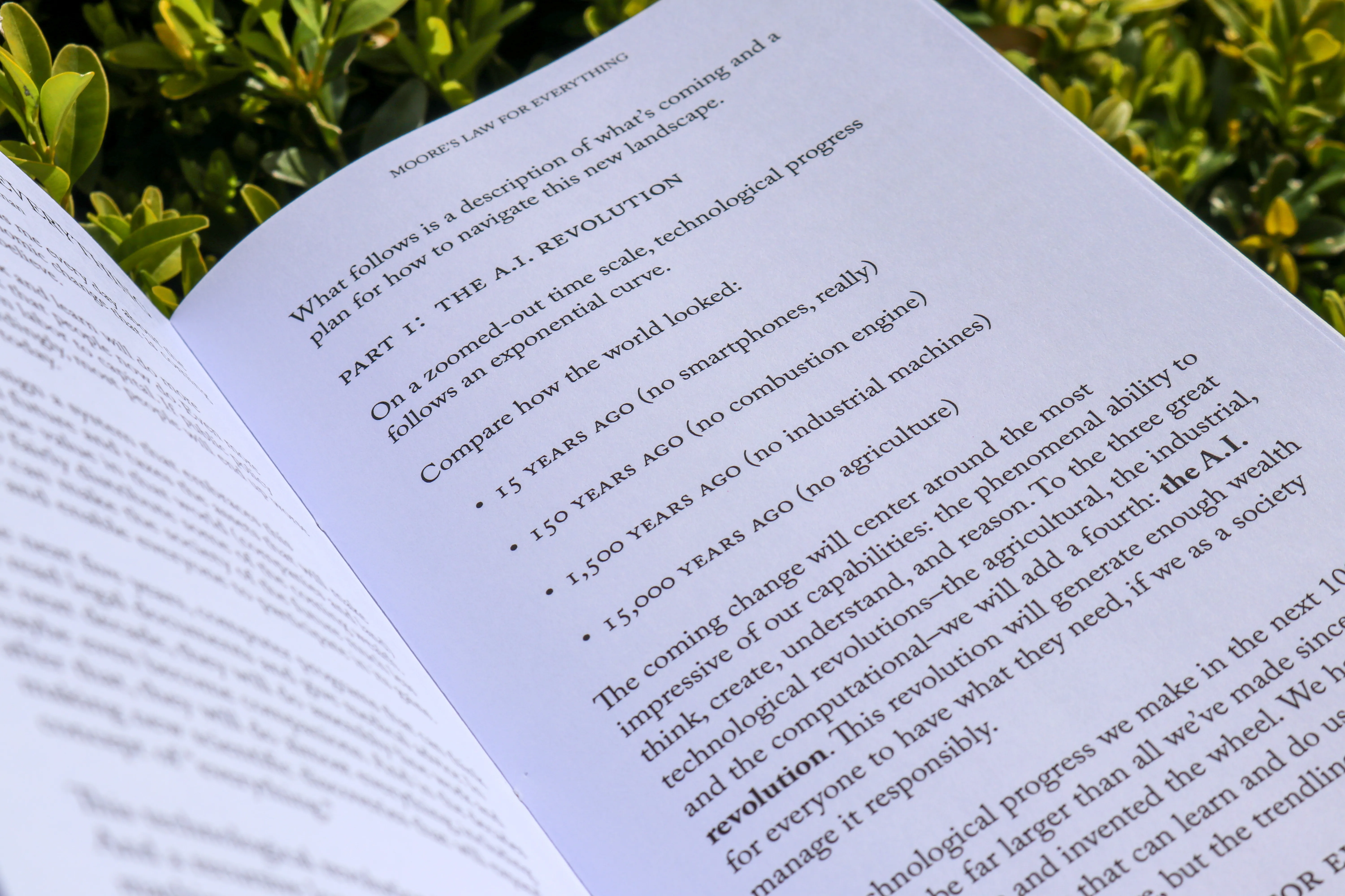
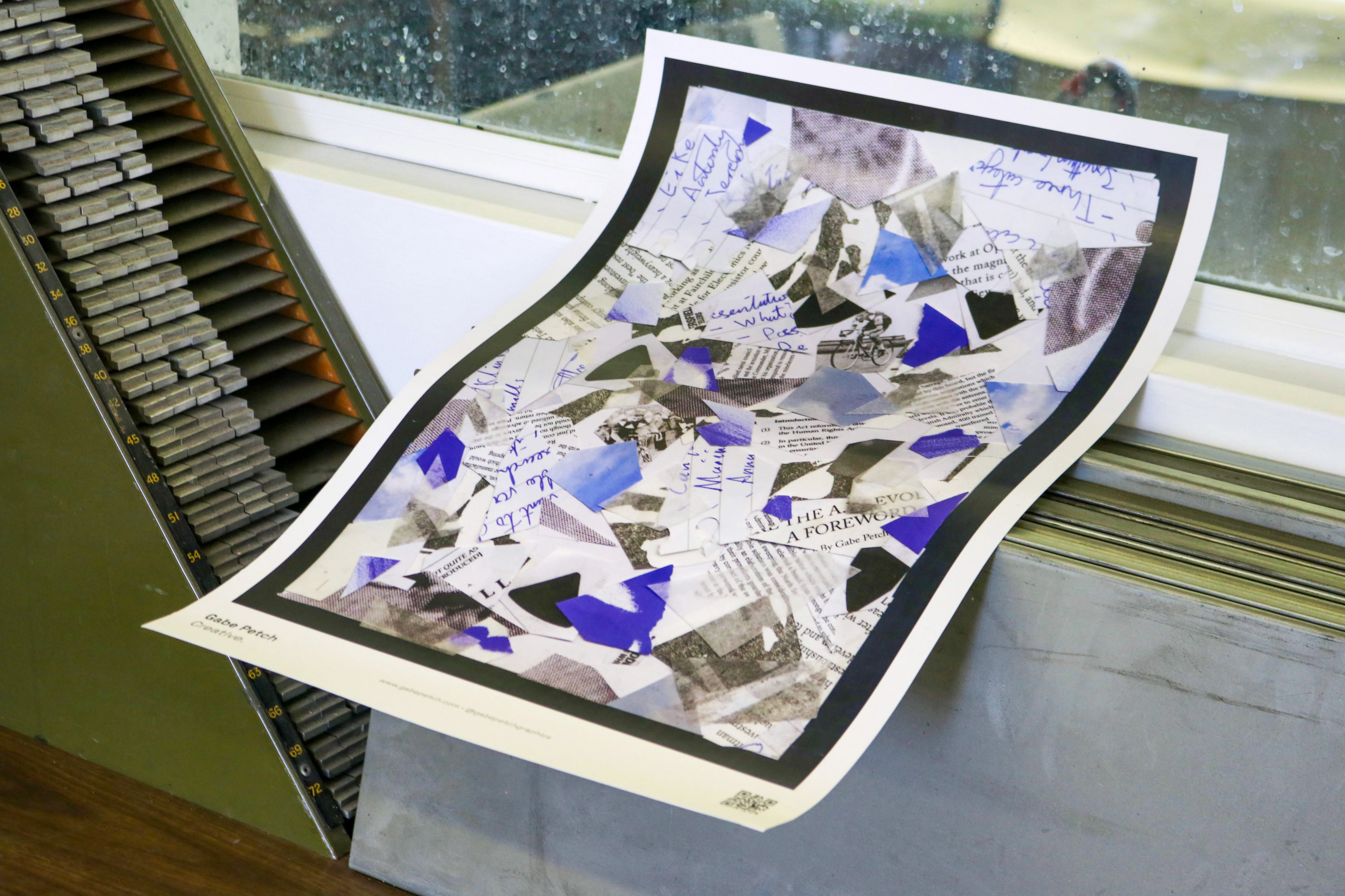
In 2021, OpenAI CEO Sam Altman wrote an article discussing what he predicts to be the massive economic and societal changes due to AI along with what we need to do to avoid disaster.
I wrote a foreword investigating Sam Altman and his claims, alongside how he sits within the US economic and political spheres.
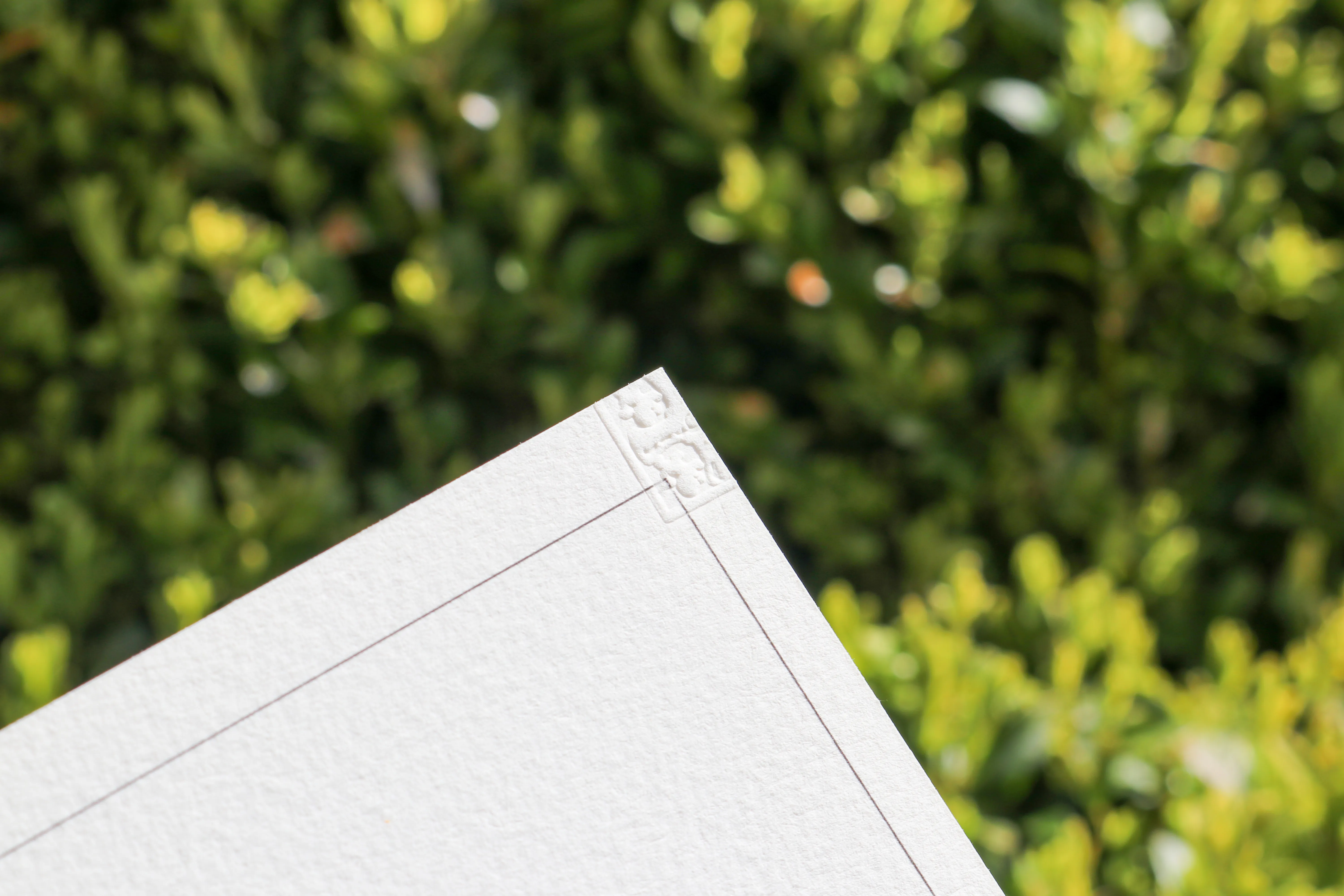
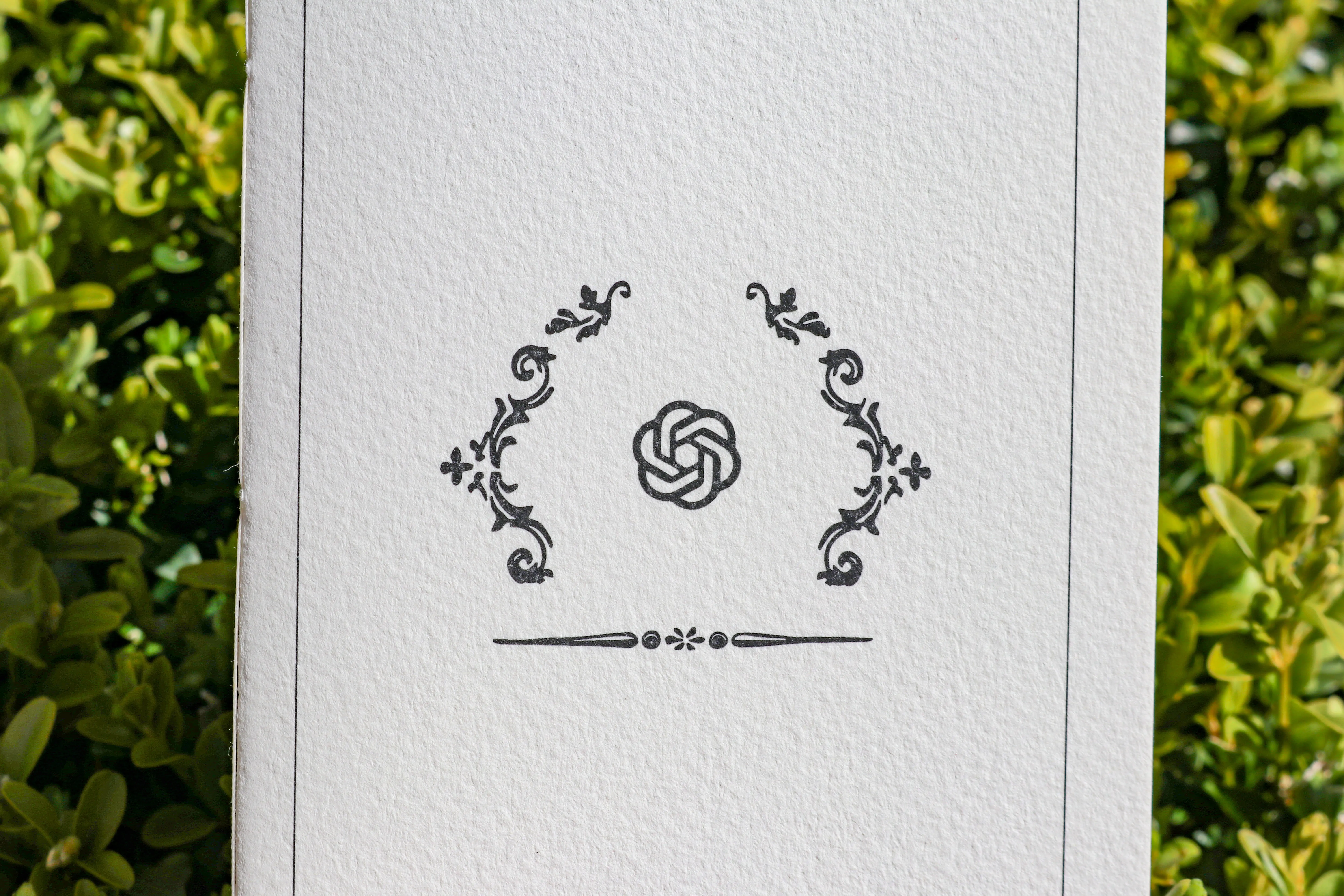
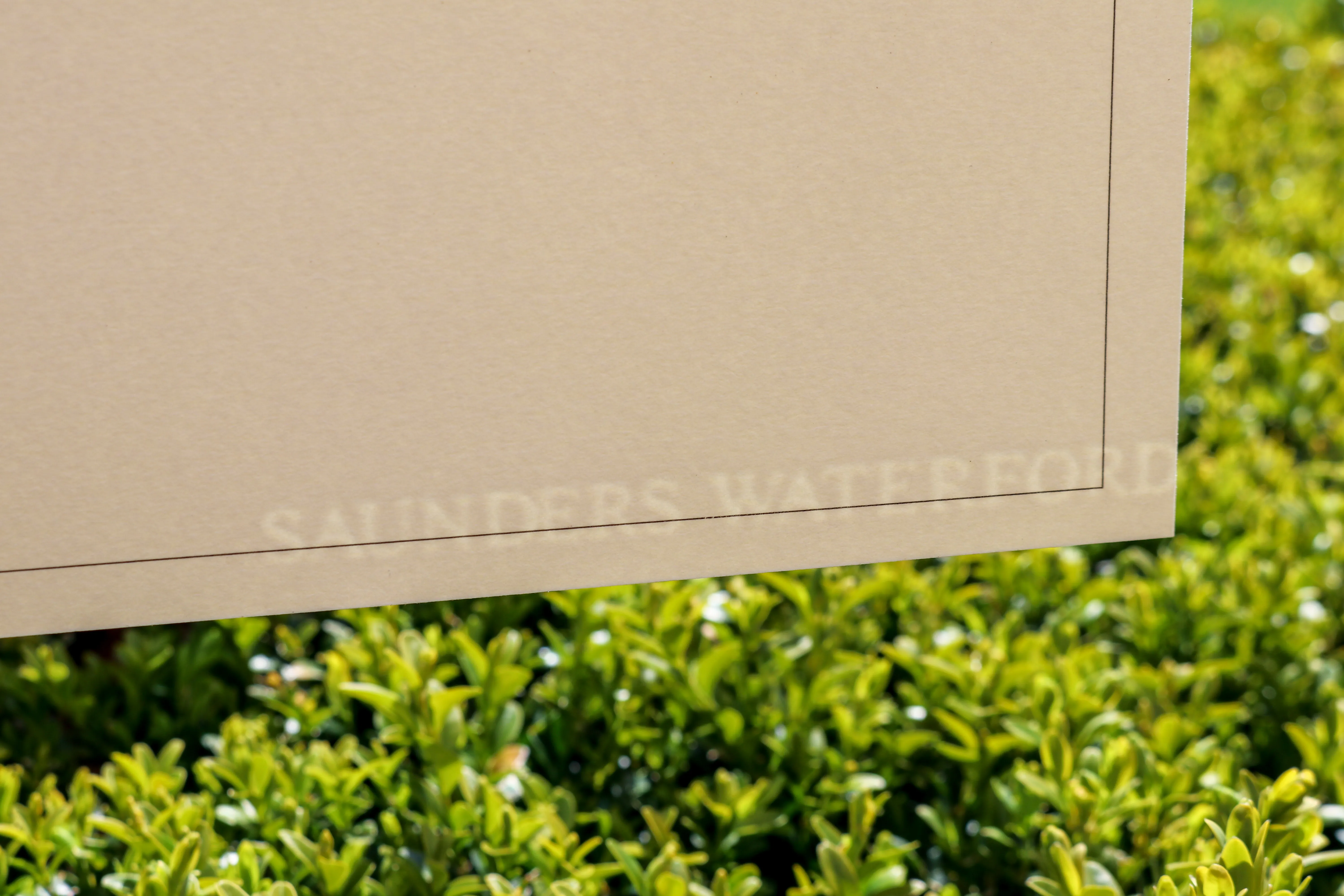
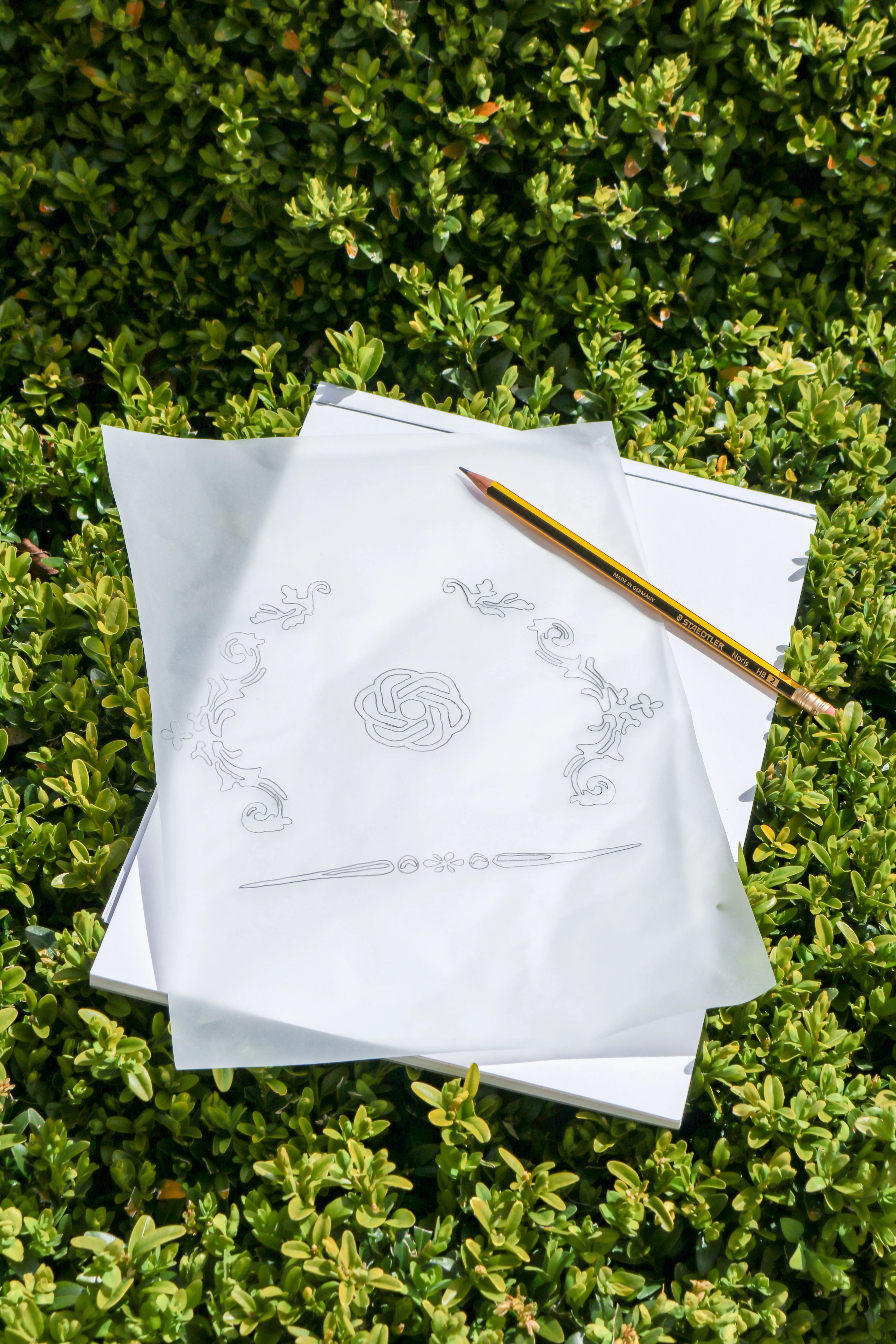
Bound in Saunders Waterford 100% cotton paper, I wanted to maintian the Saunders Waterford watermark and embossed logo, so worked hard to crop the paper accordinly for print.
As A.I. development is continued, more and more will the individuals behind the technology be responsible for how it is employed. Will a focus on profits and the bottom line override any larger force for good?
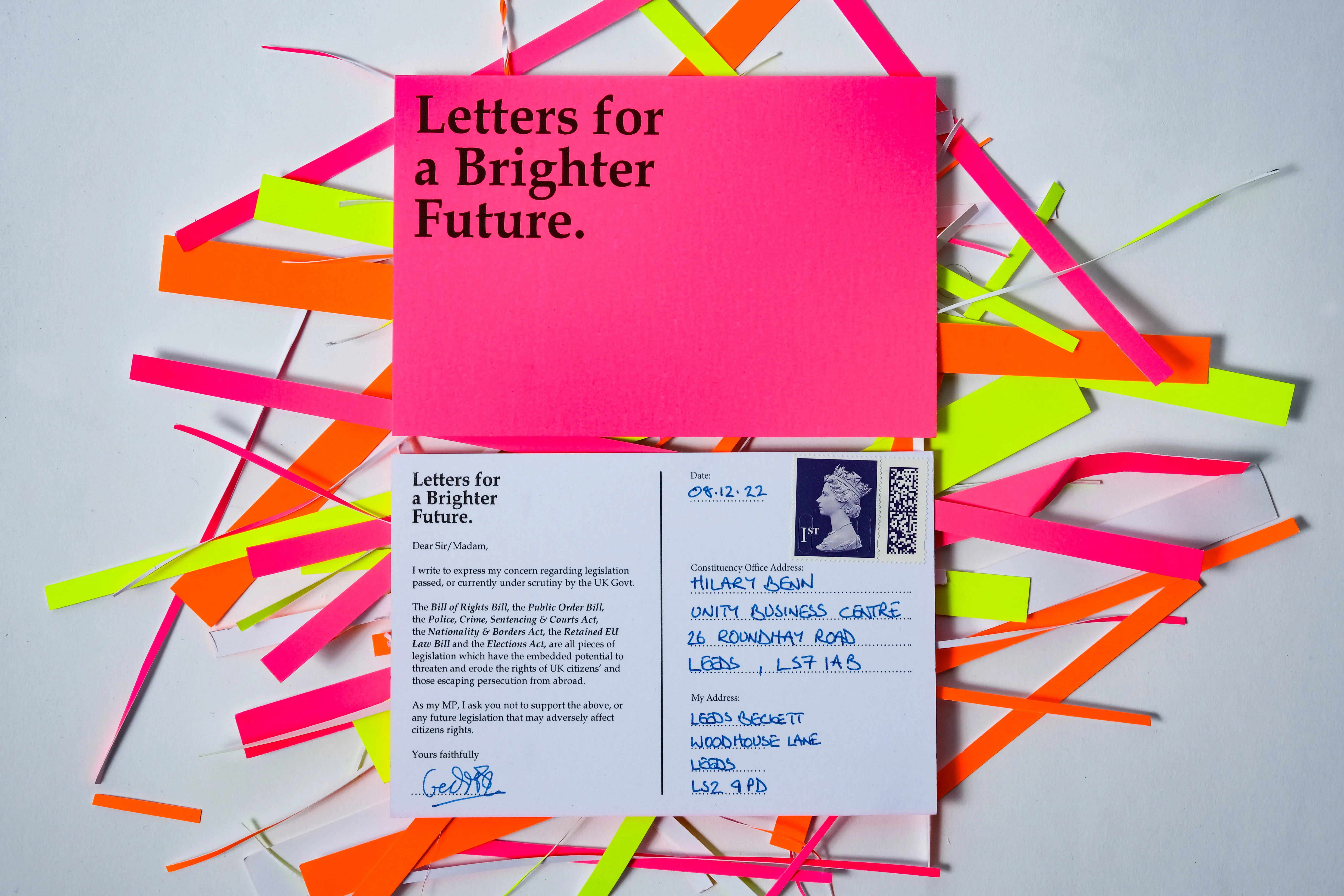
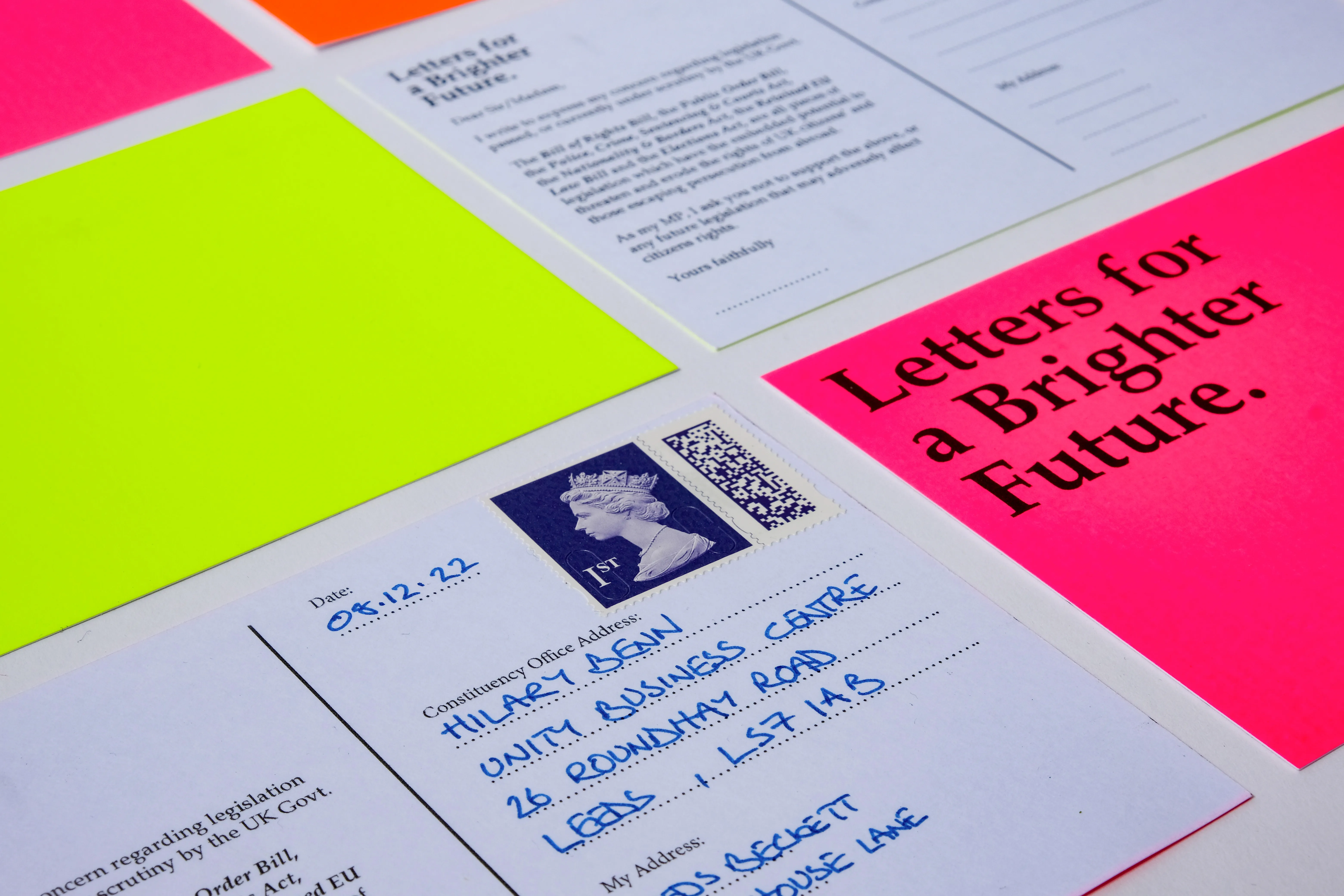
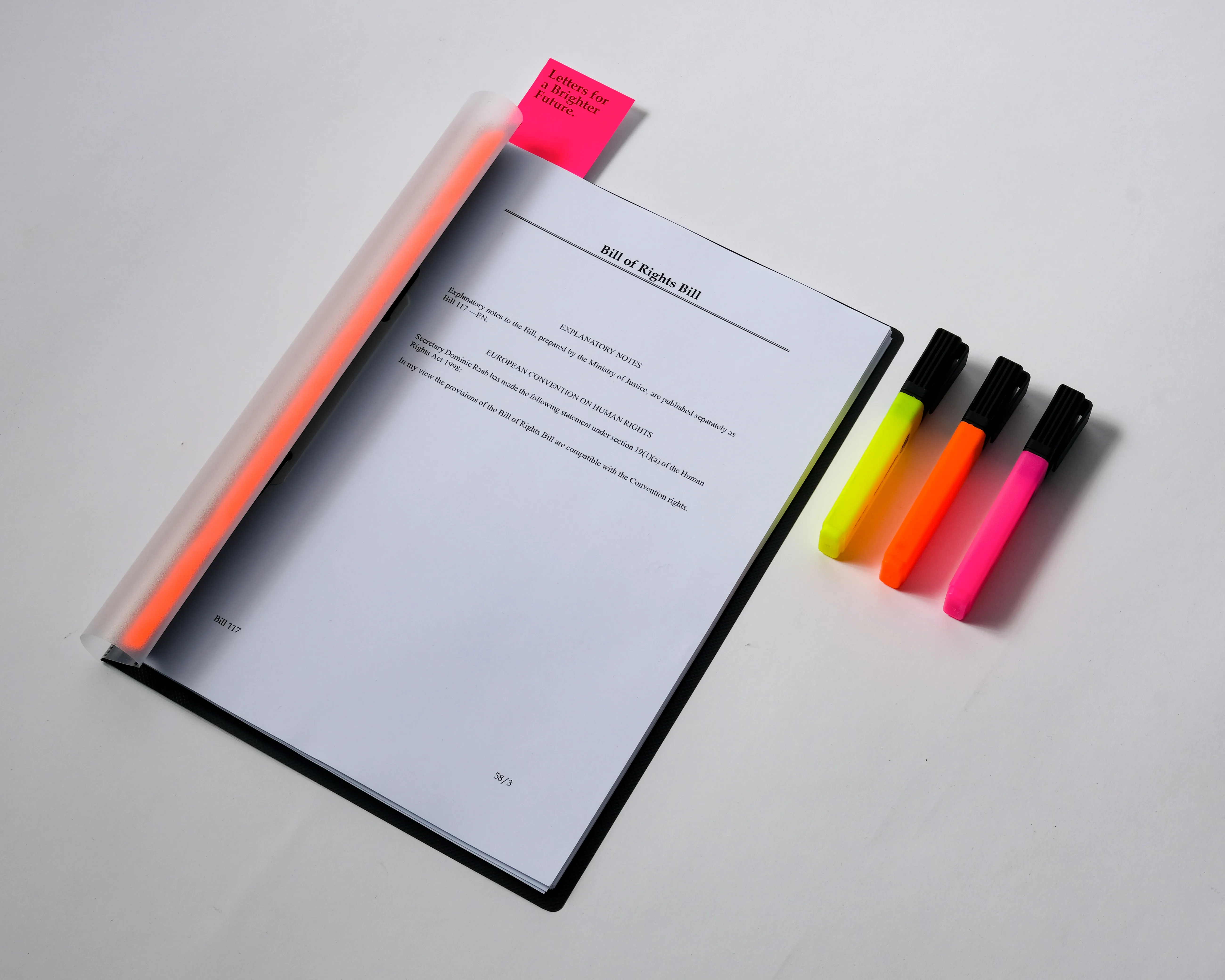
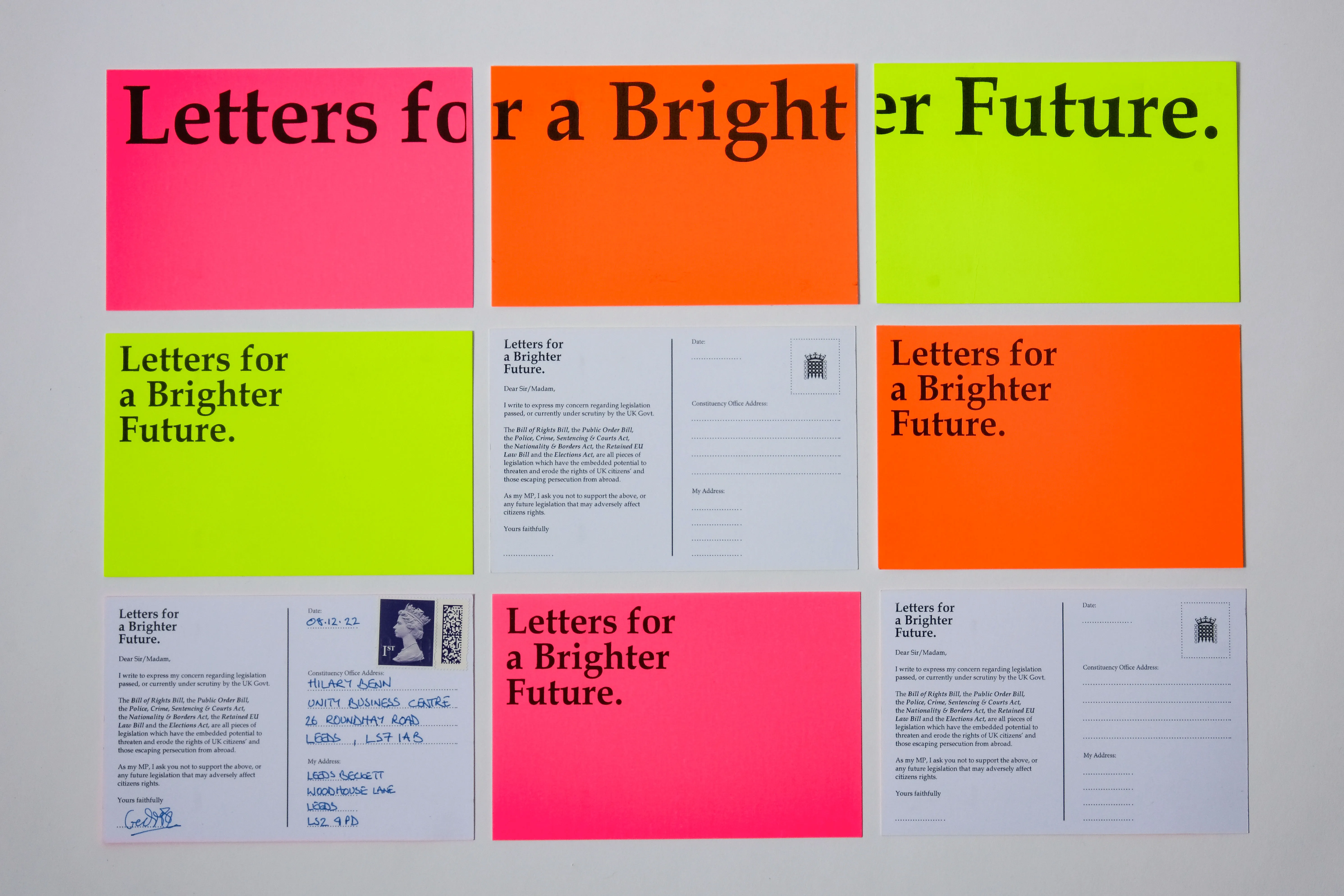
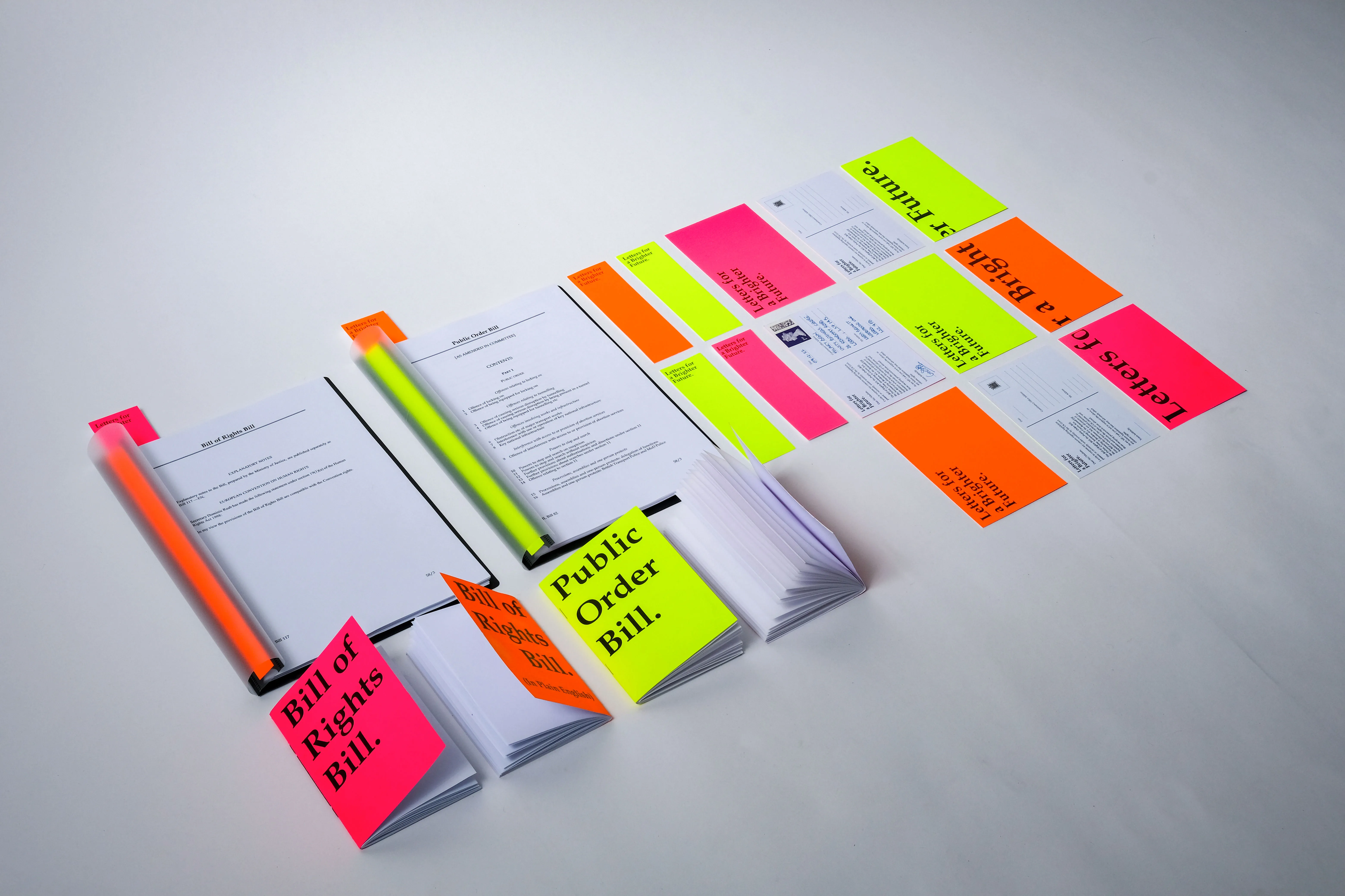
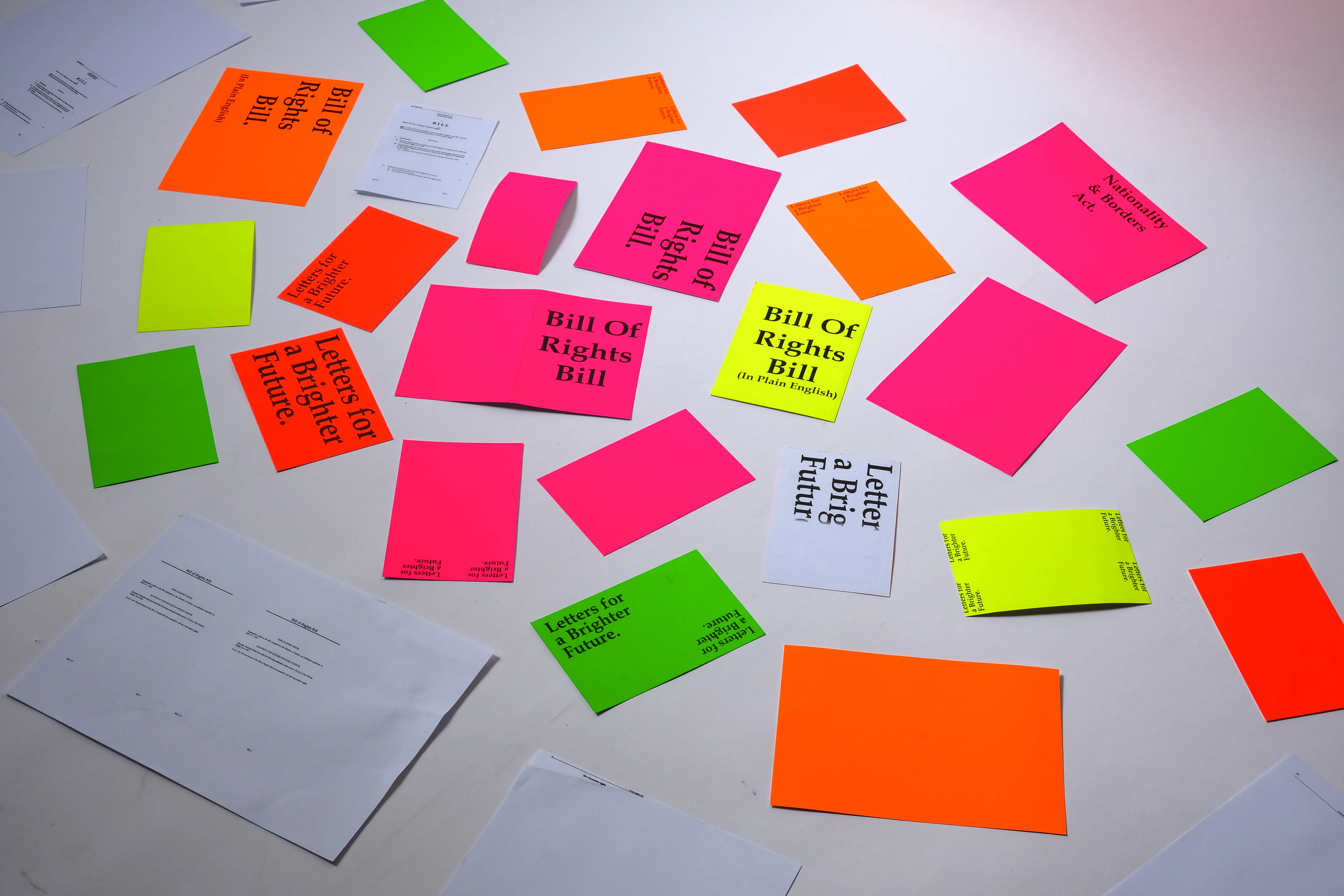
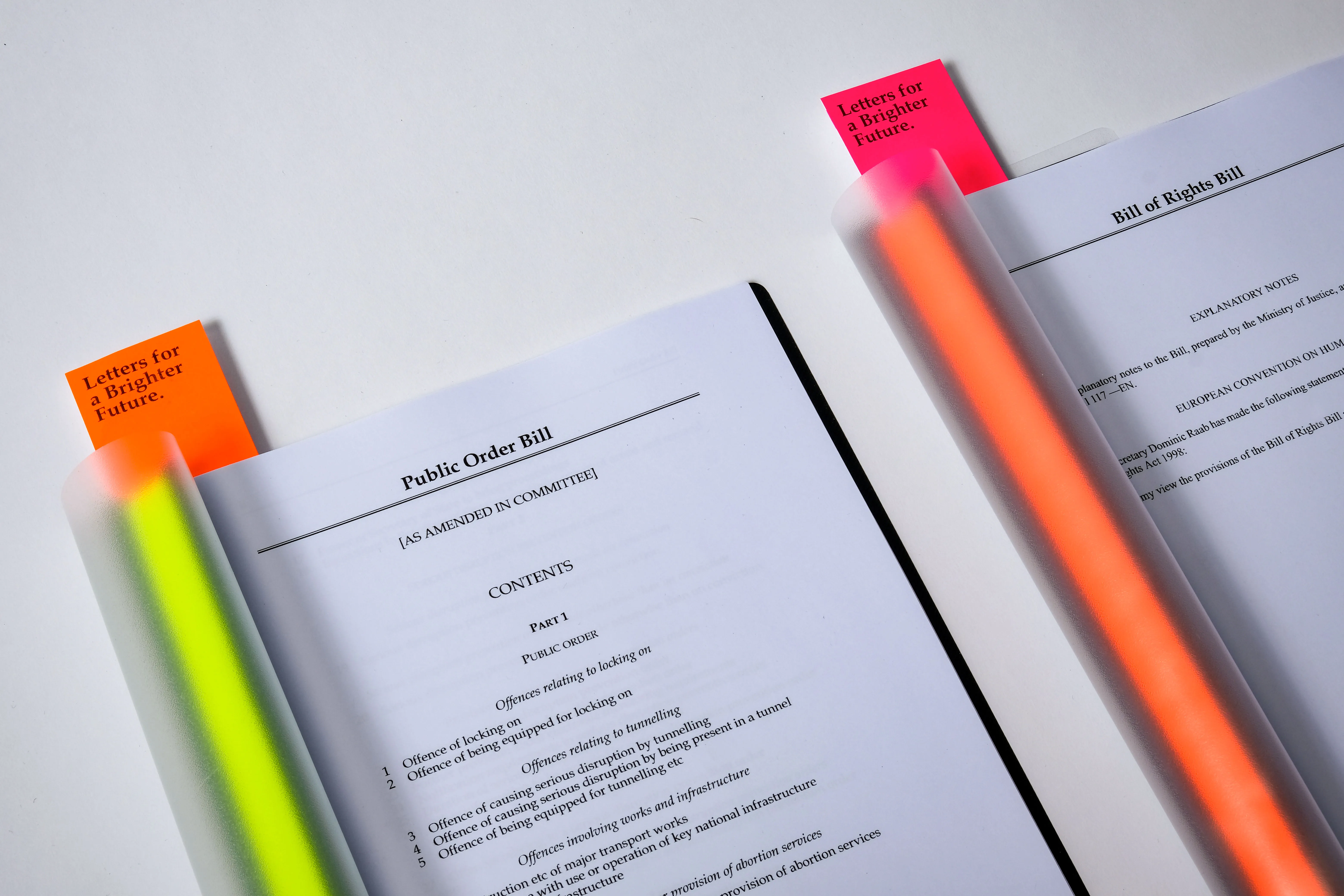
Hidden behind complex legal language, legislation such as the ‘Bill of Rights Bill’, ‘Public Order Bill’, ‘Police, Crime, Sentencing and Courts Act’, ‘Nationality and Borders Act’, ‘Retained EU Law Bill’ and the ‘Elections Act’, seeks vast changes to the rights and freedoms of UK citizens and those who may be seeking sanctuary from persecution overseas.
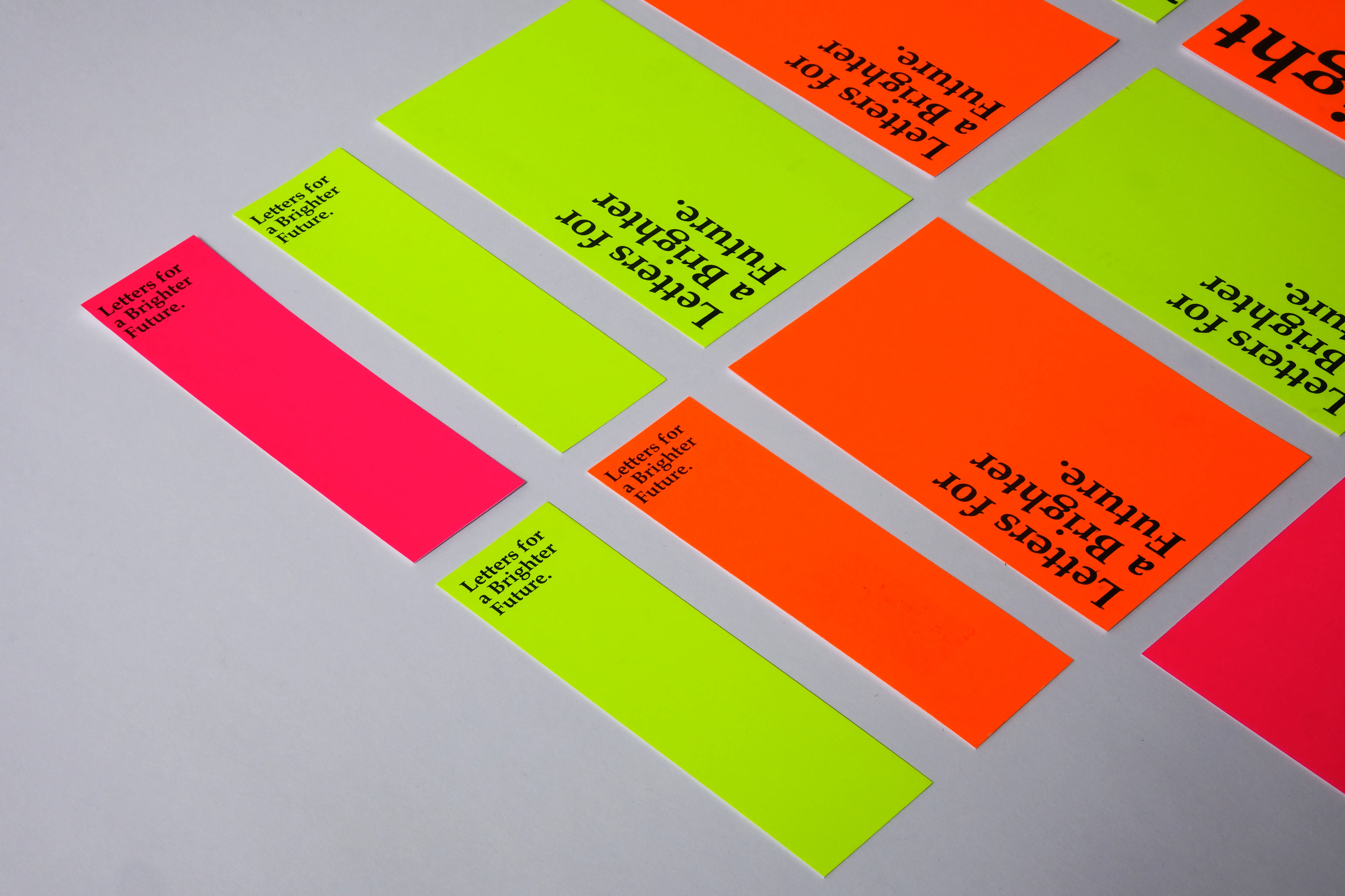
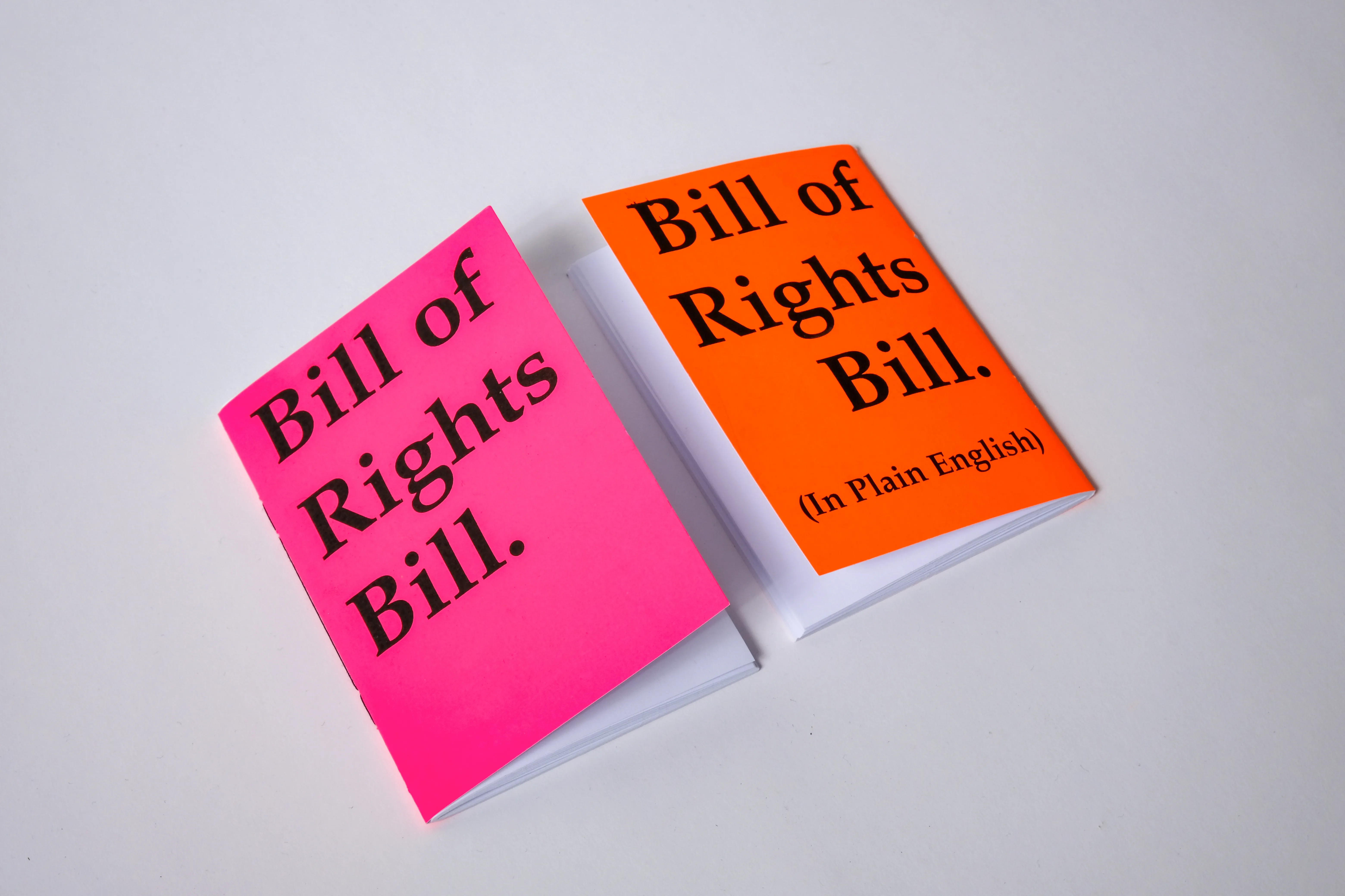
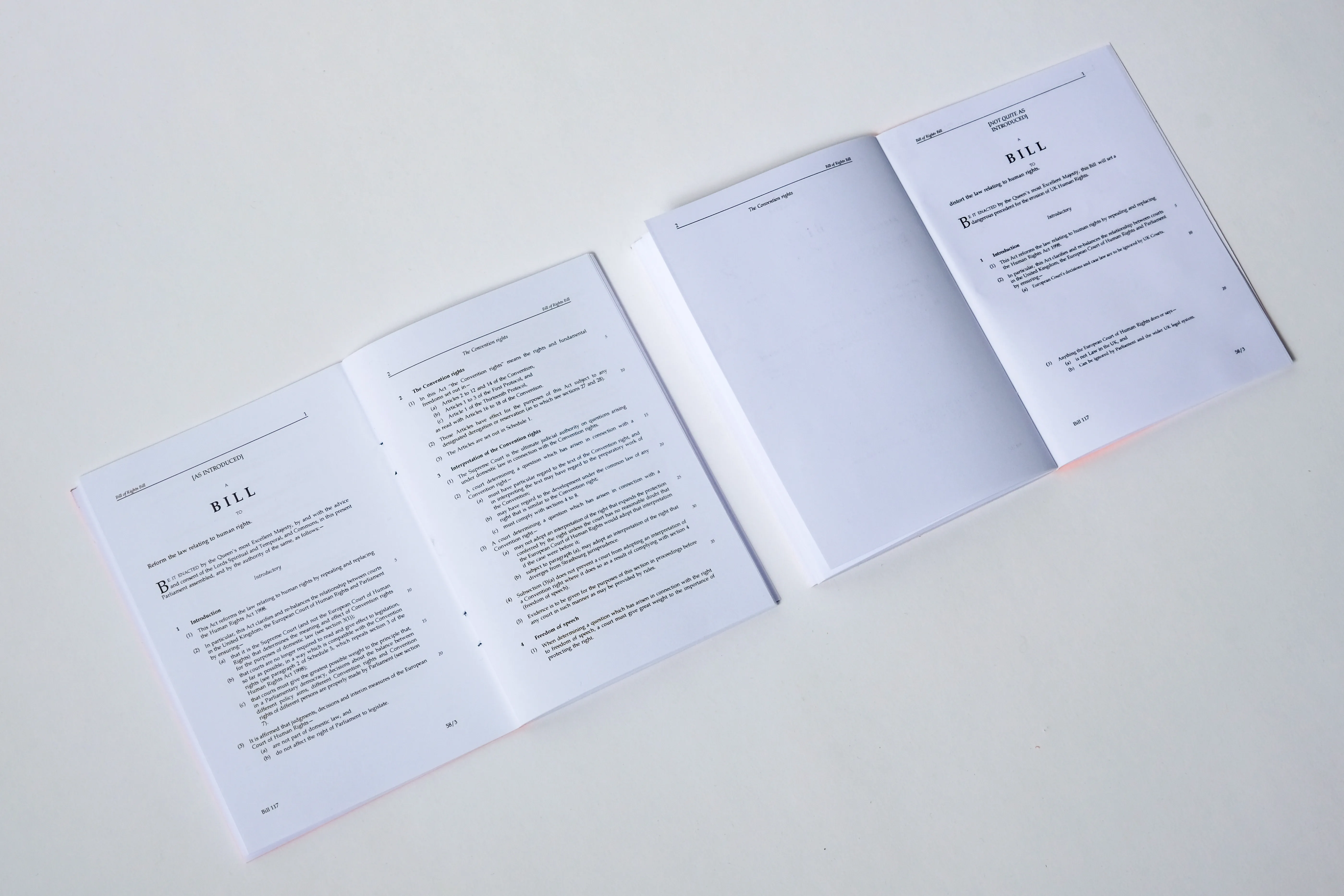
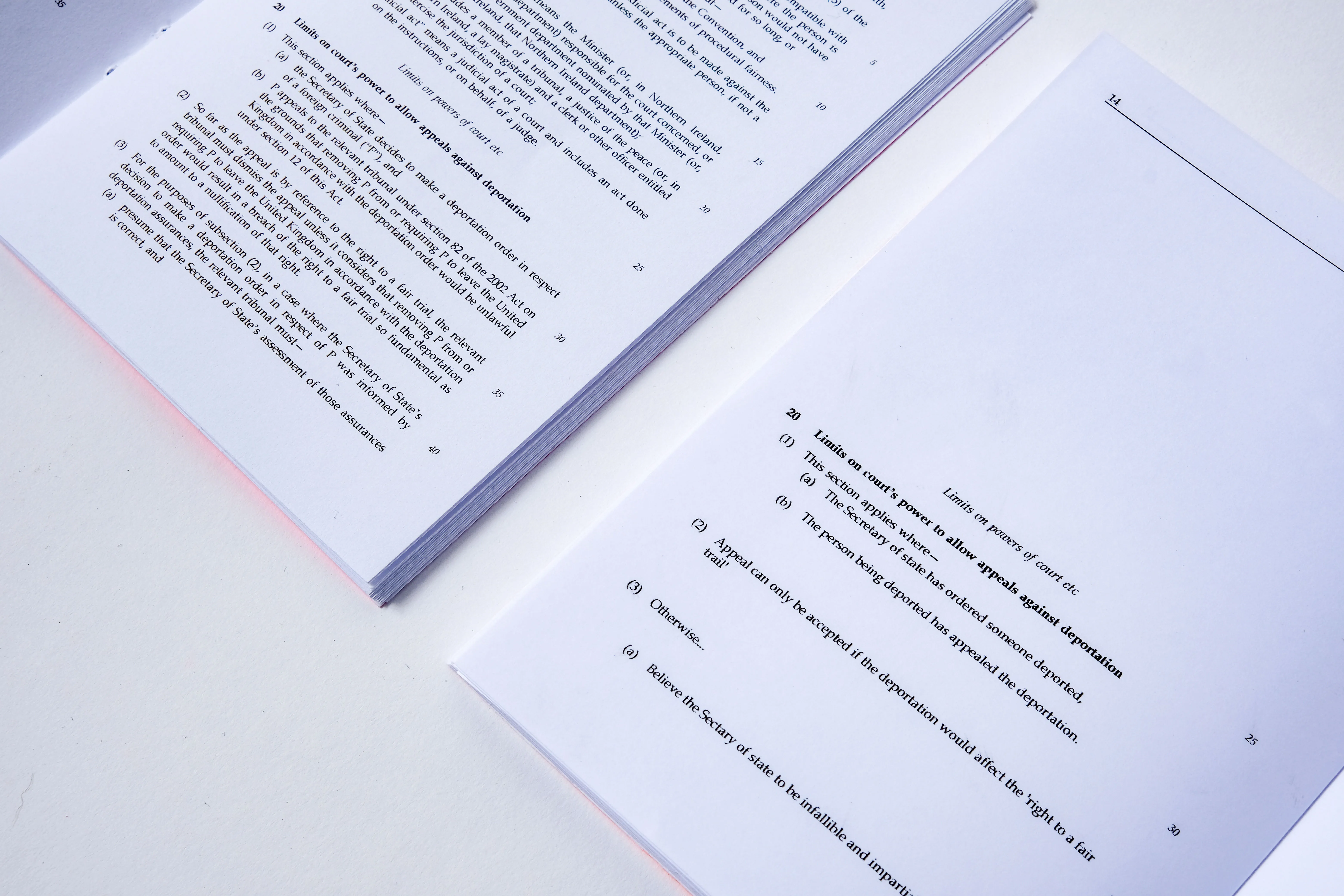
Letters for a Brighter Future seeks to highlight potential threats to UK rights and freedoms though ‘translation’ of these documents into language which is easier to read and understand. Simultaneously, Letters for a Brighter Future uses a postal campaign to directly appeal to MPs to reject these pieces of legislation and any potential future threats to UK rights and freedoms.
Using 3 colour, high visibility stock, alongside typesetting which referencesparliamentary documents, Letters for a Brighter Future hopes to protect therights and freedoms of the UK, starting at the top.
Lorem ipsum dolor sit amet, consectetur adipiscing elit. Suspendisse varius enim in eros elementum tristique. Duis cursus, mi quis viverra ornare, eros dolor interdum nulla, ut commodo diam libero vitae erat. Aenean faucibus nibh et justo cursus id rutrum lorem imperdiet. Nunc ut sem vitae risus tristique posuere.
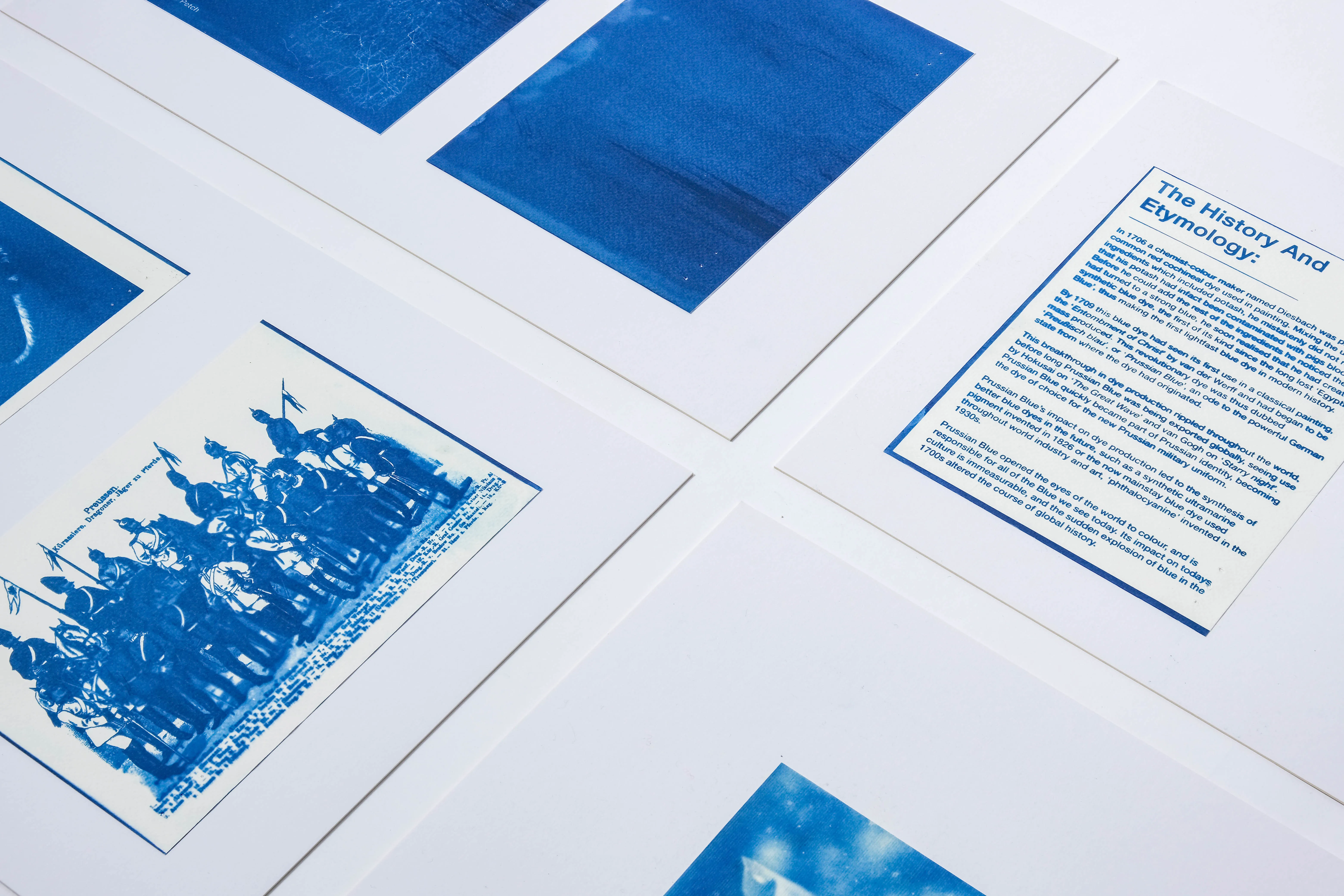
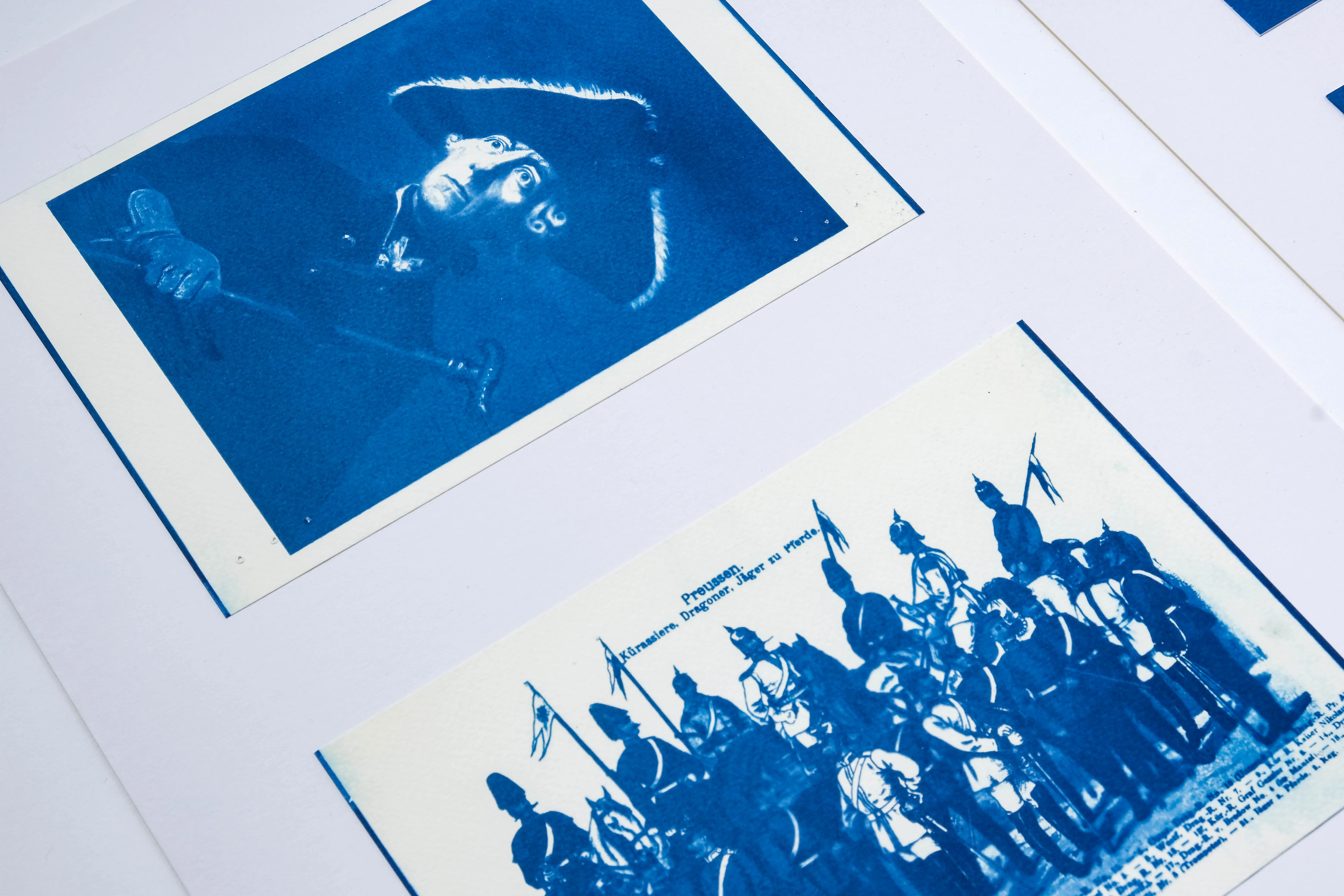
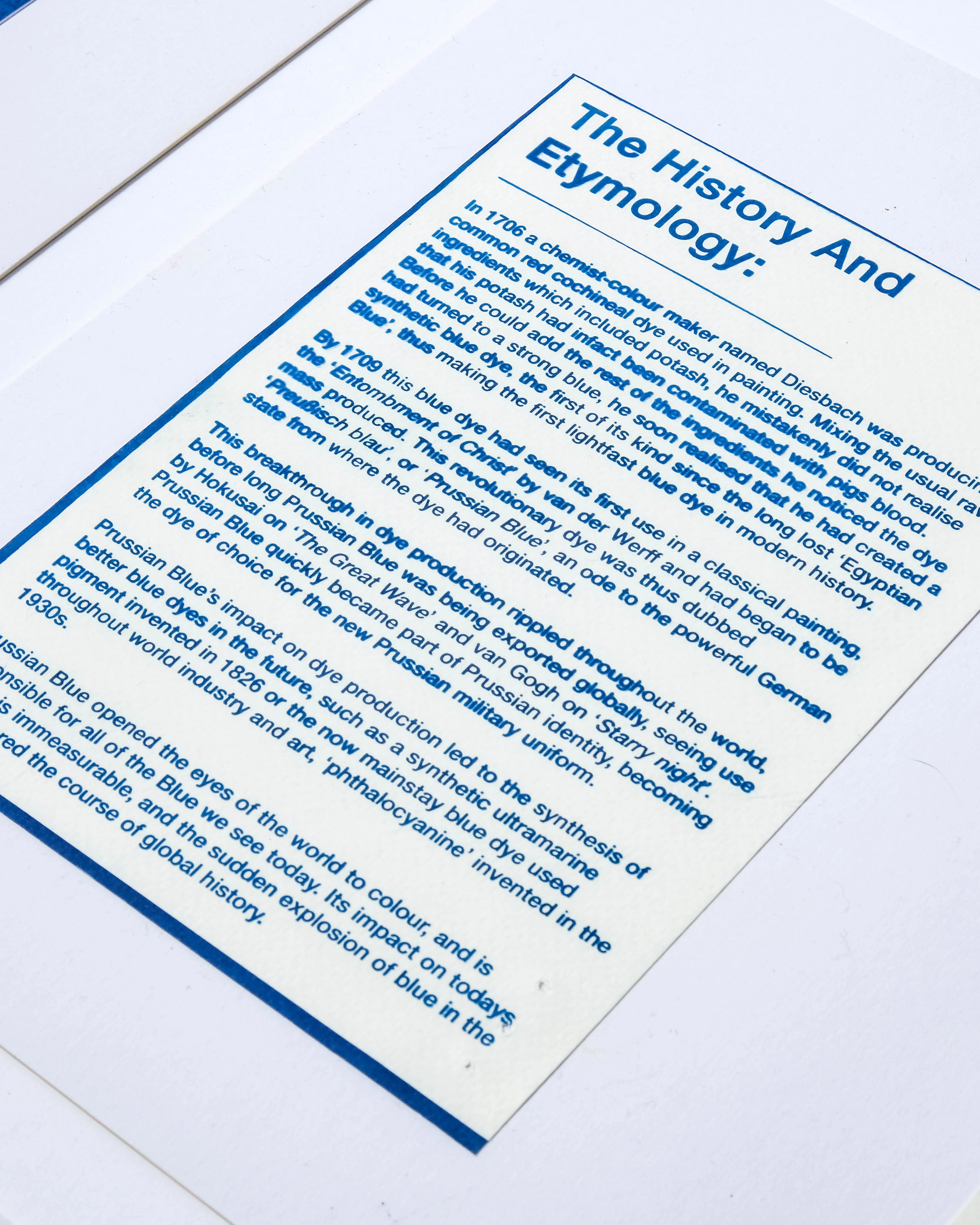
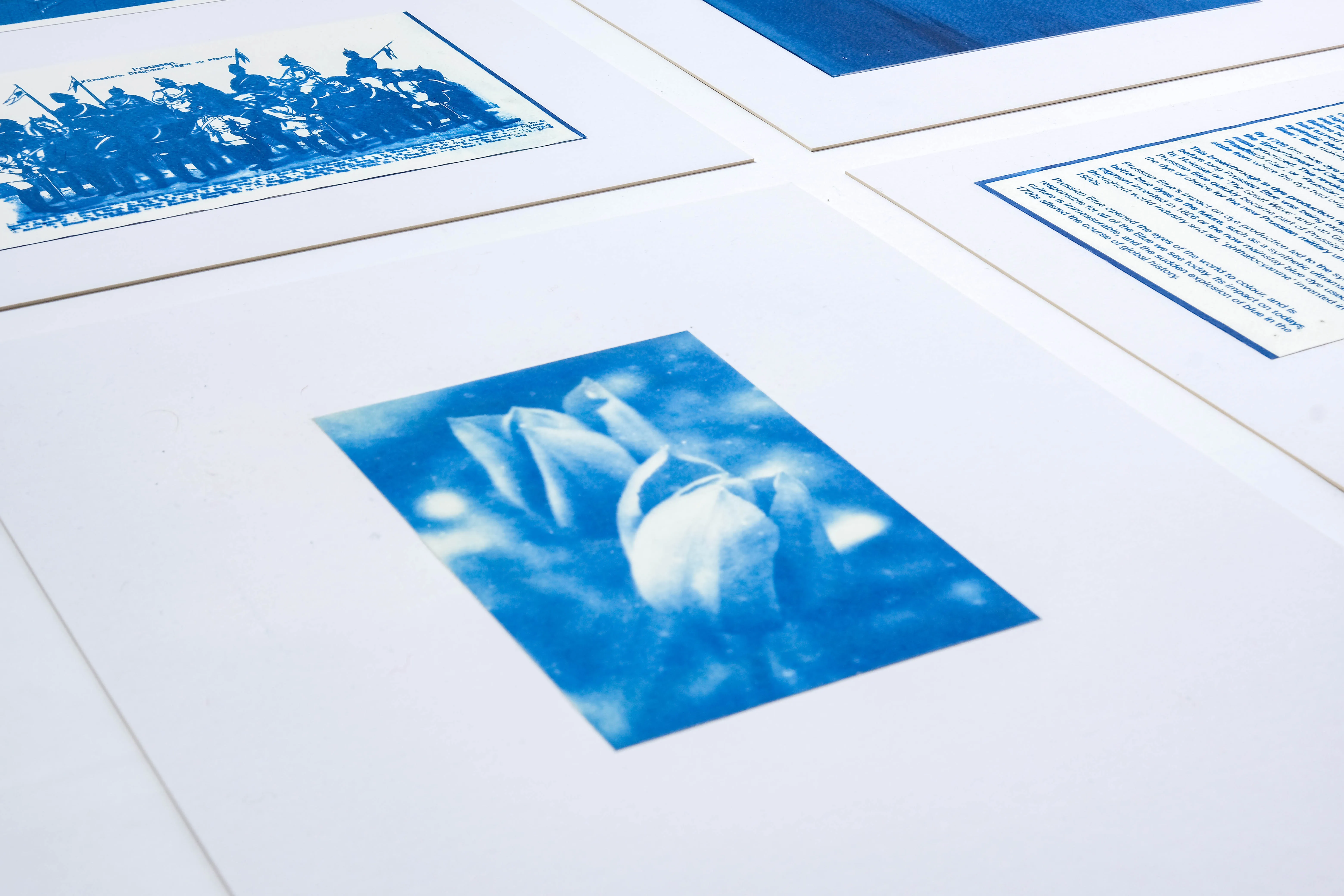
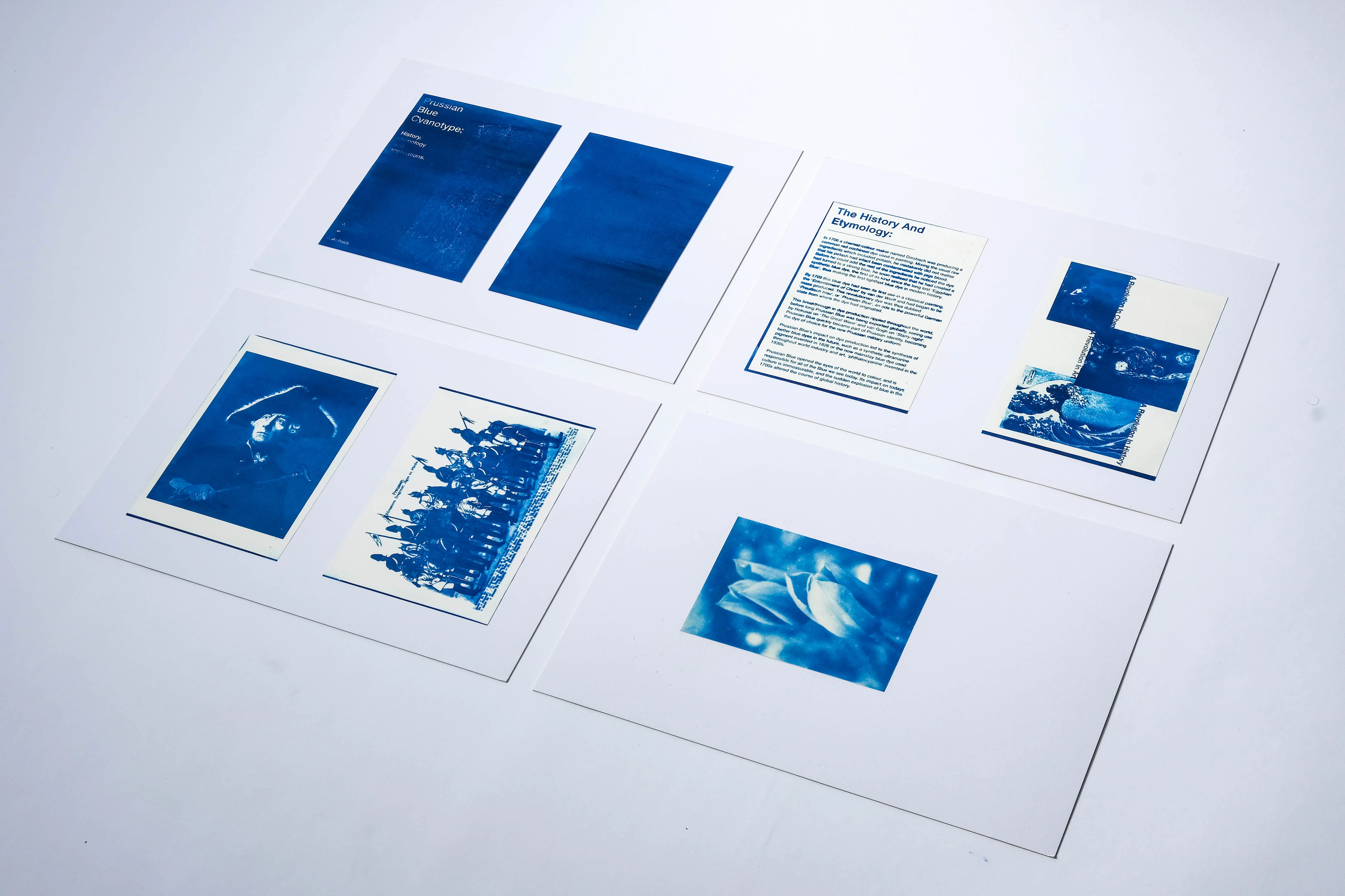
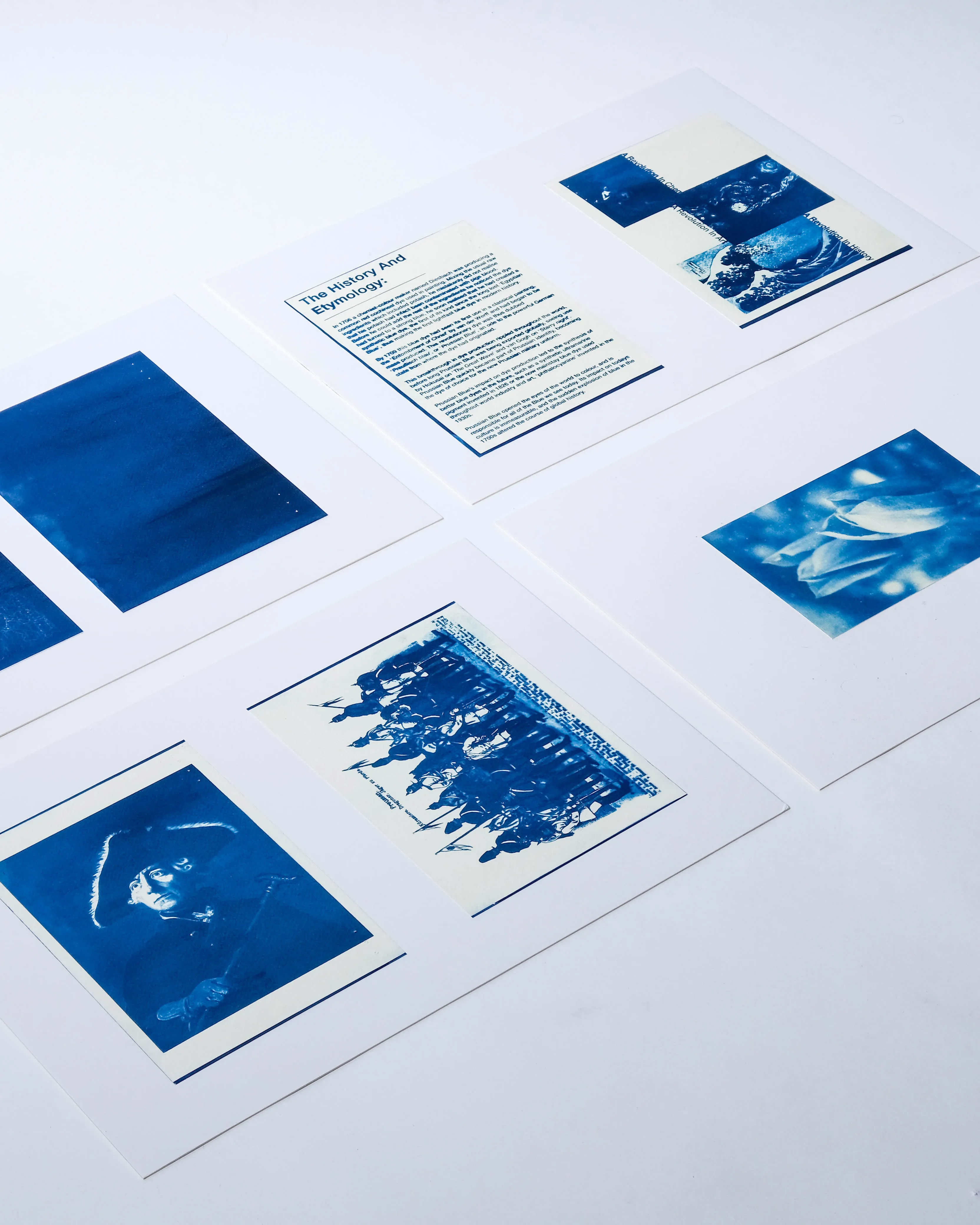
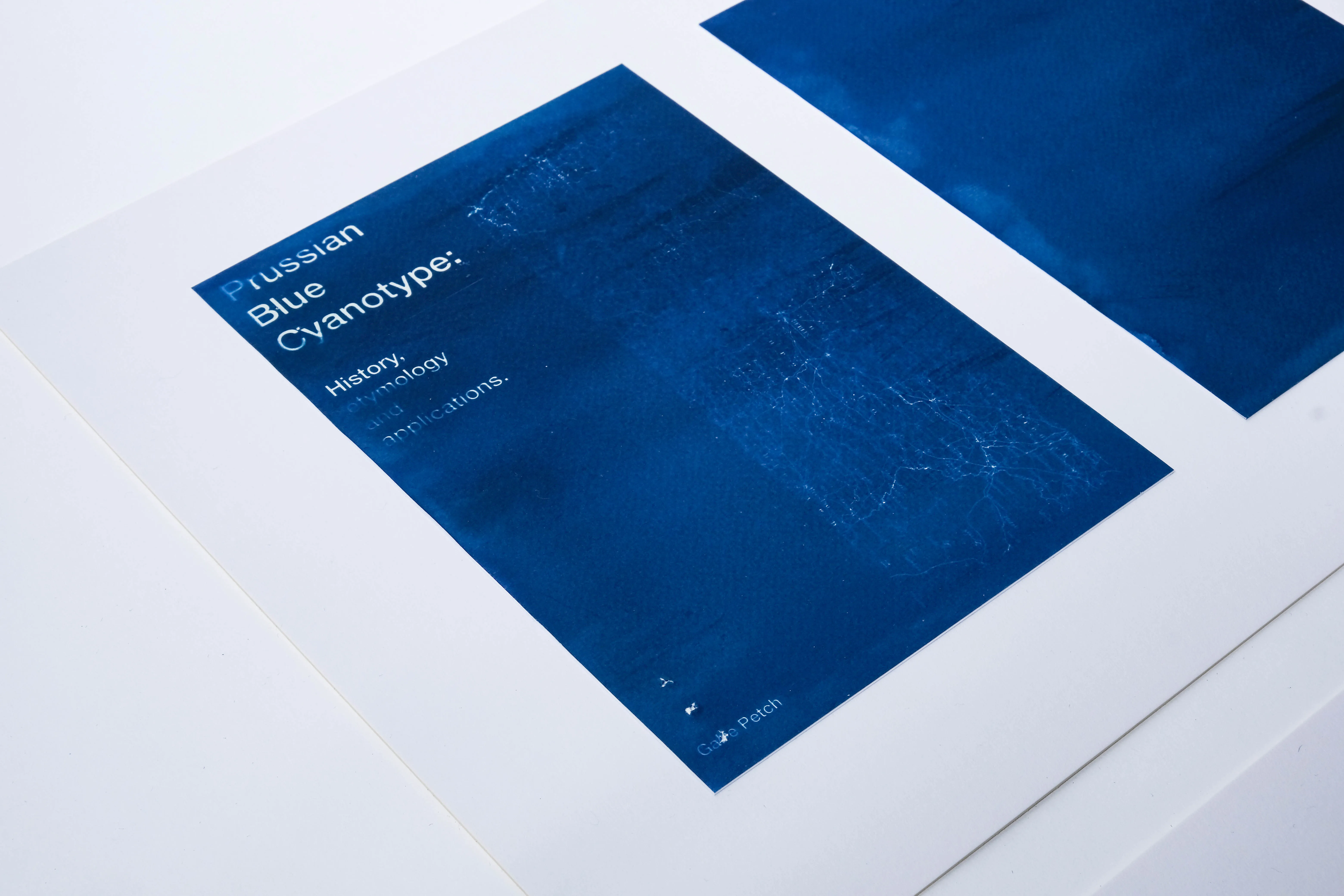
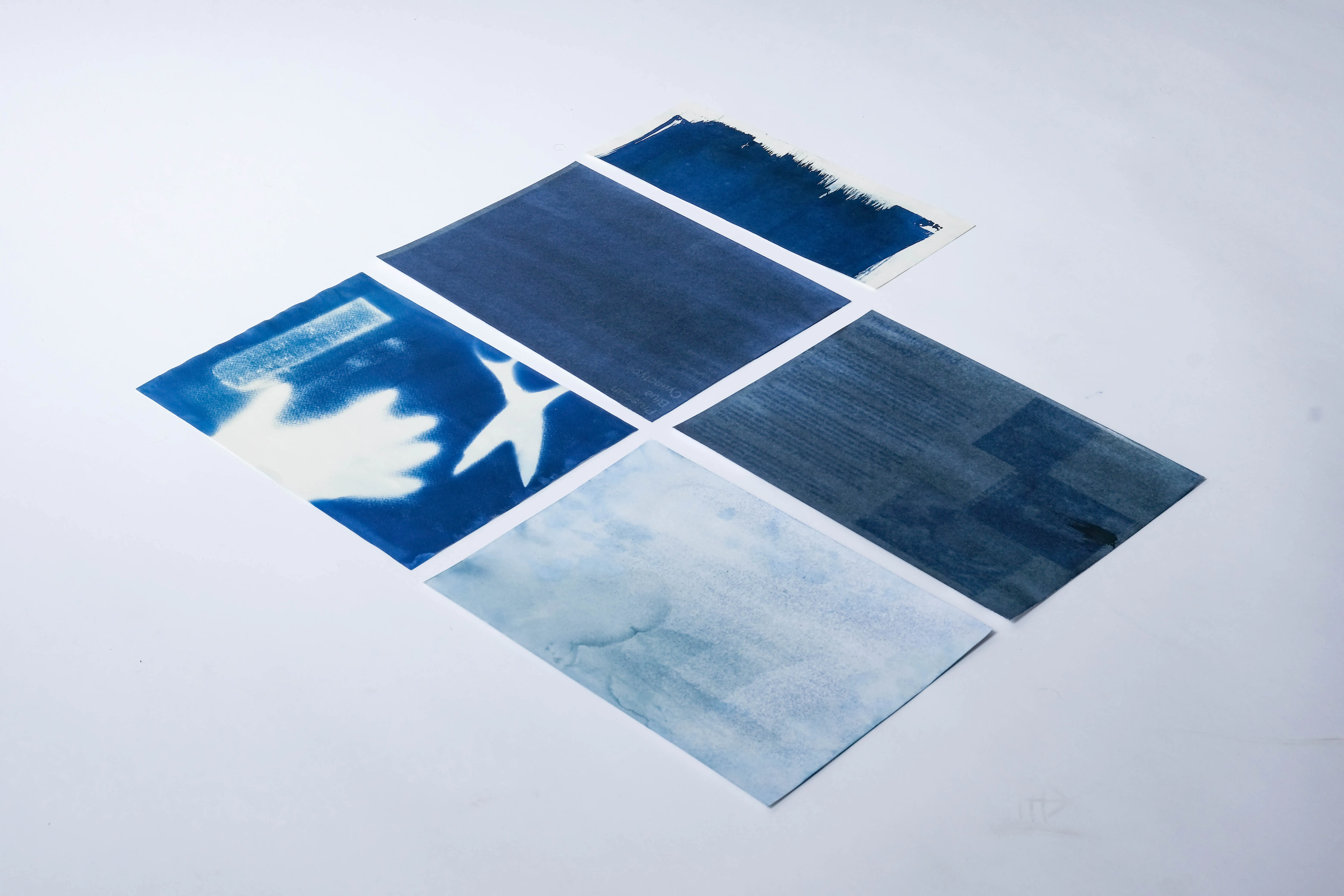
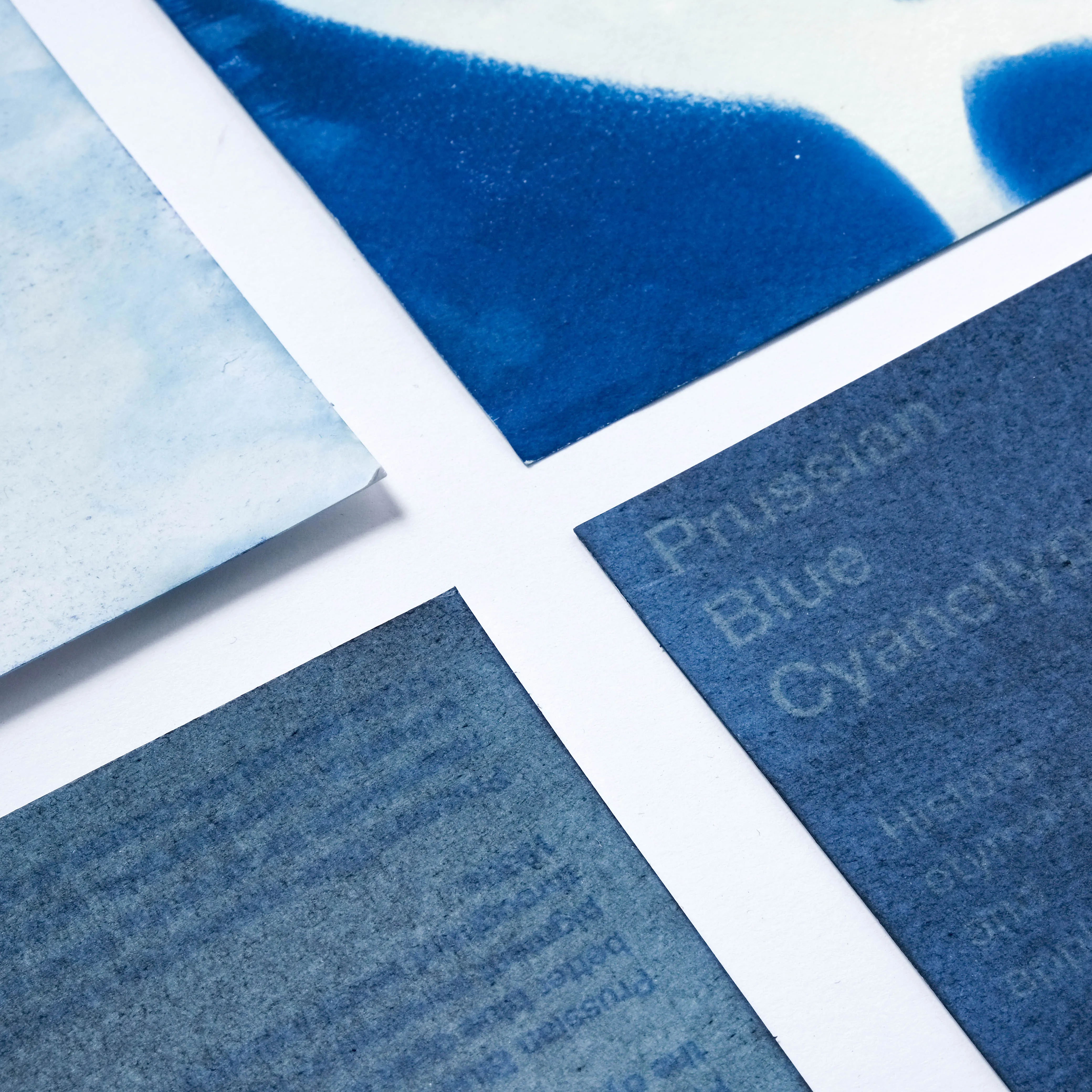
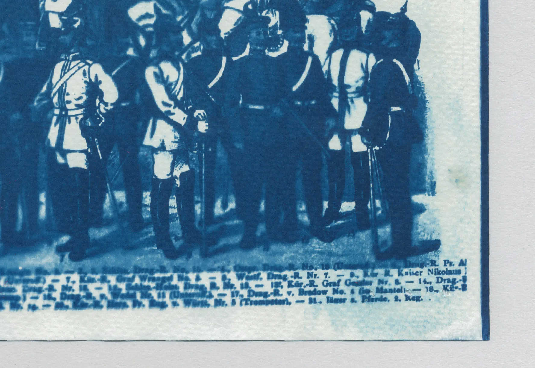
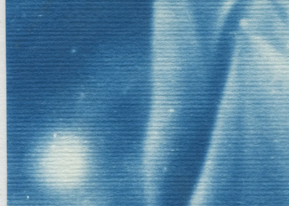
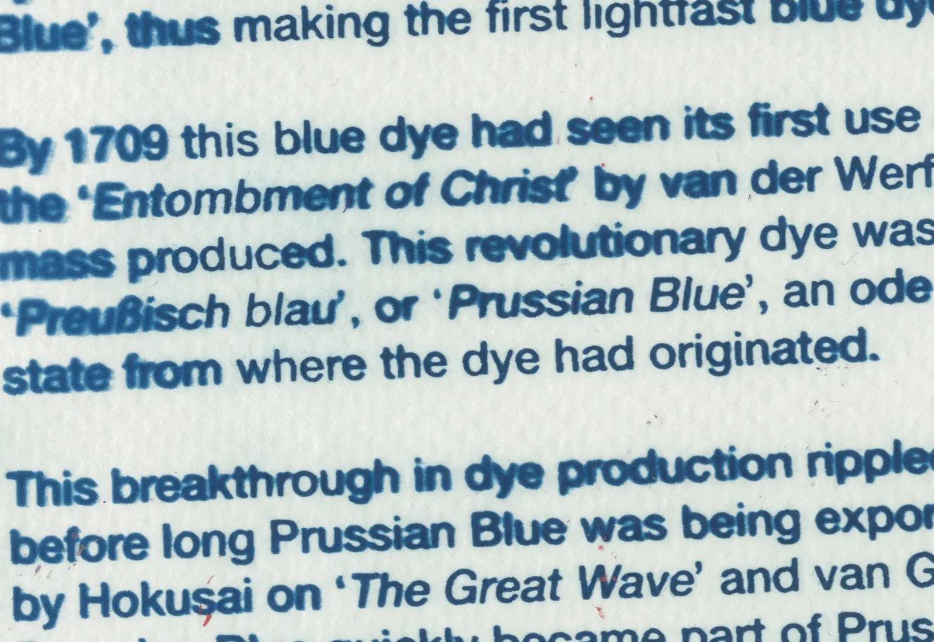
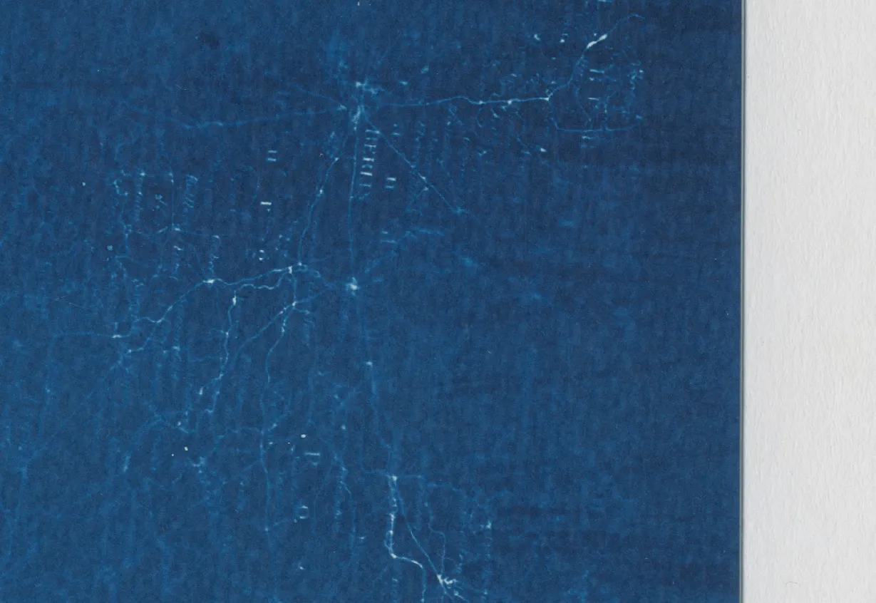
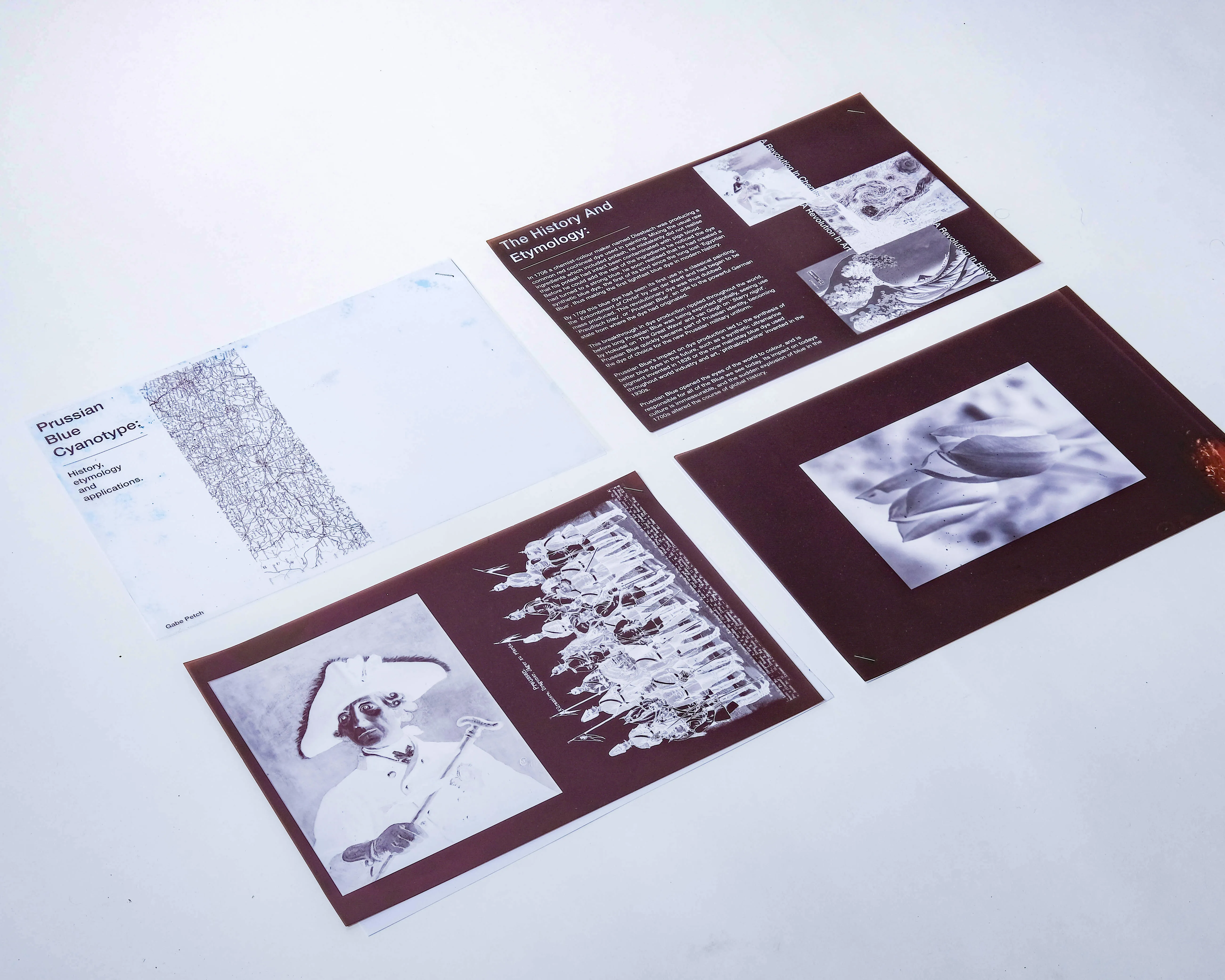
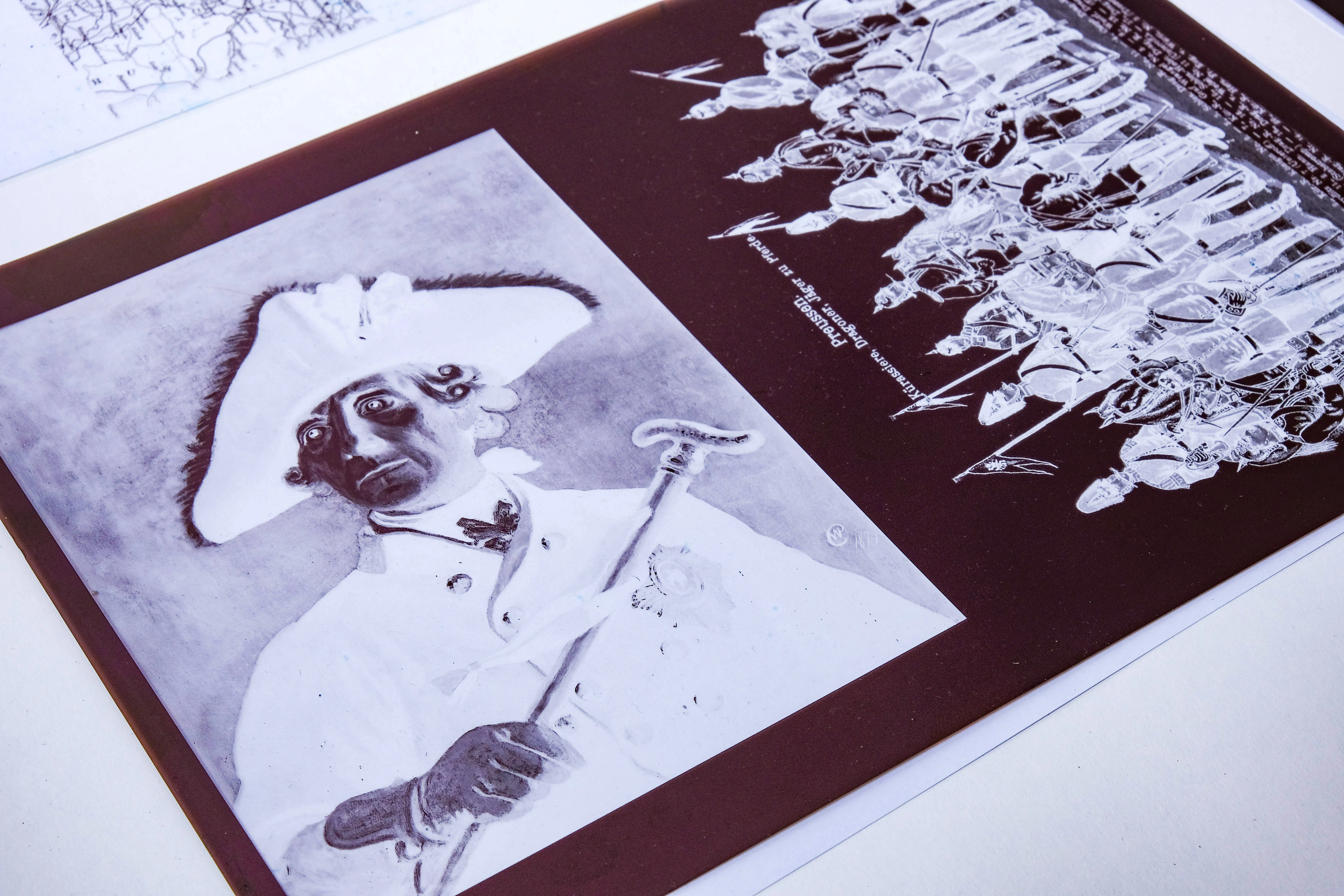
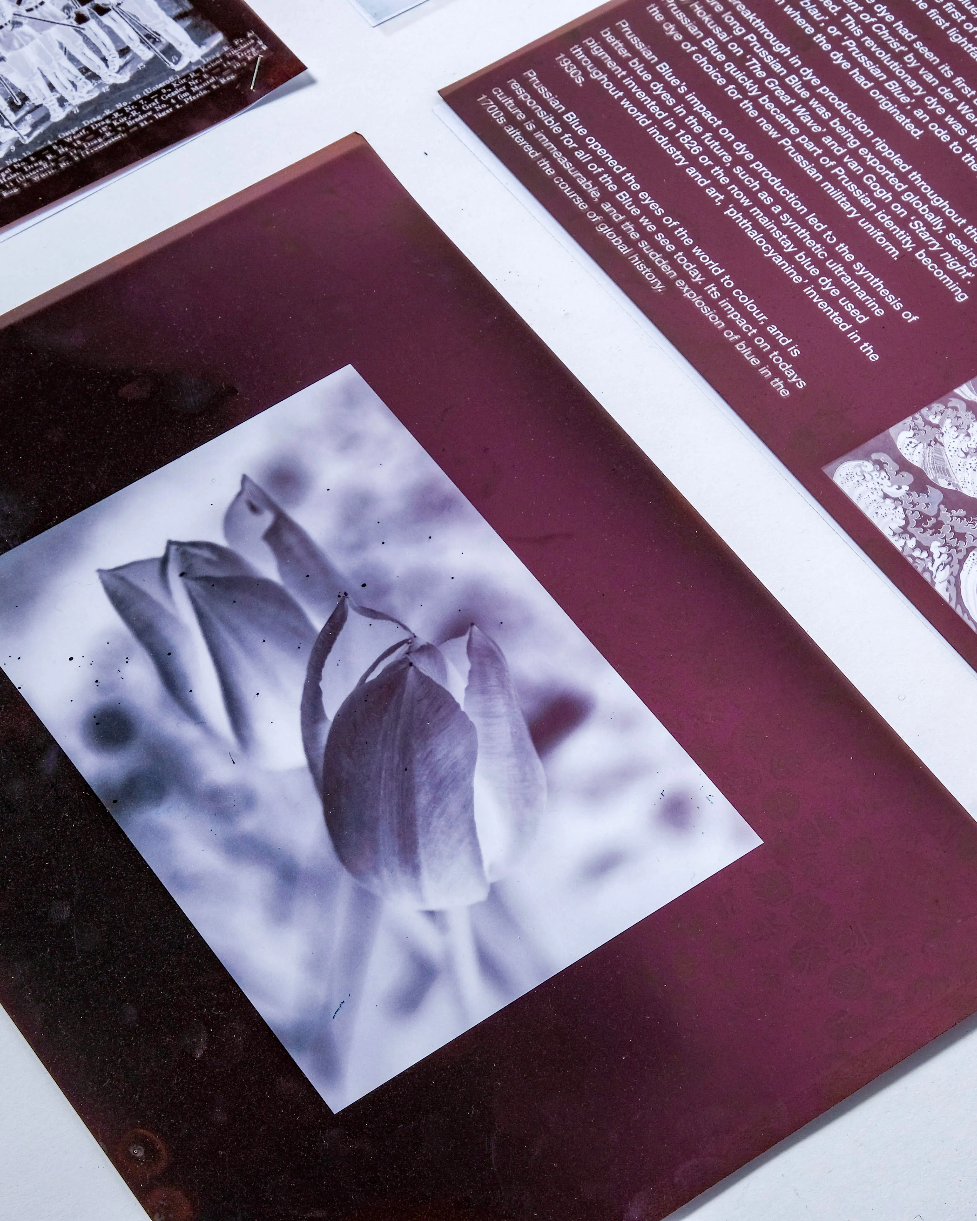
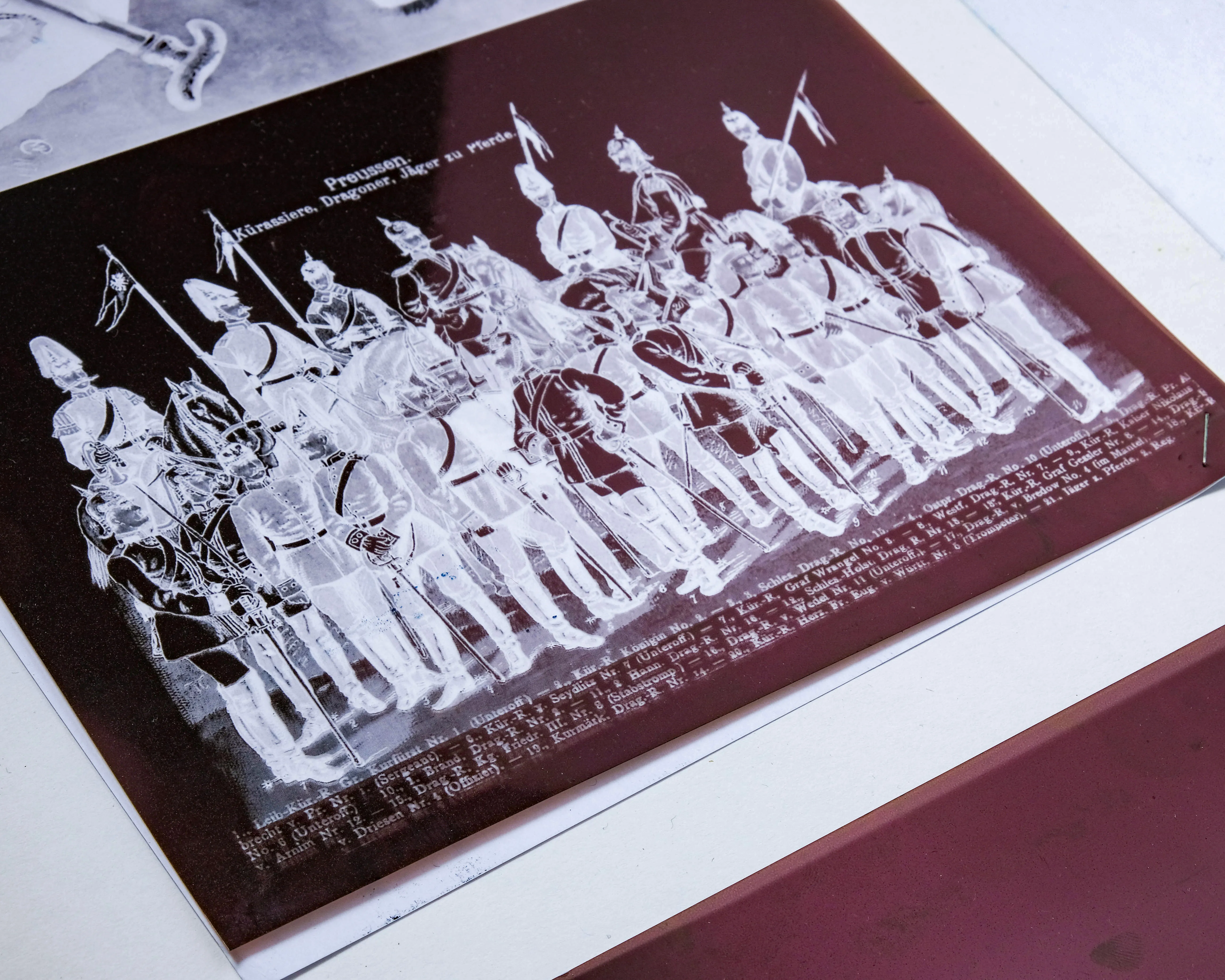
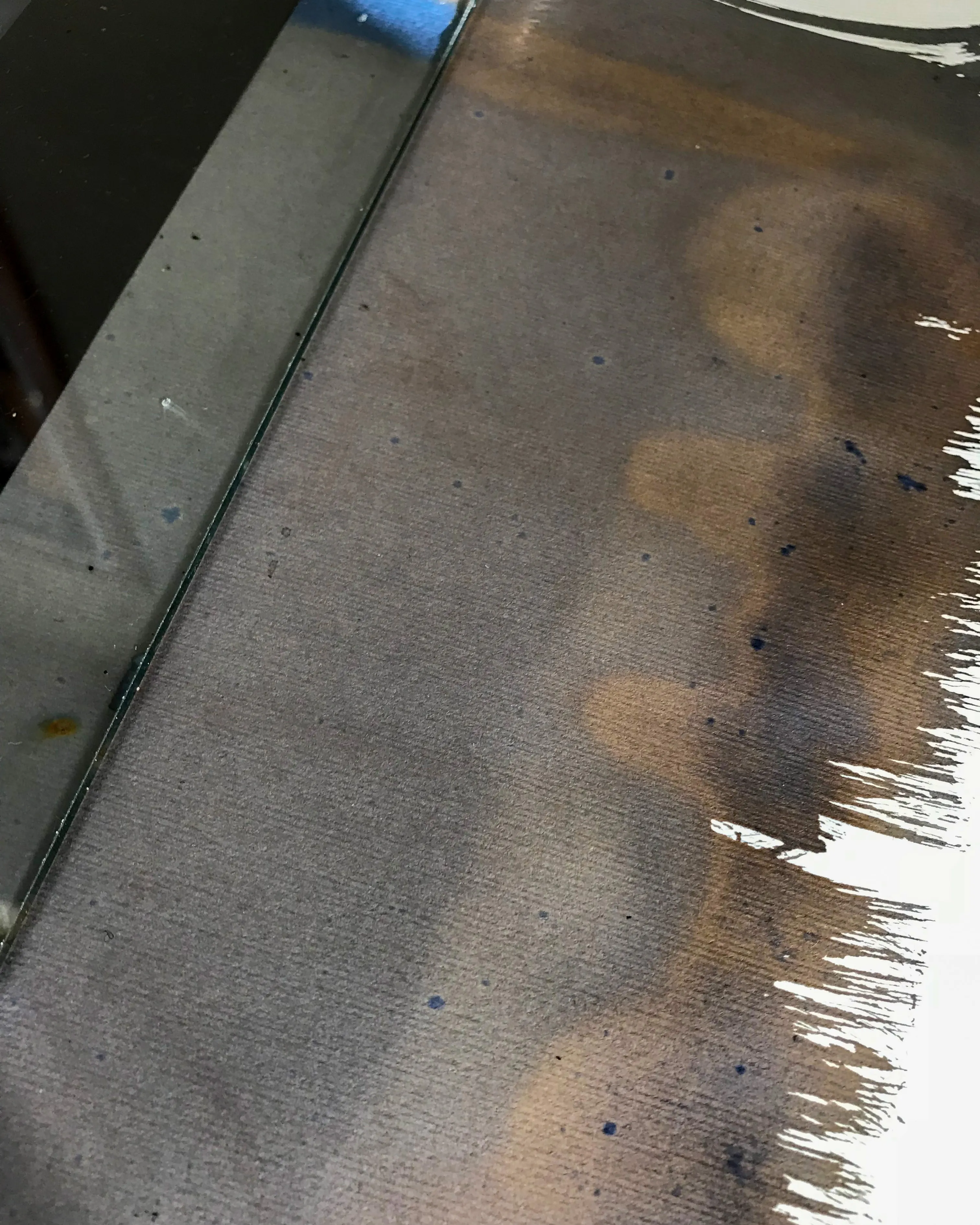
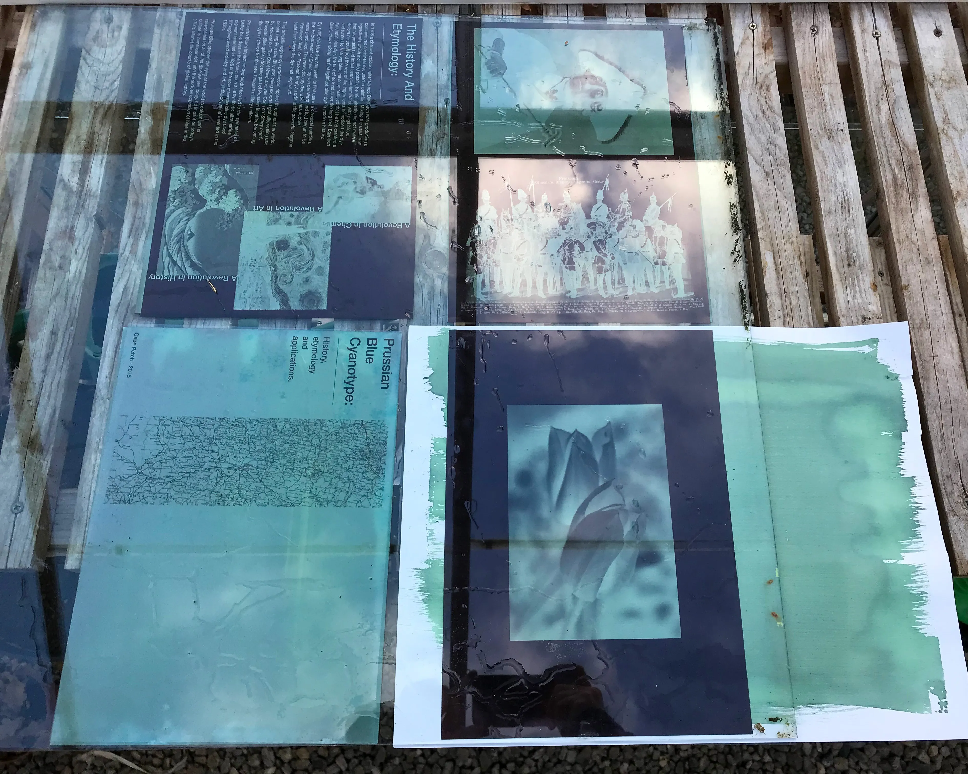
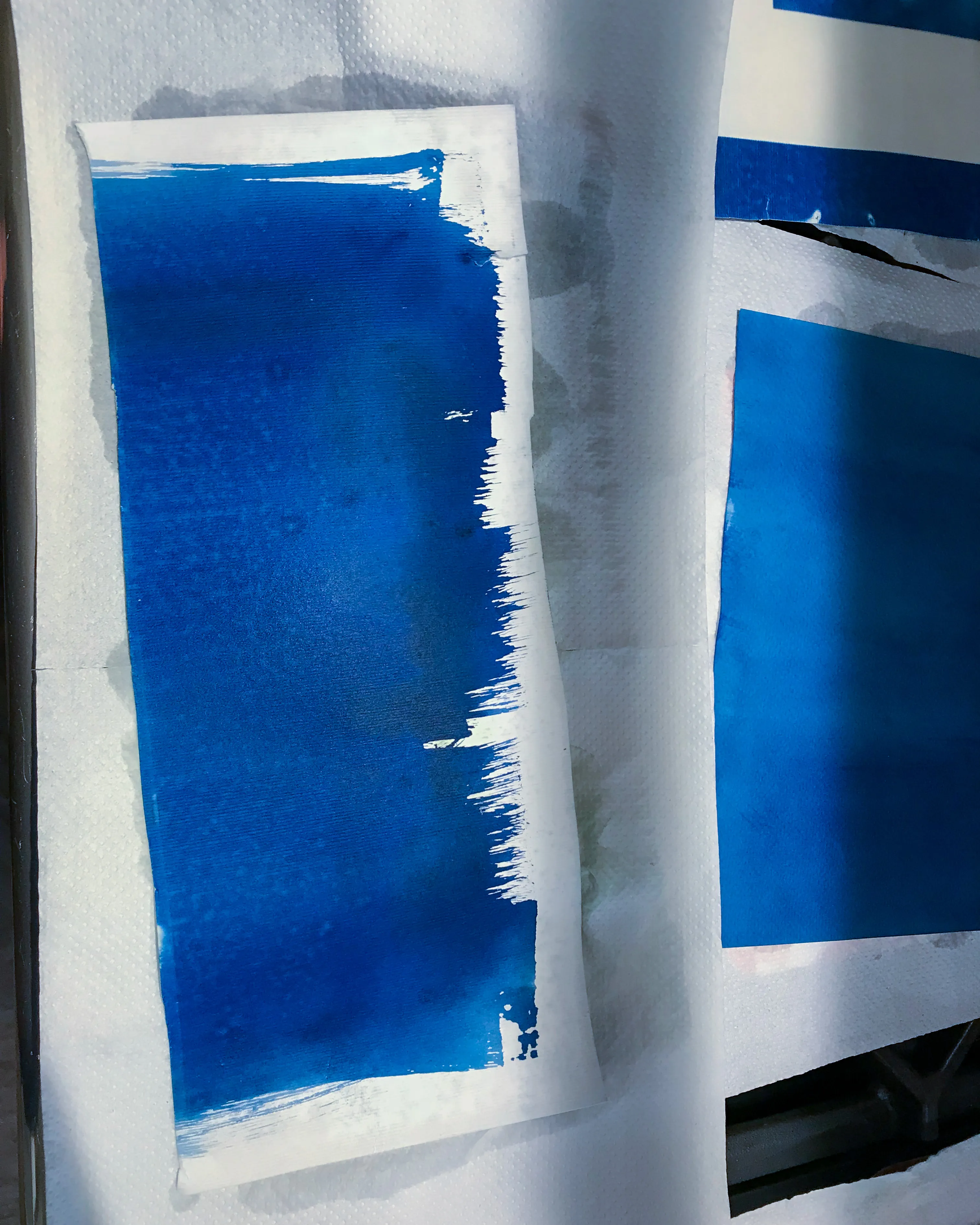
Printed using acetate negatives, cyanotype and the sun’s rays, this publication is made from the very substance it discusses, bringing with it any of the flaws and imperfections which come from the nature of the chemical reaction. Making use of historical images with a link to the dye’s history, this publication highlights the beauty and complexity of this chemical process and the cultural significance of Prussian Blue dye.